3 Types of Web Design: Which One is Right for Your Business?
 Byte Breaker
In today's digital age, having a well-designed website is crucial for businesses to succeed. A website serves as your online storefront, attracting potential customers and providing them with information about your products or services. However, with various web design approaches available, it can be challenging to determine the best option for your business. In this comprehensive guide, we'll explore the three primary types of web design – responsive, adaptive, and fluid – and help you identify the one that aligns with your specific needs and goals.
Responsive, Adaptive, and Fluid: Understanding the Differences
Before diving into the specifics of each type, let's clarify the key distinctions:
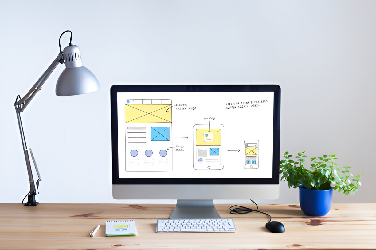
Responsive Web Design: This approach involves creating a single website that automatically adjusts its layout and content to fit different screen sizes and devices (e.g., desktops, tablets, smartphones). The website's code is fluid, allowing it to adapt seamlessly to various screen resolutions.
Adaptive Web Design: This method utilizes multiple pre-designed layouts tailored to specific screen sizes. The website automatically switches to the appropriate layout based on the user's device.
Fluid Web Design: Similar to responsive design, fluid design uses a single codebase that adjusts to different screen sizes. However, it focuses more on maintaining a consistent aspect ratio and scaling elements proportionally, rather than automatically adjusting the layout.
Responsive Web Design: The Most Popular Choice
Responsive web design has emerged as the dominant approach in recent years due to its versatility and user-friendliness. It offers several advantages:
Seamless User Experience: Responsive websites provide a consistent and enjoyable experience across all devices, ensuring visitors can easily access and navigate your content.
Improved SEO: Search engines favor websites that are mobile-friendly, and responsive design helps you rank higher in search results.
Cost-Effective: Responsive design typically requires less development time and resources compared to adaptive or fluid design, making it a more affordable option.
Future-Proof: As new devices and screen sizes continue to emerge, responsive design ensures your website remains adaptable and relevant.
Adaptive Web Design: A Structured Approach
Adaptive web design offers a structured approach with predefined layouts for specific screen sizes. This can be beneficial in certain scenarios:
Complex Designs: If your website has intricate layouts or requires specific design elements for different screen sizes, adaptive design can provide greater control.
Performance Optimization: By creating optimized layouts for specific devices, adaptive design can potentially improve performance and loading times.
Legacy Systems: If you have an existing website with multiple versions for different devices, transitioning to adaptive design might be a more straightforward approach.
Fluid Web Design: Prioritizing Consistency
Fluid web design emphasizes maintaining a consistent aspect ratio and scaling elements proportionally across various screen sizes. This approach can be ideal for:
Image-Heavy Websites: If your website relies heavily on images or graphics, fluid design can help preserve the visual integrity and prevent distortion on different devices.
Design-Centric Websites: For businesses that prioritize a visually appealing and consistent design experience, fluid design can be a suitable choice.
Choosing the Right Approach for Your Business
The best web design type for your business depends on several factors:
Target Audience: Consider the devices your target audience primarily uses. If they predominantly use smartphones or tablets, responsive design is likely the most suitable option.
Website Complexity: If your website has complex layouts or requires specific design elements for different screen sizes, adaptive design might be more appropriate.
Design Priorities: If preserving the visual integrity and consistency of your website is paramount, fluid design could be a good choice.
Budget and Timeline: Responsive design is generally more cost-effective and can be implemented more quickly than adaptive or fluid design.
Additional Considerations
Testing and Optimization: Regardless of the approach you choose, it's essential to thoroughly test your website on various devices and browsers to ensure optimal performance and user experience.
Accessibility: Prioritize accessibility by following web accessibility guidelines (e.g., WCAG) to make your website usable for people with disabilities.
Maintenance and Updates: Regularly update your website's content and ensure it remains compatible with the latest technologies and devices.
Conclusion
In conclusion, the choice between responsive, adaptive, and fluid web design depends on your specific business needs, target audience, and design priorities. Responsive design has emerged as the most popular and versatile option, offering a seamless user experience across all devices. However, adaptive and fluid design may be suitable for businesses with unique requirements or a strong focus on visual consistency. By carefully evaluating these factors, you can select the web design approach that best aligns with your goals and helps you achieve online success.
Remember, a well-designed website is not just about aesthetics; it's about providing a valuable and user-friendly experience that drives conversions and builds brand loyalty.
Subscribe to my newsletter
Read articles from Byte Breaker directly inside your inbox. Subscribe to the newsletter, and don't miss out.
Written by
