UI Builder Tips #2: An Introduction to UI Builder
 Reece Poulsen
What is UI Builder?
ServiceNow’s UI Builder is a powerful tool that lets developers and designers create, customize, and manage modern, responsive interfaces within the Now Platform. It offers an intuitive and visual way to build user interfaces (UIs) using reusable, pre-built components and easy drag-and-drop functionality. UI Builder is inspired by modern web development, so web developers will find it quite familiar!
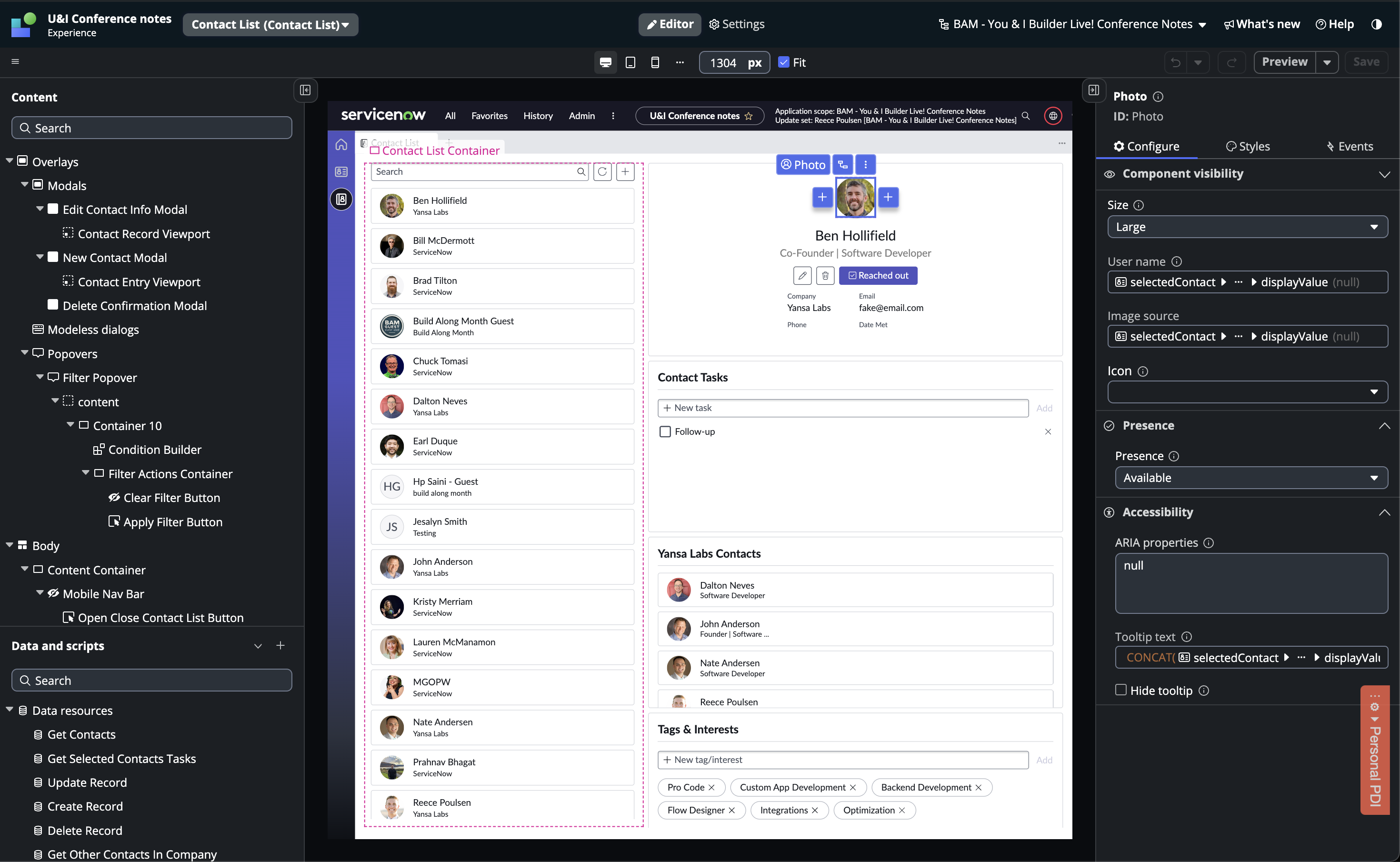
Core Concepts
UI Builder relies on ServiceNow's custom UI framework called Seismic. This framework allows developers to create modern web components using React-like code that works on ServiceNow. The code inside these components can't access traditional server-side APIs like GlideRecord or platform client-side APIs like g_form, but rather they have their own set of APIs. This is a whole new set of skills for ServiceNow developers to learn. Fortunately, ServiceNow has built and maintains a whole library of components that are highly customizable and ready to use. However, custom component development is still an option.
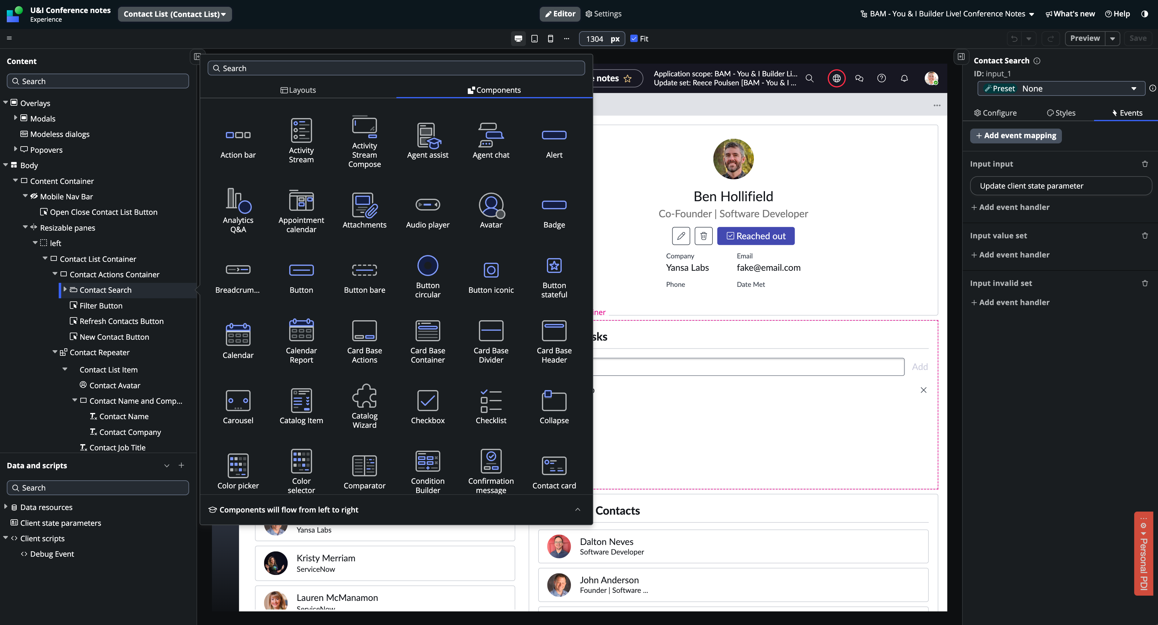
Component Properties and Events
Components are reusable bundles of HTML, CSS, and JavaScript. Most components accept inputs through the use of properties. Whenever one of a component's properties is updated, the component re-renders. This isolated re-rendering allows the browser to only re-render components on the page when they need to be updated.
Components can emit events that can then be linked to event handlers. These event handlers let you trigger actions when an event happens. There are many pre-built event handlers for common scenarios, or you can create your own with scripts.
Client State
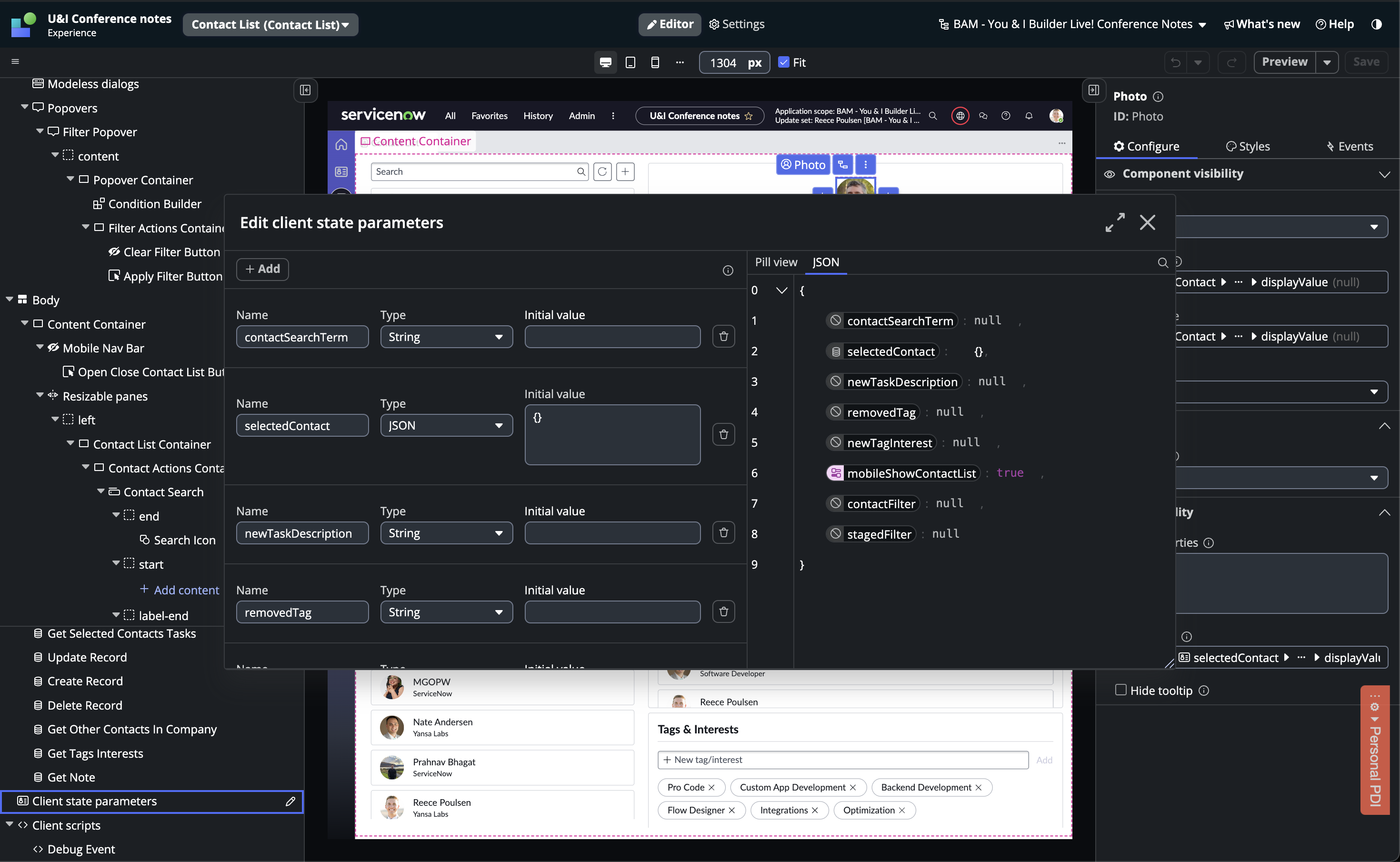
Each page has its own state that holds values for the page. You can create your own client state variables, each with a data type and a default value. When a page loads, all client state variables are set to their default values. The client state gets updated as the user interacts with the interface.
Data Binding
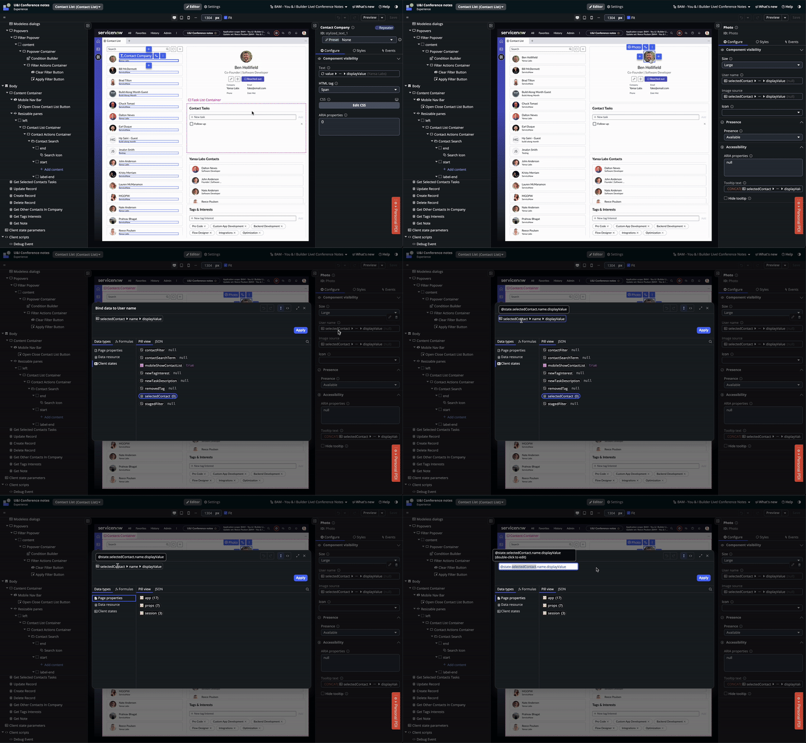
Component properties can have either a static or dynamic value. Data binding lets you link a dynamic value from the client state or a data resource to a component property. You can use the data pill picker or bind data directly with a script.
The Interface
There is a lot going on in UI Builder's interface, lets break it down.
Document Tree
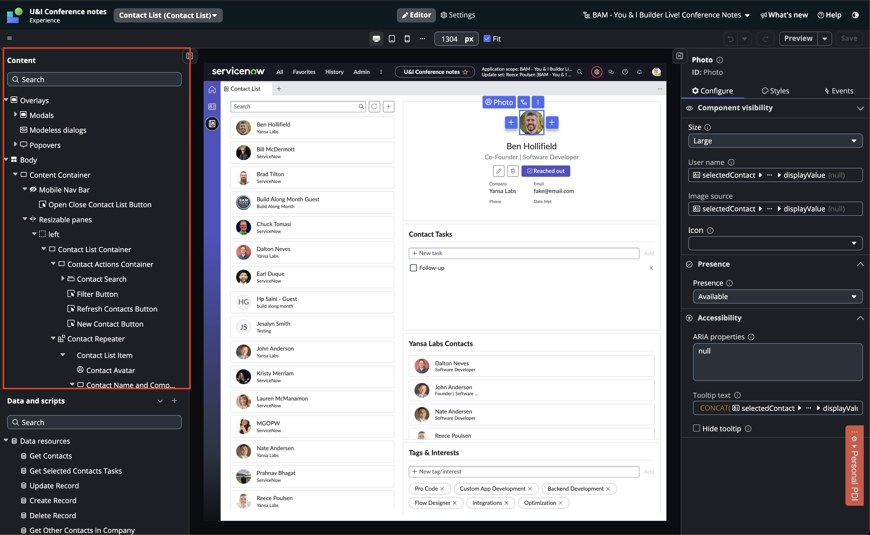
The document tree shows the structure of your page. It includes an Overlays section and a Body section. The Overlays section is for modals, modeless dialogues, and popovers. The Body section is where most of the page content will be. The elements in the document tree are shown as parent-child relationships. How you nest your containers will greatly affect their styling later, so a bit of planning here is very helpful.
Data and Scripts Menu
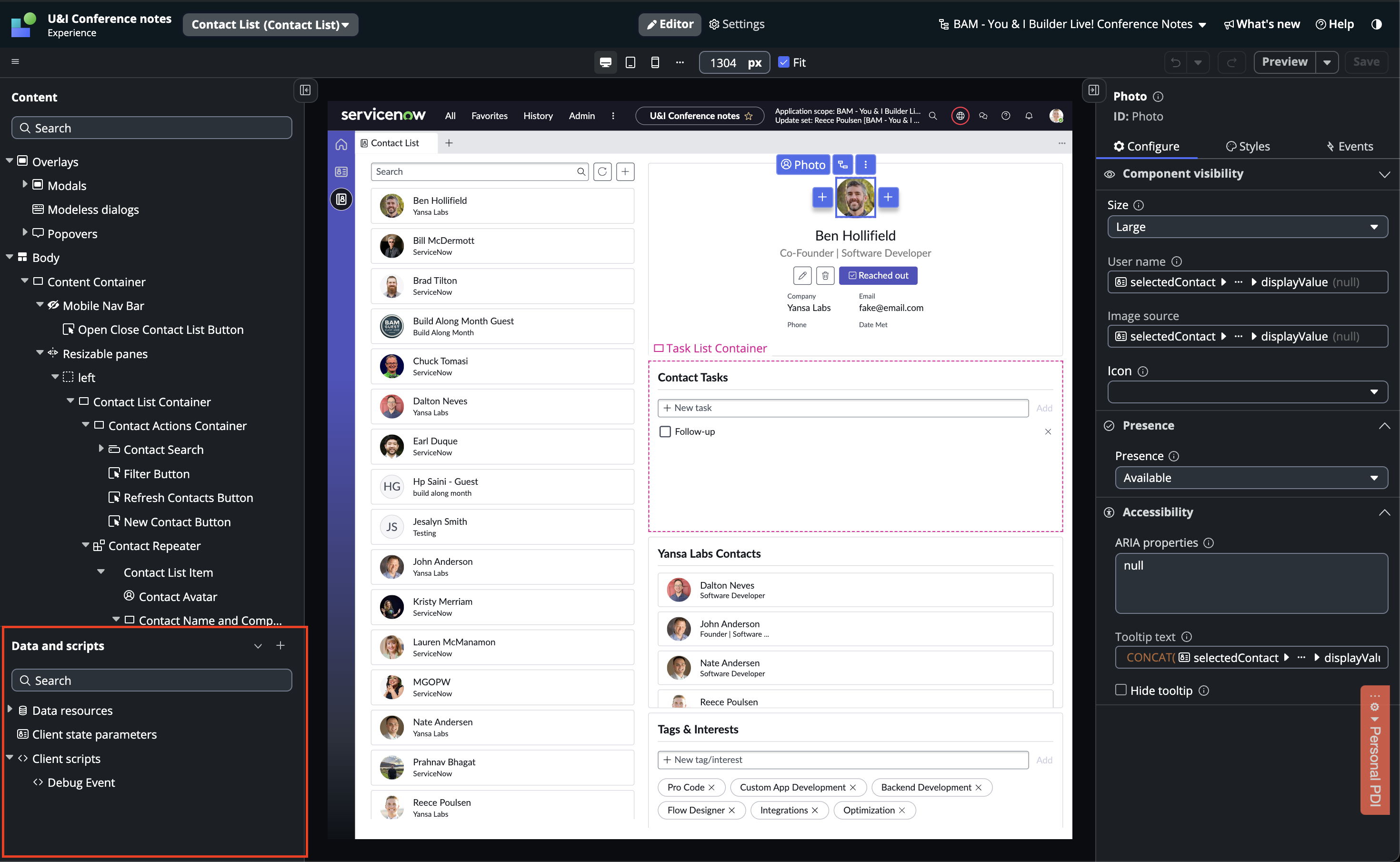
This menu contains your data resources, client state parameters, and client scripts. It's essentially where all the data for your page lives.
The Stage
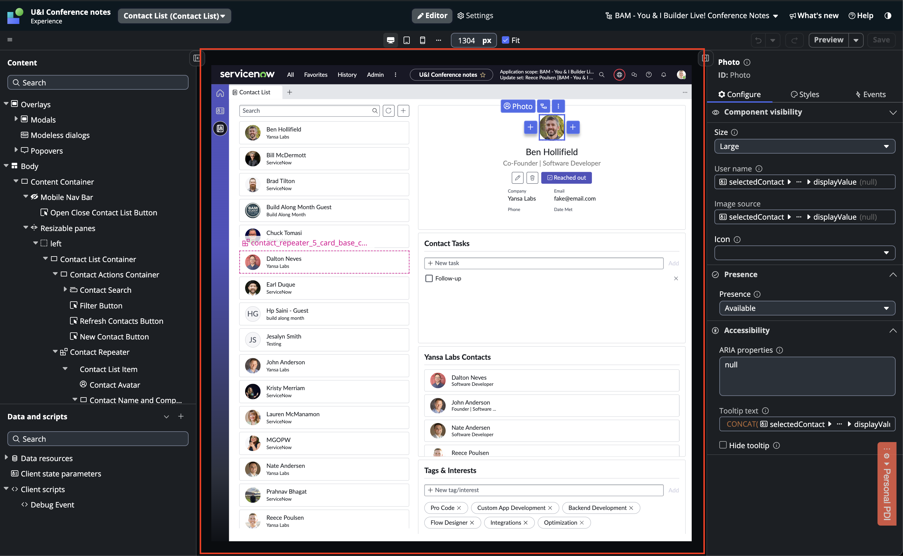
The stage updates in real-time as you make changes to your components and document tree. Improvements have been made to the stage in recent releases of UI Builder, but it's not always 100% accurate to how your page will actually look. I usually verify how my page looks by opening the route in another tab.
Responsive Design Menu
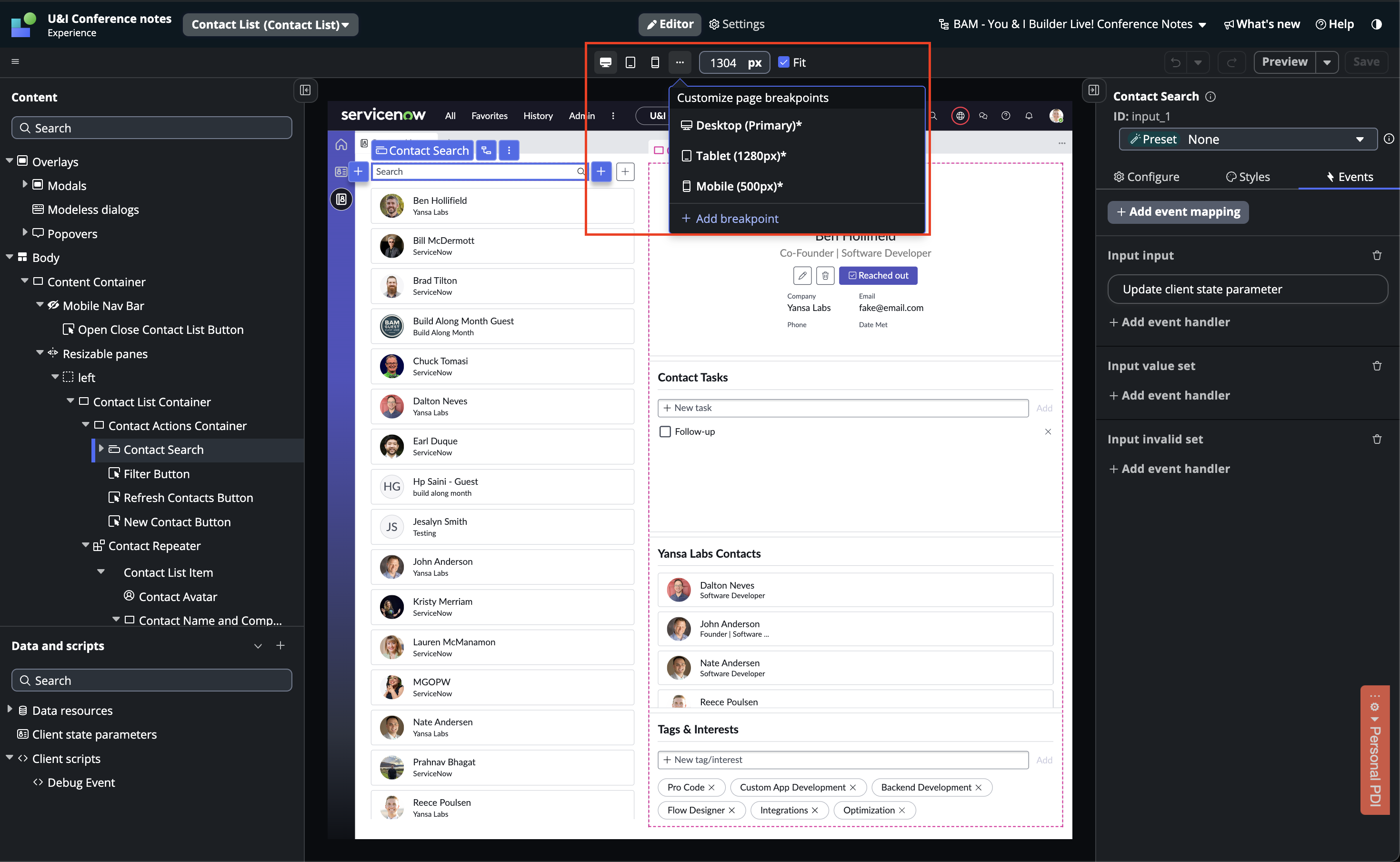
The responsive design menu is a new feature in the Xanadu release. The default option is the Desktop view, but you can switch to other breakpoints to adjust your page's behavior for each specific breakpoint. I usually build the desktop version first and then adjust for the smaller breakpoints.
Configuration Panel
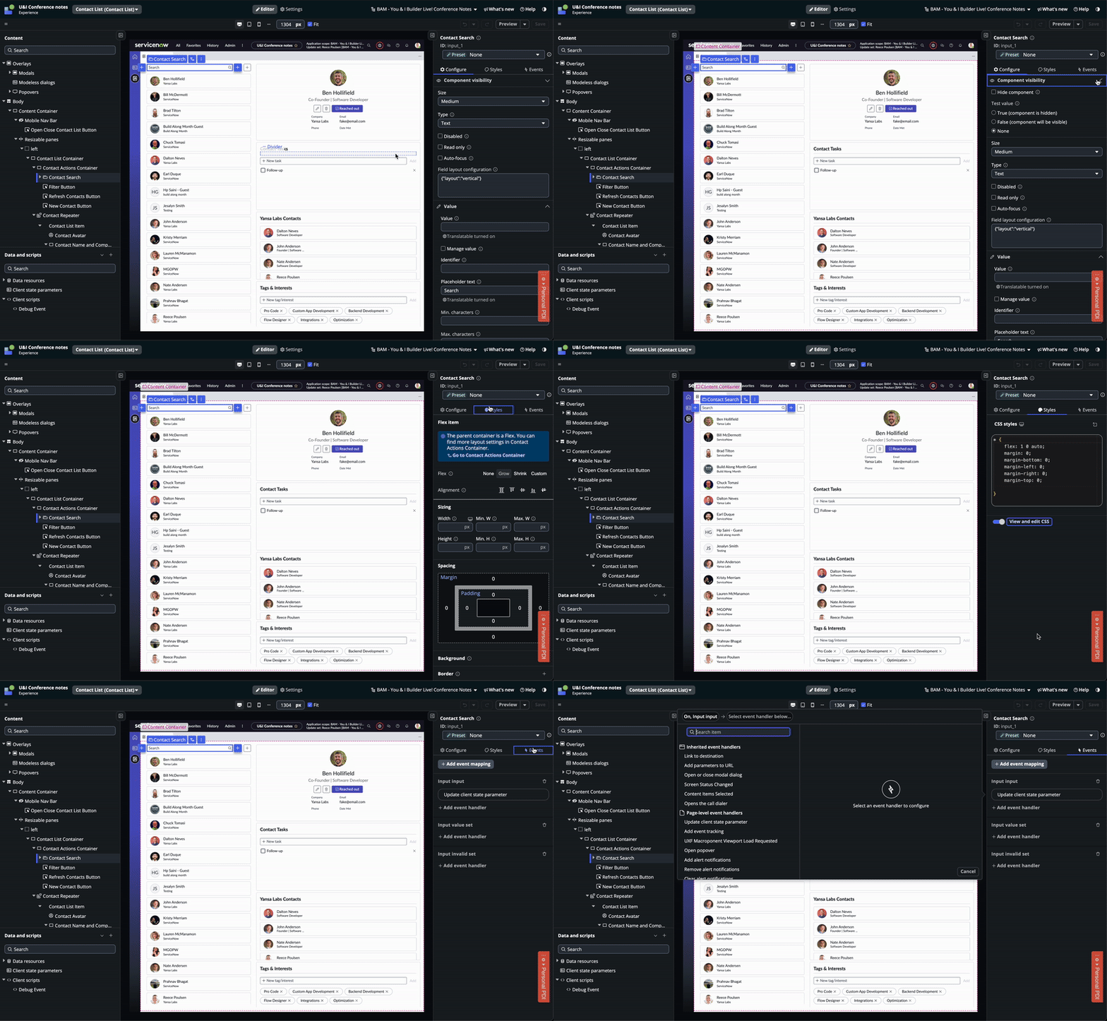
The configuration panel has three tabs: Configure, Styles, and Events.
The configure tab is where you interact with a components properties. Every component has a 'Component Visibility' section where you can configure if the component should show or hide. The other sections in the configuration panel will change based on the component that you are interacting with.
The styles tab is where you setup the styling for your component. This tab looks the same for every component but it adapts if the component's parent container is a grid or a flexbox. There is a toggle at the bottom of this tab that allows you to go straight to the CSS of the component.
The events tab allows you to map events to event handlers. If a component has events that can be handled there will be an 'Add event mapping' button at the top that will show a list of events that the component fires.
Developer Menu
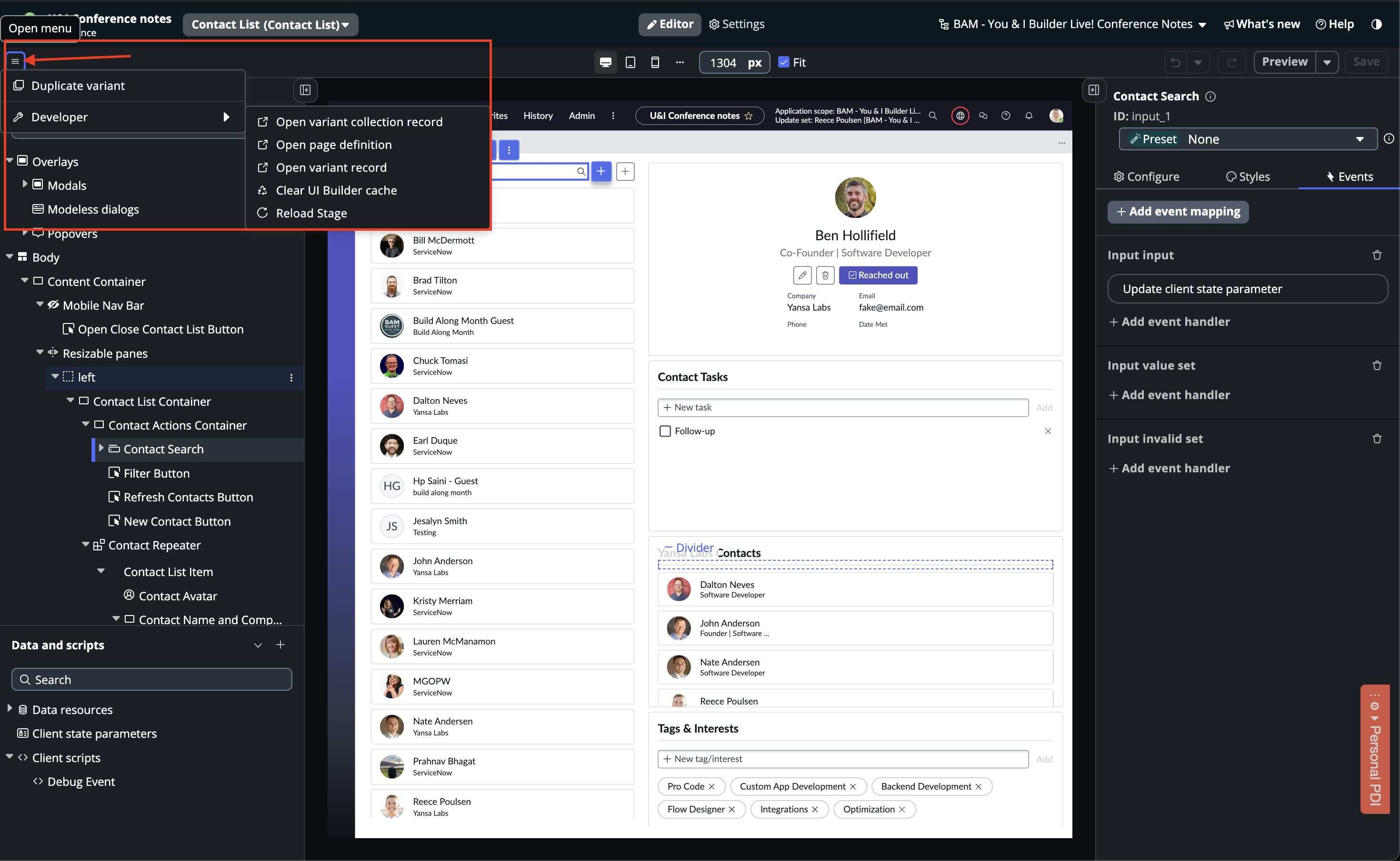
The developer menu is a recent quality-of-life update. The first three links take you to the backend records for the variant collection, page definition, and variant record. The last two options, 'Clear UI Builder cache' and 'Reload Stage,' are the ones I use the most. Whenever UI Builder is acting up, this is where I go.
Conclusion
Now that you understand the core concepts and interface behind UI Builder, it's time to try it out! Open UI Builder, create a page from scratch, and build a side project or a proof of concept for your next app. The sooner you dive in and get hands-on experience, the better! Follow my UI Builder Tips series as I continue to share what I've learned along the way.
Subscribe to my newsletter
Read articles from Reece Poulsen directly inside your inbox. Subscribe to the newsletter, and don't miss out.
Written by

Reece Poulsen
Reece Poulsen
Back in my freshman year of college, I was introduced to the world of programming, and it immediately caught my attention. The idea of creating something new with just a little learning and a couple of lines of code fascinated me—it was like discovering a whole new universe of possibilities! Ever since that moment, I've been on a continuous journey to expand my programming knowledge and skills. Now I'm a relatively new software developer on the ServiceNow platform, and I'm eager to explore its potential. Through this blog, I hope to share some of the things I'm learning along the way. Let's dive into the world of ServiceNow together and uncover the tricks and insights that can make a difference for us as developers!