Visualize data with QuickSight
 yyounos shaik
Difficulty : easy Time : 60 - 120 mins Cost : 0$
What you'll Need :
- An AWS account - Create one here!
AWS Services : - Amazon S3 , Amazon Quicksight
Overview
Amazon QuickSight helps you analyse data and create visualisations easily. Today we're going to analyse a huge dataset of Netflix shows and movies to create a dashboard that extracts all the juicy insights.
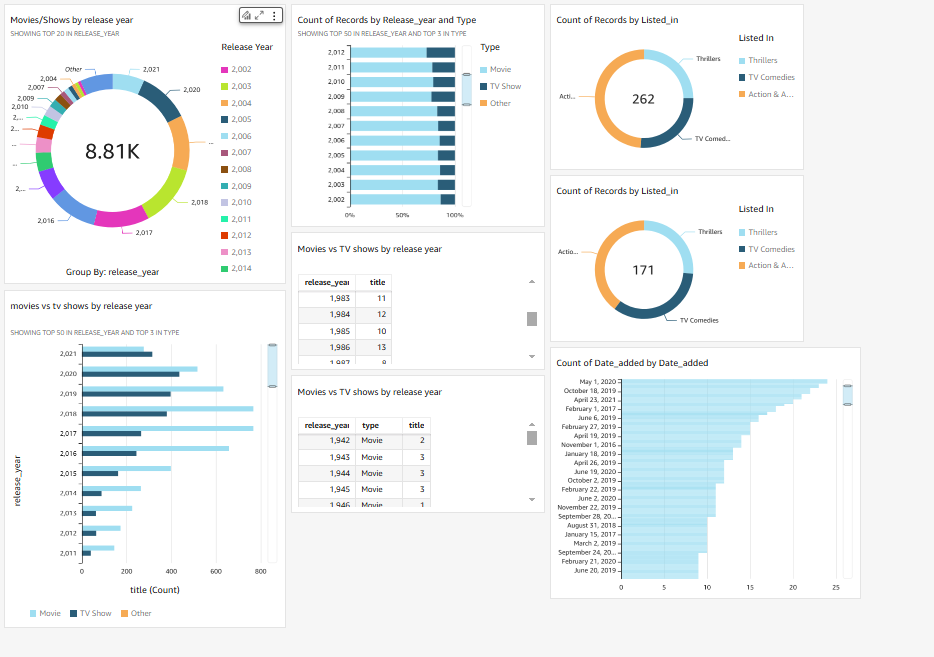
Even if you're not familiar with data analysis, Amazon QuickSight is designed to be beginner friendly. Here's what you will create in the next hour or two.
Here's the game plan that will take you from beginner to dashboard complete! In this project, you will:
Upload a dataset into an S3 bucket.
Create an account on Amazon QuickSight.
Connect your dataset (in the S3 bucket) to Amazon QuickSight.
Create a variety graphs, charts and analysis using QuickSight.
Publish a dashboard full of insights into your dataset!
Step 1 : Store the Dataset in Amazon S3
Open your
S3 console.Select
Create Bucket.
Why are we using Amazon S3? Isn't this project about QuickSight?
In this step, we're storing our dataset in an Amazon S3 bucket. Later, QuickSight will connect to S3 to use the data in this bucket and create visualisations.
Name the bucket
demo-quicksight-project-shaik(replacenamewith your name).Select the Region closest to you.
Keep the rest of the settings as default, and select
Create bucket.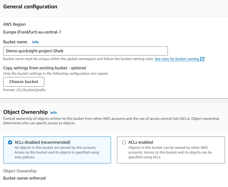
Download netflix_titles.csv. (right click, and select Save Link As). This file contains all the data we're analysing!
Download manifest.json. (right click, and select Save Link As). We'll explain why we need it in a minute!
Upload the CSV file and the
manifest.jsonfile into the bucket.

Copy the S3 URL of your
netflix_titles.csvfile.Open your
manifest.jsonfile in your laptop's text editor - for example, TextEdit (Mac) or Notepad (Windows).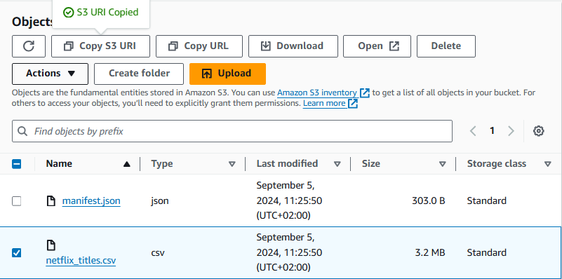
Replace the URL in the
manifest.jsonfile with the S3 URL of your dataset.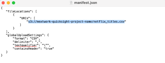
Re-upload the edited
manifest.jsonfile into your bucket, which you'll notice automatically replaces the existing one.
Step 2: Create you Amazon Quicksight Account
Search for
Amazon QuickSight.
Select
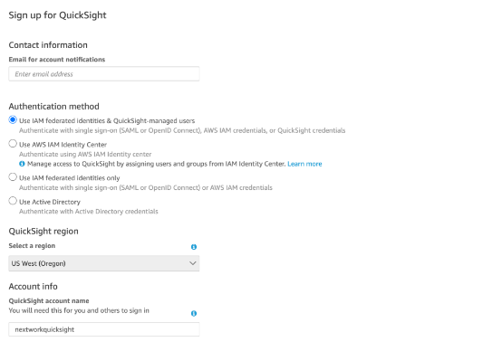
Sign up for QuickSight.Sign up for a free trial of the
Enterpriseedition if you don't have an account.Important Tip!
Make sure you uncheck this option wheen signing up for quicksight.

Enter your details for your QuickSight account - make sure the email you use is the same email for your AWS account.
Select
Amazon S3Select
Select S3 buckets.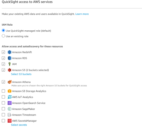
Tick the box for the S3 bucket you created.
Select
Create.It might take a minute for your account to be ready.
Congrats! You've created an Amazon QuickSight account!
Select
Go to Amazon QuickSightto keep going.
Step 3: Connect your S3 bucket to Amazon QuickSight
From the left hand navigation bar, select
Datasets, thenNew dataset.Select
S3.For the first field (source name), enter
kaggle-netflix-data.What is the source name for?
This source name is just a label to remind you what this piece of data is about! In this case, we sourced the csv field from a database called Kaggle, and the file is all about Netflix TV shows and movies.
There's also a second field called
manifest.json URL- does manifest.json found familiar?Open a new tab to open your AWS Management Console again. Head back to your S3 bucket.
Select the checkbox next to
manifest.json, then selectCopy S3 URL.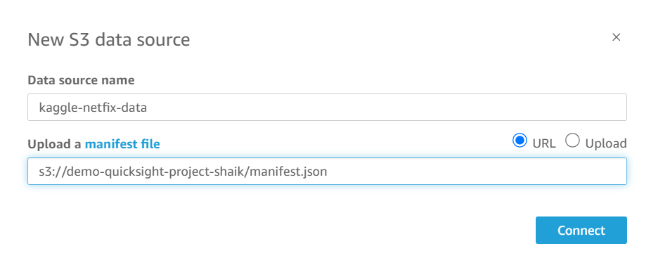
So what does the manifest.json file do?
The manifest.json file is like a map that tells Amazon QuickSight where your data lives and how to read your data. Just like how people can speak in many different languages, data can come in all different kinds of forms!
Enter thr S3 URL to your
manifest.Jsonfile.Select
Connect.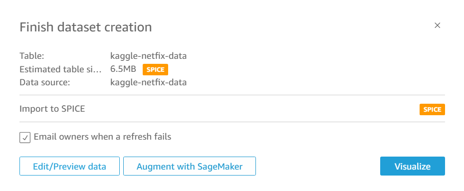
Success!
Select
Visualize.Select
Create.Select
Interactive sheetto start creating visualisations.
Step 4: Create Your First QuciSight Visualisation
Now we get to the creative part! With QuickSight, you can sort, filter, and customise your data top create visualisations. You can also experiment with different types of graphs like bar charts, pie charts, line graphs, etc.
You can see on the left hand panel that the dataset's fields are already imported.
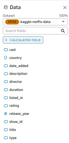
Drag fields into the graph to create visualisations. Let's run through one example together.
Drag
release_yearinto the Y-Axis heading. Woo! Now you can see a breakdown on the year that these Netflix-featured TV shows and movies were released.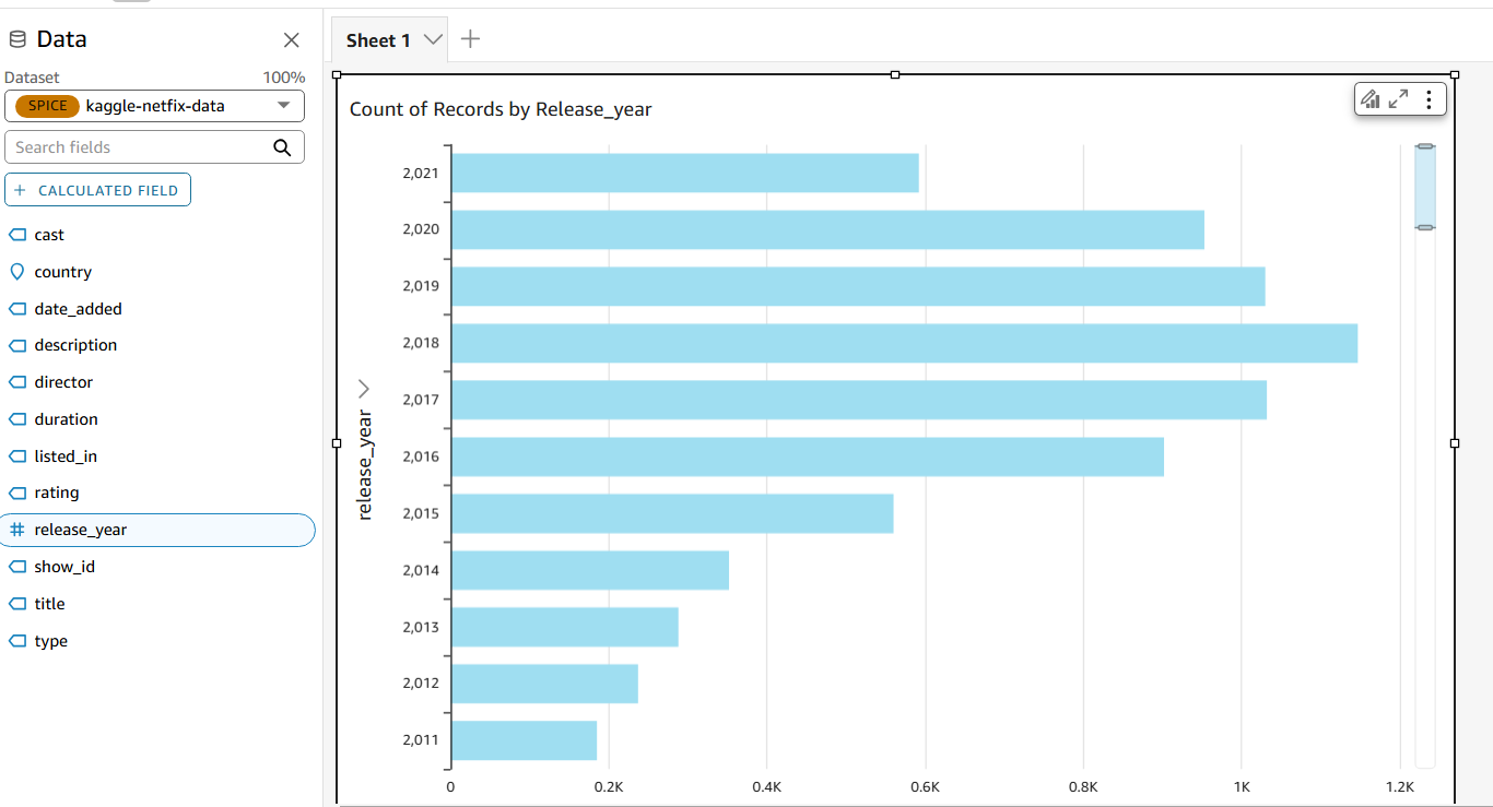
Did you know you can create different types of charts too? See what happens when you change your chart to a donut chart!
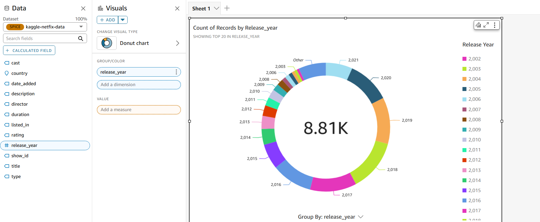
Now let's create a new visual, select
+ ADDunder the Visuals heading on your middle navigation bar, and you'll see another blank frame pop out.Hmmmm... what would you do to see a breakdown of TV shows vs movies for every year?
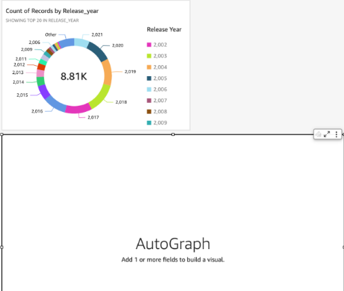
Drag the
release_yearlabel into the Y Axis heading.Next, drag the
typelabel into the Group/Color heading.Nice work!
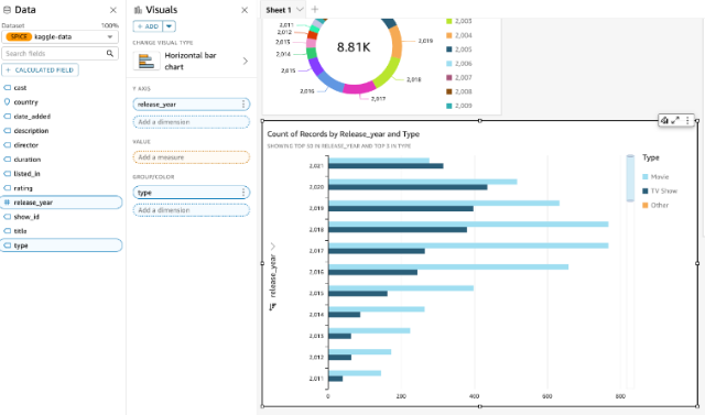
Resize your bar chart so it's the same width as the pie chart. If you click on the frame and hover over the black edges, you can also start to move your chart around the screen.
Step 5 : Your QuickSight treasure hunt
Continue adding to your dashboard (make sure not to replace your existing graph for each task). Some of these are more advanced requests than others, but give it a go!
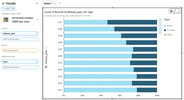
"I quite like the breakdown of TV shows/movies for each release year. Would it be possible to stack movies and TV shows in the same row, so you can visualise the % of each?"
Picking up where you left off in the previous task, change the graph type to a Horizontal stacked 100% bar chart!
"On what day did Netflix add the largest number of movies/TV shows to their catalogue?"
Answer: January 1, 2020. Netflix added 109 TV shows/movies to their catalogue.
To do this, move the
date_addedlabel to both the Y Axis and Value headings.Then, next to the Value heading, click on the three dots and select
Sort order: Descending.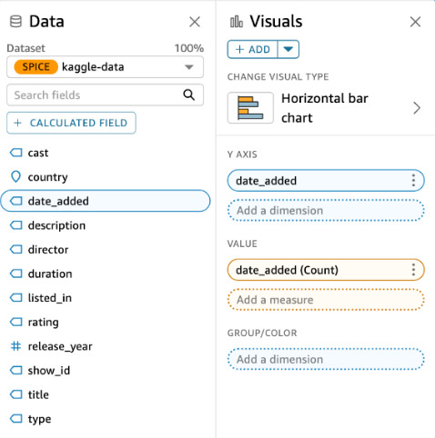
Use your mouse to scroll to the top bar - it's January 1, 2020!

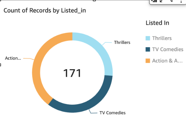
"Of the TV shows and movies with the listing, how many were released on 2015 or after?"
Answer: 68 + 58 + 45 = 171
To pick up where you left off, you can simply click on the three dots and select duplicate visual. This pops out an identical chart that gets you started right away.
Click on the created filter to edit it.
Deselect the
Select allcheckbox, then select these three tags (use the Search values search box to help you):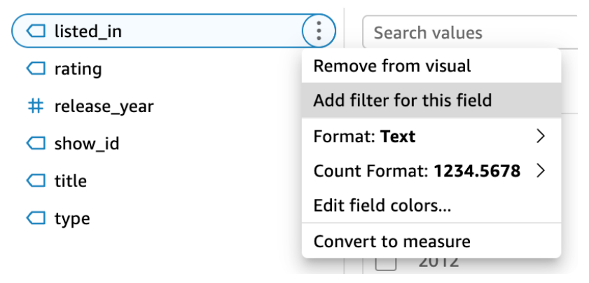
Action & Adventure
Thrillers
TV Comedies
Select
Applywhen you're done.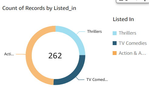
"Of the TV shows and movies with the listing, how many were released on 2015 or after?"
Answer: 68 + 58 + 45 = 171
To pick up where you left off, you can simply click on the three dots and select duplicate visual. This pops out an identical chart that gets you started right away.
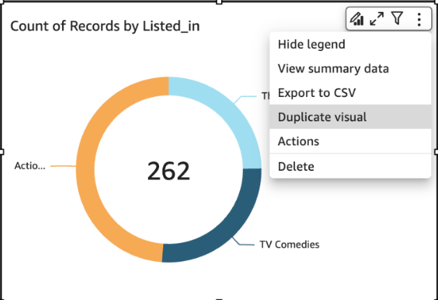
Next, let's make sure this is filtered to items that were released from 2015 or after. Select the
Filtericon and add arelease_yearfilter.Done!!
Step 6: Finish up the touches
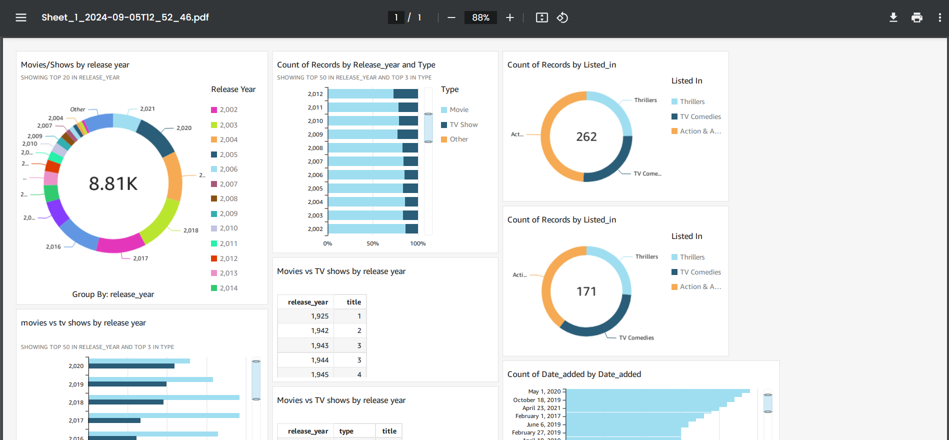
After arraning the dashboard here how it would look like...

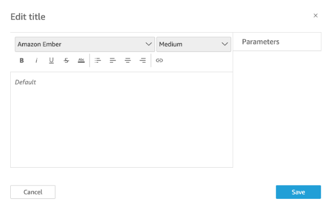
To round it all off, edit the titles in your charts so that anyone can understand them at a glance.
Double click on the titles of all the charts you see in front of you.
This
Edit titlepanel will pop up:
On the top right hand corner, select
Publish. This will make your dashboard public so you can share it with your data team lead.Give your dashboard a name (e.g. Netflix titles analysis) and click on that
Publish dashboardbutton.Now your work is available to the world in a clean, tidied up dashboard.
Before we close your account and finish this project, let's make sure you have a copy of your dashboard. On the top right hand corner, select the
Exporticon.Select
Generate PDFs.Wait for the PDF to be ready, then select
Downloadwhen you see that green banner pop up!Niceeeee, now you see a wonderful PDF version of the dashboard you've just created.
Summary
So finally you have created and visualised the data using the Amazon QuickSight!!
Congrats!!!!
Subscribe to my newsletter
Read articles from yyounos shaik directly inside your inbox. Subscribe to the newsletter, and don't miss out.
Written by

yyounos shaik
yyounos shaik
An Aspring Cloud Engineer