Creating Glassmorphism Effect in Figma: A Step-by-Step Guide
 Chidera Nwankwagu
Introduction
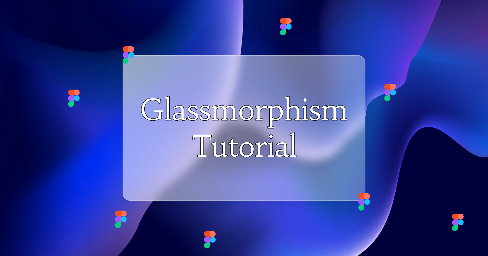
Glassmorphism is a contemporary design trend characterized by a frosted glass effect that blends blur, transparency, and colorful backgrounds, adding depth and elegance to user interfaces. This effect can make your UI design stand out with its visually appealing style. In this tutorial, you'll learn how to create glassmorphism effects in Figma. This guide is perfect for both seasoned designers looking to refine their skills and beginners eager to try new design techniques.
Prerequisites
Steps to Create a Glassmorphism Effect in Figma
1. Setting Up the Background
First, open a new frame by pressing the {F} key on your keyboard. Set the frame's height to 800 pixels and its width to 1200 pixels. This will serve as your design's background.
However, a plain white background won't bring out the glassmorphism effect. Remember, a colorful background is essential to accentuate the frosted glass impression. To add an image to the frame, download one from Unsplash. A vibrant image will enhance the glass effect you apply to it.
2. Drawing a Rectangle for the Glassmorphism Effect
After adding the image, it's time to draw the rectangle that will create the glassmorphism effect. Press R on your keyboard to activate the rectangle shape tool, then click and draw a rectangle on the frame. Set the width of the rectangle to 500 pixels and the height to 300 pixels. Next, set the corner radius to 16 pixels to smooth the edges.
3. Applying a Gradient Fill to the Rectangle
Go to the right-hand panel and click on "Fill." Change the fill type from "Solid" to "Linear" to create a linear gradient. Set both gradient colors to #FFFFFF. Move the first gradient point to the upper-left corner and the second point to the lower-right corner.
Set the opacity of the first color to 60% and the second color to 30%.
4. Adding a Stroke to the Rectangle
To add a stroke to the rectangle, go to the right panel and locate the "Stroke" section. Click the plus icon next to it, and a stroke will appear on the rectangle. Set the stroke color to #FFFFFF and reduce the stroke opacity to 40%. Change the stroke type to a "Linear" gradient and move the first point to the upper-left corner and the second point to the lower-right corner.
5. Adding Effects to the Rectangle
Next, add a "Background Blur" effect in the "Effects" area on the right side of the screen. Set the blur level to 20. This will give the rectangle a frosted glass appearance.
To enhance the effect, add a "Drop Shadow" from the effects menu. Set the shadow color opacity to 10% and the shadow blur to 40%.
6. Add Text or Additional Elements
Your glassmorphism card is now complete! You can add any text or additional elements to complement your design.
Conclusion
In this tutorial, you learned what glassmorphism is, its applications, and how to create this effect in Figma. Keep in mind that while glassmorphism can be visually appealing, overusing it can make a design feel crowded and less functional. It's best to use this style selectively to maintain both aesthetics and usability.
Subscribe to my newsletter
Read articles from Chidera Nwankwagu directly inside your inbox. Subscribe to the newsletter, and don't miss out.
Written by
