Data Visualization with Plotly
 Erick Scott CHURACUTIPA BLAS
Introduction
In today’s world, data visualization has become an essential tool for understanding large volumes of information in a clear and effective way. With the growing demand for interactive graphics and impactful visualizations, various tools and libraries have emerged to facilitate this process. One of the most popular ones is Plotly.
What is Plotly?
Plotly is an interactive graphing library that allows users to create impressive data visualizations in Python, R, and JavaScript. What makes Plotly stand out is its ability to generate high-quality, fully interactive charts with advanced options for customization and data analysis. Additionally, Plotly is known for its simplicity, as it doesn’t require complex setups, and its charts can be easily integrated into web applications.
Advantages of Using Plotly
Interactivity: Plotly charts allow users to interact with the data, such as zooming in and out, filtering, or highlighting specific parts of the visualization.
Versatility: Plotly supports a wide range of charts, from line and bar graphs to heat maps, 3D charts, and geospatial visualizations.
Web Integration: You can easily embed your charts in web applications using frameworks like Flask, Dash, or directly in HTML.
Serverless Charts: Plotly allows you to generate offline charts that can be viewed without a server, simply as HTML files.
A Practical Example
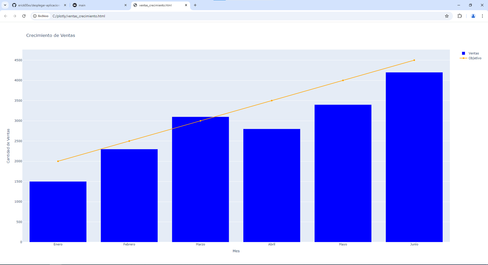
To illustrate the power of Plotly, below is a basic example where we create a bar chart combined with a line chart to represent sales growth over several months. This type of chart is very useful in performance reports and business data analysis.
import plotly.graph_objs as go
import plotly.offline as pyo
import pandas as pd

data = {
    'Mes': ['Enero', 'Febrero', 'Marzo', 'Abril', 'Mayo', 'Junio'],
    'Ventas': [1500, 2300, 3100, 2800, 3400, 4200],
    'Objetivo': [2000, 2500, 3000, 3500, 4000, 4500]
}

df = pd.DataFrame(data)

trace1 = go.Bar(
    x=df['Mes'],
    y=df['Ventas'],
    name='Ventas',
    marker={'color': 'blue'}
)

trace2 = go.Scatter(
    x=df['Mes'],
    y=df['Objetivo'],
    mode='lines+markers',
    name='Objetivo',
    line={'color': 'orange'}
)

layout = go.Layout(
    title='Crecimiento de Ventas',
    xaxis={'title': 'Mes'},
    yaxis={'title': 'Cantidad de Ventas'},
    barmode='group'
)

fig = go.Figure(data=[trace1, trace2], layout=layout)

pyo.plot(fig, filename='ventas_crecimiento.html')

Deploying the Application to the Cloud
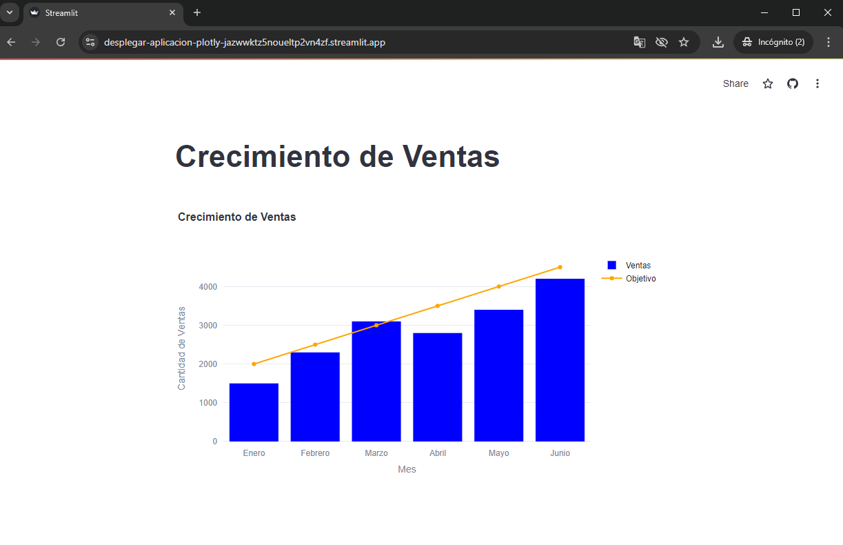
Once we’ve created our chart using Plotly, the next step is to deploy our visualization to the cloud. By using Streamlit Sharing, we can easily share our visualizations with others without needing to configure complex servers.
To deploy our application, we follow these steps:
Adapt the Code for Streamlit: Streamlit is a tool that allows you to turn Python scripts into interactive web applications with just a few lines of code. The best part about Streamlit is that you don’t need to worry about infrastructure; you simply upload your code, and Streamlit takes care of the rest.
Upload the Project to GitHub: Streamlit integrates directly with GitHub, so we upload our adapted code to a public GitHub repository.
Deploy on Streamlit Sharing: Next, from the Streamlit platform, we select our repository and deploy the application. Streamlit will install the necessary dependencies and provide us with a public link to share.
import streamlit as st
import plotly.graph_objs as go
import pandas as pd

data = {
    'Mes': ['Enero', 'Febrero', 'Marzo', 'Abril', 'Mayo', 'Junio'],
    'Ventas': [1500, 2300, 3100, 2800, 3400, 4200],
    'Objetivo': [2000, 2500, 3000, 3500, 4000, 4500]
}

df = pd.DataFrame(data)

trace1 = go.Bar(
    x=df['Mes'],
    y=df['Ventas'],
    name='Ventas',
    marker={'color': 'blue'}
)

trace2 = go.Scatter(
    x=df['Mes'],
    y=df['Objetivo'],
    mode='lines+markers',
    name='Objetivo',
    line={'color': 'orange'}
)

layout = go.Layout(
    title='Crecimiento de Ventas',
    xaxis={'title': 'Mes'},
    yaxis={'title': 'Cantidad de Ventas'},
    barmode='group'
)

fig = go.Figure(data=[trace1, trace2], layout=layout)

st.title('Crecimiento de Ventas')
st.plotly_chart(fig)

Conclusion
Plotly is a powerful tool for creating interactive data visualizations, ideal for data analysts, developers, and data scientists who need detailed and highly customizable charts. With the integration of tools like Streamlit, we can take our visualizations to the cloud easily and effectively, making it simple to distribute and access our analyses.
If you are looking for a solution that combines ease of use, interactivity, and flexibility, Plotly is definitely an option to consider for your data visualization projects.
Subscribe to my newsletter
Read articles from Erick Scott CHURACUTIPA BLAS directly inside your inbox. Subscribe to the newsletter, and don't miss out.
Written by
