CSS Grid vs. Flexbox
 Abheetha Pradhan
If you're a GenZ reading this, you probably remember learning the HTML element <table> in school to arrange items in rows and columns. And once you'd coded a table with <thead>, <tbody>, <tr> , <td> , <th> you'd go on to attach CSS styles to each table element, to further arrange the table items in specific ways.
You probably also used a property called float, that would "float" items left or right inside a <div>. Apart from these you'd have used position and display properties.
But it wasnt until 2013-2015 that the property display: flex was adopted in most modern browsers after its first draft in 2010, recommended by W3C.
Fast forward again to 2017 CSS Grid was introduced and adopted widely.
Flexbox and Grid are one dimensional and two dimensional layout systems respectively that are defined in CSS3.
The default arrangement of html elements in a the browser is "display: block" . Items arrange one below the other.
Flex and grids need a parent and some children elements defined under them. You apply a "flex layout" or a "grid layout" to the parent, and the children under the parent will become flex items or grid items.
If you observe in the codepen when you toggle between different display,
With display: block, top/bottom margins of children items overlap/collapse
With display: grid/flex, margins don't overlap
Read more about this here: Margin Collapse
<style>
    .container: {
        display: flex; /* test with grid / block */
    }
</style>

<div class="container">
    <div class="item">Item 1</div>
    <div class="item">Item 2</div>
</div>
Flexbox
Since flexbox was introduced first, lets start with it.
As soon as you apply display: flex, Two things happen
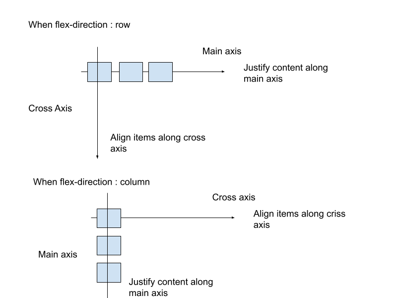
Items get arranged next to each other in the form of a row, along a "main axis". And the items get a cross axis.
By default, items are arranged in a row.
Now there are a few things you can do with flex.
Direction and Alignment
Direction: Row or Column
flex-direction: (row, column, row-reverse, column-reverse)
You essentially define what you want the main axis to be, should the items be arranged in a row, or a column.
flex-wrap: (nowrap, wrap, wrap-reverse)
You define what to do with the flex items if they overflow out of the container
Alignment
justify-content: (flex-start, flex-end, space-evenly, space-between, space-around, center)
You define how the flex items must be justified in the main axis
align-items: (flex-start, flex-end, stretch, baseline)
You define how the flex items must be aligned in the cross axis
Self Align:
justify-self: (auto, flex-start, flex-end, stretch, baseline)
You apply this to one particular flex item to define how it aligns in the main axis
align-self: (auto, flex-start, flex-end, stretch, baseline)
You apply this to one particular flex item to define how it aligns in the cross axis
Refer the diagram below and play with the codepen to understand how each property affects the items!

If you recall, I mentioned flex is one dimensional, but what does this exactly mean?
Although you can define flex as either a row or column, you do exactly that, the items either arrange in a row, or a column !
Imagine you had to create the following layout
Here's how you'd have to do it flex
/*Container using Flex */
<style>
    .container1 {
      width: 200px;
      height: 150px;
      border: 2px solid;
    }
    .item {
      width: 40px;
      height: 40px;
      border: 2px solid;
    }
    .column{
      display: flex;
      flex-direction: column;

    }
    .row {
      display: flex;
      flex-direction: row;
    }

</style>
<div class="container1">
   <div class="column">
        <div class="row">
          <div class="item"></div>
          <div class="item"></div>
          <div class="item"></div>
        </div>
       <div class="row">
          <div class="item"></div>
          <div class="item"></div>
          <div class="item"></div>
        </div>
   </div>
</div>
Here's how you'd do it using grids
/* Container using Grid /*
<style>
    .container2 {
      width: 200px;
      height: 150px;
      border: 2px solid;
      display: grid;
      grid-template-columns: repeat(3, 40px);
      /*Make 3 columns, of size 40px each */
      grid-template-rows: repeat(2, 40px);
      /* Make 2 rows, of size 40px each */
    }

    .item {
      width: 40px;
      height: 40px;
      border: 2px solid;
    }
</style>
<div class="container2">
      <div class="item"> </div>
      <div class="item"> </div>
      <div class="item"> </div>
      <div class="item"> </div>
      <div class="item"> </div>
      <div class="item"> </div>
    </div>
  </div>
And thats where grids shine! Any "Grid" can be coded in a very simple way with one parent and a bunch of children and each grid item can be customised to a great extent!
Grid
Let me introduce grids a bit more formally.
Grid layouts are an ancient design,
Once you've defined that you want a container to be a "grid". Nothing will happen. There will be no change to arrangement of the items. As a next step you need to define how many columns or rows, or both you need in the grid.
You can also define how you want each grid item to span, that is from which row/column should it and where it should end.
<style>
    .container {
      display: grid;
      grid-template-columns: repeat(3, 40px);
      /*Make 3 columns, of size 40px each */
      grid-template-rows: repeat(2, 40px);
      /* Make 2 rows, of size 40px each */
    }
    .item1 {
      width: 40px;
      height: 40px;
      border: 2px solid;
      grid-column: 1/4;
      /*shorthand , start from 1 column and span till fourth*/
      grid-row: 2/3;
      /*start from first row, end at third row*/
    }
</style>
<div class="container2">
      <div class="item1"> </div>
      <div class="item2"> </div>
      <div class="item3"> </div>
      <div class="item4"> </div>
      <div class="item5"> </div>
      <div class="item6"> </div>
    </div>
  </div>
Play around with the above code pen and test out how to define number of columns, rows and how to span them. (The grid lines here are just for illustration purposes, you can also define dimensions of each grid item, irrespective of what the dimensions of the row or column of the grid are)
There's something similar you can do with flex, but you'll see it doesn't hold too much power as the customization grids offer.
Flex grow, and shrink
You can make the flex items grow (fit the container width) or shrink (shrink some items or all if they are going to overflow out of the container). This is kind of similar to wrap, but here you grow or shrink the flex items individually.
<style>
    .container{
        display: flex;
        flex-direction: row;
    }

    .item1{
        flex-grow: 1;
    }
    .item2{
        flex-shrink: 0;
    }
</style>
<div class="container">
       <div class="item1"></div>
        <div class="item2"></div>
<div>
Top Usecases of Flexbox and Grid
- You can make a layout responsive very easily along with media queries with flexbox and grids.
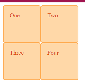
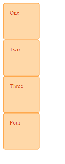
Lets make a simple grid that is mobile responsive.
<style>

          .wrapper > div {
            border: 2px solid #ffa94d;
            border-radius: 5px;
            background-color: #ffd8a8;
            padding: 1em;
            color: #d9480f;
          }

      .wrapper {
            width: 500px;
            display: grid;
            grid-template-columns: repeat(2, 100px);
            grid-template-rows: repeat(2, 100px) ;
          }
        @media (max-width: 600px) {
          .wrapper {
            grid-template-columns: repeat(1, 100px);
            grid-template-rows: repeat(4, 100px);
            width: 100%;
          }
</style>
   <div class="wrapper">
        <div>One</div>
        <div>Two</div>
        <div>Three</div>
        <div>Four</div>
    </div>
Grid - Medium Size Screens

Grid - Mobile View

With flex as well you change directions of flex containers according to requirements and get similar results as grids. Can you code responsive layout using flex and media queries along the same lines?
- Flexbox goes well with designs such as a Navbar, Grids go well with more complex structures, or whole websites structures where the header, footer, main section. sidebars, etc.,
<style>

.navbar {
    display: flex;
    justify-content: space-between;
    align-items: center;
    background-color: #000; /* Black background */
    padding: 10px 20px;
    color: #fff; /* White text */
}


.logo {
    font-size: 1.5em;
    font-weight: bold;
}


.search-box input {
    padding: 5px 10px;
    border: none;
    background-color: #fff; /* White background */
    color: #000; /* Black text */
    border-radius: 3px;
}

<style>
<nav class="navbar">
    <div class="logo">Logo</div>
    <div class="search-box">
        <input type="text" placeholder="Search...">
    </div>
    <div class="menu">Menu</div>
</nav>

Website layout using grid areas
- CSS Grids are great to use when there's a complex grid layout system, and also when you need gaps between containers, with the "gap" property.
Peculiarities
Flexbox and grid, can create layouts where the layout defines a visual reading order that is different to the underlying source.
Say you have a visual reading order of flex items as item1, item3, item2 from left to write, but if your html is of the order item1, item2 and item3, the reading orders are not the same. If you navigate using keyboard "tab" then you wont navigate as 1,3,2 but as 1,2,3, because thats the order in the source html file.
CSS Working Group is working on a solution for this , by proposing a new property called reading-order.
Learn more about this, here
https://developer.chrome.com/blog/reading-order/?ref=csslayout.news
Some interesting facts
Bento Grids are becoming a popular design , inspired by Japanese Bento Boxes, the niche is the grid items have slightly rounded corners.
Rachel Andrew is a top voice for CSS Grids and she has many usecases that you can further explore
Adam Argyle’s coded something called “4 layouts for the price of 1” It uses no media queries. Instead of using breakpoints, it uses fluid principles to create a layout that flows seamlessly.
%[https://codepen.io/argyleink/pen/LYEegOO]
Interesting portfolio based on grids -> https://mnsh.me/
Power through flex and grids with Tailwind CSS. Tailwind has a lot of utility classes in flex and grids that can speed up your development process if you're using nodejs projects.
Conclusion
Learning flex and layouts can help you build highly customized and creative layouts for all screen sizes. Moreover, learning some shorthand, and more specific helper functions such as minmax, grid-template shorthand etc., can enable you to create more complex, creative and highly customized designs.
Also doing some learning on the design theories of layouts can also help to visualize and create more perfect layouts for your applications.
Subscribe to my newsletter
Read articles from Abheetha Pradhan directly inside your inbox. Subscribe to the newsletter, and don't miss out.
Written by
