Utility Report Dashboard
 Jogleen Calipon
This sample project examines the trend of payables over the past 5 years to identify any patterns that need attention.
The dataset can be found and downloaded for your reference on Kaggle
Tools Used for this Project: Power Pivot, Data Modeling, Power Query, DAX, Slicers, and the Built-in Charts of Microsoft Excel
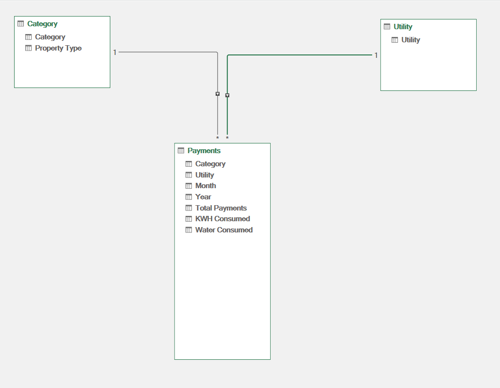
Data Preparation
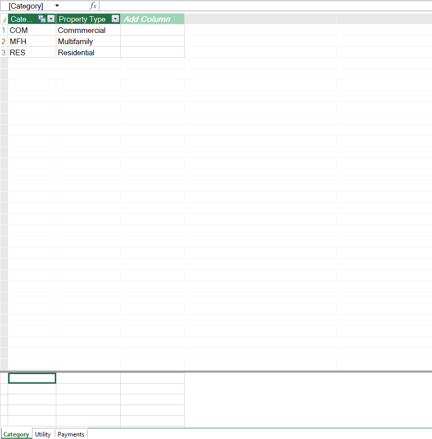
For this sample project, I gathered three datasets: Category, Payments, and Utility.
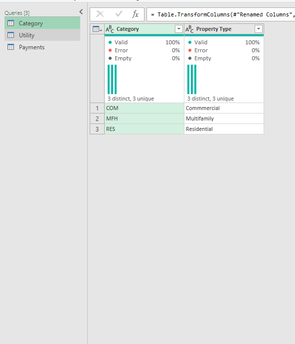
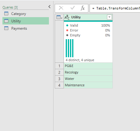
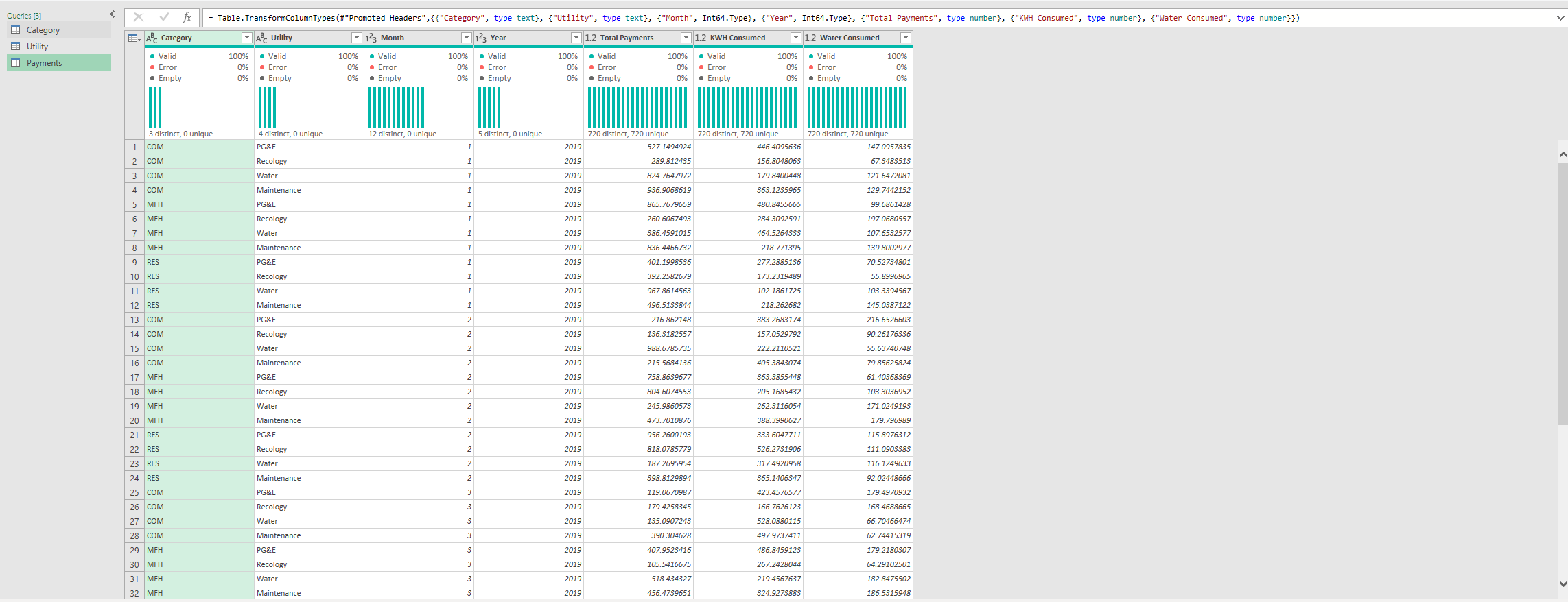
I have already cleaned the data before loading it into Power Query. I dropped unnecessary columns and formatted the data to serve its purpose.
Data modeling structure
For data modeling, since the dataset is not large, I used a relational model for this.
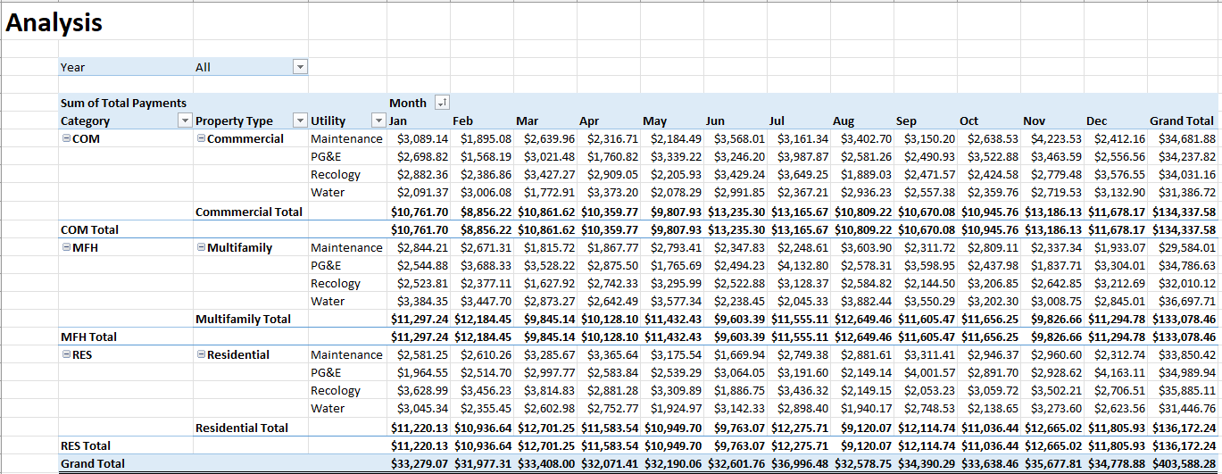
Analysis
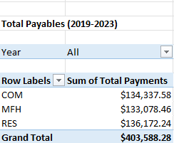
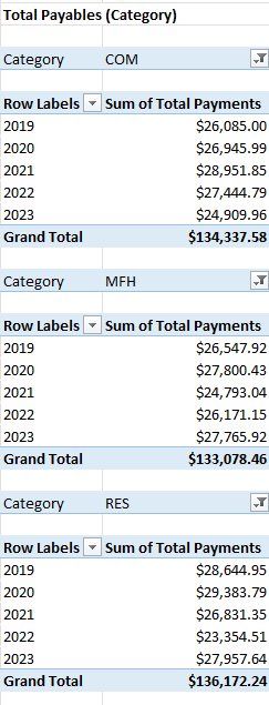
In the first part of the analysis, I focus on the total payables from 2019-2023 and their breakdown, as shown below:
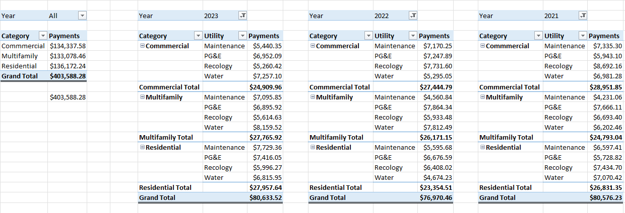
To easily identify who has the highest percentage, I summarized it by the percentage of the grand total, as shown below:
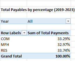
Based on this data, we can see that COM (Commercial) and RES (Residential) have the highest percentages.
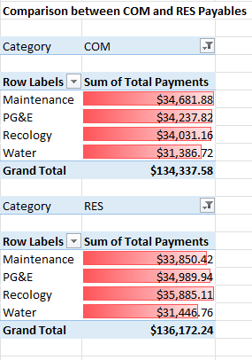
But if we look closely at the data, we can see that there are no significant gaps within the total amounts in the three categories. This leads us to conclude that there are no irregularities in this data.
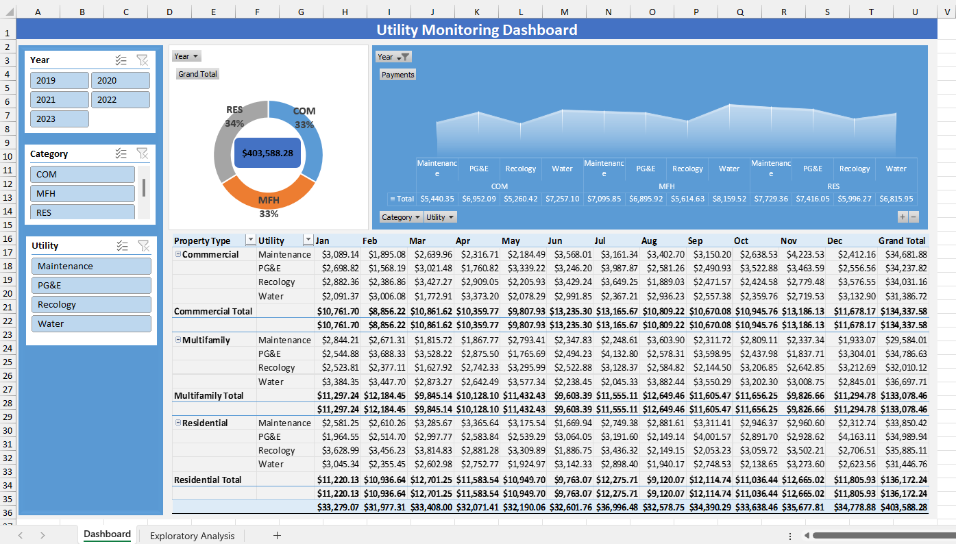
Visualization
Based on the analysis, I created a dashboard highlighting the key metrics that had the most impact on our findings. The dashboard is shown below.
Advertisement
If you have a similar project that you need help with, feel free to contact me.
Subscribe to my newsletter
Read articles from Jogleen Calipon directly inside your inbox. Subscribe to the newsletter, and don't miss out.
Written by
Jogleen Calipon
Jogleen Calipon
👋 Welcome to My Profile! I'm a Data Analyst with over four years of experience turning data into meaningful insights that drive smart business decisions. Whether it's building automated reports, uncovering operational inefficiencies, or creating interactive dashboards that tell a clear story—I'm passionate about using data to solve real-world problems. 💡 What I Do Best Data Preparation: Cleaning, shaping, and enriching messy datasets Data Analysis: Extracting insights to inform decisions Automation: Streamlining recurring reports and building data entry forms Business Reporting: Creating reports tailored to decision-makers Visualization: Designing dashboards that make data easy to understand Collaboration: Translating technical findings for non-technical audiences 🛠️ Tools & Technologies Spreadsheets & Data Processing Microsoft Excel: Power Query, Power Pivot, DAX, advanced lookup functions, custom automation workflows Business Intelligence Power BI: Interactive dashboards and visual storytelling Databases & SQL Foundational knowledge of MS SQL Server, MySQL, BigQuery, and MS Access Experience writing basic to intermediate SQL queries Programming Python: Foundational experience with Pandas, NumPy, SciPy, Seaborn, and Matplotlib for data analysis and visualization R: Working knowledge of data wrangling, ggplot2, and statistical modeling 🚀 Let's Connect I'm currently open to short-term projects and part-time roles where I can contribute to: Optimizing processes Unlocking insights hidden in data Building scalable, automated solutions Thanks for visiting my profile! Feel free to explore my projects and reach out for collaboration or just to connect. 😊