CSS Layout Techniques
 Namrata Jain
The Box Model: The Foundation of CSS Layout
In CSS, the term "box model" is fundamental when discussing design and layout. Every HTML element is essentially a box, and understanding how this box works is crucial for mastering CSS layout techniques.
The box model consists of four key components:
Content: The actual content of the element, like text or an image.
Padding: The space between the content and the border.
Border: The edge surrounding the padding (or the content, if there's no padding).
Margin: The space outside the border, creating distance between this element and others.
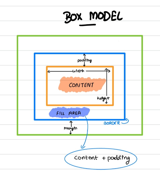
Understanding how these components interact allows you to control the size and spacing of elements on your page.
The box-sizing Property: Controlling Size Calculation
The box-sizing CSS property determines how the total width and height of an element are calculated.
content-box(default):width= width of the contentheight= height of the content
border-box:width= border + padding + width of the contentheight= border + padding + height of the content
Traditional Layout Techniques: Float and Position
Before the advent of modern layout techniques like Flexbox and Grid, designers relied heavily on float and position properties. While these methods have largely been superseded, they remain important to understand, especially when working with legacy code.
Float: Pushing Content to the Side
The float property allows an element to be pushed to the left or right of its container, causing the following content to wrap around it. This was often used to create simple layouts, like text wrapping around images.
Values for float include:
left: Floats the element to the left.right: Floats the element to the right.none: The element does not float (default).inline-start/inline-end: Floats based on the writing direction (less common).
However, float has its limitations. For instance, it doesn't work if the element’s display is set to none. Over-reliance on float can also lead to layout issues, such as collapsing containers and overlapping content.
Position: Moving Elements Around
The position property specifies how an element is positioned in the document. By default, elements are positioned according to the normal document flow, but with the position property, you can change this behavior.
Different values of position include:
static(default): The element is positioned according to the normal flow of the document.relative: The element is positioned relative to its normal position. You can usetop,bottom,left, andrightproperties to offset it from this position.absolute: The element is positioned relative to its nearest positioned ancestor (i.e., an ancestor with a position value other thanstatic). If none is found, it positions relative to the root element (the<html>element).fixed: The element is positioned relative to the viewport, meaning it stays in the same place even when the page is scrolled.sticky: The element toggles between relative and fixed positioning, depending on the scroll position. It behaves like arelativeelement until it crosses a specified threshold, after which it becomes fixed.
For a long time, float and position were the go-to methods for creating CSS layouts. However, these methods come with their own set of challenges, especially when trying to center elements or maintain consistent sizes across multiple elements. This is where modern layout techniques like Flexbox and Grid come into play.
Next Up: Flexbox and Grid - Modern Layout Techniques
Flexbox: The Power of Flexible Layouts
Flexbox, short for "Flexible Box Layout," is a one-dimensional layout method designed to efficiently arrange items in rows or columns within a container. This layout method offers incredible flexibility, allowing elements to automatically adjust their size to fill available space or shrink to fit within their container.
Flexbox is a game-changer for creating layouts, as it provides a more intuitive way to align, distribute, and organize space among items in a container—hence the name "Flexbox."
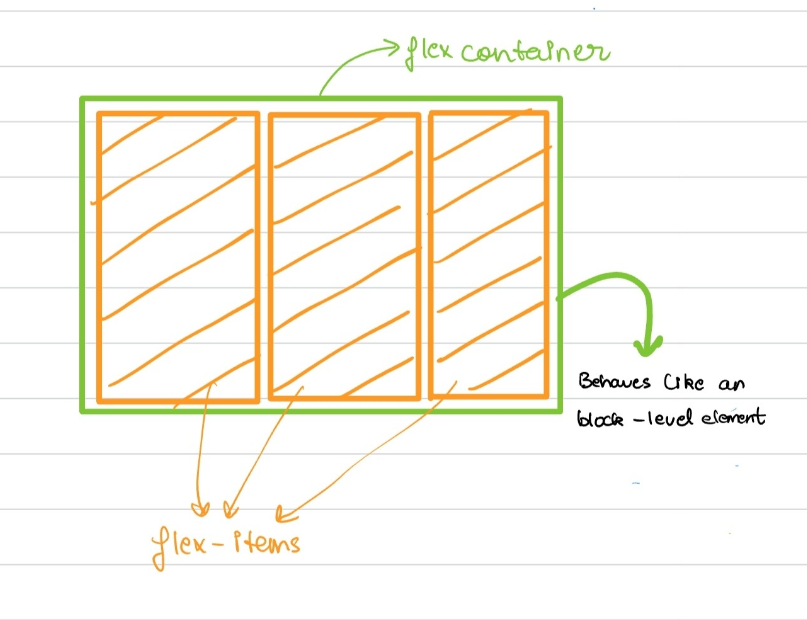
To start using Flexbox, you simply apply the display: flex property to a parent container. This turns the container into a flex container, and its child elements become flex items. For example, if you have a <div> element with three child elements inside it, applying display: flex to the <div> makes it a flex container, and the child elements automatically become flex items.
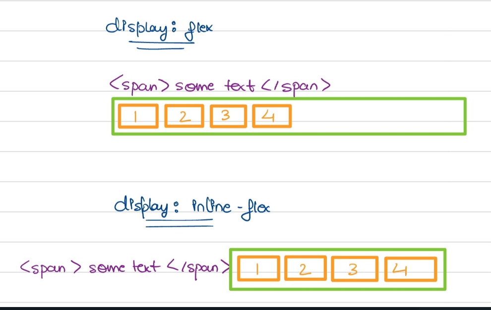
Want to maintain the benefits of Flexbox while keeping the parent element inline? You can achieve this by using display: inline-flex, which allows the flex container to behave like an inline element while still enjoying all the benefits of Flexbox.
Understanding the Flexbox Model:
The flex items are laid out along two key axes:
main axis: The primary direction in which the flex items are laid out (horizontally or vertically)cross axis: The axis perpendicular to the main axis, controlling how items are aligned in the opposite direction.
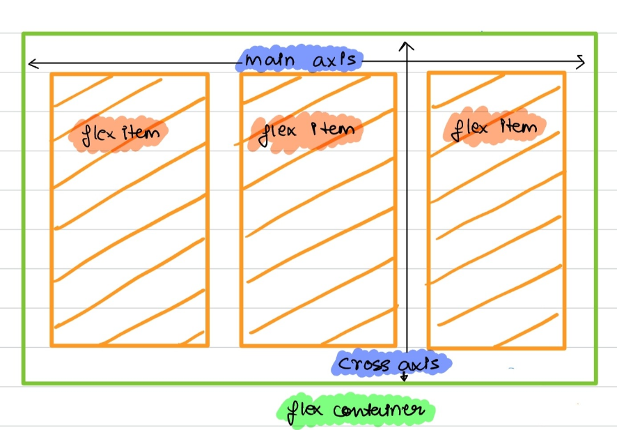
Let’s dive into the essential Flexbox properties that will help you harness the full potential of this layout model.
flex-direction: Setting the Flow
The flex-direction property controls the direction in which flex items are placed in a flex container by defining the main axis
Default:
row(Items flow horizontally from left to right)Applies to:- flex containersflex-direction: row; // Horizontal layout (default) flex-direction: column; // Vertical layout // You can also lay out flex-items in a reverse direction flex-direction: row-reverse; // Horizontal layout, but reversed flex-direction: column-reverse; // Vertical layout, but reversed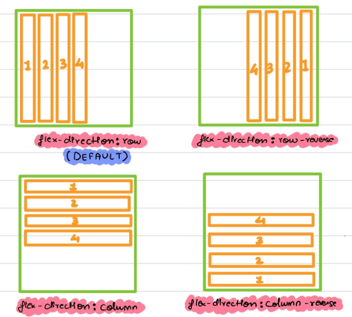
flex-wrap: Managing Overflow
A single-line flex container places all its children in one line, even if it causes its flex items to overflow.
A multi-line flex container wraps the content or flex items to the next line along the cross axis when the items overflow.
By default, Flexbox tries to fit all items into a single line, even if it causes overflow. The
flex-wrapproperty controls whether flex items should wrap onto multiple lines if they don't fit in a single line.Applies to:- flex containersflex-wrap: nowrap; // single-line flex container flex-wrap: wrap; // multi-line flex container // wrap flex-items in a reverse direction flex-wrap: wrap-reverse;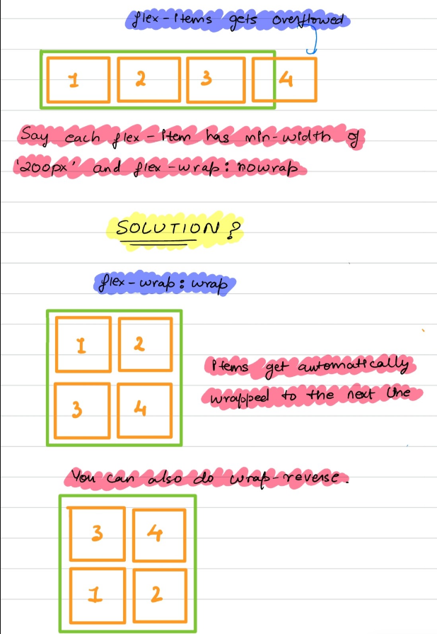
flex-flow: Simplifying with Shorthand
The
flex-flowproperty is a shorthand for combiningflex-directionandflex-wrapin one line. This allows you to define both the flow direction and wrapping behavior of your flex container.Applies to:- flex containersflex-flow: <flex-direction> <flex-wrap>; // syntax // example flex-flow: row nowrap;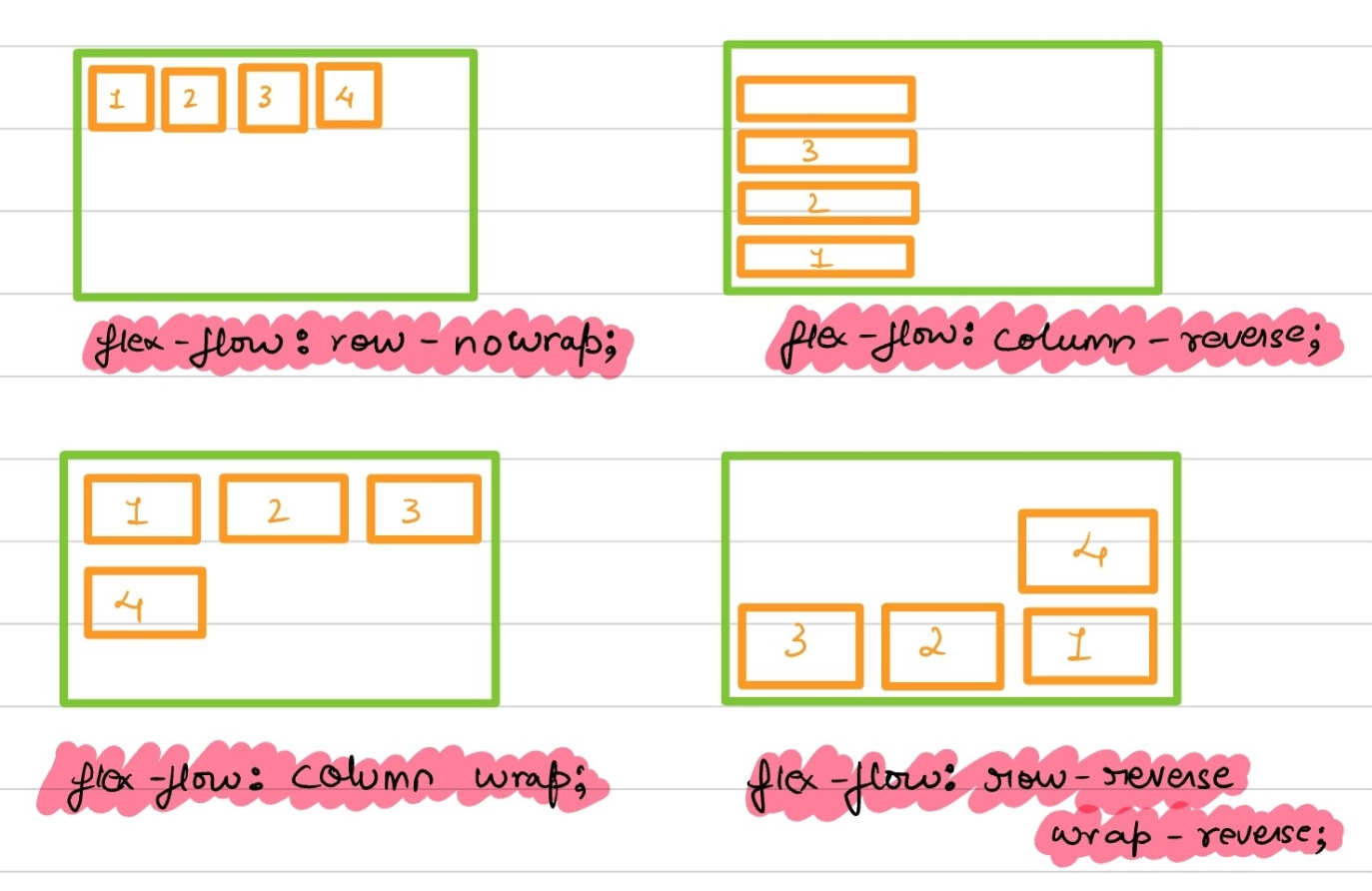
order: Customizing Item Order
The
orderproperty controls the order in which flex items appear in the container, regardless of their HTML source orderTakes in a single integer value.
This is useful for rearranging items visually without altering your HTML structure.
Default:
0(Items are displayed in the order they appear in the HTML)Applies to:- flex-items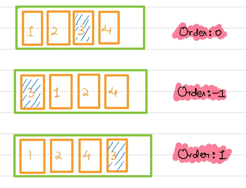
justify-content: Aligning Along the Main Axis
The
justify-contentproperty is used to distribute space between flex items along the main axis.Default:
flex-start(Items align at the start of the container)This property is perfect for controlling how items are spaced within their container.
Applies to:- flex containers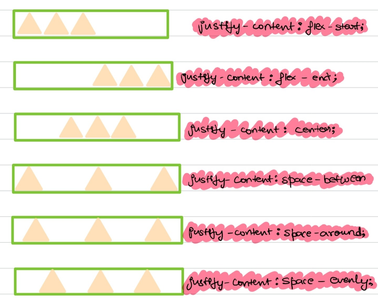
align-items: Aligning Along the Cross Axis
While
justify-contentaligns items along the main axis, thealign-itemsproperty controls alignment along the cross axis.Default:
stretch(Items stretch to fill the container)Applies to:- flex-containers// list of accepted values align-items: stretch; // Stretch items to fill the container (default) align-items: flex-start; // Align items to the start of the cross axis align-items: flex-end; // Align items to the end align-items: center; // Center items along the cross axis align-items: baseline; // Align items along their baseline align-items: auto;
align-self: Individual Item Alignment
While
align-itemsaligns all items as a group, thealign-selfproperty allows you to override this for individual flex items.Default:
auto(Inherits thealign-itemsvalue)Applies to:- flex-items// list of accepted values align-self: stretch; align-self: flex-start; align-self: flex-end; align-self: center; align-self: baseline; align-self: auto;
This is handy when you need one item to stand out or behave differently from the rest.
align-content: Controlling Multi-Line Alignment
When you have multiple lines of flex items, the
align-contentproperty aligns the lines themselves within the flex container.Applies to:- multi-line flex containersDefault:
stretch(Lines stretch to fill the container)// list of accepted values align-content: flex-start; align-content: flex-end; align-content: center; align-content: space-between; align-content: space-around; align-content: stretch;
Note: align-content has no effect on single-line flex containers.
flex-grow: Expanding Items to Fill Space
The
flex-growproperty allows flex items to grow to fill any available space inside the flex container.Applies to:- flex-itemsUsage: Set a positive integer to allow an item to grow relative to the other items.
Default:
0(Items don’t grow)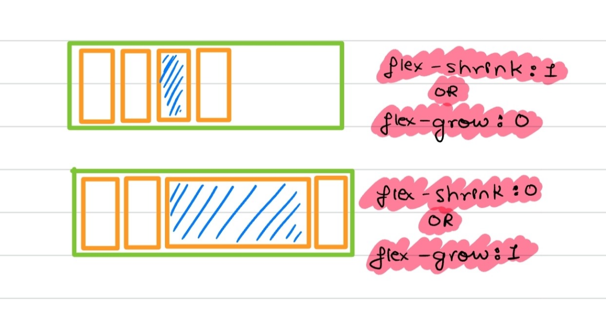
This property is crucial for creating responsive designs where items expand to fill the container as needed.
flex-shrink: Shrinking Items to Fit
The flex-shrink property determines how flex items shrink when there’s not enough space.
Default:
1(Items can shrink)Usage: Set a positive integer to control the rate at which items shrink relative to each other.
Applies to:- flex-itemsDefault value -> '1'
This property helps maintain a balanced layout when the container is too small for all its items.
flex-basis: Defining the Initial Size
The flex-basis property specifies the initial size of a flex item before any space distribution happens.
Default:
auto(Item size based on its content or width/height)Usage: Set a specific size (e.g.,
flex-basis: 200px;) to control the item’s starting size.Applies to:- flex-items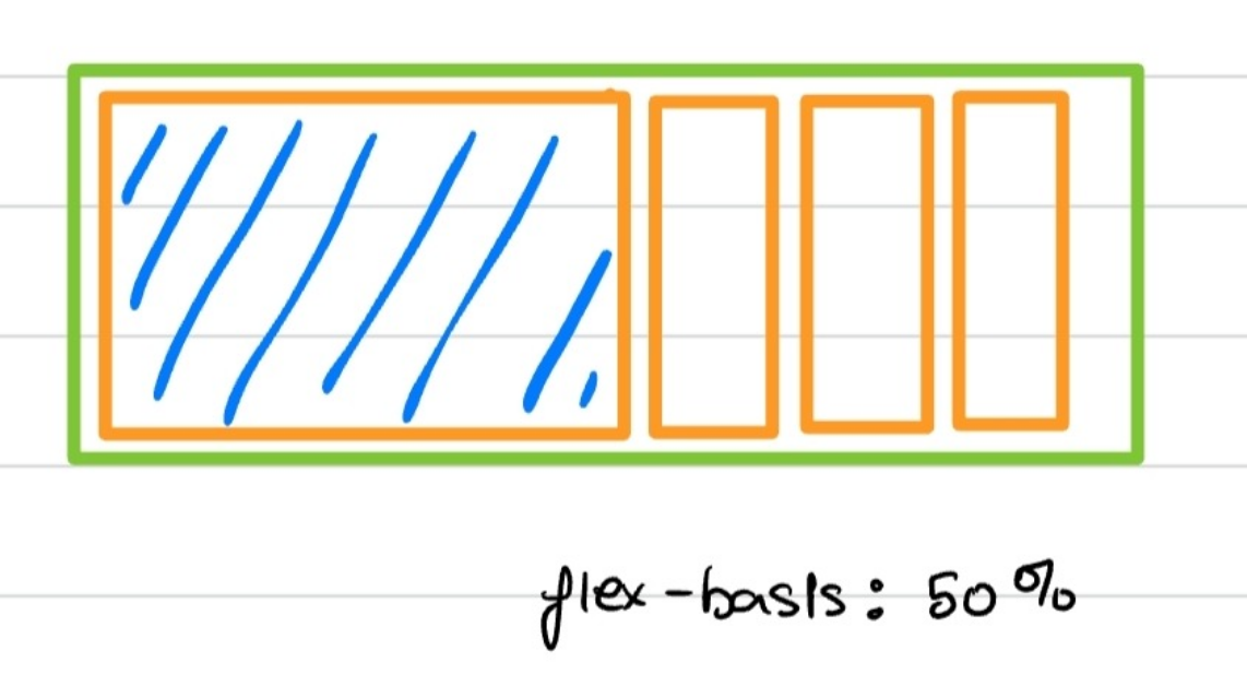
flex-basis vs. width: While flex-basis and width might seem similar, flex-basis takes precedence in a flex container. If flex-basis is set, the width property is ignored. However, if flex-basis is not set, width acts as the fallback.
Flexbox in Action: Growing and Shrinking with Flex Properties
Flexbox shines when space is either too tight or too generous. Here’s where flex-grow, flex-shrink, and flex-basis come into play, allowing items to adapt seamlessly to different screen sizes:
Not Enough Space? Flexbox’s
flex-shrinkkicks in to shrink items proportionally.Too Much Space? Flexbox’s
flex-growexpands items to fill the available space.
You can even combine these properties using the shorthand flex property:
- Example:
flex: 1 0 auto;(This meansflex-grow: 1;,flex-shrink: 0;, andflex-basis: auto;)
This shorthand is a quick way to set all three properties at once, making your layout even more efficient.
CSS Grid: Mastering Two-Dimensional Layouts
CSS Grid is a powerful, two-dimensional layout system that enables you to arrange elements in rows and columns with ease. It’s a game-changer for complex layouts, offering unparalleled control over both horizontal and vertical spaces.
When you apply display: grid to a container, it becomes a grid container, and its direct children automatically become grid items.
display: grid; /* Grid items take up the full width of the container and are laid out in rows by default */
display: inline-grid; /* The grid container only takes up the necessary width, similar to inline elements */
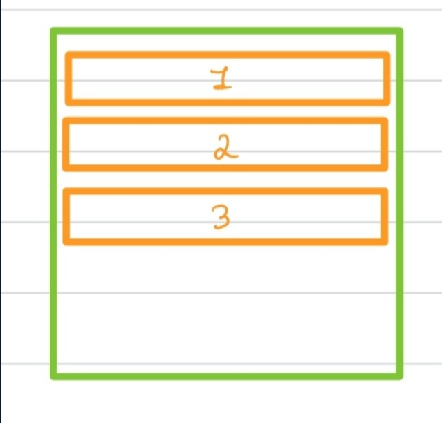
With CSS Grid, you can create layouts that would be challenging or even impossible with other layout methods. Let’s explore the key properties that make Grid so powerful.
grid-template-columns and grid-template-rows: Defining the Grid Structure
These properties define the structure of your grid by specifying the number and size of the columns and rows.
// syntax
grid-template-columns: <track-size> ...;
grid-template-rows: <track-size> ...;

// example
grid-template-columns: 200px 1fr 200px; /* Three columns: fixed width, flexible, fixed width */
grid-template-rows: 100px auto; /* Two rows: fixed height and automatic height */
You can mix and match fixed, flexible, and automatic sizes to create the perfect grid for your layout.
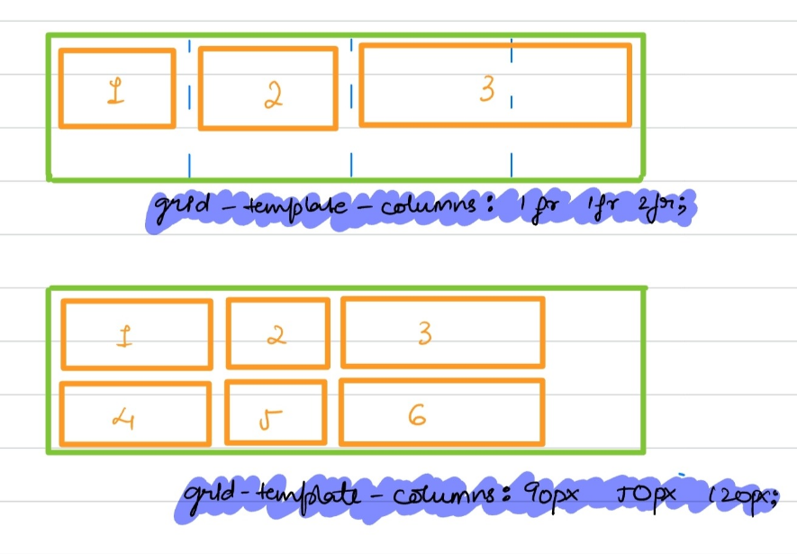
One can also use minmax() function to define the grid items min. and max. size. The function accepts two arguments.
grid-template-rows: minmax(100px, auto);
grid-template-columns: minmax(auto, 50%) 1fr 3rem;
Repeating grid tracks:
→ Define repeating grid tracks using repeat() function.
grid-template-rows: repeat(4, 100px);
grid-template-columns: 30px repeat(3, 1fr) 30px;
grid-column and grid-row: Positioning Grid Items
The grid-column and grid-row properties allow you to position grid items within the grid.
// syntax
grid-column: <start-line> / <end-line>;
grid-row: <start-line> / <end-line>;

grid-column-start: 1;
grid-column-end: 3;
 // OR
grid-column: 1 / 3; /* Span from column 1 to column 3 */

grid-row-start: 1;
grid-row-end: 2;
 // OR
grid-row: 1 / 2; /* Span from row 1 to row 2 */

// shorthand of grid-row and grid column
grid-area: 1/1/2/3;
// grid-row-start/grid-column-start/grid-row-end/grid-column-end
This gives you the power to make items span multiple columns or rows, creating dynamic layouts.
gap: Spacing Between Grid Items
The gap property (formerly known as grid-gap) controls the spacing between rows and columns.
// syntax
gap: <row-gap> <column-gap>;

// example
gap: 20px 10px; /* 20px row gap, 10px column gap */
justify-items and align-items: Aligning Items Within Cells
These properties align grid items within their individual cells along the horizontal and vertical axes, respectively.
justify-items: start | end | center | stretch;
align-items: start | end | center | stretch;
justify-content and align-content: Aligning the Whole Grid
While justify-items and align-items control the alignment of items within their cells, justify-content and align-content manage the alignment of the entire grid within the container.
justify-content: start | end | center | space-between | space-around | space-evenly;
align-content: start | end | center | space-between | space-around | space-evenly;
That’s it!!! keep experimenting, keep learning, and most importantly, keep creating. The world of CSS layout is vast, and with the right knowledge, you can bring your web designs to life in ways that are unimaginable.
Thanks for giving it a read!!!🤗
Subscribe to my newsletter
Read articles from Namrata Jain directly inside your inbox. Subscribe to the newsletter, and don't miss out.
Written by

Namrata Jain
Namrata Jain
I am a BCA 22' graduate, a NeoGrad 22', and a software engineer by profession.