CSS Tutorial: A Guide to CSS Positioning Types
 Kushal Das
This article builds on the previous lesson by diving into how to position HTML elements with CSS. By the end of this guide, you'll be able to use different positioning techniques to arrange elements exactly how you want on your web page.
What is Positioning in CSS 🤔
Positioning in CSS determines how an HTML element is placed on the page. It allows you to control the exact location of elements relative to their normal position, their parent container, or the viewport. Understanding the different positioning methods helps you create more precise and flexible layouts.
Types Of Position Property 📜
There are five types of position properties:
Static
Relative
Absolute
Fixed
Sticky
Position: Static
It is the default position for HTML elements.
- The other properties like left/right/top/bottom/z-index will have no effect here.
<!DOCTYPE html>
<html lang="en">
<head>
    <meta charset="UTF-8">
    <meta name="viewport" content="width=device-width, initial-scale=1.0">
    <title>CSS Position Tutorial</title>
    <style>
        .box {
            border: 2px solid red;
            display: inline-block;
            width: 150px;
            height: 150px;
            margin: 2px;
          /*           It is the default position for HTML elements.  */
            position:static;
        }

    </style>
</head>
<body>
    <div class="box" id="box1"></div>
    <div class="box" id="box2"></div>
    <div class="box" id="box3"></div>
    <div class="box" id="box4"></div>
</body>
</html>
Output :

Position: Relative
It is used when we need to position an HTML element relative to its normal position. We can set the top, right, bottom, and left properties to move the element away from its default position.
Example: We have used the following CSS to design four boxes as shown in the image above:
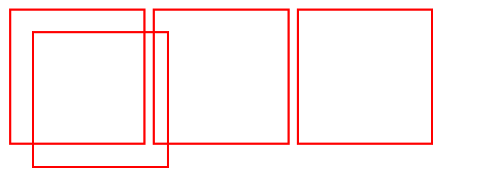
The default position of all the boxes in the above image is static. Now, we will change the position from static to relative for box3. Here is the CSS used:
#box3 {
        position: relative;
        top: 34px;
        left: 34px;
    }
You can see in the image below that box3 has shifted 34px away from the top and left side relative to its normal position.
Output :

Position: Absolute
An element with the absolute position will move according to the position of its parent element. If there is no parent element with a position set, the HTML element will be placed relative to the page.
Now, we have changed the position of box3 from relative to absolute. Here is the CSS used:
#box3 {
        position: absolute;
        top: 34px;
        left: 34px;
    }
    .container {
        border: 2px solid black;
        background-color: khaki;
        height: 3444px;
    }
You can see in the image below that box3 has moved to the left side of the page.
Output:

Position: Fixed
An element with position: fixed will remain stuck in a specific position even after the page is scrolled. This property is used when we want to keep an HTML element at a fixed spot no matter where the user is on the page.
Notice the box fixed at the top right corner of the page in the image below. Here is the CSS used:
#box3 {
            position: fixed;
            right: 4px;
        }
Output:

Position: Sticky
It is a hybrid of relative and fixed positioning. An HTML element with position: sticky will remain in its normal position until it reaches a defined offset, where it will then stick.
Use the CSS below to get a better understanding of the sticky element:
#box3 {
        position: sticky;
        top: 3px;
    }
Live Demo: 🌐
Conclusion 💥⚡️
In this article, we explored various CSS positioning properties: static, relative, absolute, fixed, and sticky. Each type of positioning offers a different way to place elements on your web page. Understanding these options allows you to design layouts that are not only functional but also visually appealing. With this knowledge, you can control how elements are positioned and interact on your site, making your designs more effective and engaging.
Thanks for reading all the way to the end! 💖
I hope these things help you as much as I do. Please drop a comment 💬 about your feedback or ideas, it will help me a lot to draw experience on next article.
Let's connect! Find me on the web 🔗
If you have any Queries or Suggestions, feel free to reach out to me.
Happy Coding :)❤️
Subscribe to my newsletter
Read articles from Kushal Das directly inside your inbox. Subscribe to the newsletter, and don't miss out.
Written by

Kushal Das
Kushal Das
A Full Stack Web Developer | A Mentor | A freelancer💻 | Data science enthusiastic | Open source enthusiastic | Create and write content | Enjoy learning new techs | love meeting new people! 😊

