Flexbox vs Grid
 Namrata Jain
Hello folks,
In my previous blog on CSS layout techniques, I covered essential concepts like the box model, float, positioning, and more modern layouts using Flexbox and CSS Grid. While these are powerful layout methods on their own, understanding when and how to use Flexbox versus CSS Grid can significantly enhance your ability to create responsive and efficient layouts.
In this blog, I will dive deeper into both Flexbox and Grid, comparing their strengths, use cases, and providing practical examples to help you choose the right tool for your next project.
1. Layout Types
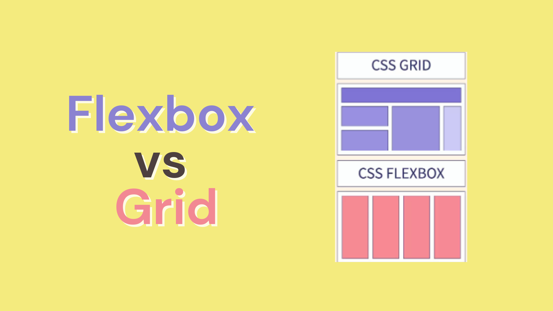
Flexbox: Flexbox is one-dimensional (either a row or a column).
Grid: Grid is two-dimensional (both rows and columns).
2. Use Case
Flexbox: It's perfect when you want to distribute space between items or align them in a specific direction.
Grid: Ideal for more complex grid-like layouts, where items need to be placed both in rows and columns.
When to Use Flexbox:
Aligning items in a row or column.
Building responsive components that need to adapt based on content size.
Simple layouts where elements need equal or specific spacing on one axis.
When to Use Grid:
Complex layouts that require controlling both rows and columns.
When you need precise control over item placement in a 2D grid.
When the layout structure is the priority and content needs to fit within it.
Both systems can be combined to handle specific layout challenges. For example, you might use Grid for the overall page structure and Flexbox within a particular component.
Thank you for gving it a read!!!🤗
Subscribe to my newsletter
Read articles from Namrata Jain directly inside your inbox. Subscribe to the newsletter, and don't miss out.
Written by

Namrata Jain
Namrata Jain
I am a BCA 22' graduate, a NeoGrad 22', and a software engineer by profession.