Using LordIcons in React
 Okunola Samson
When it comes to UI, we can all agree that animations are a great way to capture users' attention and improve their experience. Enter LordIcons – an extraordinary collection of animated, interactive icons meticulously crafted for web and app interfaces. In this article, we'll delve into how LordIcons can be seamlessly integrated into React projects, elevating the user interface's visual appeal and interactivity.
NB: This article is for devs using React and TyeScript. I tried using the LordIcon npm package and for some reason, it wasn't working as expected.
Prerequisite
It would help if you were fairly comfortable with TypeScript and React. Also, you need a LordIcons account. You can sign up here.
What is LordIcons?
LordIcons stand out as animated icons designed to make your UI come alive. With a comprehensive array of captivating, interactive icons, they offer a unique blend of aesthetics and functionality, perfect for enriching the visual storytelling of web applications. Their benefits extend beyond mere embellishments, providing a dynamic and engaging element within the UI.
Integrating it into React-TypeScript
TypeScript gives everyone a little tough time now and then, but I believe it is all for the best. And working with LordIcons is no exception. First, we need to understand how the icons work. LordIcons uses Lottie behind the scenes to animate icons.
A Lottie is a JSON-based animation file format that allows you to ship animations on any platform as easily as shipping static assets. They are small files that work on any device and can scale up or down without pixelation. LottieFiles lets you create, edit, test, collaborate on and ship a Lottie in the easiest way possible.
I assume you already have a React project running. Install lottie-web and lord-icon-element
yarn add lottie-web lord-icon-element
After installing the dependencies we need, we create the type we need for our icon element. If you don't have a types folder already, create a types.ts file in your src folder. Inside the types file, we declare the types we're going to use:
type LordIconTrigger = "hover" | "click" | "loop" | "loop-on-hover" | "morph" | "morph-two-way"

type LordIconProps = {
    src?: string
    trigger?: LordIconTrigger
    colors?: string
    delay?: string | number
}

type LordIconElement = React.DetailedHTMLProps<React.HTMLAttributes<HTMLElement>, HTMLElement> &
    LordIconProps
The properties for a lord-icon element are available on their website and so is the list of animation triggers that we can use. We also need to make the <lord-icon /> element globally available, so in our types file we will add the element to the JSX namespace:
declare global {
    // eslint-disable-next-line @typescript-eslint/no-namespace
    namespace JSX {
        interface IntrinsicElements {
            "lord-icon": LordIconElement
        }
    }
}
So, now we need to create the reusable LordIcon component making use of Lottie and lord-icon-element. Create a lord-icon.tsx file in the src folder.
import { defineElement } from "lord-icon-element"
import Lottie from "lottie-web"

defineElement(Lottie.loadAnimation)

type LordIconTrigger = "hover" | "click" | "loop" | "loop-on-hover" | "morph" | "morph-two-way"

type LordIconColors = {
    primary?: string
    secondary?: string
}

type LordIconProps = {
    src?: string
    trigger?: LordIconTrigger
    colors?: LordIconColors
    delay?: number
    size?: number
}

export const LordIcon = ({ colors, delay, size, src, trigger }: LordIconProps) => {
    return (
        <lord-icon
            colors={`primary:${colors?.primary},secondary:${colors?.secondary}`}
            src={src}
            trigger={trigger}
            delay={delay}
            style={{
                width: size,
                height: size,
            }}
        />
    )
}
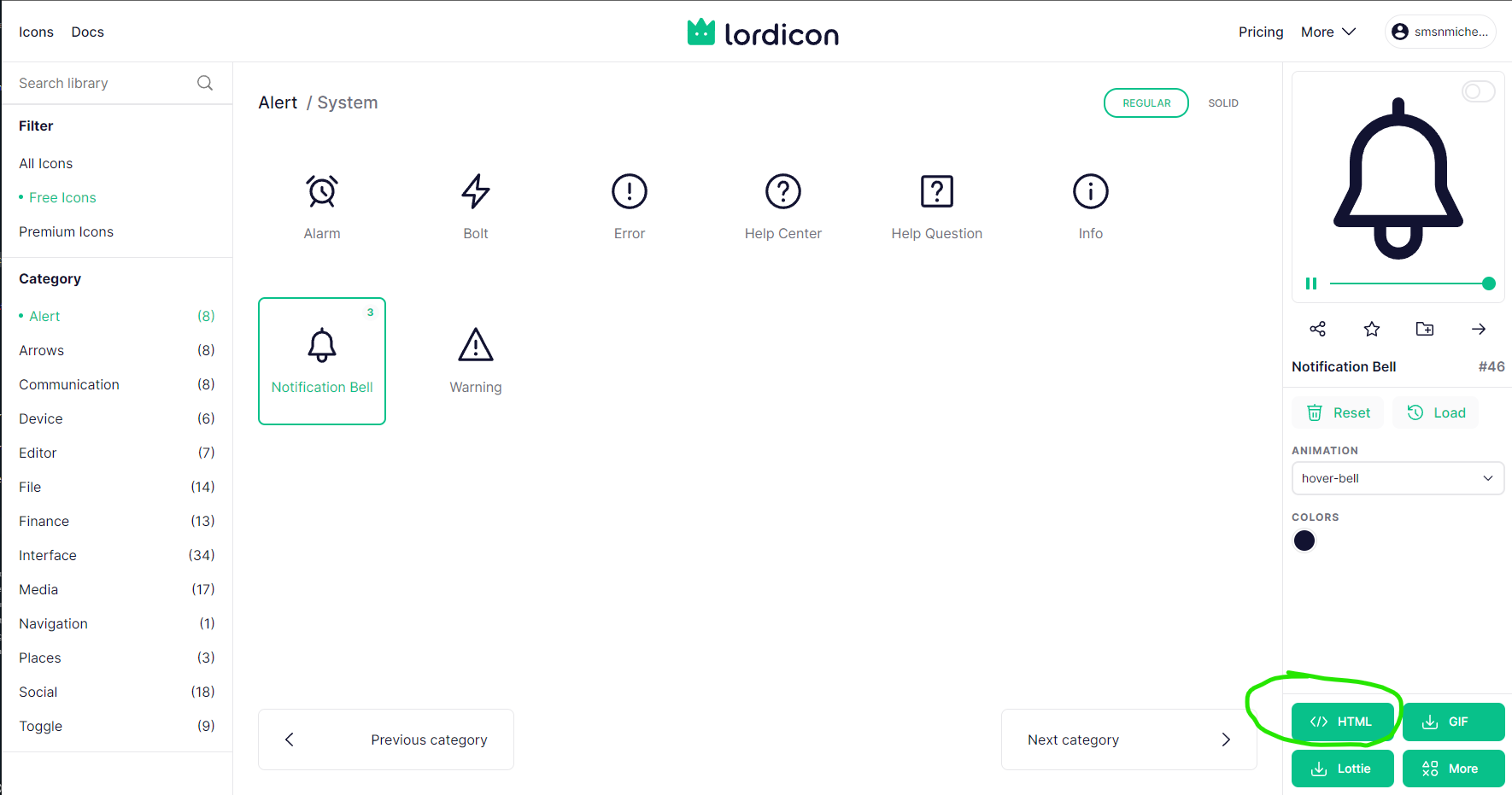
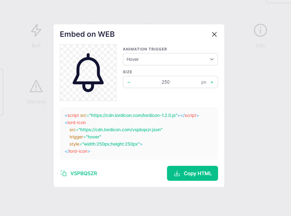
So, our LordIcon component is done. But there is still one very important part that we're missing. We can't use the icons without the JSON Lottie files. What I did was go to the LordIcons website, select an icon I wish to use and copy the value of the src property and paste it in my component. You can play around with the trigger and delay until you find the best values for your icon.


We can now make use of the icon by importing it and passing all the necessary props to it.
import { Lordicon } from "lord-icon"

const Component = () => {
  return (
    <nav className="navbar">
      {/* other code... */}
      <LordIcon
        colors={{primary: "#fff", secondary: "#000"}}
        delay={2000}
        size={28
        src="https://cdn.lordicon.com/vspbqszr.json"
        trigger="hover"
      />
    </nav>
  )
}
The animation on this icon will run whenever we hover over it.
Conclusion
Using animated icons for users’ interaction, feedback and gestures will greatly improve the UI and UX of your application.
Subscribe to my newsletter
Read articles from Okunola Samson directly inside your inbox. Subscribe to the newsletter, and don't miss out.
Written by

Okunola Samson
Okunola Samson
I'm a software developer based in Nigeria. I specialise in building web applications. I find both front-end and back-end development interesting and fun. I enjoy building things that live on the internet, whether it's a website or an application. I'm passionate about creating innovative solutions and exploring new technologies. I always seek new challenges and opportunities to grow as a developer. I'm open to new opportunities and collaborations.