Dashing to the dashboard!
 CodeCara
Things I've worked on/completed since my last post..
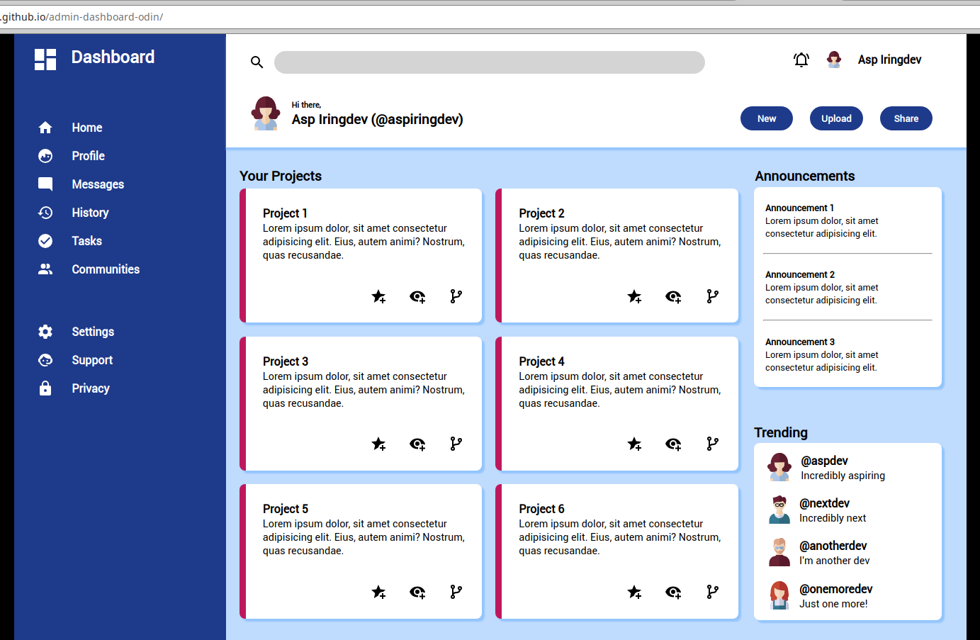
I completed the Admin Dashboard(!).
Please note that the project has not been adjusted for responsiveness (not required at this point of the course) and may look different at different resolutions/on systems other than Linux.
On my system, it meets the requirements of the project and looks correct.
https://codecara.github.io/admin-dashboard-odin/
Things that went well...
Firstly, I really enjoyed this project!
I believe I am now better able to visualise the layout structure and what is needed in advance
I’ve improved at using selectors. I am still no expert, but I find myself doing some things more automatically and without having to revise them
I find that things are comings to me faster and/or that I am recalling things I have previously learnt (using z-index, applying box-shadow in the right way). Sure, they may be simply examples, but this shows me that I am improving somewhat, which is very encouraging.
My focus is improving when working in projects
I think my judgement in terms of whether I should spend more time over something or not (whether it is worth it), is improving (rather than asking others ‘do you think I should spend more time on this?’)
I am asking for much less help from other devs when trying to solve problems (though I may eat my words when I move onto the Javascript section!)
My understanding or how changing certain elements impacts other elements has definitely improved compared to earlier in my journey
I am continuing to use color variables and will continue to do so
Not sure if this is a good or bad thing, but on maybe one (max two) occasions, if something looked a ittle off (by say a pixel or two), i would just create a class and maybe adjust that one element using that class. This may be a bit ‘hacky’, but for the level I am at, I thought it was appropriate. I am sure I could have solved the problem by rearraning bigger elements, but it did not seem worth it
I am continuing to order my CSS in rouhgly the same order as the HTML, which seems logical at the moment (maybe this will change in the future if I come across more efficient ways to organise things)
Things that didn't go quite so well...
I need to develop a better understanding of how to manipulate SVGs and their sizes. I was advised not to change viewbox settings (which I need to look into more) and to just change the heght in the CSS, which enabled me to make the SVGs to appear as I wanted them to
I am forgetting to make git commits at appropriate times
I had a ‘problem’ importing fonts, which was due to an incorect path name(!). Lesson learny - hopefully.
Although I think my classnames were okay, some were too long and others, too similar to each other
Things I've learnt/need to improve on...
Manipulating the width (height) of a border-bottom is not easy (if even possible) and <hr> was a much better option (for me)
I mistook empty space in grid cells for margin on a couple of occasions, but I will be aware of this next time.
SVG height should be changed with CSS and not in the SVG code istelf (not until I understand viewbox better at least
I made the silly mistake of including colour names themselves in some colour variables (e.g. —sidebarGreen). This obviously became a problem when I changed the colour to blue. Something to bear in mind in the future.
I need to become better at making git commits. I think this is because I am becoming absorbed in how to actually just get something put together and by the time I commit, there is little to no relationship between the changes I have made. Maybe if I work section-by-section a bit more, I can improve this.
Plan for the forthcoming week...
I am thrilled to be starting on the Javascript section. Yes, thrilled!
Subscribe to my newsletter
Read articles from CodeCara directly inside your inbox. Subscribe to the newsletter, and don't miss out.
Written by
