CSS Positioning Basics: A Beginner's Guide
 Rahul Singh Rautela
The position property in CSS is essential for controlling the placement of elements on a webpage. It allows you to decide where and how elements should appear in relation to their surroundings. Let’s break down each type of positioning and how you can use them effectively.
Static Position
Static is the default setting for the position property. When you use static positioning, elements are placed according to the normal flow of the document. Imagine placing a series of photos on a wall. They hang in the order you put them up, without any adjustments. This means if you have five items, the first four will be arranged first, and then the fifth item will appear in its place.

In the example above, we see two divs aligned by default, meaning the second div will be aligned after the first div.
Absolute Position
Absolute positioning is like sticking a note on a specific spot on a whiteboard. This note stays in the same position relative to the whiteboard’s edges, no matter how you move the board. In CSS, an element with absolute positioning is placed relative to its first positioned ancestor (the parent element). Just remember, for this to work properly, the parent element shouldn’t be set to static.

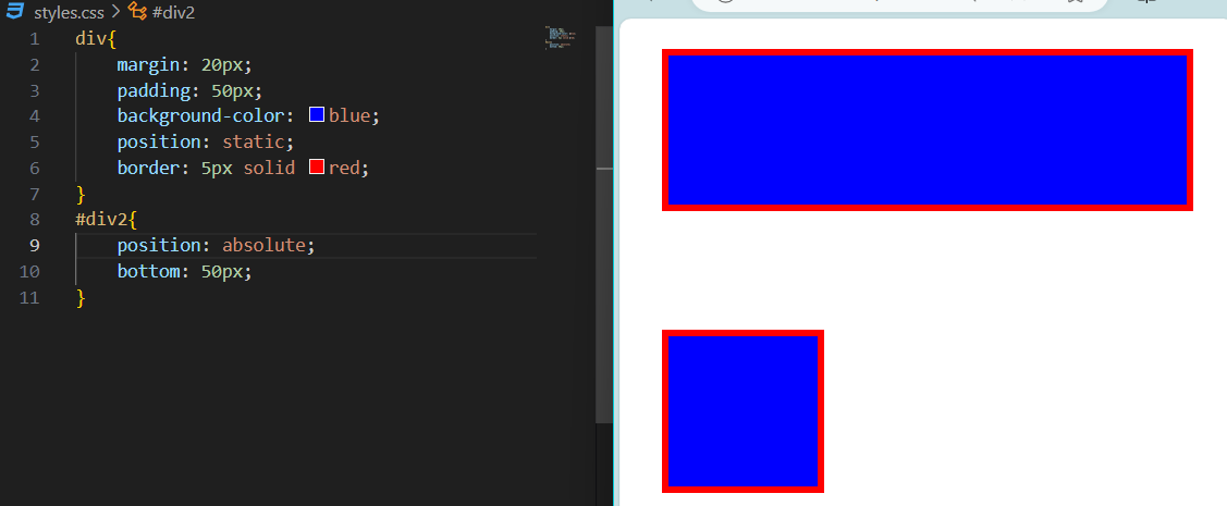
In the example above, we can see that div2 is aligned with respect to its parent container (bottom: 50px).
Relative Position
Relative positioning allows you to nudge an element from its default location. Imagine moving a photo slightly from where it was originally hung on the wall. The space where the photo would have been remains, but the photo overlaps with other items without affecting their positions. This means you can adjust the element’s position while preserving its original space.

In the example above, we can see that div2 is aligned relative to its original position, with the bottom 50px above its default location.
Fixed Position
Fixed positioning keeps an element in a specific place on the screen, similar to putting a sticky note on your computer screen. This note stays in the same spot, regardless of how much you scroll through your document. You can adjust its stacking order using z-index, with higher values bringing the element to the top.

In the example above, we can see that div1 is fixed 10px from the top and stays there even when you scroll.
Sticky Position
Sticky positioning combines the best of both relative and fixed positioning. It works like a sticky note that moves with you as you scroll down a webpage, but sticks in place when you reach a certain point. Unlike fixed positioning, which remains in the viewport regardless of the original position, sticky positioning keeps the element fixed only within its parent container.

In the example above, it's similar to fixed positioning, but the div1 will become fixed when the user scrolls 10px from the top.
In Summary,
Static: Elements are placed in the natural flow of the document.
Absolute: Elements are positioned relative to their first positioned ancestor.
Relative: Elements are adjusted from their default position while keeping their original space.
Fixed: Elements stay in a specific spot on the screen, unaffected by scrolling.
Sticky: Elements stick in place after scrolling past a certain point, within their parent container.
By understanding these positioning types, you can better control how your elements appear on the page and create more dynamic and responsive web designs.
Subscribe to my newsletter
Read articles from Rahul Singh Rautela directly inside your inbox. Subscribe to the newsletter, and don't miss out.
Written by
