ALX PORTFOLIO PROJECT BLOG POST: An Interactive Sales Dashboard Built-In Python And Streamlit Library To Visualize Data From Excel.
 Nnamdi Ogbolu
INTRODUCTION
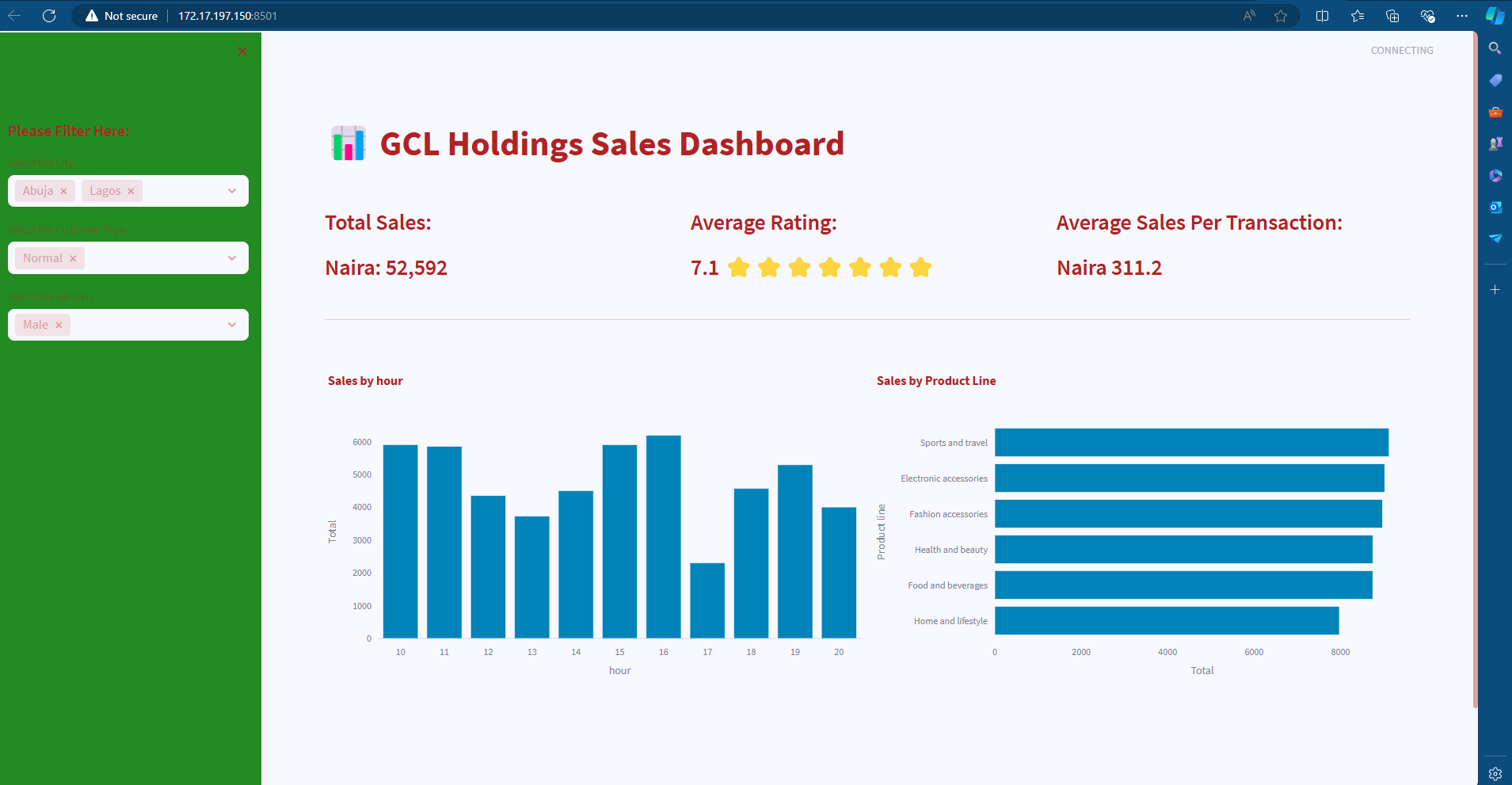
Recently, I embarked on a project to build an Interactive sales dashboard built-in Python and Streamlit library to visualize data from Excel as part of fulfilling the requirement for the graduation for the foundation program in ALX Software Engineering. This project aimed to create a user-friendly interface for analyzing sales data with key filters such as city, gender, and customer type, and provided real-time insights through visualizations like bar charts and key performance indicators (KPIs).
The main goal of this project was to provide a tool that could display complex sales data in a simple, interactive way. By leveraging filters, users can quickly drill down into sales figures, visualize patterns, and make data-driven decisions in a visually engaging approach. The dashboard was designed specifically with business executives, sales managers, and project managers in mind. These set of individuals usually rely on up-to-date sales data in mind. Its simplicity ensures that non-technical users can gain insights without dealing with complex data analysis techniques.
I was inspired to develop this project due to my fascination with data analysis, visualization, and project management. Early in my career, I worked on a project where analyzing sales data in a traditional spreadsheet format was cumbersome and time-consuming. This sparked the idea of building a real-time, interactive dashboard to streamline decision-making processes, particularly in finance and sales. In addition to the data analysis and visualization aspect, data privacy and security were crucial considerations for developing this project. Ensuring that user data is secure and properly managed protects both a company and its customers, maintaining trust and transparency.
ACCOMPLISHMENTS
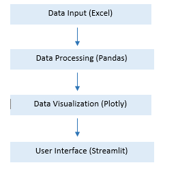
I am excited to have completed this project, it came together beautifully as it allows users to filter sales data by their respective chosen filter terms while displaying KPIs such as total sales, average ratings, and sales per transaction. The architecture, which uses Pandas for data handling and Plotly Express for visualizations. This is a simple but effective for dynamic chart rendering.
Below is a simplified flow of data through the application:

The Technologies for this project include;
- Streamlit which was chosen for its simplicity in building interactive web apps without deep knowledge of front-end development.
- Pandas; known for fast data manipulation and transformation.
- Plotly Express; well known for clean, interactive charts that seamlessly integrate into the Streamlit app.
TECHNICAL CHALLENGES
During the development of this project, my most difficult technical challenge was handling the dynamic data filtering in real-time without crashing the app or slowing down performance. The goal was to ensure that the filters applied by users did not result in slow data retrieval or processing delays, especially with a large dataset.
To solve this, I applied Streamlit’s caching mechanism (`@st.cache_data`) to prevent reloading the dataset every time a filter was changed. This allowed the app to hold the processed data in memory and efficiently query it without re-reading the excel file. This caching solution drastically improved performance, enabling real-time filtering without delays. The dashboard became highly responsive, regardless of the complexity of the filters applied.
PROJECT TAKEAWAYS
The major technical takeaway from this project is that I have learned the importance of caching in web apps, especially when dealing with large datasets. The integration of Pandas, Plotly, and Streamlit allowed me to build an intuitive user interface without sacrificing functionality.
What I might do differently going forward is that, I would focus more on user experience design from the start, ensuring the layout was mobile-responsive. In future iterations, I might incorporate machine learning for predictive analytics on sales trends.
As an aspiring a Software Engineer, I have learnt that this project revealed my passion for data analysis, visualization and the power of intuitive design. It reinforced my belief in building tools that can simplify decision-making for non-technical users.
Finally, this Project has informed my engineering path by driving my interest deeper into data engineering and business intelligence tools. The intersection of technology and user-centered design excites me. I see myself building more tools to empower businesses to act on data insights quickly.
Building this dashboard was both challenging and rewarding, pushing me to balance both the technical and user experience aspects of software engineering.
ABOUT ME
I am an tech enthusiast and an aspiring software engineer with a passion to balance both the technical and user experience aspects of software engineering.
Subscribe to my newsletter
Read articles from Nnamdi Ogbolu directly inside your inbox. Subscribe to the newsletter, and don't miss out.
Written by
