HR Data Insights Dashboard
 Jogleen Calipon
Table of contents

This sample project examines trends in employee numbers, average annual salaries, hiring trends, employee count by department, employee tenure, and the job sources where most recruited employees applied.
The dataset spans from 2006 to 2018, providing a perfect opportunity to identify any patterns that need attention.
The dataset can be found and downloaded for your reference on Kaggle
Tools Used for this Project: Power Pivot, Data Modeling, Power Query, Slicers, and the Built-in Charts of Microsoft Excel
Data Preparation
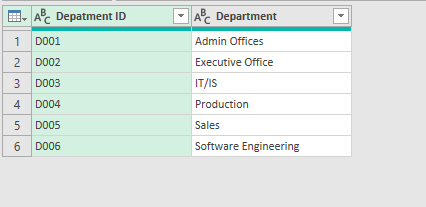
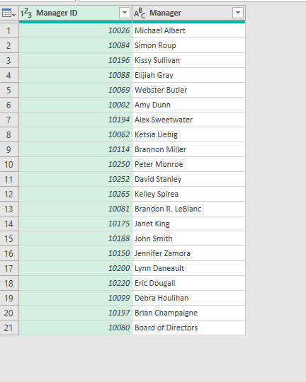
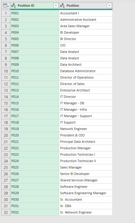
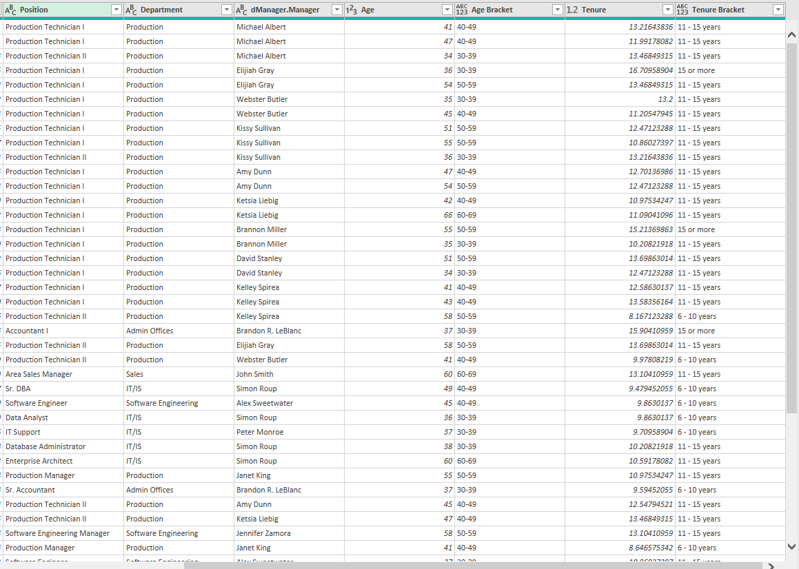
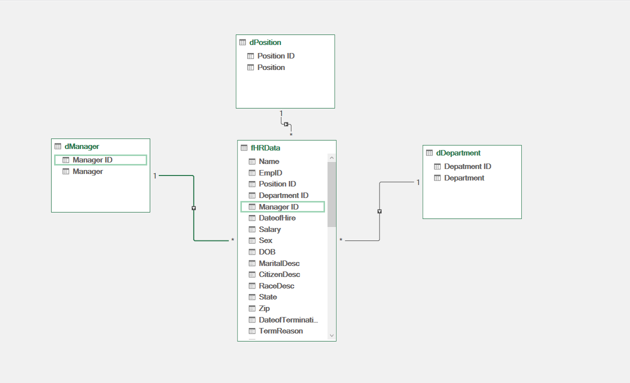
I modified the dataset to suit my needs. Instead of loading it all at once in Power Query, I divided it into four parts and added some categorization. For example, the Department dataset has two columns: Department ID and Department. The Manager dataset includes Manager ID and Manager columns, and the Position dataset contains Position ID and Position columns. These are my dimension tables.
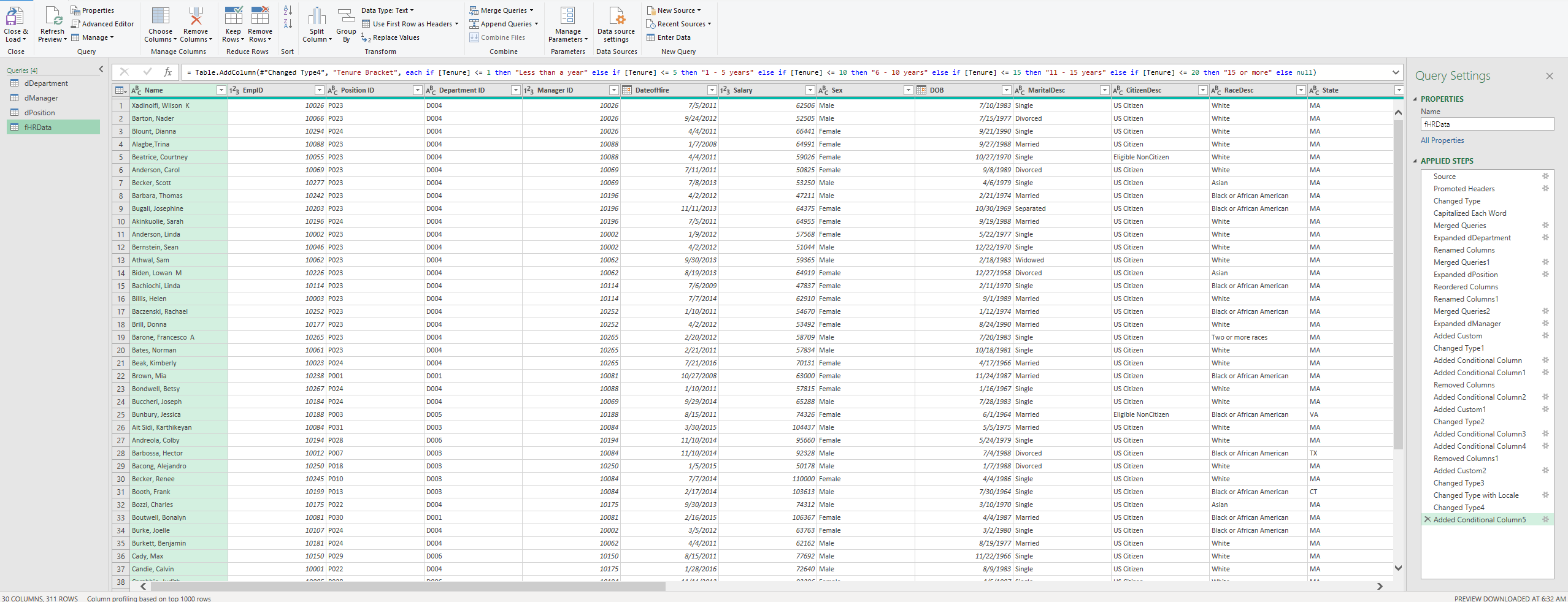
Now, for the fact table, I downloaded the HR dataset and cleaned and organized the data using the Power Query editor.
Note:
I cleaned the data before loading it into Power Query but still made modifications within the editor to ensure the dataset's integrity. I removed unnecessary columns and formatted the data to fit the project's needs. For this project, I added some helper columns based on my dimension tables, including Position, Department, Manager, Age, Age Bracket, Tenure, and Tenure Bracket to support my analysis.
Data Modeling
For data modeling, since the dataset is not large, I used a relational model for this.
Analysis
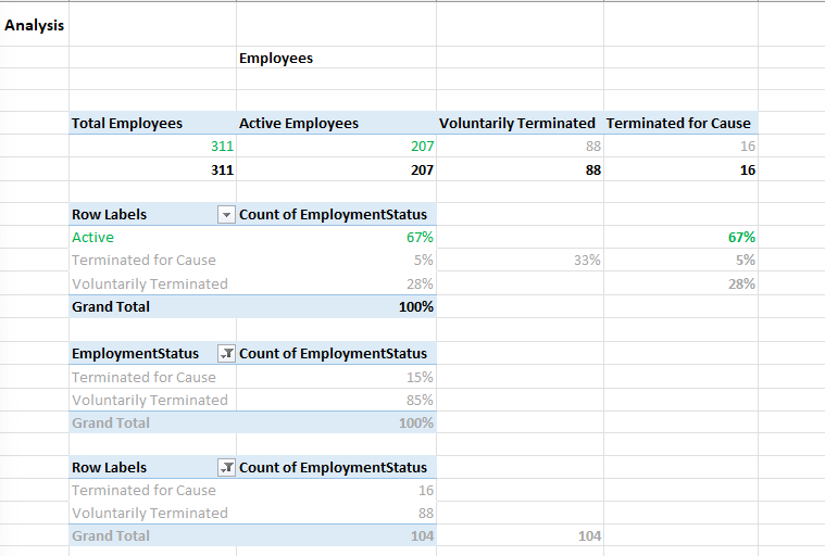
In the first part of the analysis, I focus on the employee structure to identify the total population in the dataset. Here is the summary:
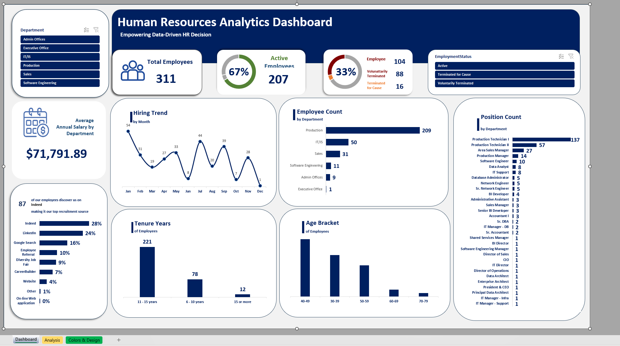
Total Employees: 311
Active Employees: 207
Terminated Employees: 104
Categorized by:
Voluntarily Terminated: 88
Terminated for Cause: 16
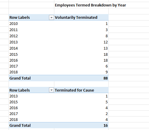
And categorized by year
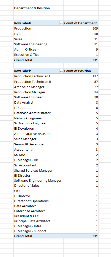
Next, I looked at the departments and positions to identify which department has the most employees and the breakdown of employees by position. In summary, I found that the Production department has the highest number of employees, followed by IT/IS.
The gender Distribution for all employees is summarized below:
All Employees:
Female: 176
Male: 135
Active Employees:
Female: 116
Male: 91
Total: 207
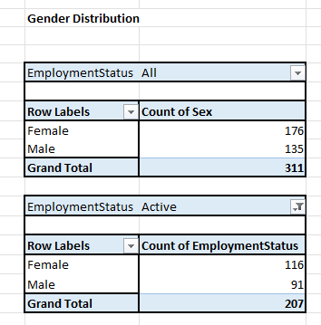
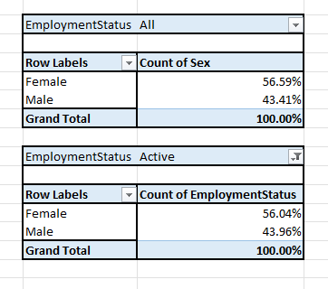
Here we can see that the majority of the workforce is made up of women, both in total employees and active employees.
Next, we need to look into the Age Bracket. This will help us identify the age range of most of our employees.
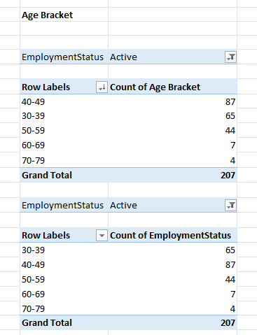
We can see that most of the employees fall within the age bracket of 40-49 years, both among total employees and active employees.
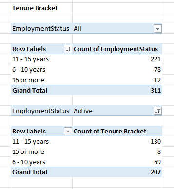
I can also see that the majority of the employees have been with the company for 11-15 years, for both total employees and active employees.
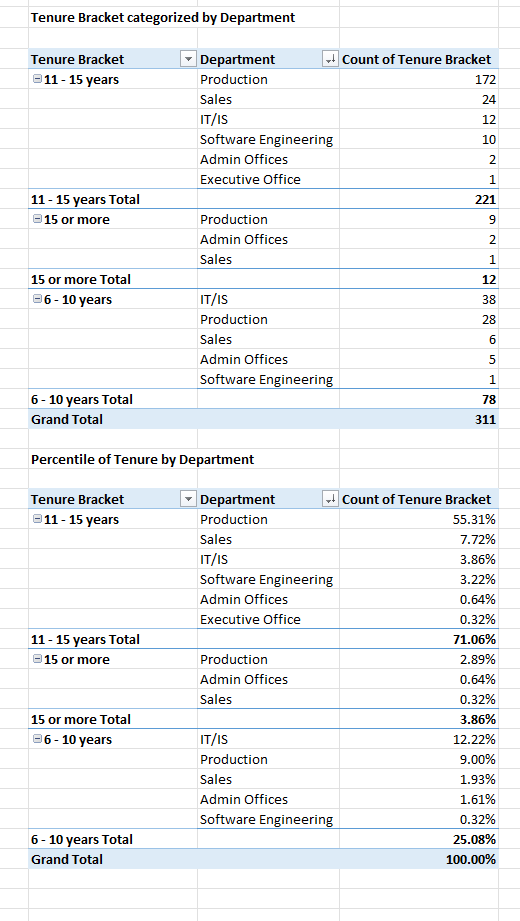
And on this more detailed table, I can see that the Production Department has the most tenured employees, which is 55.31%
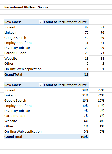
I also checked which platform most of the employees used to apply. Based on the data, 87 employees applied through Indeed!
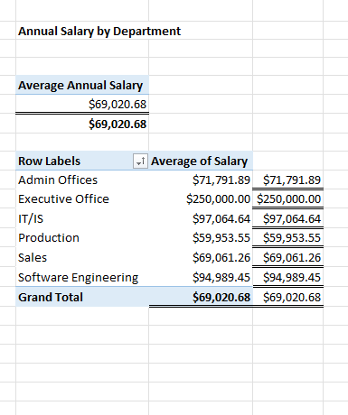
We also want to identify the average annual salary of our employees. Based on the dataset, we can see that it is $69,020.68.
The highest average salary is in our IT/IS department, followed by software engineering (excluding the Executive Office).
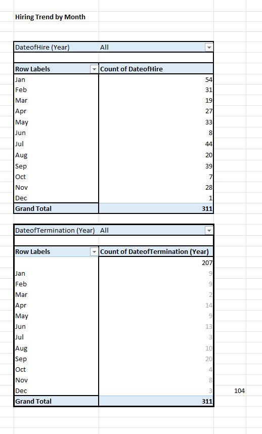
Now, let’s take a look at our hiring trend versus our termed trend.
Based on the hiring trend, we see higher numbers in January and July, while our term trend peaks in September, followed by April, with a total of 104 employees.
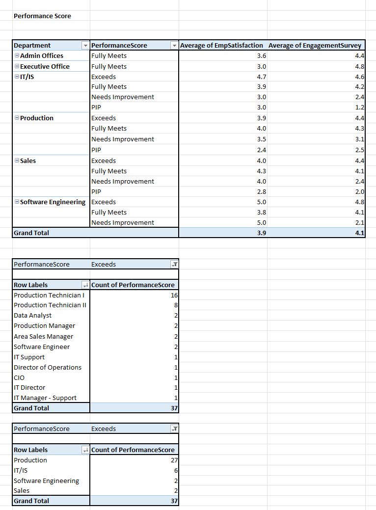
I also want to see the Performance Score of all employees to check if there is a correlation between employee satisfaction and engagement.
Based on the data from the IT Department, the performance score exceeds expectations, with a satisfaction rating of 4.7 and an engagement rating of 4.6. Hence, we can assume that there is a correlation.
Visualization
Based on the analysis, I created a dashboard highlighting the key metrics that had the most impact on my findings. The dashboard is shown below.
For the final output of this analysis. You can download it on Kaggle.
Subscribe to my newsletter
Read articles from Jogleen Calipon directly inside your inbox. Subscribe to the newsletter, and don't miss out.
Written by
Jogleen Calipon
Jogleen Calipon
👋 Welcome to My Profile! I'm a Data Analyst with over four years of experience turning data into meaningful insights that drive smart business decisions. Whether it's building automated reports, uncovering operational inefficiencies, or creating interactive dashboards that tell a clear story—I'm passionate about using data to solve real-world problems. 💡 What I Do Best Data Preparation: Cleaning, shaping, and enriching messy datasets Data Analysis: Extracting insights to inform decisions Automation: Streamlining recurring reports and building data entry forms Business Reporting: Creating reports tailored to decision-makers Visualization: Designing dashboards that make data easy to understand Collaboration: Translating technical findings for non-technical audiences 🛠️ Tools & Technologies Spreadsheets & Data Processing Microsoft Excel: Power Query, Power Pivot, DAX, advanced lookup functions, custom automation workflows Business Intelligence Power BI: Interactive dashboards and visual storytelling Databases & SQL Foundational knowledge of MS SQL Server, MySQL, BigQuery, and MS Access Experience writing basic to intermediate SQL queries Programming Python: Foundational experience with Pandas, NumPy, SciPy, Seaborn, and Matplotlib for data analysis and visualization R: Working knowledge of data wrangling, ggplot2, and statistical modeling 🚀 Let's Connect I'm currently open to short-term projects and part-time roles where I can contribute to: Optimizing processes Unlocking insights hidden in data Building scalable, automated solutions Thanks for visiting my profile! Feel free to explore my projects and reach out for collaboration or just to connect. 😊