Checkbox in HTML
 dheeraj koranga
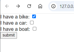
A checkbox allows the user to select one or more options from a set. Each checkbox is independent, so you can select multiple checkboxes at once.
<form action="/server">
    <label for="vehicle1"> I have a bike:</label>
    <input type="checkbox" id="vehicle1" name="vehicle1" >
    <br>
    <label for="vehicle2"> I have a car:</label>
    <input type="checkbox" id="vehicle2" name="vehicle2" value="Car">
    <br>
    <label for="vehicle3"> I have a boat:</label>
    <input type="checkbox" id="vehicle3" name="vehicle3" value="Boat">
    <br>
    <button>submit</button>
</form>


If you submit the checkbox by ticking it, it will send on as a response to the server and if not then it will not send any data
Radio button in HTML
Radio buttons allow the user to select only one option from a predefined set. All radio buttons that belong to the same group must have the same name attribute value to enforce single selection.
<form action="/server">

    <input type="radio" name="fruit" id="apple">
    <label for="apple">Apple</label>
    <br>
    <input type="radio" name="fruit" id="banana">
    <label for="apple">Banana</label>
    <br>
    <input type="radio" name="fruit" id="guvava">
    <label for="apple">Guvava</label>
    <br>
    <button>submit</button>
</form>

Select (Dropdown) in HTML
The <select> element is used to create a dropdown list, where the user can choose one or multiple options. Each option inside the <select> element is defined by the <option> tag.<form>
<form>
    Choose your state :
    <select name="state" id="state">
        <option value="uk">Uttarakhand</option>
        <option value="up">UttarPradesh</option>
    </select>
    <button>submit</button>
</form>

Range Input in HTML
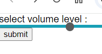
The <input type="range"> element creates a slider, which allows the user to select a value from a specified range. You can specify the minimum (min), maximum (max), and step (step) values.
<form action="/server">
    <label for="volume">select volume level :</label>
    <input type="range" id="volume" name="volume" min="0" max="100" step="10">
    <button type="submit">submit</button>
</form>


In this example:
- The user can adjust the slider to select a value between 0 and 100, in increments of 10.
Summary:
Checkbox (
<input type="checkbox">): Allows users to select multiple options.Radio button (
<input type="radio">): Allows users to select only one option from a group.Dropdown (
<select>): Displays a dropdown menu with one or more selectable options.Range input (
<input type="range">): Provides a slider for selecting a value within a range.
Subscribe to my newsletter
Read articles from dheeraj koranga directly inside your inbox. Subscribe to the newsletter, and don't miss out.
Written by
