Comparing Sales Over the Same Date Range for Multiple Years in Power BI
 Nalaka Wanniarachchi
Table of contents

In Power BI, one common need is to compare sales over the same date range across multiple years. For example, analyzing sales from January 1 to January 5 across 2018, 2019, and 2020, etc.. can provide valuable insights. Achieving this is easy with a date slicer and a custom DAX formula, even when using a disconnected table for advanced filtering.
In this guide, we’ll show you how to create a visual that displays sales for the same date range across different years using a disconnected date table, a slicer, and a custom DAX measure.
Step-by-Step Guide
1. Data Model Setup
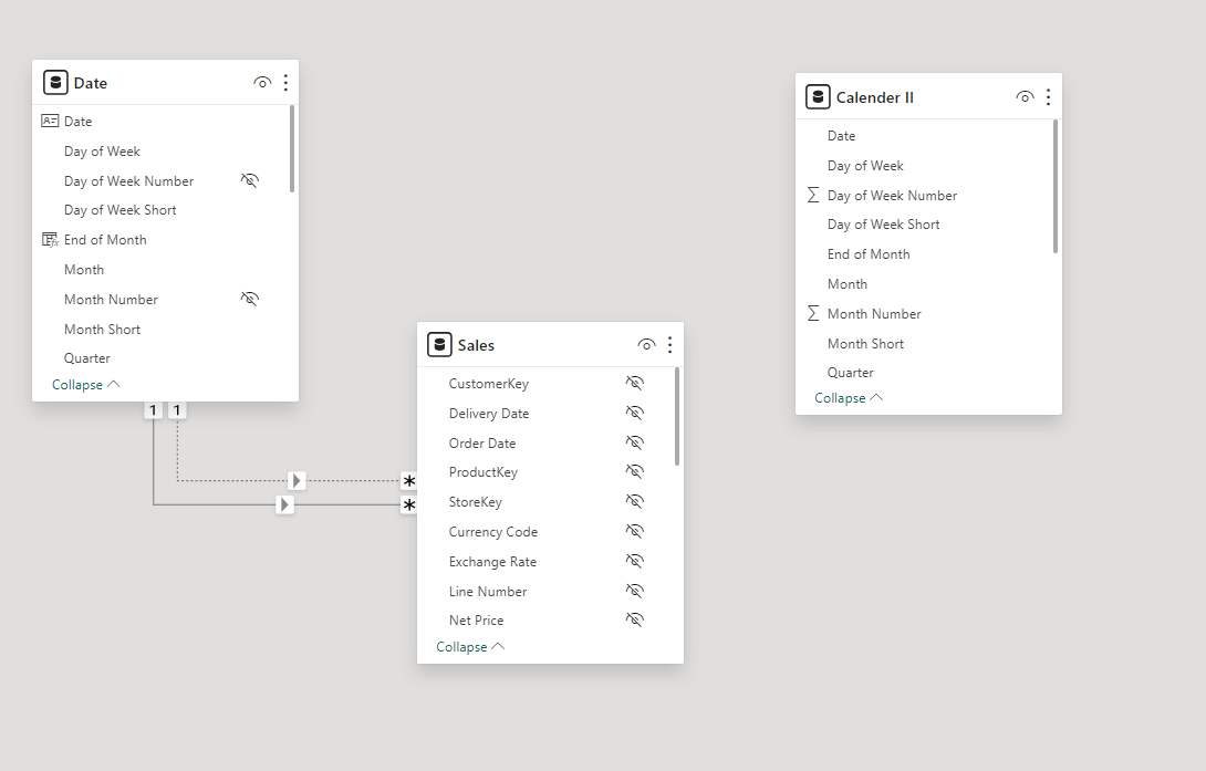
Before creating the measure, let’s look at the data model. In this case, the model includes three main tables:
Date: A standard date table containing fields such as Date, Month, Year, etc.
Sales: Contains sales-related fields like
Sales Amount,Order Date,CustomerKey, etc.Calendar II (Disconnected Table): A disconnected table used for date slicer filtering. It is not connected directly to the other tables, which allows us to use it flexibly without influencing other relationships.

2. Creating the Measure
Next, we create a DAX measure to calculate sales for the selected date range across all years. The following DAX formula helps achieve this:
Selected_Sales =
SUMX(
    FILTER(
       'Date',
        MONTH('Date'[Date]) = MONTH(MAX('Calendar II'[Date])) &&
        DAY('Date'[Date]) >= DAY(MIN('Calendar II'[Date])) &&
        DAY('Date'[Date]) <= DAY(MAX('Calendar II'[Date]))
    ),
    Sales[Sales Amount]
)
Explanation:
The
FILTERfunction extracts dates from theDatetable based on the month and day range from the slicer onCalendar II(the disconnected table).MINandMAXfunctions capture the boundaries of the date range selected by the user in the slicer.Finally,
SUMXcalculates the total sales amount within this date range for each year.
This measure now allows you to view sales for the same date range across all years.
3. Adding the Date Slicer
To let users select their desired date range, we added a date slicer based on the disconnected Calendar II table. This allows us to filter and compare sales for specific days of the year across multiple years without affecting other parts of the model.

4. Visualizing the Data
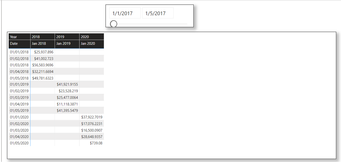
With the measure and slicer ready, you can now create a table or matrix visual to display sales for each year within the selected date range. Here’s an example of what the table might look like:
| Date | 2018 | 2019 | 2020 |
| 01/01/2018 | $25,937.89 | $41,921.91 | $37,922.70 |
| 01/02/2018 | $41,002.72 | $23,528.22 | $17,076.22 |
| 01/03/2018 | $6,583.97 | $25,477.01 | $16,500.09 |
| 01/04/2018 | $32,211.67 | $11,118.39 | $28,648.94 |
| 01/05/2018 | $49,781.63 | $41,395.55 | $739.08 |
This table helps in directly comparing sales figures for the same period across different years.

Conclusion
By using a combination of Power BI slicers and a disconnected date table, it’s easy to compare sales for the same date range across multiple years. This method gives you the flexibility to uncover trends and perform in-depth year-over-year comparisons.
Whether you're analyzing specific seasonal periods or any other important date range, this approach will provide you with actionable insights.
Thanks For Reading !!!
Subscribe to my newsletter
Read articles from Nalaka Wanniarachchi directly inside your inbox. Subscribe to the newsletter, and don't miss out.
Written by

Nalaka Wanniarachchi
Nalaka Wanniarachchi
Nalaka Wanniarachchi is an accomplished data analytics and data engineering professional with over 20 years of working experience. As a CIMA(ACMA/CGMA) UK qualified ex-banker with strong analytical skills, he transitioned into building robust data solutions. Nalaka specializes in Microsoft Fabric and Power BI, delivering advanced analytics and engineering solutions. He holds a Microsoft certification as a Fabric Analytic Engineer and Power BI Professional, combining technical expertise with a deep understanding of financial and business analytics.