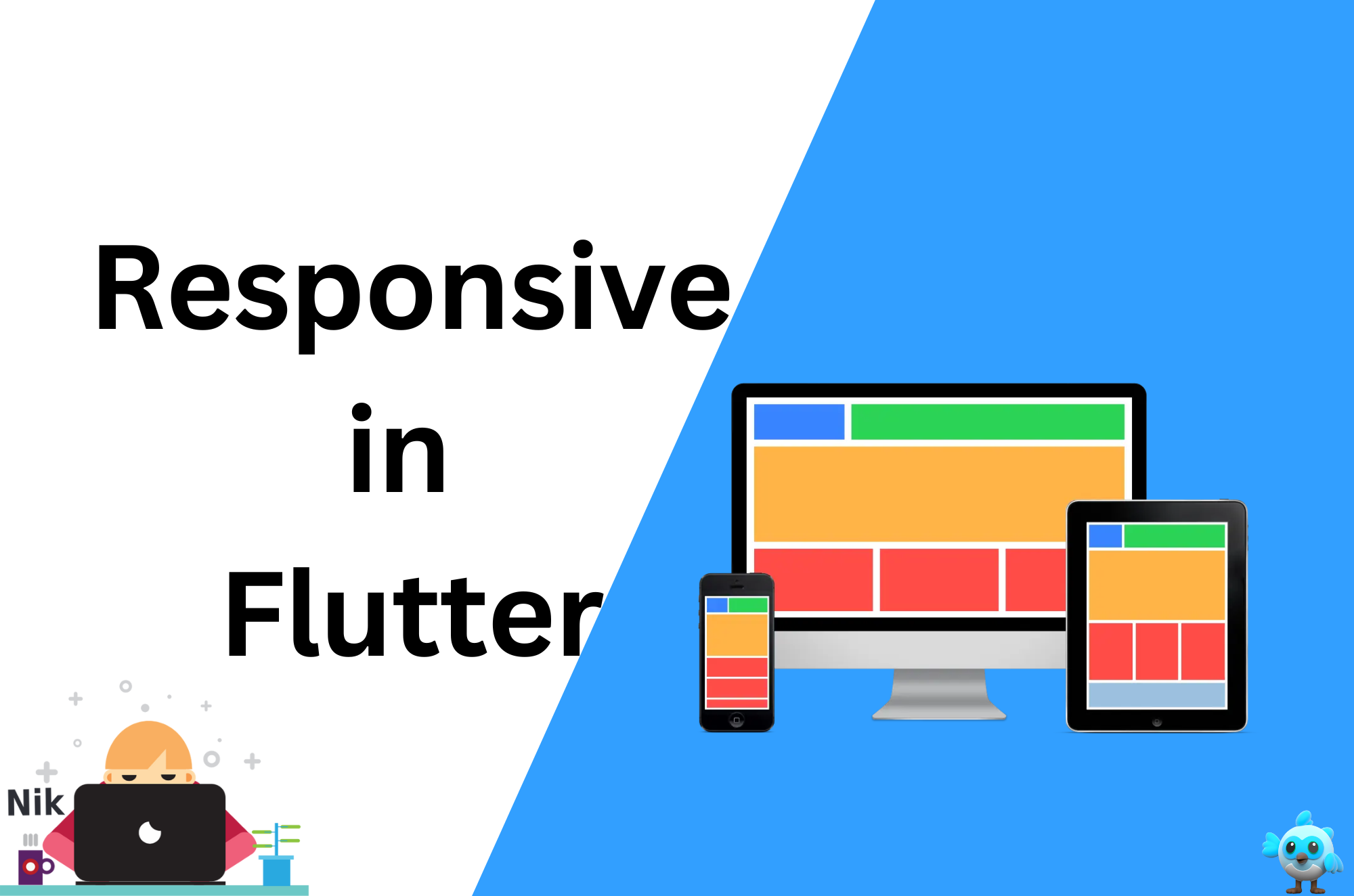
Building Responsive Flutter UIs: A Guide to Adaptive Layouts
 Ravi Patel
In today’s diverse tech ecosystem, apps need to work seamlessly across various devices with different screen sizes. Whether it’s a smartphone, tablet, or desktop, ensuring your Flutter app looks great on all devices requires a responsive design. In this blog, we’ll explore how to create adaptive layouts in Flutter, ensuring your UI is both functional and visually appealing, regardless of the screen size.
Why is responsive design important?
Diverse Screen Sizes: Users interact with apps on a variety of devices, each with different resolutions and aspect ratios.
Improved User Experience: A responsive layout ensures that the app looks professional and provides a smooth experience on all devices.
Consistency Across Platforms: With Flutter’s cross-platform capabilities, responsive design becomes crucial for maintaining a consistent look and feel across iOS, Android, and web.
Key Concepts for Building Responsive UIs in Flutter
Before diving into implementation, let’s clarify some key concepts in responsive design:
Flexibility: UI elements should resize and reposition themselves based on the available screen size.
Scalability: Fonts, padding, and margins should scale proportionally to different device sizes.
Device Orientation: The app should adjust to both portrait and landscape orientations.
Using MediaQuery for Screen Size Detection
Flutter provides the MediaQuery class, which allows you to query screen dimensions and orientation dynamically. Here’s how to use MediaQuery to build responsive layouts:
dartCopy code@override
Widget build(BuildContext context) {
  var screenSize = MediaQuery.of(context).size;

  return Scaffold(
    appBar: AppBar(
      title: Text('Responsive UI'),
    ),
    body: screenSize.width > 600
        ? _buildTabletLayout()
        : _buildMobileLayout(),
  );
}
In this example, we dynamically switch between mobile and tablet layouts based on the screen width.
Using the LayoutBuilder for Adaptive Layouts
The LayoutBuilder widget allows you to build different layouts based on the available constraints. This is useful for adjusting layouts in a flexible manner:
dartCopy code@override
Widget build(BuildContext context) {
  return Scaffold(
    body: LayoutBuilder(
      builder: (context, constraints) {
        if (constraints.maxWidth > 600) {
          return _buildTabletLayout();
        } else {
          return _buildMobileLayout();
        }
      },
    ),
  );
}
This approach helps to create a scalable UI that adapts to different screen sizes.
Creating Responsive Grids with Flutter
Grids are a common layout pattern, especially for larger devices like tablets or desktops. In Flutter, the GridView widget makes it easy to create responsive grid layouts:
dartCopy code@override
Widget build(BuildContext context) {
  var screenSize = MediaQuery.of(context).size;

  return GridView.builder(
    gridDelegate: SliverGridDelegateWithFixedCrossAxisCount(
      crossAxisCount: screenSize.width > 600 ? 4 : 2,
      crossAxisSpacing: 10,
      mainAxisSpacing: 10,
    ),
    itemBuilder: (context, index) {
      return Card(
        child: Center(child: Text('Item $index')),
      );
    },
    itemCount: 20,
  );
}
This grid adjusts the number of columns based on the screen width, offering a responsive experience.
Responsive Text and Font Sizes
In responsive design, text should scale appropriately for different screen sizes. Flutter provides MediaQuery to scale text size dynamically:
dartCopy code@override
Widget build(BuildContext context) {
  var screenWidth = MediaQuery.of(context).size.width;
  var fontSize = screenWidth > 600 ? 24 : 16;

  return Text(
    'Responsive Text',
    style: TextStyle(fontSize: fontSize),
  );
}
Here, the text size increases on larger screens, ensuring readability.
Handling Orientation Changes
In addition to different screen sizes, your app should also handle orientation changes (portrait and landscape). You can use MediaQuery to detect the orientation:
dartCopy code@override
Widget build(BuildContext context) {
  var orientation = MediaQuery.of(context).orientation;

  return Scaffold(
    body: orientation == Orientation.portrait
        ? _buildPortraitLayout()
        : _buildLandscapeLayout(),
  );
}
This ensures your layout adjusts when users rotate their devices, improving the overall user experience.
Using the flutter_screenutil Package for Responsive Design
While Flutter’s built-in tools like MediaQuery and LayoutBuilder are great, you can also use packages like flutter_screenutil to simplify responsive design. This package allows you to set responsive sizes for fonts, padding, margins, and more.
Step 1: Install flutter_screenutil
Add the following dependency to your pubspec.yaml file:
yamlCopy codedependencies:
  flutter_screenutil: ^5.9.3
Run flutter pub get to install the package.
Step 2: Initialize ScreenUtil
Initialize ScreenUtil in the main.dart file:
dartCopy codevoid main() {
  runApp(MyApp());
}

class MyApp extends StatelessWidget {
  @override
  Widget build(BuildContext context) {
    return ScreenUtilInit(
      designSize: Size(360, 690),
      builder: () => MaterialApp(
        home: ResponsiveHomePage(),
      ),
    );
  }
}
Step 3: Use ScreenUtil for Responsive Sizes
Once ScreenUtil is initialized, you can easily set responsive font sizes, padding, and more:
dartCopy code@override
Widget build(BuildContext context) {
  return Padding(
    padding: EdgeInsets.symmetric(horizontal: 20.w),
    child: Text(
      'Responsive Text',
      style: TextStyle(fontSize: 24.sp),
    ),
  );
}
Here, .w scales the padding based on the screen width, and .sp scales the font size proportionally.
Best Practices for Responsive Design in Flutter
Test on Multiple Devices: Use Flutter’s built-in emulator to test your app on various screen sizes and orientations.
Design for Flexibility: Avoid hardcoding sizes and positions. Instead, use flexible layouts and widgets like
Flexible,Expanded, andSizedBox.Use Breakpoints: Identify breakpoints in your app where the layout should adjust (e.g., mobile, tablet, desktop).
Optimize for Touch and Click: Ensure buttons and interactive elements are appropriately sized and spaced for touch interaction on mobile and click interaction on desktop.
Conclusion
Building responsive UIs in Flutter ensures your app delivers a great experience across all devices, from small phones to large desktops. By using tools like MediaQuery, LayoutBuilder, and the flutter_screenutil package, you can create flexible, adaptive layouts that enhance the usability and appeal of your Flutter apps.
With these strategies, your Flutter apps will be ready to scale across any platform, delivering a seamless and polished experience to your users.
Happy coding!
Subscribe to my newsletter
Read articles from Ravi Patel directly inside your inbox. Subscribe to the newsletter, and don't miss out.
Written by

Ravi Patel
Ravi Patel
"📱 Passionate Flutter Developer with 6+ years of experience, dedicated to crafting exceptional mobile applications. 🚀 Adept at turning ideas into polished, user-friendly experiences using Flutter's magic. 🎨 Design enthusiast who believes in the power of aesthetics and functionality. 🛠️ Expertise in translating complex requirements into clean, efficient code. 🌟 Committed to staying updated with the latest trends and continuously pushing boundaries. Let's create something extraordinary together!"