Microinteractions and animations to improve UX
 David J
In the design of digital products, one of the most effective techniques to improve the user experience is the implementation of microinteractions .
Microinteractions are essentially specific interactions within a product that are triggered to perform a specific function , thus contributing to a more intuitive and consistent workflow.
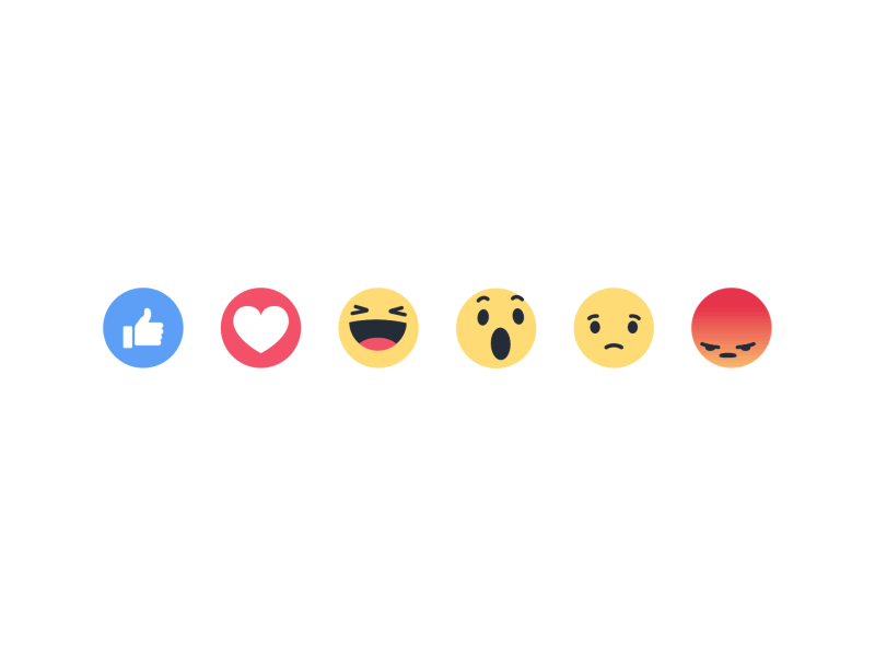
Typical examples include swiping to refresh a page, expressing liking for content through a “like,” or adjusting a preference in settings. User interface animations, such as the effect with which a menu appears on screen or how a card disappears with a gesture, are also part of these microinteractions.
Although the user may not always be aware of these microinteractions, the subliminal perception of these contributes significantly to a more fluid , intuitive and satisfactory user experience .
These details, however tiny, have the power to transform a good user experience into an exceptional one, proving that in design, the biggest impacts often come from the smallest, most thoughtful touches.
Definition and objectives of microinteractions
Microinteractions are small, purpose-designed actions that occur within a user interface. These subtle, yet brief, moments are loaded with meaning and have the power to influence a user’s overall experience with a digital product.
A microinteraction can be as simple as a notification sound for an incoming message , the visual effect of a button being clicked, or the animation of an icon changing state . Despite their simplicity, these interactions are critical to guiding users through their tasks efficiently and effectively, turning complex processes into fluid, understandable experiences.
Aim
The main goal of microinteractions is to improve usability and user satisfaction when interacting with an interface. By focusing on details, microinteractions serve several important functions:
They provide immediate feedback on the actions taken.
They help prevent user errors by clarifying the consequences of actions.
Types of effective microinteractions in user interfaces
There are several types of microinteractions in user interfaces, each aimed at improving specific aspects of the user experience. These include:
Feedback microinteractions: These provide visual, auditory, or tactile feedback to user actions, such as a button changing color when clicked, or a gentle vibration upon completion of an action, ensuring the user receives immediate confirmation of their actions.
Status microinteractions: These inform the user about what is happening in the app or website, such as progress indicators, loading bars, or icons that change to reflect a new status, keeping the user informed and engaged.
Error prevention: Helps prevent user errors by providing visual cues or tips that appear before a critical action is taken, such as validation alerts on forms or warnings before deleting an important file.
Subtle animations: Enrich the visual experience and guide the user's attention in an intuitive way, such as smoothly animating elements that appear or disappear on the screen, or transitioning between views in an application.
Smooth transitions: These make it easier for the user to move through different parts of the application or website, offering a more consistent and enjoyable experience when navigating between tasks or sections, such as scrolling animations between screens.
Each of these types of microinteractions contributes to a richer, more satisfying user experience, not only improving usability and functionality, but also adding a level of detail and care that can differentiate a product in today’s highly competitive marketplace.
The psychology behind microinteractions
At a fundamental level, microinteractions satisfy the human need for instant feedback , a psychological principle that is rooted in operant conditioning theory. When users interact with an interface and receive immediate feedback, whether it be a subtle animation or a color change, it creates a sense of gratification and control. Not only does this increase the usability of the interface , but it also enhances the user’s emotional experience , making the product more engaging.
Furthermore, microinteractions can be designed to trigger positive emotions and build an emotional connection between the user and the product. For example, a fun animation or a pleasant sound effect upon completing a task can elicit a smile, transforming a mundane action into a moment of delight. These types of positive emotions become associated with the product, improving overall perception and fostering user loyalty.
Basic principles for designing effective microinteractions
To design effective microinteractions, it is essential to focus on clarity of purpose , ensuring that each action has a specific intention and is easily understandable to the user.
Clarity of purpose: Each microinteraction should have a specific goal (inform, delight, prevent errors, facilitate tasks), ensuring it is intuitive and relevant.
Simplicity: Keep microinteractions simple and understandable to avoid overloading the user with unnecessary information or actions.
Harmonious integration: Microinteractions should be cohesively integrated with the overall interface design, maintaining aesthetic and functional coherence.
Brand Personalization: Tailoring microinteractions to reflect your brand personality or product tone.
Reflecting on the overall impact of microinteractions and animations, it’s clear that their influence on UX goes beyond just fulfilling functionality.
These small gestures, which we as UX Designers embed in the fabric of interfaces, really act as an invisible thread that helps users follow the right path to achieve their goals within the digital product.
Subscribe to my newsletter
Read articles from David J directly inside your inbox. Subscribe to the newsletter, and don't miss out.
Written by
