Flexbox Froggy: A Simple and Enjoyable Approach to Mastering Flexbox CSS
 Shubham Sutar
As developers, one of the trickiest yet essential skills to master is CSS layout design. Flexbox has become a cornerstone in this area, providing a powerful, flexible way to control the alignment, spacing, and ordering of elements within a webpage. But learning Flexbox can sometimes feel overwhelming, especially when it’s mixed with the nuances of browser behavior. #2Articles1Week, #Hashnode
Fortunately, there’s a playful and practical way to get a grip on Flexbox : Flexbox Froggy. flexbox-froggy-ultimate-game-for-developers.
What is Flexbox Froggy?
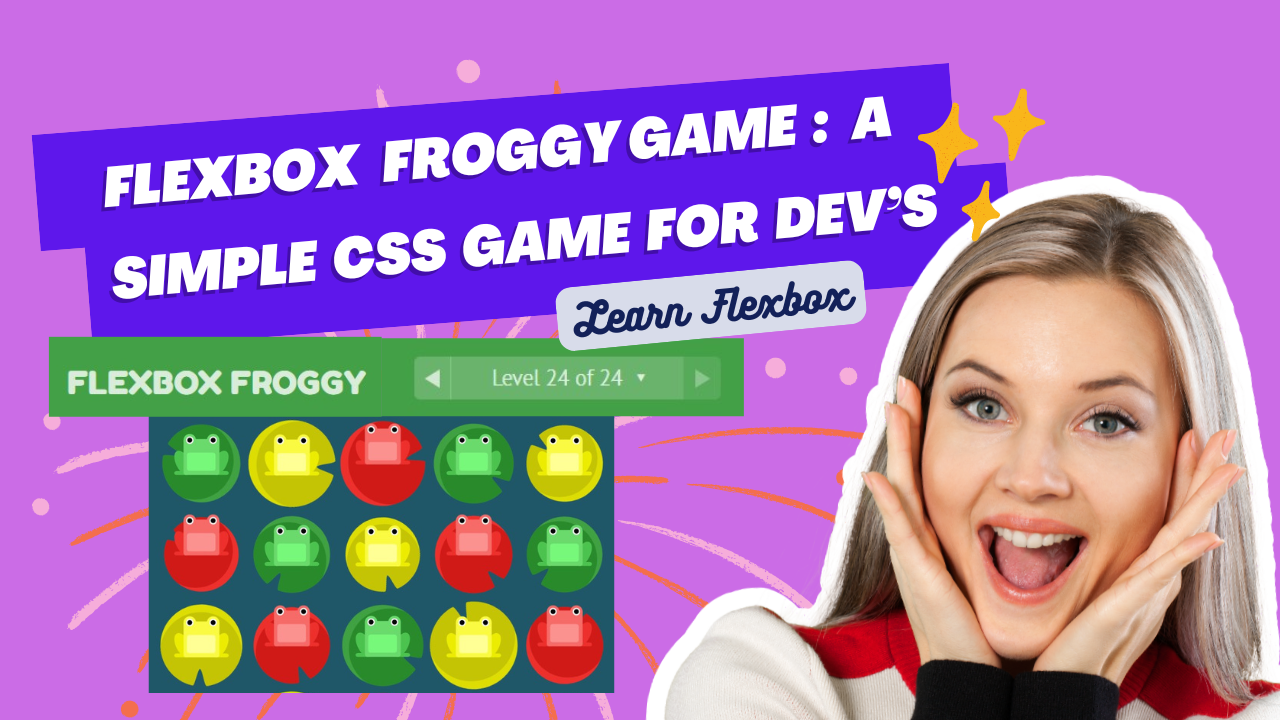
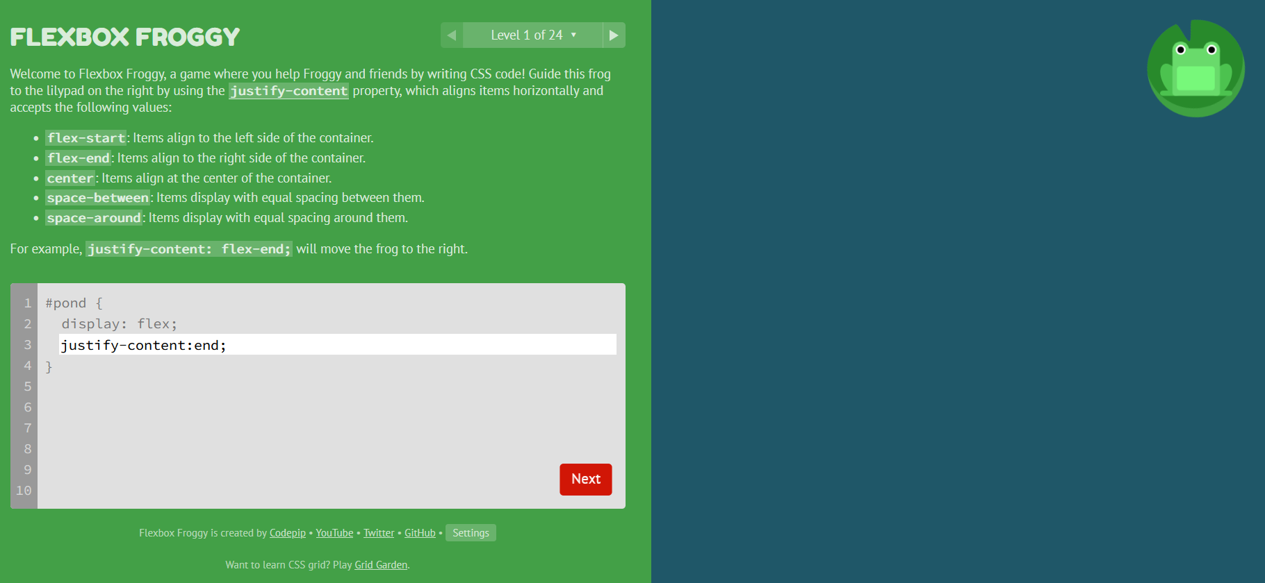
Flexbox Froggy is an interactive, web-based game that helps developers learn CSS Flexbox in a fun and intuitive way. Created by Thomas Park, this educational game teaches you how to use Flexbox properties by guiding a cute little frog to its lily pad. The goal is simple: write the correct CSS code to position Froggy and other frogs on lily pads using various Flexbox rules.
The game consists of 24 levels, each focusing on different Flexbox properties like justify-content, align-items, and flex-direction. As you progress, the challenges become more complex, forcing you to think critically about how different Flexbox properties interact with one another.
Why Flexbox Froggy Stands Out
There are plenty of coding tutorials and resources available, but Flexbox Froggy has some unique elements that make it particularly effective and enjoyable:
Interactive Learning
Most CSS tutorials explain Flexbox through static code snippets, but Flexbox Froggy allows you to see immediate results as you write CSS. This real-time feedback helps reinforce learning by showing the direct impact of each Flexbox property on the layout. You’re not just reading theory; you’re actively solving problems with code.Gamification Makes Learning Fun
The game’s playful approach to coding helps make the often-confusing Flexbox properties more approachable. The simple objective of guiding frogs to their lily pads is both lighthearted and rewarding. Learning becomes a process of trial and error, allowing you to experiment with Flexbox without the frustration of traditional lessons.Gradual Learning Curve
One of the best aspects of Flexbox Froggy is its progressive learning curve. The early levels introduce basic Flexbox properties likejustify-contentandalign-items, which are easy to grasp for beginners. As you advance, more complex topics likeorderandflex-wrapcome into play, preparing you for real-world layout scenarios.Visual Feedback for Deeper Understanding
CSS can be abstract, with properties that don’t always seem to follow logic, especially when combined in intricate layouts. Flexbox Froggy offers visual cues as you progress through each level, making it clear how properties likealign-selforflex-basisaffect individual elements within a flex container. This visual learning greatly improves understanding.
Breaking Down the Game Mechanics
Let’s look at a few key Flexbox properties you’ll master while playing Flexbox Froggy:
justify-content: This property aligns items horizontally within the container. For instance,justify-content: space-around;spreads items evenly, leaving space between and around the items. You’ll use this to move the frogs into their desired horizontal positions.align-items: Whilejustify-contentcontrols horizontal alignment,align-itemsadjusts the vertical alignment of flex items. If you want your frogs to align to the top, middle, or bottom of the pond,align-itemswill help you.flex-direction: Sometimes you’ll need to reverse the order of the frogs or position them vertically instead of horizontally. This is whereflex-directioncomes in handy. You can experiment withrow,row-reverse,column, andcolumn-reverse.order: Ever wondered how to shuffle the order of elements without changing the HTML structure? Theorderproperty allows you to change the positioning of flex items visually without modifying the actual DOM order.align-self: For a more granular control,align-selfallows you to adjust the alignment of individual flex items, overriding thealign-itemsproperty.
Why Flexbox is Crucial for Modern Web Development
Learning Flexbox isn’t just about getting frogs on lily pads; it’s an essential skill for modern web development. As web pages and applications become more complex, developers need a reliable way to create responsive and flexible layouts that work across different devices and screen sizes.
Flexbox shines when dealing with responsive design. Unlike traditional layout methods, such as floats and positioning, Flexbox dynamically adjusts the layout based on the size of the container. This flexibility is invaluable in today’s multi-device landscape, where you need to account for desktops, tablets, and mobile phones.
How to Make the Most Out of Flexbox Froggy
Start Slow: If you’re new to Flexbox, take your time with the early levels. Don’t rush through them, even if they seem easy. These foundational concepts will come in handy as the challenges increase.
Experiment: Try different Flexbox properties and values, even if you think they won’t work. Sometimes the best way to learn is by making mistakes and seeing what happens when things go wrong.
Apply What You Learn: After each session, take what you’ve learned and apply it to a real project. Whether you’re designing a landing page or a web app, implementing Flexbox in practical scenarios will solidify your understanding.
Final Thoughts: The Power of Learning Through Play
Flexbox Froggy turns a dry technical concept into an engaging learning experience. Whether you’re a beginner learning Flexbox for the first time or a seasoned developer looking to refresh your skills, this game offers a unique, hands-on approach that’s both educational and fun. The gamification of coding concepts not only boosts retention but also makes it easier to apply those concepts to real-world projects.
So, if you’re looking for a fun way to improve your CSS layout skills, give Flexbox Froggy a try. You’ll find yourself mastering Flexbox properties without even realizing it—and who knows, you might even start looking forward to your next CSS challenge!
YouTube Video:
This blog not only introduces Flexbox Froggy but also dives into the importance of Flexbox in modern web design, making it highly relevant for developers. Let me know if you’d like to make any changes or add more details !
Happy coding ❤
Subscribe to my newsletter
Read articles from Shubham Sutar directly inside your inbox. Subscribe to the newsletter, and don't miss out.
Written by

Shubham Sutar
Shubham Sutar
"Tech enthusiast and blogger exploring the latest in gadgets, software, and innovation. Passionate about simplifying tech for everyday users and sharing insights on trends that shape the future."
