How to Predict Employee Attrition Using Python and Logistic Regression
 Abdul-Salam Adebayo
Introduction
Have you ever considered what it takes to build a resume-worthy project from the ground up? During my summer internship, I had the remarkable opportunity to delve into data science, which was truly enlightening. The endless nature of data and its omnipresence captivate me and drive my desire to explore this field further. I found a liking to visualizing data because it gives a clearer picture and a deeper meaning to the dataset which truly fascinates me. At the end of my internship, I was tasked with building a project which would truly stand out (resume-worthy).
In this article, I’ll walk you through the process of building a Machine Learning model to predict Employee churn/turnover in a company. Whether you are new to Python or looking to enhance your skills, there’s something here for everyone. Let’s dive in!
Project Overview
Setting up the Environment
Before the actual writing of the code, I had to get my resources ready. I preferred to use Jupyter Notebook to run my code but you can use Google Colab or any IDE like VisualStudio Code. Here is how the whole program went:
Importing and selecting packages
To build this prediction system, I need a couple of Python libraries that would handle various tasks such as arranging datasets in data frame format, visualizing data and so on. Here are the some of key packages I used:
import pandas as pd
import numpy as np
import matplotlib.pyplot as plt
import seaborn as sns
import warnings
warnings.filterwarnings('ignore')
Explanation:
Pandas: Pandas is a powerful Python library used for data manipulation and analysis. It provides data structures like DataFrames, which allow for easy handling and analysis of structured data
Numpy: NumPy is a fundamental package for numerical computing in Python. It offers support for large, multi-dimensional arrays and matrices, along with a collection of mathematical functions to operate on these arrays
Matplotlib: Matplotlib is a widely used plotting library in Python. It enables the creation of static, interactive, and animated visualizations, making it essential for data visualization tasks
Seaborn: Seaborn is a statistical data visualization library built on top of Matplotlib. It provides a high-level interface for drawing attractive and informative statistical graphics
Warnings: Warnings in Python are messages that alert you to potential issues in your code. They don’t stop the execution but inform you about things that might need attention, such as deprecated features or potential errors
Download the Data
The link to download the dataset→ https://drive.google.com/file/d/1t1tC7y_PqeH-i-kMCOSEC77LmgX8jtIm/view
Description of the data
Age: A period of employee life, measured by years from birth.
Attrition: The departure of employees from the organization.
BusinessTravel: Did the employee travel on a business trip or not?
DailyRate: Employee salary for the period is divided by the amount of calendar days in the period.
Department: In which department is the Employee working?
DistanceFromHome: How far the Employee live from the office location.
Education: In education 1 means 'Below College', 2 means 'College', 3 means 'Bachelor', 4 means 'Master', and 5 means 'Doctor'
EducationField: In which field Employee complete his education?
EmployeeCount: How many employees work in a department
EmployeeNumber: An Employee Number is a unique number that has been assigned to each current and former State employee and elected official in the Position and Personnel DataBase (PPDB).
Job involvement: Is the degree to which an employee identifies with their work and actively participates in it where 1 means 'Low', 2 means 'Medium', 3 means 'High', and 4 means 'Very High'
JobLevel: Job levels, also known as job grades and classifications, set the responsibility level and expectations of roles at your organization. They may be further defined by impact, seniority, knowledge, skills, or job title, and are often associated with a pay band. The way you structure your job levels should be dictated by the needs of your unique organization and teams.
JobRole: What is the job role of an employee?
JobSatisfaction: Employee job satisfaction rate where, 1 means 'Low', 2 means 'Medium', 3 means 'High', and 4 means 'Very High'
MaritalStatus: Marital status of the employee.
MonthlyIncome: total monetary value paid by the organization to an employee.
MonthlyRate: The per-day wage of the employee.
NumCompaniesWorked: Before joining this organization how many organizations employees worked?
Over18: Is the employee age over 18 or not?
OverTime: An employee works more than 9 hours on any day or for more than 48 hours on any week.
PercentSalaryHike:
PerformanceRating 1 'Low' 2 'Good' 3 'Excellent' 4 'Outstanding'
EnvironmentSatisfaction 1 'Low' 2 'Medium' 3 'High' 4 'Very High'
RelationshipSatisfaction 1 'Low' 2 'Medium' 3 'High' 4 'Very High'
StandardHours: This is the number of hours of production time that should have been used during a working period.
StockOptionLevel: Employee stock options, also known as ESOs, are stock options in the company’s stock granted by an employer to certain employees. Typically they are granted to those in management or officer-level positions. Stock options give the employee the right to buy a certain amount of stock at a specific price, during a specific period of time. Options typically have expiration dates as well, by which the options must have been exercised, otherwise they will become worthless.
TotalWorkingYears: Total years the employee working in any organization
TrainingTimesLastYear: Last year how many times employees took training sessions?
WorkLifeBalance 1 'Bad' 2 'Good' 3 'Better' 4 'Best'
YearsAtCompany: How many years has the employee working in the current organization
YearsInCurrentRole: How many years has the employee working in the current position
YearsSinceLastPromotion: How many years has the employee working in the current position after promotion
YearsWithCurrManager: How many years has the employee working under the current manager
Reading the file
We can read the content of the file in a single line of code by using the pandas method pd.read_csv to read CSV files and store them in a data frame
df = pd.read_csv('Employee-Attrition.csv')
df
Check for Duplicates and Null Values
We can check for duplicates in our data frame using :
# Check for duplicates
df.duplicated().value_counts()
# Check for null values
df.isnull().sum()
We can also gather more insights from the data by using df.info() to check for null values, data types, shape of the data frame
Visualizing Attrition
Since what we are trying to achieve(target variable) is ‘Attrition’, Let us visualize it so we know how much Attrition there is in this dataset.
plt.figure(figsize = (15, 5))
plt.rc("font", size=14)
sns.countplot(y = 'Attrition', data = df, palette='viridis')
plt.show()
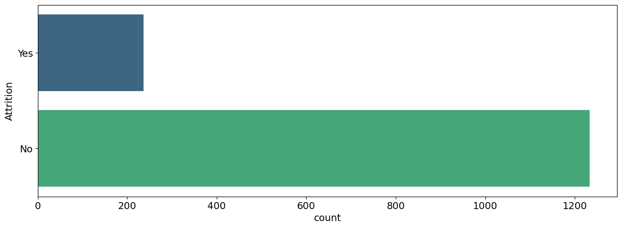
Over here we noticed that the Target column is Highly Imbalanced, we need to balance the data by using some Statistical Methods.
Exploratory Data Analysis (EDA)
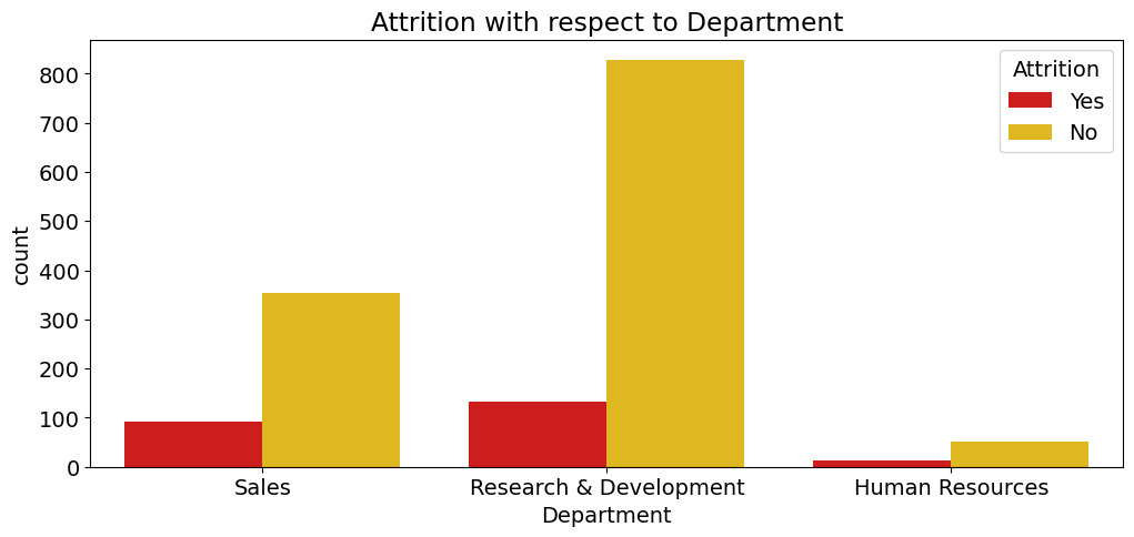
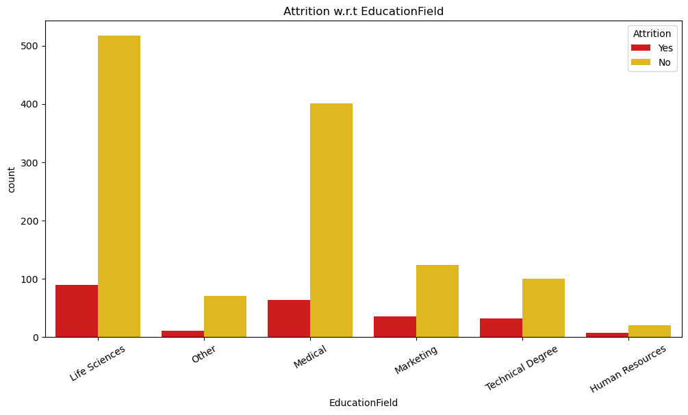
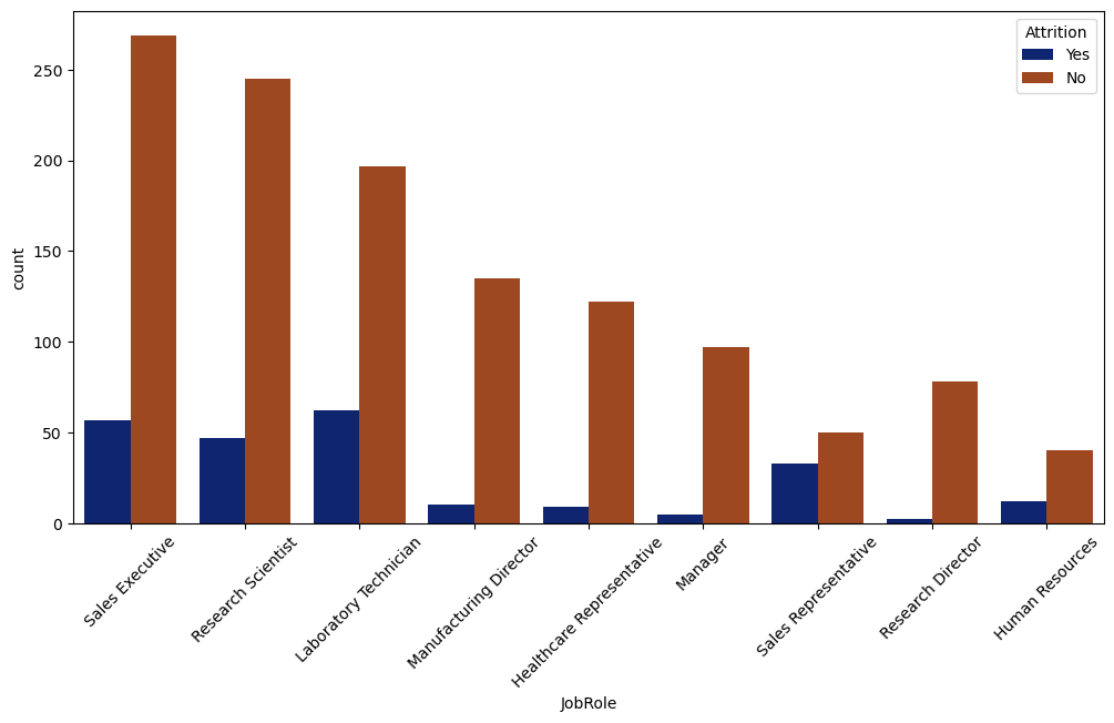
Here we are trying to visualize the various factors that can hinder attrition.
# Attrition wrt Deartment
plt.figure(figsize=(12,5))
sns.countplot(x='Department',hue='Attrition', data=data, palette='hot')
plt.title("Attrition w.r.t Department")
plt.show()
# Attrition wrt Education Field
plt.figure(figsize=(12,5))
sns.countplot(x='EducationField',hue='Attrition', data=data, palette='hot')
plt.title("Attrition w.r.t EducationField")
plt.xticks(rotation=45)
plt.show()
# Attrition w.r.t JobRole
plt.figure(figsize=(12,5))
sns.countplot(x='JobRole',hue='Attrition', data=data, palette='hot')
plt.title("JobRole w.r.t Attrition")
plt.legend(loc='best')
plt.xticks(rotation=45)
plt.show()
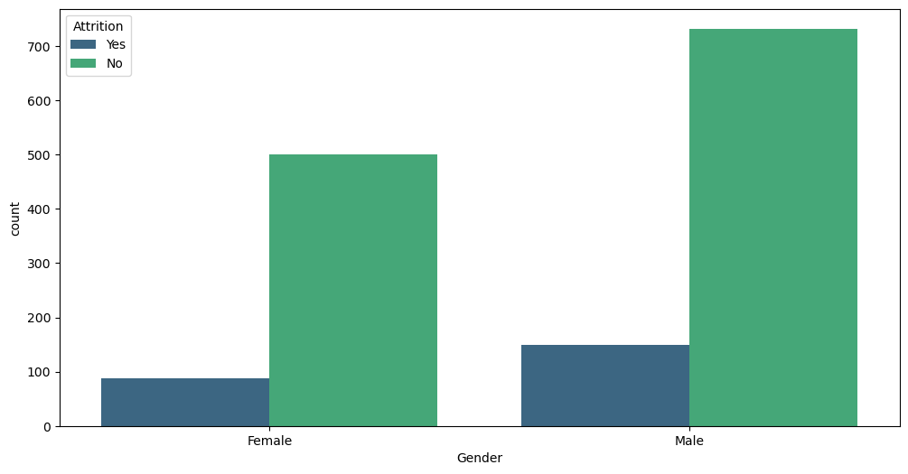
# Attrition wrt Gender
plt.figure(figsize=(12,5))
sns.countplot(x='Gender',hue='Attrition', data=data, palette='hot')
plt.title("Gender w.r.t Attrition")
plt.legend(loc='best')
plt.show()
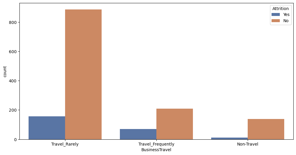
# Attrition w.r.t Business Travel
plt.figure(figsize= (12, 6))
sns.countplot(x = 'BusinessTravel', hue = 'Attrition', data = df, palette = 'deep')
plt.show()
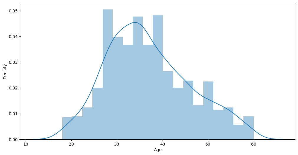
# age distribution
plt.figure(figsize= (12, 6))
sns.distplot(df['Age'])
plt.show()
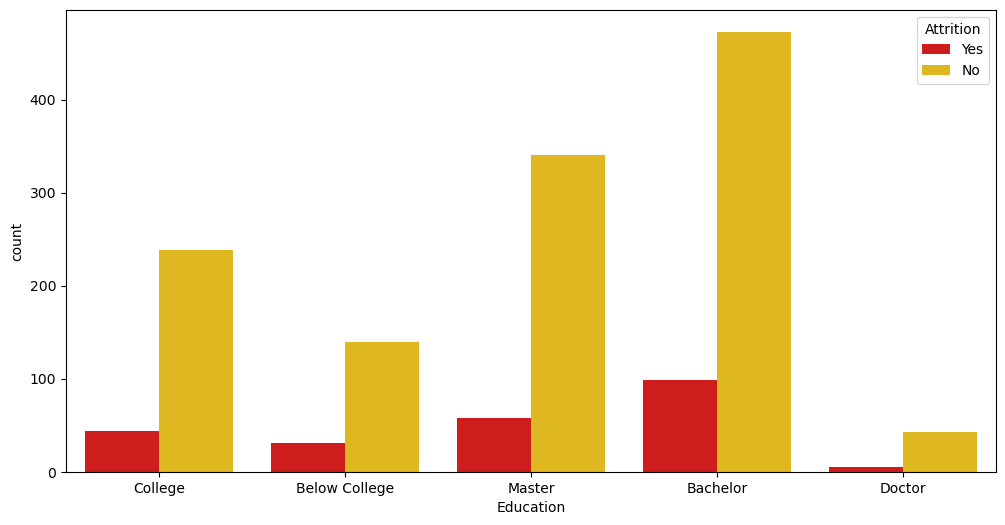
Plotting Attrition against Education
if you’ve noticed, the education column has ordinal values. We got this from the information about the dataset. So to plot this we need to map the current values(int) to (str), making it easier to understand and plot.
# Count plot of Attrition with respect to Education
education_mapping = {1 : 'Below College', 2 : 'College', 3 : 'Bachelor', 4 : 'Master', 5 : 'Doctor'}
plt.figure(figsize = (12, 6))
sns.countplot(x = df['Education'].map(education_mapping), hue = 'Attrition', data = df, palette = 'hot')
plt.show()
We can also map these Columns to make it easier for the machine to understand. (Our end goal is to make all data in the data frame (int))
# Target Variable(Attrition)
data['Attrition'] = data['Attrition'].replace({'No':0,'Yes':1})
#encode binary variables
data['OverTime'] = data['OverTime'].map({'No':0,'Yes':1})
data['Gender'] = data['Gender'].map({'Male':0,'Female':1})
df['Over18'] = df['Over18'].map({'Y' : 1, "N" : 0})
Label Encoding
In machine learning, we usually deal with datasets that contain multiple labels in one or more than one column. These labels can be in the form of words or numbers. To make the data understandable or in human-readable form, the training data is often labelled in words but the computer only understands integers so we have to encode the (object) to (int).
from sklearn.preprocessing import LabelEncoder
encoding_cols=['BusinessTravel','Department','EducationField','JobRole','MaritalStatus']
label_encoders = {}
for column in encoding_cols:
    label_encoders[column] = LabelEncoder()
    data[column] = label_encoders[column].fit_transform(data[column])
Machine Learning: Splitting the data into Training and Testing sample
We don’t use the full data for creating the model. Some data is randomly selected and kept aside for checking how good the model is. This is known as Testing Data and the remaining data is called Training data on which the model is built. Typically 70% of data is used as Training data and the rest 30% is used as Testing data.
X = data.drop(['Attrition','Over18'], axis=1)
y = data['Attrition'].values
# We dropped the Over18 column because we don't need it because we already have an age column
Resampling
Resampling is the method that consists of drawing repeated samples from the original data samples. Oversampling and undersampling in data analysis are techniques used to adjust the class distribution of a data set. These terms are used both in statistical sampling, survey design methodology and in machine learning. Oversampling and undersampling are opposite and roughly equivalent techniques. We are going to use OverSampling to avoid data loss because we only use UnderSampling when we have a large dataset
from collections import Counter
from imblearn.over_sampling import RandomOverSampler
print(Counter(y))
rus = RandomOverSampler(random_state = 42)
X_over, y_over = rus.fit_resample(X,y)
print(Counter(y_over))
# Split the data into training and testing set
from sklearn.model_selection import train_test_split
X_train, X_test, y_train, y_test = train_test_split(X_over, y_over, test_size=0.2, random_state=42)
Logistic Regression in Machine Learning
Logistic Regression is used for predicting a category, especially the Binary categories(Yes/No, 0/1). For example, whether to approve a loan or not (Yes/No)? Which group does this customer belong to (Silver/Gold/Platinum)? etc. When there are only two outcomes in Target Variable it is known as Binomial Logistic Regression.
If there are more than two outcomes in Target Variable it is known as Multinomial Logistic Regression.
from sklearn.linear_model import LogisticRegression
from sklearn.metrics import confusion_matrix, accuracy_score, roc_curve, roc_auc_score
logreg = LogisticRegression()
logreg.fit(X_train, y_train)
Prediction & Accuracy & Classification Report
Making Predictions Using the Test Sets, finding the accuracy and showing the classification report
prediction = logreg.predict(X_test)
print("The Accuracy Score-> ", accuracy_score(y_test, prediction))
precision = precision_score(y_test, prediction)*100
recall = recall_score(y_test, prediction)*100
f1score = f1_score(y_test, prediction)*100
print(f"Precision Value-> {precision}%, Recall Value-> {recall}% F1 Score-> {f1score}%")
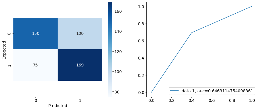
Making two subplots
1.) A confusion matrix to show how well the model predicted
2.) A plot showing the area under the curve on the accuracy plot
fig = plt.figure(figsize = (15,6))
ax1 = fig.add_subplot(1,2,1)
ax1 = sns.heatmap(pd.DataFrame(cnf_matrix), annot = True, cmap = 'Blues', fmt = 'd')
bottom, top = ax1.get_ylim()
ax1.set_ylim(bottom + 0.5, top - 0.5)
plt.xlabel('Predicted')
plt.ylabel('Expected')

ax2 = fig.add_subplot(1,2,2)
y_pred_proba = logreg.predict_proba(X_test)[::,1]
fpr, tpr, _ = roc_curve(y_test,  prediction)
auc = roc_auc_score(y_test, prediction)
ax2 = plt.plot(fpr,tpr,label="data 1, auc="+str(auc))
plt.legend(loc=4)
plt.show()
Conclusion
Building this project served as an opportunity to assess my progress in understanding and utilizing various libraries. It allowed me to deepen my knowledge of Exploratory Data Analysis (EDA) and Logistic Regression, and to apply these techniques to real-world data sets.
Reflecting on this project, I’ve realized the importance of choosing the right tools and technologies that align with the specific goals of the project. The ability to work with a diverse tech stack and see the model’s performance was both challenging and rewarding.
If you’re interested in building your model or have any questions about the process, I’d love to hear from you! Thank you for reading and don’t forget to clap! You can connect with me here on Instagram or WhatsApp
Subscribe to my newsletter
Read articles from Abdul-Salam Adebayo directly inside your inbox. Subscribe to the newsletter, and don't miss out.
Written by
