Display Property in CSS
 dheeraj koranga
The display property in CSS determines how an element is displayed on a webpage. It defines the type of box that an element generates. The most common values for the display property are inline, block, inline-block, and flex
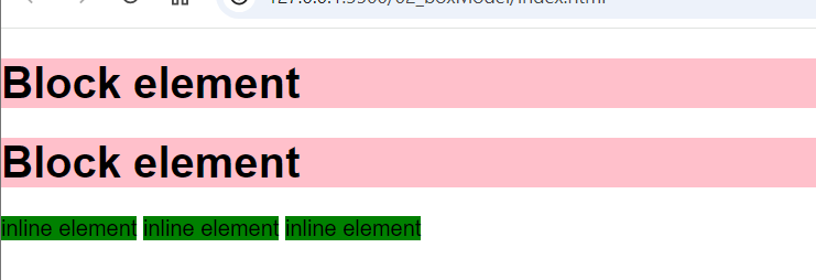
h1{
    background-color: pink;
}
span{
    background-color: green;
}

- Before applying
display: inlineproperty the block element take whole width as usual
h1{
    background-color: pink;
    display: inline;
}
span{
    background-color: green;
    display: block;
}

- after applying
display: inlinethe block element behave as inline and inline element behave as block element
1. display: inline
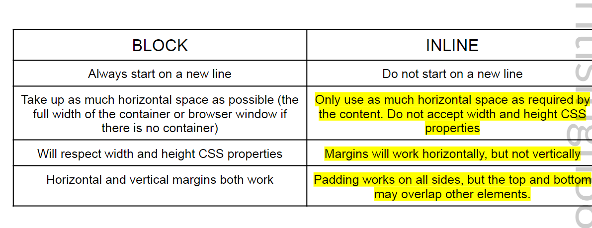
An element with display: inline does not start on a new line and takes only as much width as necessary. It cannot have a width and height set, and margins and paddings will only push the content but won’t affect the surrounding elements significantly.
- Example elements:
<span>,<a>,<strong>,<em>
Characteristics:
Does not start on a new line (stays in the same line as neighboring inline elements).
Width and height properties are ignored.
Padding and margin are applied, but they don’t push away other elements.
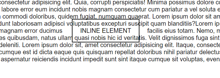
span{
    height: 50px;
    width: 50px;
    border: 2px solid black;
    padding:20px;
    margin: 20px;
}

width and height properties are ignored ( you can see the content is same as other text, with no change in height and width)
Margin is applied horizontally, ( the top and bottom margins don’t work and only the horizontal margin is working )
Padding ( top and bottom paddings overlap the elements and the right and left padding works properly )
2. display: block
An element with display: block starts on a new line, and it takes up the entire width available (as wide as its container) unless a specific width is set. Block elements can have their width, height, padding, and margins adjusted.
- Example elements:
<div>,<p>,<h1>to<h6>,<section>
Characteristics:
Starts on a new line (takes up the full width of its container by default).
Width, height, margin, and padding properties can be applied.
Can contain other block or inline elements.

3. display: inline-block
An element with display: inline-block is like an inline element (does not start on a new line), but it behaves like a block element in that it can have width, height, margin, and padding properties applied. It’s commonly used for creating layouts where you need elements to be on the same line but with individual sizing.
- Example elements: Commonly used with custom elements like buttons or images.
Characteristics:
Does not start on a new line (stays in line with other inline or inline-block elements).
Width and height can be set.
Margins and paddings are respected and applied.
Often used for creating grid layouts without flexbox.
div{
    height: 200px;
    width: 200px;
    background-color: green;
    border: 2px solid black;
    margin: 5px;
    display: inline;
}

- if you apply display: inline to block elements then it will ignore its height and width as you can see in the above example. To display the block element in inline and also want to retain the height and width then we will use display inline-block

- applying
display: inline-blockyou can see the result, all the block element are displayed in the inline and don’t lost any property.
4. display: flex ( we will read this in detail in upcoming blogs)
The flexbox model (display: flex) is used for creating flexible, responsive layouts. When an element is set to display: flex, it becomes a flex container and its child elements become flex items. This allows for dynamic control over the alignment, distribution, and sizing of child elements inside the container.
- Example usage: Creating responsive navbars, footers, or grids of items.
Characteristics:
Creates a flexible container that adjusts child elements (flex items) based on available space.
Child elements can be arranged horizontally (
flex-direction: row) or vertically (flex-direction: column).Powerful for building responsive layouts with minimal code.
Key Flexbox Properties:
justify-content: Aligns flex items along the main axis (horizontally by default).align-items: Aligns flex items along the cross-axis (vertically by default).flex-wrap: Controls whether items should wrap to the next line or stay on the same line.
Comparison of inline, block, inline-block, and flex
| Property | inline | block | inline-block | flex |
| Starts on a new line? | No | Yes | No | No |
| Width & height applied? | No | Yes | Yes | Yes |
| Can contain block elements? | No | Yes | No | Yes |
| Common uses | Text formatting,links | Layout, containers, sections | Buttons, images, flexible layouts | Responsive layouts, navigation bars |
Subscribe to my newsletter
Read articles from dheeraj koranga directly inside your inbox. Subscribe to the newsletter, and don't miss out.
Written by
