Box-Shadow Property
 dheeraj koranga
The box-shadow property in CSS adds shadow effects around an element’s frame. It is a versatile property that allows you to create various shadow effects by adjusting its values.
Syntax of box-shadowelement {
box-shadow: offset-x offset-y blur-radius spread-radius color inset;
  }
Each part of the box-shadow syntax represents a different aspect of the shadow:
offset-x(required): Defines the horizontal distance of the shadow from the element. Positive values shift the shadow to the right, and negative values shift it to the left.offset-y(required): Defines the vertical distance of the shadow from the element. Positive values shift the shadow downward, and negative values shift it upward.blur-radius(optional): Defines how much the shadow should blur. The higher the value, the more blurry the shadow becomes. If omitted, the default is0(sharp shadow with no blur).spread-radius(optional): Defines how much the shadow should expand or contract. Positive values increase the size of the shadow, while negative values make it smaller. Default is0.color(optional): Specifies the color of the shadow. If omitted, it defaults to the current color of the element.inset(optional): Changes the shadow to an inner shadow, making it appear inside the element rather than outside. By default, the shadow is an outer shadow.
div {
    background-color: rgb(255, 255, 255);
    height: 100px;
    width: 100px;
    margin : auto;
    border: 2px red solid;
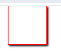
    box-shadow: 3px 3px 5px black;
}

Inner Shadow (Inset Shadow)
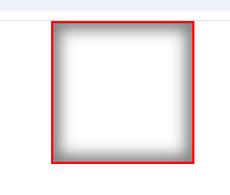
The inset keyword places the shadow inside the element, creating an inner shadow effect.
div {
    background-color: rgb(255, 255, 255);
    height: 100px;
    width: 100px;
    margin : auto;
    border: 2px red solid;
    box-shadow: inset 0px 0px 10px 5px rgba(0, 0, 0, 0.5);
}
This creates a shadow inside the element with:
No offset (centered inside the element).
10px blur.
5px spread.
Semi-transparent black color.

Multiple Shadows
You can apply multiple shadows to an element by separating each shadow with a comma.
div {
    background-color: rgb(255, 255, 255);
    height: 100px;
    width: 100px;
    margin : auto;
    border: 2px red solid;
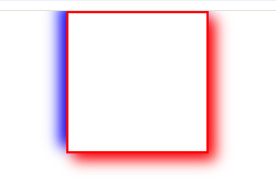
    box-shadow: 5px 5px 10px red, -5px -5px 10px blue;
}

In this example:
The first shadow is 5px to the right, 5px down, with a 10px blur and a red color.
The second shadow is 5px to the left, 5px up, with a 10px blur and a blue color.
Summary
box-shadowadds a shadow to an element, and you can control its position, blur, spread, and color.insetcreates an inner shadow.You can stack multiple shadows by separating them with commas.
Subscribe to my newsletter
Read articles from dheeraj koranga directly inside your inbox. Subscribe to the newsletter, and don't miss out.
Written by
