What is Interaction Design and it's Principle?
 Ravi Gurung
Interaction design is all about making it easy and natural for people to use digital products, like websites or apps. It does this by giving feedback when users interact, such as showing animations when they scroll, changing the look of buttons when clicked, or transition between multiple pages.
Interaction design also called IxD, uses things like animations, small interactive details, text, colors, and layout to guide how people feel and act while using the product. Basically, it is all about helping to create a better overall experience.
The goal of interaction design is to create a user experience that makes interacting with technology easy and enjoyable. It involves understanding user needs, behaviors, and expectations to design interfaces that are both functional and fun to use.
How the interaction design helps on engaging user?
When we use an app or website, we follow steps based on what we want to do. Each time we take an action or enter information, the computer responds. When we do something else, it reacts again according to the action performed. Interaction design makes this process feel easy and smooth, like a conversation between us and the computer, rather than the computer just telling us what to do.
UI elements, micro-interactions, and navigation options helps to guide users through tasks. Interaction design not only arranges these elements but also predicts user behavior.
According to Usability.gov, designers should consider:
Are the elements sized properly for easy interaction?
Do menus and navigation options appear in expected places, like corners or edges?
Are familiar design patterns used to help users navigate smoothly?

What are the Interaction Design Principles?
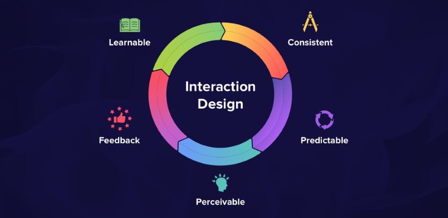
According to the book “The Design of Everyday things” by Don Norman, father of UX also co-founder of NN Group these are some principles of IxD Design.
Visibility
With many features and limited space, making sure key elements are visible is a big design challenge. Don Norman's theory says that the more visible something is, the more likely users will notice and use it. Interaction designers need to balance making important features easy to find while considering user needs and business goals.

A common example is prioritizing segmented button on mobile devices. Designers choose which section to show and which ones to hide.
Feedback
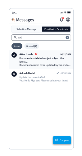
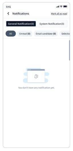
Feedback is how a digital product communicates with users. Interaction designers can show this feedback using animations, touch responses, sounds, or text.
Designers must also consider accessibility, making sure feedback is clear and usable for everyone
Constraints
Cluttered UIs with too many options can confuse users and cause usability issues. Good interaction design makes the user experience simpler by limiting actions and guiding users through the product more effectively.
This is clear on landing pages, where designers remove extra navigation, links, and other distractions. By focusing on a single, clear call-to-action (CTA) or form, users are encouraged to engage with the content that leads to conversions.
Consistency
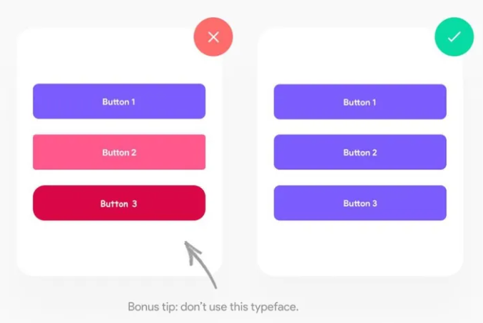
Consistency is crucial in interaction and UI design. Inconsistent designs can confuse users and cause usability problems. Designers must ensure a uniform experience within the interface and across different screen sizes and devices.
To keep things consistent, many organizations create a design system or use an open-source component library. These tools offer standardized UI patterns and interactions, letting designers focus on improving the user experience instead of making the same design decisions repeatedly. This approach helps users achieve their goals more efficiently.

Mapping
Interaction designers need to make sure there's a clear link between controls and their effects on a digital product, so users find it natural.
For example, on an iPhone, the top button raises the volume, and the bottom button lowers it. This simple layout means users don't have to remember which button does what.
The more intuitive and simple a product is, the easier and more enjoyable it is to use.
Affordance
Affordance shows users how to interact with a UI element or perform an action. It's the interaction designer's job to make sure it's clear how to use these elements to complete tasks.

For example, using different colors and underlines for links makes it obvious which text is clickable. Also, disabled submit button seen on UI indicates that users need to fill out all required fields before submitting the form.
Conclusion
In conclusion, good interaction design relies on key principles that help users navigate digital experiences easily. Visibility makes sure important elements are easy to see and access. Consistency keeps the experience uniform across different contexts and devices. Affordance shows users how to use various UI elements. Mapping aligns controls with their functions in an intuitive way. Constraints streamline user actions, focusing their attention and preventing errors. Feedback confirms user actions and guides them through interactions. By using these principles well, designers can create intuitive, engaging, and effective digital products that improve user satisfaction and drive success.
Subscribe to my newsletter
Read articles from Ravi Gurung directly inside your inbox. Subscribe to the newsletter, and don't miss out.
Written by
