Top 5 UX Metrics Frameworks to measure your design performance
 Lollypop Vietnam
As designers, we use a complex design thinking process to create solutions, which is an ongoing endeavor. In theory, every small component in a product can be improved, and it takes a considerable amount of time, effort, and skill to move from a design problem to a solution.
We all understand that User Experience (UX) focuses on the design and usability of a website, application, digital product, or service. Good UX means that the user can solve their problem or fulfill their need with ease, leading to higher user satisfaction, greater user loyalty to your brand, and an easier decision to make a purchase and increase profit.
To judge whether a product's UX is good or bad, relying solely on the designer's subjective perspective is not enough to reflect properly. Instead, a more objective approach is to collect opinions from users and apply metrics used by UX experts. Only by recording and analyzing data from user interactions with the product can we determine if the design is truly effective for users.
Crafting a delightful user experience goes beyond simply understanding the project's requirements and business goals. To truly gauge the success of a UX project, we must delve into the minds of our users and comprehend how and why they interact with our product. This requires a keen eye for UX metrics and UX KPIs, which allow us to quantitatively measure the success of our product. By skillfully employing these metrics, we can accurately assess how effective our user's journey is and ensure that every interaction with our product is a joyous and rewarding experience.
In this blog post, we will guide you through the process of understanding why measuring UX metrics is crucial, how to use them to measure and evaluate the UX performance of design products, and review the top five performance measurement frameworks for achieving design excellence.
After reading this blog post from Lollypop Vietnam, you will be able to discover:
WHAT the two main types of UX metrics are and how do they differ from each other.
WHEN to use UX metrics to measure user experience and in which cases they are most effective.
HOW to use a UX metrics framework to evaluate the success of a UX project and ensure optimal user experience.
Why do we need to measure UX?
In a competitive market where users have countless options at their fingertips, your product must not only meet their needs but also captivate them on an emotional and cognitive level. Simply satisfying users is not enough; you must strive to make their experience effortless, intuitive, and memorable. As the wise economist Peter Drucker once said, "You cannot improve what you do not measure." This statement holds particularly true when it comes to enhancing the user experience of your product. Here's why measuring UX is essential:
Understand user preferences: UX metrics measure satisfaction and highlight areas for improvement.
Improve usability: Analyzing metrics like task success, errors, and bounce rates inform data-driven decisions for enhancing usability.
Track progress: Regularly measuring UX metrics enables setting targets and evaluating design iterations.
Make informed decisions: Better user experiences are the result of using objective metrics to provide UX insights for data-driven decision-making.
Remember, measuring UX is crucial for enhancing products and meeting user needs. Start evaluating your UX now to unlock your product's full potential.
How do behavioral and attitudinal UX metrics differ from one another?
UX metrics, also known as usability or product experience (PX) metric, allows you to measure, compare, and track the user experience of a website or app. This enables you to make informed decisions about how to improve the user experience. UX KPIs are generally divided into two categories of metrics: behavioral (what users do) and attitudinal (what users say).
Quantitative behavioral metrics are a type of metric that measures the actions that users take while interacting with a product or service, such as time on task, page views, error rate, and bounce rate.
Qualitative attitudinal metrics gauge user sentiment towards your product or service, including brand association, loyalty, satisfaction, usability, and credibility. These metrics rely on user feedback, such as SUS (System Usability Scale), CSAT (Customer Satisfaction), and NPS (Net Promoter Score).
Behavioral UX metrics
Understanding user behavior and how they interact with a product is a fundamental aspect of user research, in which task-based usability testing is a widely recognized method for collecting this crucial information. Behavioral UX metrics focus on observing and analyzing user actions during interactions with a digital product. These metrics can be collected through lab testing or analytics tools and provide valuable insights into user activities.
Time on task
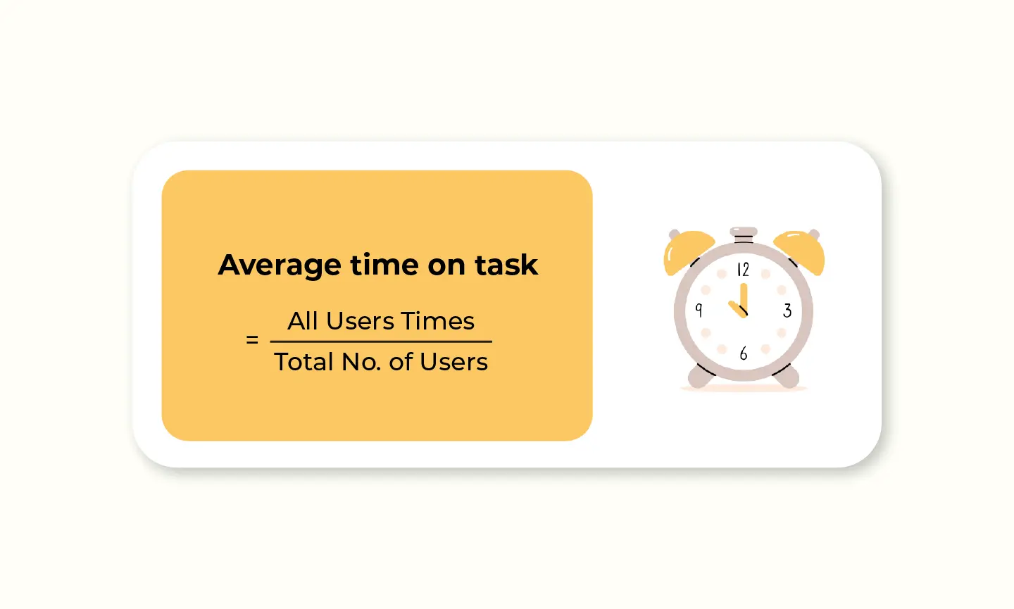
Time spent on task, also known as task time or time on task, is a metric that measures the average time users spend on completing specific tasks within a mobile app or website, usually in absolute units such as seconds, minutes, or hours. Due to various factors, different users may have different completion times for the same task. In general, the less time a user spends on a task, the better the UX of your product, as the numbers can reveal UX insights about the efficiency and intuitiveness of the design. If your customers spend too much time on tasks in your product, it could indicate that an interaction or function is not properly designed.
Measuring time spent on a task helps you:
Identify usability issues to do a design audit on your website or app interface
Define the difference between customer lag time and system lag time, especially when a customer perceives time subjectively during task completion
To fill the emotional gap left by time on task, session recordings can add context by showing you individual users' journeys from page to page. You can see how they experience your site and how they behave on tasks, where they get stuck, distracted, confused, or frustrated.
Pageviews
Pageviews are an engagement metric used by marketers to indicate the number of pages a user has viewed on a website within a specific period of time. This metric helps identify what content on the website users are interested in and whether they have difficulty finding certain information.
To gain a better understanding of user behavior, it is recommended to combine pageviews with other metrics to provide more context. For example, in mobile apps, a combination of clicks, taps, number of screens, or steps with pageviews can provide a more comprehensive picture of the meaning of each user activity.
Task Success Rate
The task success rate is one of the most important UX metrics that UX/UI designers should consider when evaluating the effectiveness of their designs. It measures the percentage of participants who successfully complete a specific task or achieve their goals, which can help designers identify areas for improvement.
For example, completing a checkout process or adding a product to the shopping cart are tasks that can be measured using this metric. However, it's important to keep in mind that the task success rate alone doesn't explain how well users perform tasks or the reasons why they fail them.
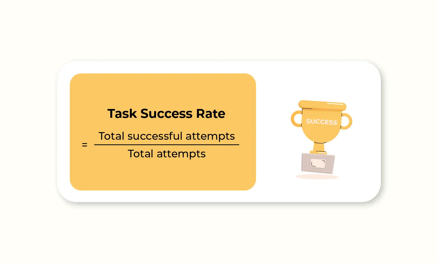
For example, if you conducted a usability test where participants attempted a task, and out of 50 participants, 29 successfully completed the task, the task success rate would be (29/50) * 100 = 58%
To get accurate results, designers should gather data from as many users as possible. Additionally, it's recommended to track whether users complete the task for the first time, as this can provide valuable UX insights into how their experience changes over time.
Error rate
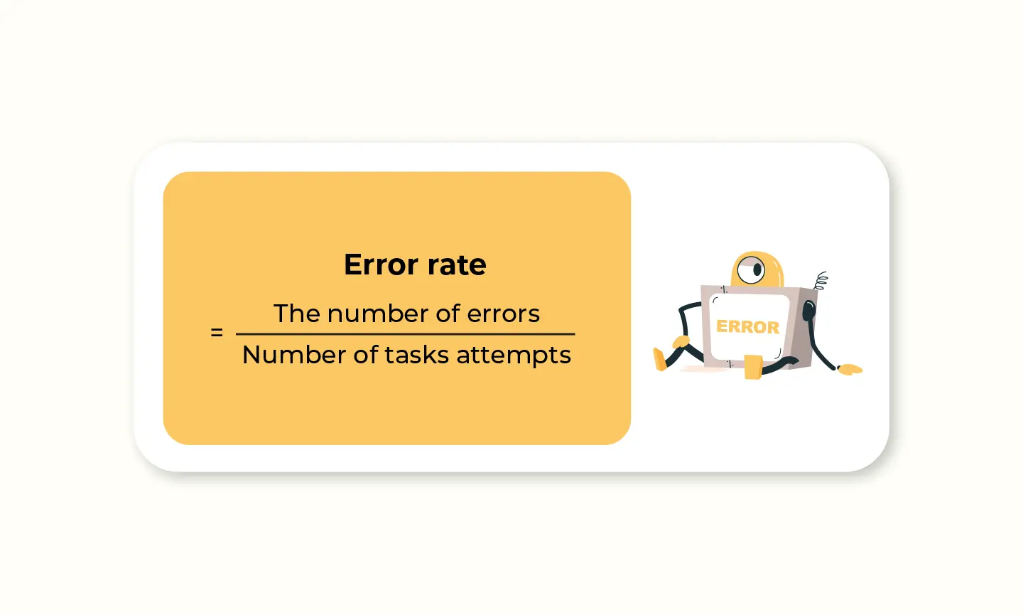
The error rate is the frequency at which users encounter obstacles when using your product and fail to complete a task they intended to do. It indicates how easy or difficult your product is to use. High error rates suggest usability issues, so it's crucial to determine what actions should be considered errors.
These may be related to UI/UX design, additional features, workflow, and more. For example, users might accidentally select the wrong action in the user interface, or make an unsuccessful attempt to fill out lead forms on a landing page.
Bounce Rate
When it comes to evaluating user retention, metrics such as time on page are contrary to bounce rate. Bounce rate measures the percentage of users who land on a page and then give up on a task without further interaction. This can affect the way users feel, making them annoyed and less patient than they expected. A high bounce rate may indicate issues with content relevance, user interface design, or usability.
You can collect data for behavioral metrics in web analytics or application analytics. Google Analytics is a well-known tool for web analytics, and Mixpanel is a popular tool for application analytics. These tools can track user sessions, recordings on the site, heatmaps, bug tracking, and more, making it an easy and inexpensive way to start tracking UX metrics.
Alternatively, you can track these metrics using other UX research methods, such as observation, A/B testing, eye tracking, and usability testing.
To fully understand why users bounce, it is important to combine this metric with some attitudinal metrics. This provides a complete picture of why you are getting these numbers.
Do you know about: The Power of the UX Pyramid in User-Centered Design
Attitudinal UX metrics
Attitudinal metrics can help you quantify qualitative data and understand how users perceive your product including what they say and how they feel about it. These metrics can be quantified through various labels, such as adoption (which features are most used), satisfaction (how much users enjoy the product), credibility (how much users trust the service), and loyalty (how likely users are to use the service again).
SUS (System Usability Scale)
The System Usability Scale (SUS), a widely recognized UX measurement tool developed by John Brooke in 1986, has become an industry standard for assessing users' perceptions of system usability. It involves a questionnaire-based survey with 10 questions, where users rate their agreement on a scale of 1 to 5. SUS scores above 68 are considered above average, while anything below 68 indicates a need for optimization.
UX designers and researchers widely utilize SUS as a valuable tool in their arsenal. The survey-based approach involves presenting users with 10 questions, asking them to rate their agreement on a scale of 1 to 5, from strongly disagree to strongly agree.
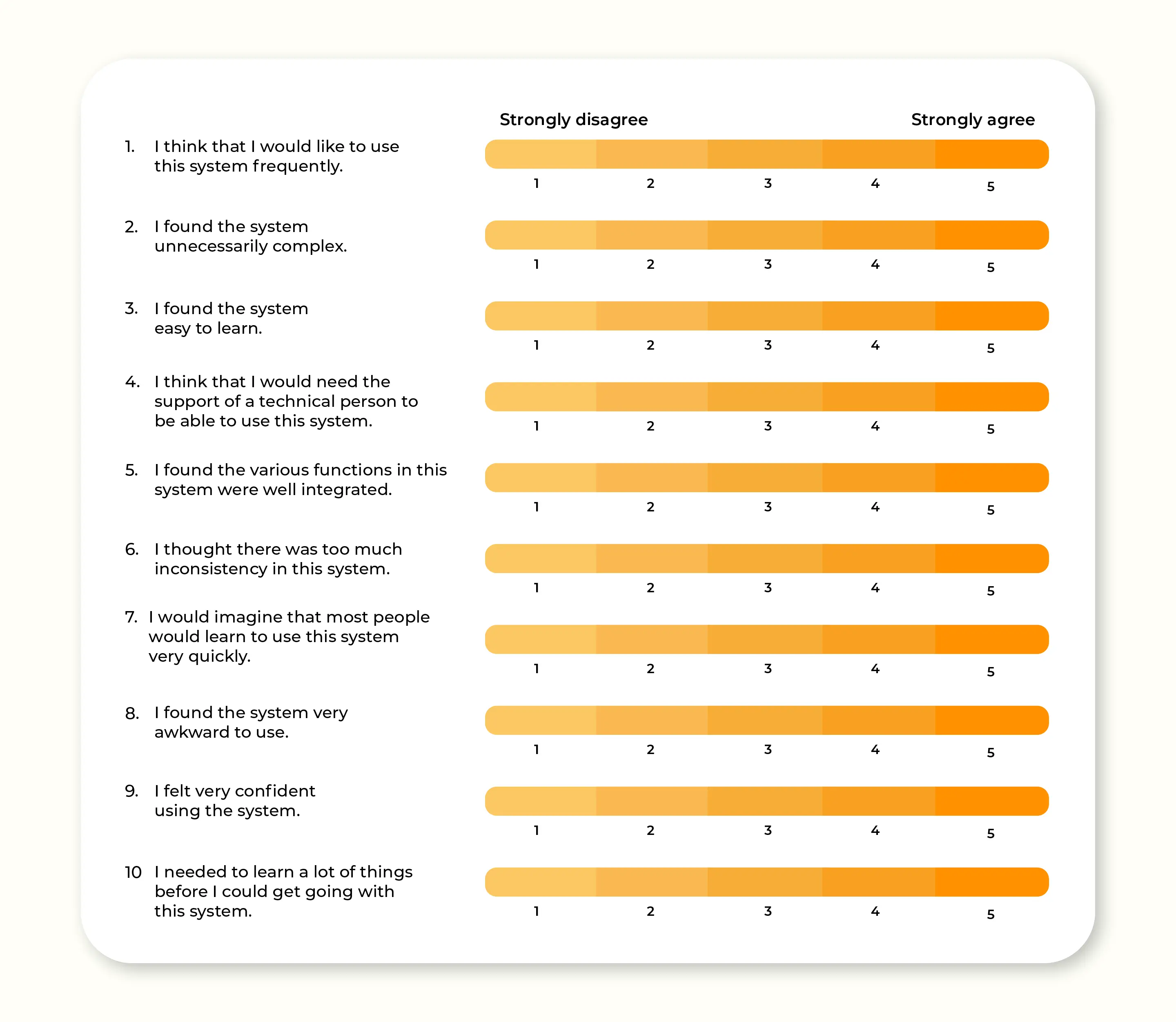
While SUS is straightforward to administer and can be applied to small user samples or test cases, it's important to note that the scoring system itself can be complex and lacks diagnostic capabilities. It shouldn't be seen as a replacement for a dedicated user research team, as it doesn't provide in-depth insights into why users may rate a system poorly.
To truly understand and address the reasons behind low SUS scores, it is essential to complement it with data-driven insights from comprehensive user research. This combination empowers designers to uncover the underlying issues affecting system usability and make informed decisions for improvement.
CSAT (Customer Satisfaction Score)
The Customer Satisfaction (CSAT) Score is a key indicator of the overall level of user satisfaction with your product, from its features to its app functionality.
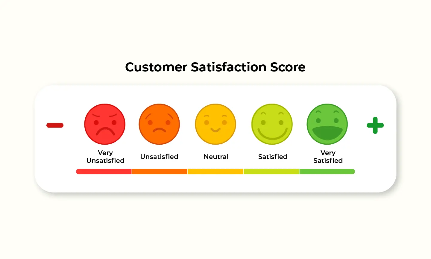
Typically, CSAT is collected through questionnaires or online surveys, where users rate their experience on a satisfaction scale. They are then asked whether they would recommend the brand, product, or service to their friends, family members, or other contacts. This score provides insights into user sentiment and can offer both a general overview and specific details about how well a product or service fulfills customers' expectations at different stages of the customer journey.
The CSAT scale is commonly based on a Likert scale or a smiley face rating system, ranging from 1 (very unsatisfied) to 5 (very satisfied). To calculate the percentage of satisfied users, divide the total number of satisfied users (those who rated 4 or 5) by the total number of respondents and multiply by 100.
NPS (Net Promoter Score)
Net Promoter Score (NPS) is a user loyalty metric that was introduced by Fred Reichheld, the founder of Bain & Company. This score unveils the likelihood of users recommending your company, product, or service to their inner circle. Brace yourself for a journey into customer loyalty and the almighty influence of word-of-mouth referrals.
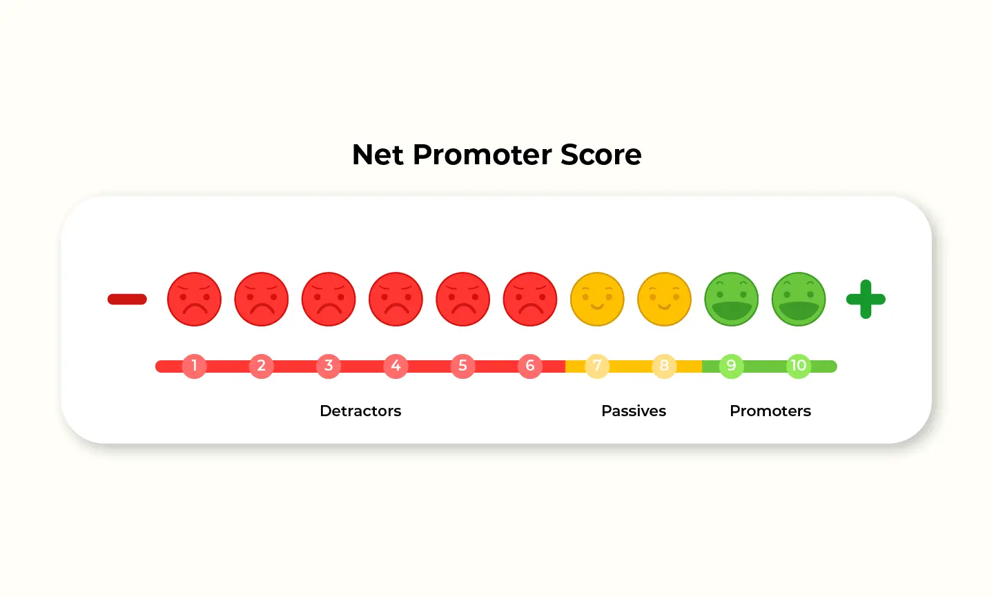
To track NPS, simply ask users one crucial question: "Would you recommend us to a friend or colleague?" They rate their likelihood on a scale of 0 to 10, from "not at all likely" to "extremely likely.”
Based on their responses, users are classified into three categories: detractors (0-6), passives (7-8), and promoters (9-10). Here's what we can infer from this ranking:
Promoters (score 9-10): These users are your super fans. They shout your praises from the rooftops and bring in new customers. They're like your customer lifetime value, boosting your acquisition and lowering costs.
Passives (score 7-8): These users are content, but not head over heels. They're satisfied, but not fiercely loyal. The most important factors that keep them engaged with your service are irresistible offers and incentives.
Detractors (score 0-6): They are highly unsatisfied users who may have serious issues with your product. Address their concerns promptly and turn those frowns upside down
You may want to know: Design System: Explained, Explored, and Evaluated
Top 5 UX Frameworks to measure User Experience in 2023
HEART Framework
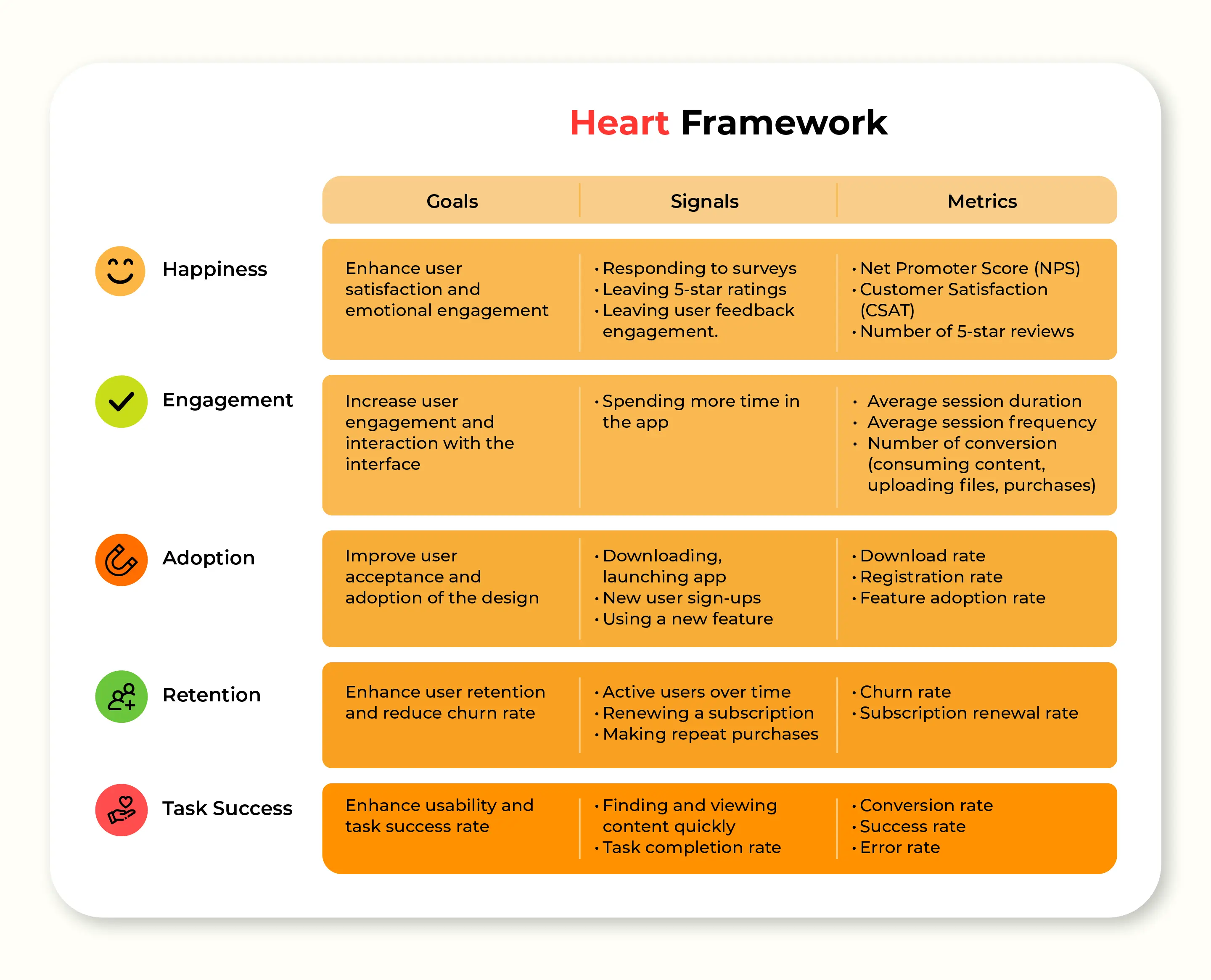
Introducing the remarkable HEART framework, a gift to the UX realm from the brilliant minds at Google. Crafted with meticulous care by Kerry Rodden, Hillary Hutchinson, and Xin Fu in 2010, this methodology seamlessly blends behavioral and attitudinal metrics, offering profound insights into user experience assessment.
Do you wonder what HEART UX metrics stand for? HEART is an acronym that stands for Happiness, Engagement, Adoption, Retention, and Task Success. It encapsulates the key dimensions of user experience evaluation. Let's delve deeper into each element, exploring their significance and the metrics that drive them.
Happiness: User satisfaction is key. By leveraging metrics like CSAT (Customer Satisfaction), NPS (Net Promoter Score), and SUS (System Usability Scale), we can gauge users' attitudes and uncover areas for improvement. Engaging user surveys and NPS responses provide valuable insights to boost happiness levels and delight our users.
Engagement: Deep user involvement leads to memorable experiences. Analyzing in-product analytics, such as time spent in-app, number of sessions, and shares, allows us to measure engagement levels. This empowers us to create immersive experiences that captivate and leave a lasting impact.
Adoption: Attracting new users is essential for growth. By quantifying the number of unique users who may have installed your app, signed up, and done a successful login over time, you can count as new adopters. This provides insights into the product's ability to gauge the users' interest in your product and how it can be further enhanced.
Retention: Long-term success lies in retaining loyal users. Tracking metrics like Daily Active Users (DAU), Weekly Active Users (WAU), and Monthly Active Users (MAU) helps us nurture a dedicated community. By reducing churn and fostering user loyalty, we secure the foundation for sustainable growth.
Task Success: Seamless task completion enhances the user experience. Behavioral metrics, including error rates, failure rates, APR (App Not Responding), and in-app task completion, allow us to optimize task efficiency. Empowering users to effortlessly achieve their goals elevates the overall experience.
Each metric from the HEART framework is scaled against a Goals-Signals-Metrics process. It is a simple method that keeps the entire product team in sync by articulating the goals of a product or feature, identifying signals that indicate success, and building specific metrics to track on a dashboard.
Goals: The first step is assigning goals for the product or feature, in terms of user experience. Keep in mind that the goals for specific features and updates may differ from those for the entire product. Do not choose too many goals, as this can make the assessment ineffective and lack focus to provide useful insights.
Signals: Each measurement framework goal needs to be related to a specific user action recorded as a signal, as well as the method to collect and map those signals.
Metrics: To capture metrics and transform the signals into measurable data points suitable for tracking overtime on a dashboard.
The combination of the HEART framework with the Goals-Signals-Metrics process provides you with precise information and analytical solutions to improve user experience. Each of these categories has specific metrics that can be applied for an individual feature/section or the entire product/project. The HEART framework can be modified as per the project requirement by adding key metrics per category, removing irrelevant categories, or focusing on a single category.
AARRR framework
The AARRR framework, also known as Pirate Metrics, was created by Dave McClure in 2007. McClure is the founder of 500 Startups and developed AARRR as a UX metrics framework to help companies focus on growth.
The framework has two main purposes:
Firstly, to guide young companies in narrowing their focus to only those metrics that can directly affect the health of their business.
Secondly, to help these companies use the right data to gauge the success of their product management and marketing efforts and to improve those initiatives that aren’t working.
AARRR Pirate Metrics is an acronym for a set of five user-behavior metrics that product-led growth businesses should track: Acquisition, Activation, Retention, Referral, and Revenue.
Acquisition: What channels do new users come to a product from? (new user sign-ups and downloads.)
Activation: What percentage of new users have a satisfying initial experience?
Retention: Do active users continue to come back over time? (Monthly active users)
Referral: Do users like the product enough to suggest it to their friends? (new sign up through referral link)
Revenue: Can users who are satisfied with the product be convinced to pay for it?
RARRA framework
The RARRA framework, proposed by Gabor Papp in 2017, is an alternative to the AARRR framework for evaluating products or services. It takes a user-focused approach that prioritizes retention over acquisition, emphasizing user engagement and satisfaction in a specific context.
The framework consists of five components:
Retention: Do active users continue to come back over time? (Monthly active users)
Activation: What percentage of new users have a satisfying initial experience?
Referral: Do users like the product enough to suggest it to their friends? (new sign up through referral link)
Revenue: Can users who are satisfied with the product be convinced to pay for it?
Acquisition: What channels do new users come to a product from? (new user sign-ups and downloads.)
While all components are important, retention is particularly crucial. Why? Acquisition strategies can be costly, making user retention a more cost-effective alternative. Additionally, user retention is the foundation of growth and is more directly connected to revenue than acquisition. In some cases, companies fail not because of acquisition, but because of customer churn. Therefore, putting emphasis on the retention phase is a sensible choice.
In today's competitive landscape, where the market for web and mobile apps is saturated, making a lasting impression is essential. Rather than solely focusing on acquisition, the RARRA framework encourages investing in user satisfaction and value delivery. By nurturing existing relationships and prioritizing user retention, you can stimulate organic growth and create a loyal user base that propels your product forward.
Retention: do they come back over time?
Activation: what % have a “happy” initial experience?
Referral: do they like it enough to tell their friends?
Revenue: can you monetize any of this behavior?
Acquisition: where / what channels do users come from?
Customer Experience Index (CX Index)
The CX Index is a comprehensive UX metrics framework developed by Forrester Research in 2016 that measures the overall customer experience. It covers various metrics that evaluate:
Effectiveness: The extent to which the product meets the user's needs.
Ease of use: The simplicity and usability of the product.
Emotion: The emotional impact of the experience on users.
Value: The perceived value and benefit users derive from the product.
Unlike User Experience (UX), which focuses on the interaction between users and a particular product, Customer Experience (CX) looks into all touchpoints of a brand (both physical and digital) to measure customer loyalty and how it affects the company's revenue. The framework has two essential indicators: Customer Satisfaction (CSAT) and Net Promoter Score (NPS).
As a company's CX Index score increases, so does its ability to win and retain users.
Read more:
Value Sensitive Design (VSD)
Value Sensitive Design (VSD), an influential framework pioneered by Professor Batya Friedman at the University of Washington in the late 1980s, offers a principled and comprehensive approach to technology design that places human values at its core. It goes beyond functionality and aesthetics, prioritizing the assessment of values like privacy, trust, and ethical considerations.
In essence, VSD aligns with the principles of User-Centered Design (UCD), encompassing the entire design spectrum from problem definition to research, prototyping, and testing. However, VSD sets itself apart by integrating a deep understanding of human values through qualitative research and continuous user feedback.
Final thought
At Lollypop - Top UI/UX Design Agency , we pride ourselves on our expertise in UI/UX design. Our experience designing for clients all over the world has allowed us to fine-tune our skills and implement UX metrics and frameworks to create designs that are not only visually appealing but also highly functional and user-friendly.
Our approach to User Experience Research is integral to our process, allowing us to gain insights that help us create innovative solutions that make a real impact. We believe that measuring UX metrics is crucial for understanding user satisfaction, identifying usability issues to do a UX Web/App Audit, and making data-driven decisions that drive product success.
If you want to work with a team of experts who are passionate about creating exceptional designs that meet your business needs, then look no further than Lollypop Design Studio Vietnam. Contact us today to learn more about our services and how we can help you take your design to the next level.
Subscribe to my newsletter
Read articles from Lollypop Vietnam directly inside your inbox. Subscribe to the newsletter, and don't miss out.
Written by

Lollypop Vietnam
Lollypop Vietnam
We are a dedicated UI/UX design agency in Vietnam, offering design services for clients in South East Asia and everywhere around the globe. Lollypop Design Studio Vietnam Add: 1/12 Hoàng Việt, Ward 4, Tân Bình, Thành phố Hồ Chí Minh Phone: 0833 744 033 Website: https://lollypop.design/ui-ux-design-agency-vietnam/