Apartment Designer Webpage
 Sandeep Rana
Table of contents

Introduction
Welcome to the world of webpage creation, where your imagination meets a blank canvas! 🖌️ Think of building a webpage as assembling your dream house — you need the right tools, a little creativity, and a pinch of patience. If you've ever felt like your computer was judging your design skills, fear not! In this blog, we’ll break down the essentials of crafting a stunning webpage from scratch. Get ready to unleash your inner web designer and bring your ideas to life! Let’s dive in and have some fun!
HTML
<!DOCTYPE html>
<html lang="en">
  <head>
    <meta charset="UTF-8" />
    <meta name="viewport" content="width=device-width, initial-scale=1.0" />
    <title>Apartment Designer Website</title>
    <link rel="stylesheet" href="./stylesheets/main.css" />
  </head>
  <body>
    <header>
      <div class="banner">
        <nav class="navbar">
          <img src="./Images/Logo.png" class="logo" />
          <ul>
            <li><a href="#">Home</a></li>
            <li><a href="#">About</a></li>
            <li><a href="#">Contact</a></li>
            <li><a href="#">Services</a></li>
            <li><a href="#">Blog</a></li>
          </ul>
        </nav>

        <div class="content">
          <h1>Design Your Dream Apartment</h1>
          <p>
            Follow My Hashnode for more amazing designs ideas and tutorials
            blogs
          </p>
          <div>
            <button type="button"><span></span> Next Blog</button>
            <button type="button">
              <span></span> Follow sandrana.hashnode.dev
            </button>
          </div>
        </div>
      </div>
    </header>
  </body>
</html>
CSS
@import url("https://fonts.googleapis.com/css2?family=Roboto:ital,wght@0,100;0,300;0,400;0,500;0,700;0,900;1,100;1,300;1,400;1,500;1,700;1,900&display=swap");
* {
  margin: 0;
  padding: 0;
  box-sizing: border-box;
}

body {
  font-family: "Roboto", sans-serif;
}

.banner {
  height: 100vh;
  width: 100%;
  background-image: linear-gradient(rgba(0, 0, 0, 0.75), rgba(0, 0, 0, 0.75)), url("../Images/Apartment.jpg");
  background-size: 100% 100%;
  background-position: center;
  background-repeat: no-repeat;
}
.banner nav {
  width: 100%;
  display: flex;
  align-items: center;
  justify-content: space-between;
}
.banner nav .logo {
  width: 120px;
  cursor: pointer;
}
.banner nav ul li {
  display: inline-block;
  margin: 0 20px;
  list-style: none;
  position: relative;
}
.banner nav ul li a {
  text-decoration: none;
  color: #fff;
  text-transform: uppercase;
}
.banner nav ul li::after {
  content: "";
  height: 3px;
  width: 0;
  background-color: #009688;
  position: absolute;
  bottom: -10px;
  left: 0;
  transition: all 0.4s ease;
}
.banner nav ul li:hover::after {
  width: 100%;
}
.banner .content {
  width: 100%;
  position: absolute;
  top: 50%;
  transform: translateY(-50%);
  text-align: center;
  color: #fff;
}
.banner .content h1 {
  text-transform: uppercase;
  font-size: 70px;
  margin-top: 80px;
}
.banner .content p {
  margin: 20px auto;
  font-weight: bold;
  line-height: 25px;
}
.banner .content button {
  width: 250px;
  padding: 15px 0;
  text-align: center;
  margin: 20px 10px;
  border-radius: 25px;
  font-weight: bold;
  border: 2px solid #009688;
  background: transparent;
  color: #fff;
  cursor: pointer;
  position: relative;
}
.banner .content button span {
  background-color: #009688;
  height: 100%;
  width: 0%;
  position: absolute;
  left: 0;
  bottom: 0;
  z-index: -1;
  transition: all 0.4s ease;
  border-radius: 25px;
}
.banner .content button:hover span {
  width: 100%;
}/*# sourceMappingURL=main.css.map */
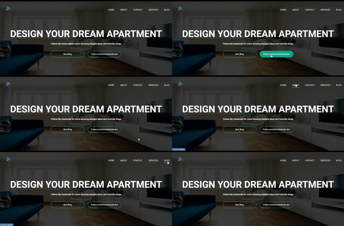
Output

Source Code
Ending Note
And there you have it — your webpage is now ready to impress on any screen size! But don’t think we’re done just yet. We’ve only scratched the surface of responsive design. Stay tuned, because in future posts, we’ll dive deeper into more tricks, tips, and fancy techniques to make your site not just responsive, but mind-blowing. Until then, keep coding and remember: a responsive webpage is like a good pizza — it should be enjoyed by everyone, everywhere!
Subscribe to my newsletter
Read articles from Sandeep Rana directly inside your inbox. Subscribe to the newsletter, and don't miss out.
Written by

Sandeep Rana
Sandeep Rana
I'm a dedicated ServiceNow Developer and Analyst with four years of experience. I previously worked at Deloitte and am currently with QBRAINX. My journey in technology started as a freelance web developer, where I developed a passion for creating user-friendly web solutions. In my current role, I specialize in various aspects of ServiceNow, including Portal design, Flow, Integration, Common Configuration, and HRSD modules. What truly excites me is experimenting with the amalgamation of web development and ServiceNow capabilities. My work allows me to blend creativity with technical prowess, ensuring the solutions I create are both functional and intuitive. I bridge the gap between complex technical concepts and user-friendly designs, striving for excellence in every project. Beyond my professional endeavors, I'm a lifelong learner, constantly exploring new technological horizons. My enthusiasm for innovation fuels my commitment to delivering high-quality results. If you share a passion for technology and innovation, I'd love to collaborate and create something extraordinary together. Let's connect!