Building a Simple Modal Popup with JavaScript: A Step-by-Step Guide
 Modefoluwa Adeniyi-Samuel
A Step-by-Step Guide to Creating a JavaScript Modal with CSS and HTML
Introduction
Have you ever clicked a button on a website and had a neat little window pop up, giving you all the information you need without leaving the page? That’s the magic of modals! Today, we’re going to create a JavaScript modal that displays useful information when you click a button. This modal will also feature a close ('x') button to return you to your normal browsing experience. Let’s dive into the world of modals and see how we can implement one on our local machines!
Prerequisites
Before we start, ensure you have a code editor installed on your computer. Here are some resources you might find useful:
CodePen for online testing. You can just use this from start to finish if you are the kind of curious person that likes to see the output of your changes in real time.
A basic understanding of HTML, CSS, and JavaScript
Understanding the Code
Now, let’s explore the code that makes our modal come to life. We’ll break it down into backbones, explaining each part's functionality.
HTML Backbone
The HTML snippet below serves as the backbone of our modal. It sets up the button to open the modal and the modal structure itself:
<!DOCTYPE html>
<html lang="en">
<head>
<meta charset="UTF-8">
<meta name="viewport" content="width=device-width, initial-scale=1.0">
<title>Modal</title>
<link href="styles.css" rel="stylesheet">
<script defer src="script.js"></script>
</head>
<body>
<button data-modal-target="#modal">Open Modal</button>
<div class="modal" id="modal">
<div class="modal-header">
<div class="title">Information Modal</div>
<button data-close-button class="close-button">×</button>
</div>
<div class="modal-body">
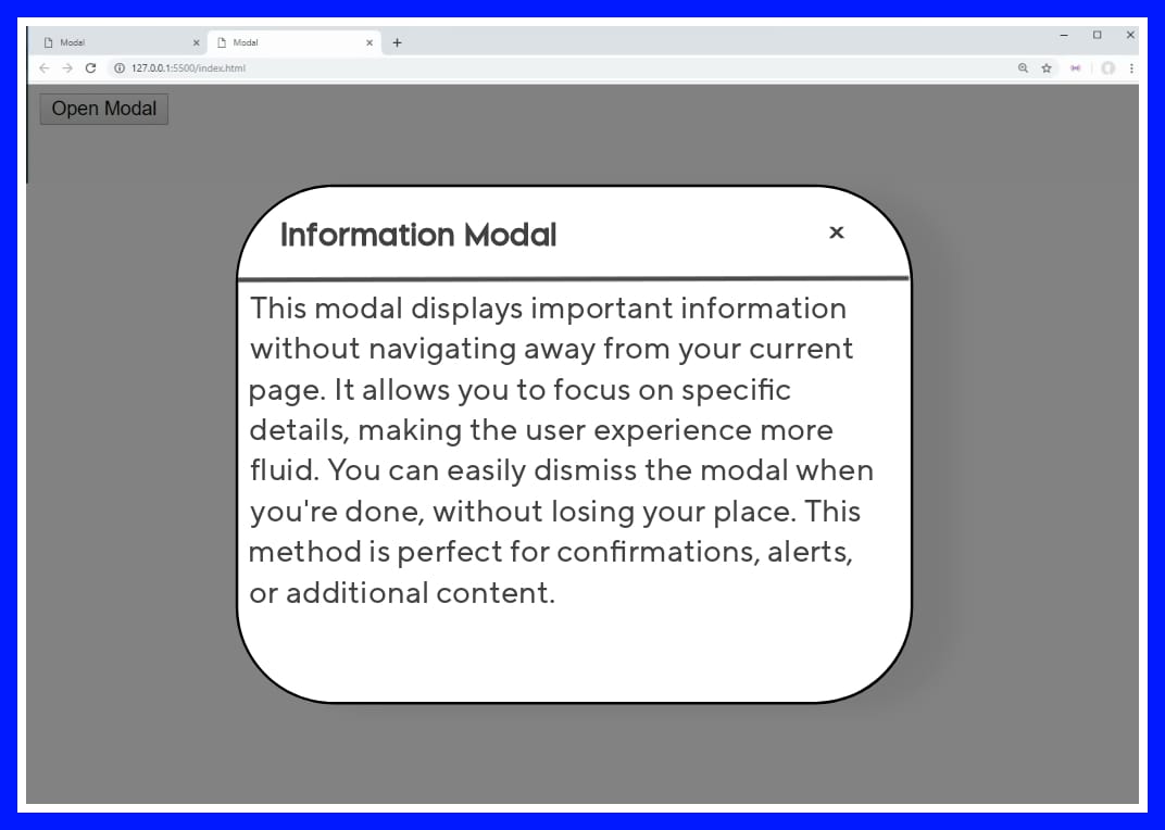
This modal displays important information without navigating away from your current page. It allows you to focus on specific details, making the user experience more fluid. You can easily dismiss the modal when you're done, without losing your place. This method is perfect for confirmations, alerts, or additional content.
</div>
</div>
<div id="overlay"></div>
</body>
</html>
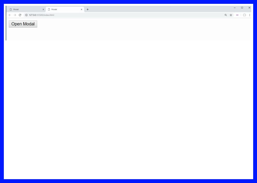
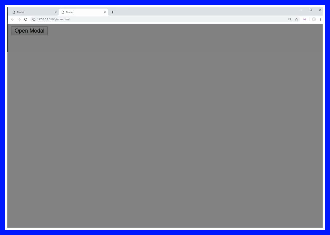
Output;
Explanation:
This structure includes a button that triggers the modal and the modal itself, which contains a header, body, and an overlay to darken the background. The data attributes help us target these elements with JavaScript.
Output;
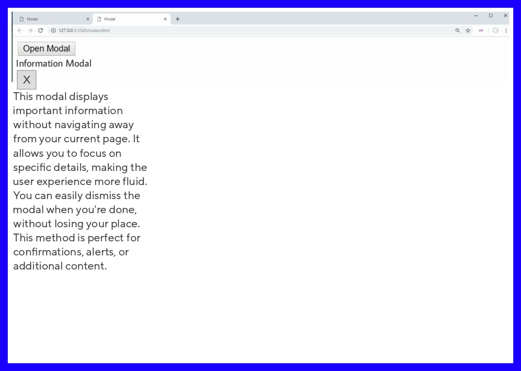
Let's proceed to the writing the css.
CSS Backbones
Universal Selector and Box-Sizing
*, *::after, *::before { box-sizing: border-box; }Explanation: Think of this as telling every element, "Hey, keep your borders and padding inside the box!" It’s like making sure everyone at the party stays in the room and doesn’t crowd the hallway. Less chaos, more control!
Modal Styling
 .modal {
   position: fixed;
   top: 50%;
   left: 50%;
   transform: translate(-50%, -50%) scale(0);
   transition: 200ms ease-in-out;
   border: 1px solid black;
   border-radius: 10px;
   z-index: 10;
   background-color: white;
   width: 500px;
   max-width: 80%;
 }
Output;
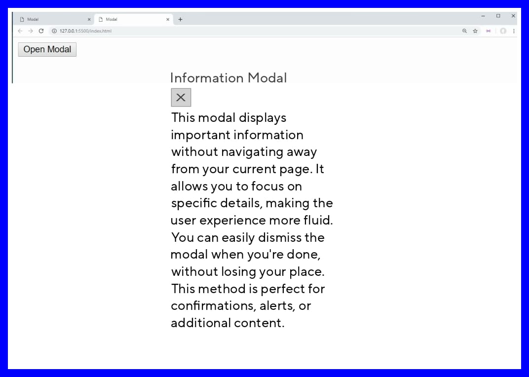
Explanation: The modal is like a shy guest at a party – it starts small and off-center, but when it’s time to shine, it scales up and struts into the spotlight. The z-index: 10 makes sure it’s at the top of the guest list!
Active Modal State
.modal.active { transform: translate(-50%, -50%) scale(1); }Explanation: Once the modal gets over its stage fright, it transforms into full view, loud and proud! Boom – center stage, and now everyone’s looking at it.
Modal Header Styling
.modal-header { padding: 10px 15px; display: flex; justify-content: space-between; align-items: center; border-bottom: 1px solid black; }Explanation: This is the modal’s "fancy hat" – padding gives it some extra space to breathe, while the border-bottom keeps things classy. Think of it as adding a sleek frame around the top of the modal.
Close Button Styling
.modal-header .close-button { cursor: pointer; border: none; outline: none; background: none; font-size: 1.25rem; font-weight: bold; }Explanation: The close button is the “escape hatch.” We’ve made sure it’s big, bold, and impossible to miss – just in case someone gets too excited about all that modal magic and needs a quick way out.
Modal Body Styling
.modal-body { padding: 10px 15px; }Explanation: We added some padding to give the content room to breathe. Because no one likes feeling cramped – not even text.
Overlay Styling
#overlay { position: fixed; opacity: 0; transition: 200ms ease-in-out; top: 0; left: 0; right: 0; bottom: 0; background-color: rgba(0, 0, 0, .5); pointer-events: none; }Explanation: The overlay is like the mood lighting at a fancy restaurant – it dims everything so you can focus on what matters (the modal, in this case). But don’t worry, it’s invisible until it’s needed, like a ninja.
Active Overlay State
#overlay.active { opacity: 1; pointer-events: all; }Explanation: Once activated, the overlay steps out of the shadows and starts catching all the clicks. It’s the bodyguard of modals, making sure nothing else gets clicked while the modal is in the spotlight.
Output;
/* The full CSS code for easy copy*/
*, *::after, *::before {
  box-sizing: border-box;
}

.modal {
  position: fixed;
  top: 50%;
  left: 50%;
  transform: translate(-50%, -50%) scale(0);
  transition: 200ms ease-in-out;
  border: 1px solid black;
  border-radius: 10px;
  z-index: 10;
  background-color: white;
  width: 500px;
  max-width: 80%;
}

.modal.active {
  transform: translate(-50%, -50%) scale(1);
}

.modal-header {
  padding: 10px 15px;
  display: flex;
  justify-content: space-between;
  align-items: center;
  border-bottom: 1px solid black;
}

.modal-header .title {
  font-size: 1.25rem;
  font-weight: bold;
}

.modal-header .close-button {
  cursor: pointer;
  border: none;
  outline: none;
  background: none;
  font-size: 1.25rem;
  font-weight: bold;
}

.modal-body {
  padding: 10px 15px;
}

#overlay {
  position: fixed;
  opacity: 0;
  transition: 200ms ease-in-out;
  top: 0;
  left: 0;
  right: 0;
  bottom: 0;
  background-color: rgba(0, 0, 0, .5);
  pointer-events: none;
}

#overlay.active {
  opacity: 1;
  pointer-events: all;
}
JavaScript Backbones
Selecting Open Modal Buttons
const openModalButtons = document.querySelectorAll('[data-modal-target]');Explanation: We’re hunting down every button that says, “I’m in charge of opening a modal!” Think of it as gathering the squad for the big show.
Selecting Close Modal Buttons
const closeModalButtons = document.querySelectorAll('[data-close-button]');Explanation: These buttons are like the bouncers of the modal world – their job is simple: "Click me, and you’re outta here!"
Selecting Overlay
const overlay = document.getElementById('overlay');Explanation: Here’s our overlay – the background dimmer, the silent shadow. It’s lurking in the background, ready to step in when the modal takes the stage.
Opening the Modal
openModalButtons.forEach(button => { button.addEventListener('click', () => { const modal = document.querySelector(button.dataset.modalTarget); openModal(modal); }); });Explanation: When you click the button, this code whispers, "Okay, it’s showtime!" It finds the right modal and brings it front and center.
Closing Modal on Overlay Click
overlay.addEventListener('click', () => { const modals = document.querySelectorAll('.modal.active'); modals.forEach(modal => { closeModal(modal); }); });Explanation: The overlay acts like the end-of-night lights at a club. Once you click it, it’s telling all the modals, "Party’s over, time to go home!"
Closing the Modal with Close Button
closeModalButtons.forEach(button => { button.addEventListener('click', () => { const modal = button.closest('.modal'); closeModal(modal); }); });Explanation: This makes sure each "X" button does its job. Like a little exit sign on the modal, it says, "Goodbye, I’m outta here!"
Open Modal Function
function openModal(modal) { if (modal == null) return; modal.classList.add('active'); overlay.classList.add('active'); }Explanation: This function is the star of the show – it says, "Alright modal, it’s your time to shine!" It makes sure the modal and overlay get their moment in the spotlight.
Close Modal Function
function closeModal(modal) { if (modal == null) return; modal.classList.remove('active'); overlay.classList.remove('active'); }Explanation: And this function? It’s the clean-up crew, making sure the modal and overlay leave gracefully once they’ve had their fun.
Output;
/* The full JavaScript code for easy copy*/
const openModalButtons = document.querySelectorAll('[data-modal-target]')
const closeModalButtons = document.querySelectorAll('[data-close-button]')
const overlay = document.getElementById('overlay')

openModalButtons.forEach(button => {
  button.addEventListener('click', () => {
    const modal = document.querySelector(button.dataset.modalTarget)
    openModal(modal)
  })
})

overlay.addEventListener('click', () => {
  const modals = document.querySelectorAll('.modal.active')
  modals.forEach(modal => {
    closeModal(modal)
  })
})

closeModalButtons.forEach(button => {
  button.addEventListener('click', () => {
    const modal = button.closest('.modal')
    closeModal(modal)
  })
})

function openModal(modal) {
  if (modal == null) return
  modal.classList.add('active')
  overlay.classList.add('active')
}

function closeModal(modal) {
  if (modal == null) return
  modal.classList.remove('active')
  overlay.classList.remove('active')
}
Conclusion
Now that you’ve learned how to create a functional JavaScript modal, you can apply this knowledge to various projects. As you explore the different parts of web development, remember that every small project builds your skills and understanding of more complex concepts.
The great thing about this project is that it enhances your grasp in JavaScript hence, understanding these principles that sharpens your critical thinking and prepares you for more challenging projects.
As they say, “Every accomplishment starts with the decision to try.” So, take this knowledge and build something amazing!
Subscribe to my newsletter
Read articles from Modefoluwa Adeniyi-Samuel directly inside your inbox. Subscribe to the newsletter, and don't miss out.
Written by

Modefoluwa Adeniyi-Samuel
Modefoluwa Adeniyi-Samuel
Hi there! I'm Modefoluwa, a committed technical writer, Web3 enthusiast, and a Computer Engineering student. With a knack for simplifying complex concepts, I specialize in creating tutorials, guides, and articles that empower developers and non-technical users alike. As a learning full-stack developer, I’m actively expanding my technical skill set to better understand the technologies I write about. My journey started with a love for storytelling, which evolved into crafting impactful content for the ever-evolving tech landscape. When I’m not writing or coding, you’ll find me exploring emerging technologies, brainstorming creative ideas, or engaging with communities that share my love for innovation. My goal? To bridge the gap between technology and its users through clear, concise, and engaging communication - cheers.