A Step-by-Step Guide to Creating Image Pop-Ups with CSS and JavaScript.
 Modefoluwa Adeniyi-Samuel
A Step-by-Step Guide to Creating Image Pop-Ups with CSS and JavaScript
Introduction: Let's Talk About Cool Image Previews
Imagine this: You're casually browsing a website, and you come across a grid of stunning images. You click on one, and bam!—a larger version of the image smoothly pops up in the center of your screen while the background fades into darkness. You tap anywhere outside the image, and the page returns to normal. No reloads, no awkward transitions, just clean and efficient.
This isn’t just some fancy internet trick. It’s a combination of CSS and JavaScript magic that creates a visually pleasing and interactive experience, perfect for portfolios, galleries, or even personal blogs. The beauty of this technique lies in its simplicity, yet it has the power to give your web pages that “wow” factor.
In this tutorial, we're going to build that experience from scratch. By the time you're done, you’ll understand how to create image pop-ups that will run smoothly on your local computer or website. We’ll keep things straightforward, breaking down every part of the code into “backbones,” so you understand what’s holding the whole thing together.
Are you getting it now?
What Will This Code Do?
In essence, you’re creating a grid of clickable images. Once you click any of them, it will open a full-screen preview of the selected image, overlayed on top of the rest of the page, which will dim in the background. When you're done viewing, you can click anywhere outside the image to close it. Simple, right?
But here's where it gets more exciting: The difficulty here is making sure this interaction works seamlessly across different screen sizes and devices. But don't worry, the way about it is clear—CSS will handle the layout and appearance, while JavaScript makes it interactive. Let’s break it all down into manageable pieces.
Prerequisites
Before diving into the code, here’s what you’ll need to get this project up and running on your local machine:
A code editor: I recommend Visual Studio Code for its ease of use.
Basic knowledge of HTML, CSS, and JavaScript: You don’t need to be a pro, but a basic understanding will help.
Live server: If you're using VS Code, you'll need the Live Server extension to view changes in real-time. It is not a must to use this, you can just save your project on the editor and check the changes made in your connected browser.
Once you have these ready, let’s start building.
The HTML Backbone
To kick things off, let's build the structure of our image gallery. This HTML will act as the skeleton for everything we do with CSS and JavaScript. We’ll be embedding nine sample images in a grid format. When clicked, these images will trigger our pop-up effect.
Explanation:
The HTML structure is quite basic but vital for holding the gallery together. We're using a simple <div> element to contain all the images, which will be displayed in a grid format. This div is what we’ll be styling and adding functionality to in the next steps.
<!DOCTYPE html>
<html lang="en">
<head>
  <meta charset="UTF-8">
  <meta name="viewport" content="width=device-width, initial-scale=1.0">
  <meta http-equiv="X-UA-Compatible" content="ie=edge">
  <link rel="stylesheet" href="styles.css">
  <script defer src="script.js"></script>
  <title>Image Pop-Up Gallery</title>
</head>
<body>
  <div class="image-gallery">
    <img src="https://picsum.photos/id/1015/400/400" alt="Mountain">
    <img src="https://picsum.photos/id/1016/400/400" alt="Nature">
    <img src="https://picsum.photos/id/1018/400/400" alt="Valley">
    <img src="https://picsum.photos/id/1021/400/400" alt="Mist">
    <img src="https://picsum.photos/id/1022/400/400" alt="Sky">
    <img src="https://picsum.photos/id/1023/400/400" alt="Forest">
    <img src="https://picsum.photos/id/1024/400/400" alt="Eagle">
    <img src="https://picsum.photos/id/1025/400/400" alt="Dog">
    <img src="https://picsum.photos/id/1026/400/400" alt="Sunset">
  </div>
</body>
</html>
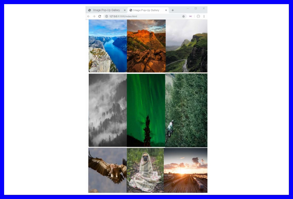
Output;

Moving forward, let’s dive into the backbone of the layout: CSS.
CSS Backbones
Now that we’ve set up the HTML structure, we’ll use CSS to control the visual layout. We want our images to line up nicely in a grid, and when an image is clicked, we want the rest of the page to dim while the selected image takes center stage.
1. Setting the Basics
Before we get into the fancy stuff, we need to clean up the page's margins.
Explanation: By setting the body margin to zero, we ensure that our grid starts at the very top of the page with no unnecessary space around it.
body {
  margin: 0;
}
2. Creating the Image Grid
We use CSS Grid to create a 3-column layout for our images.
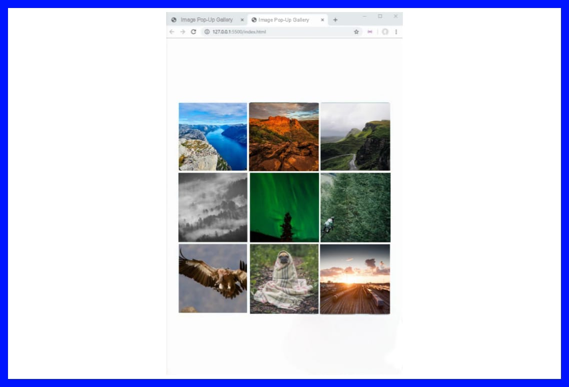
Explanation: This rule defines the layout of our image gallery. We set up a grid that automatically spaces the images in three columns, centered on the page. The images are all uniformly sized, and we use grid-gap to space them out evenly.
.image-gallery {
  display: grid;
  grid-template-columns: repeat(3, 200px);
  justify-content: center;
  align-content: center;
  grid-gap: 10px;
  height: 100vh;
}
3. Styling the Images
Now we’ll ensure that the images are clickable and sized appropriately.
Explanation: Each image is made clickable with a pointer cursor, and they are uniformly sized to keep the grid neat and consistent.
.image-gallery img {
  width: 200px;
  height: 200px;
  cursor: pointer;
}
4. Creating the Lightbox (Image Preview)
This is where things start to get fun. The lightbox is the element that pops up and displays the clicked image.
Explanation: The #image-modal element is hidden by default. When an image is clicked, we’ll use JavaScript to reveal it. It will take up the entire screen with a black overlay.
#image-modal {
  position: fixed;
  z-index: 1000;
  top: 0;
  width: 100%;
  height: 100%;
  background-color: rgba(0, 0, 0, .8);
  display: none;
}
5. Displaying the Image in the Modal
Once the modal is triggered, we need to make sure the image is displayed correctly.
Explanation: When the modal is visible, we’ll use a flexbox to center the image both horizontally and vertically. The image itself will fit within 90% of the screen's width and 80% of its height, ensuring that it doesn’t overflow.
#image-modal. visible {
  display: flex;
  justify-content: center;
  align-items: center;
}
Output;

JavaScript Backbones
JavaScript makes everything come to life by handling the interactions between the user and the images.
1. Handling Image Click Events
This script adds the functionality to show the clicked image in the modal.
Explanation: Each image is clickable, and when clicked, it triggers the modal to display the clicked image at a larger size. The modal is initially hidden and only appears when an image is clicked.
const galleryImages = document.querySelectorAll('.image-gallery image);
gallery images.forEach(image => {
  image.addEventListener('click', e => {
    imageModal.classList.add('visible');
    const modalImg = document.createElement('image);
    modalImg.src = image.src;
    while (imageModal.firstChild) {
      imageModal.removeChild(imageModal.firstChild);
    }
    imageModal.appendChild(modalImg);
  });
});
2. Closing the Modal
Here’s the code that closes the modal when the user clicks outside the image.
Explanation: We attach an event listener to the modal itself. If the user clicks anywhere outside of the image, the modal will close.
imageModal.addEventListener('click', e => {
  if (e.target !== e.currentTarget) return;
  imageModal.classList.remove('visible');
});
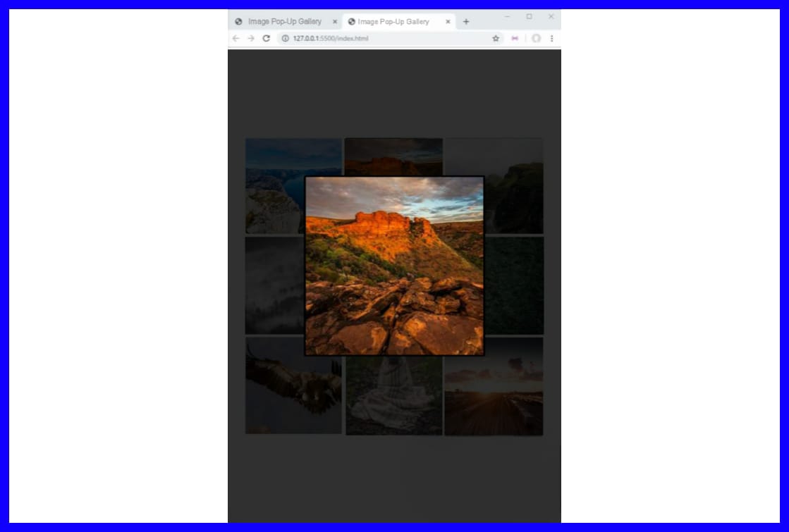
Output;

Bringing It All Together
Now that we’ve broken down the backbones, here's the entire CSS and JavaScript code combined for you to see how it all fits together.
/* The whole CSS code  */
body {
  margin: 0;
}

.grid {
  display: grid;
  grid-template-columns: repeat(3, 200px);
  justify-content: center;
  align-content: center;
  grid-gap: 10px;
  height: 100vh;
}

.grid img {
  width: 200px;
  height: 200px;
  cursor: pointer;
}

#lightbox {
  position: fixed;
  z-index: 1000;
  top: 0;
  width: 100%;
  height: 100%;
  background-color: rgba(0, 0, 0, .8);
  display: none;
}

#lightbox.active {
  display: flex;
  justify-content: center;
  align-items: center;
}

#lightbox img {
  max-width: 90%;
  max-height: 80%;
  padding: 4px;
  background-color: black;
  border: 2px solid white;
}
/* The whole JavaScript code */
const lightbox = document.createElement('div')
lightbox.id = 'lightbox'
document. body.appendChild(lightbox)

const images = document.querySelectorAll('image)
images.forEach(image => {
  image.addEventListener('click', e => {
    lightbox.classList.add('active')
    const img = document.createElement('image)
    img.src = image.src
    while (lightbox.firstChild) {
      lightbox.removeChild(lightbox.firstChild)
    }
    lightbox.appendChild(img)
  })
})

lightbox.addEventListener('click', e => {
  if (e.target !== e.currentTarget) return
  lightbox.classList.remove('active')
})
Conclusion
The great thing about this project is that it gives you a better understanding of how advanced principles of event handling and DOM manipulation work. It’s just like how some of us did math in secondary school, never thinking we’d use it in life. Actually, those equations created brain pathways that made you a better problem solver. In the same way, this project equips you with the tools to tackle more complex web interactions in the future.
"Knowledge is power, but enthusiasm pulls the switch."
Subscribe to my newsletter
Read articles from Modefoluwa Adeniyi-Samuel directly inside your inbox. Subscribe to the newsletter, and don't miss out.
Written by

Modefoluwa Adeniyi-Samuel
Modefoluwa Adeniyi-Samuel
Hi there! I'm Modefoluwa, a committed technical writer, Web3 enthusiast, and a Computer Engineering student. With a knack for simplifying complex concepts, I specialize in creating tutorials, guides, and articles that empower developers and non-technical users alike. As a learning full-stack developer, I’m actively expanding my technical skill set to better understand the technologies I write about. My journey started with a love for storytelling, which evolved into crafting impactful content for the ever-evolving tech landscape. When I’m not writing or coding, you’ll find me exploring emerging technologies, brainstorming creative ideas, or engaging with communities that share my love for innovation. My goal? To bridge the gap between technology and its users through clear, concise, and engaging communication - cheers.