React-Toastify: Simplifying Toast Notifications for Your App
 Abhishek Sadhwani
Table of contents

When building a web application, creating a seamless and user-friendly experience is essential. A key aspect of this is providing clear and effective notifications, whether they alert users to errors, provide confirmations, or convey informational messages. A well-designed notification system can significantly enhance the user experience. In the React ecosystem, one of the most popular libraries for managing notifications is React-Toastify.
In this article, we’ll dive into React-Toastify, explore its key features, and learn how to integrate it into a React project to manage toast notifications effectively.
What is React-Toastify?
React-Toastify is a simple yet customizable toast notification library for React applications. It allows you to add beautiful, easy-to-use notifications to your React apps with minimal setup.
Why React-Toastify?
Ease of use: Minimal configuration is required.
Highly customizable: It supports custom styles, positions, and animations.
Flexible notifications: Manage notifications dynamically from any part of your app.
Responsive and accessible: Supports mobile-friendly and accessible notifications out of the box.
No dependency on other CSS frameworks: Can be used independently.
Getting Started with React Toastify
Installation
To begin with we have to install React Toastify in our project which can be done using npm or yarn.
npm install react-toastify
or yarn
yarn add react-toastify
Basic Usage
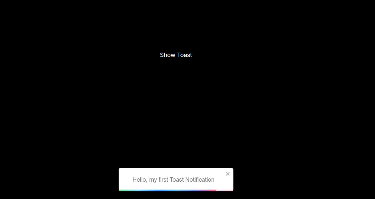
Once we have installed the package, we can import the necessary components and styles. Here is a basic example of triggering a toast notification in the React component.
import { ToastContainer, toast } from 'react-toastify';
import 'react-toastify/dist/ReactToastify.css';

const App = () => {
  const notify = () => {
    toast('Hello, my first Toast Notification', {position:"bottom-center"});
  };

  return (
    <div>
      <button className='button' onClick={notify}>Show Toast</button>
      <ToastContainer />
    </div>
  );
};

export default App;
The ToastContainer component is required to show and manage all toast notifications.
The toast() function triggers a new toast. You can use it anywhere in your application.

Customizing Toast Notification
React-Toastify offers a wide range of customization options, allowing you to tailor toast notifications to match your application's theme. You can easily adjust various aspects, such as position, animation, appearance, and more, to create notifications that seamlessly integrate with your app’s design.
Position
We can control where the toast appears on the screen by passing the position option:
toast('This toast is at the top!', {
  position: "top-center",
});
Other available positions include:
TOP_LEFT
TOP_RIGHT
BOTTOM_LEFT
BOTTOM_RIGHT
BOTTOM_CENTER
Type-based styling
React Toastify supports various types of toast that can be used to send notifications like info, success, warning, and error.
toast.success('Success Notification');
toast.error('Error Notification');
toast.warn('Warning Notification');
toast.info('Info Notification');
These different types of toast apply their own styles to notifications, but we can further customize them using custom styling.
Custom Styling
We can style individual toast by applying custom CSS properties using classes or directly passing the styles.
toast('Custom styled toast', {
  className: 'custom-toast',
  bodyClassName: 'custom-body',
});
.custom-toast {
  background-color: #4caf50;
}

.custom-body {
  color: white;
}
Advance Usage
Adding Icons and Close Button
React-Toastify allows you to display custom icons using the icons property and provides the option to add or remove the close button using the closeButton, giving users the ability to manually dismiss notifications when needed.
toast('Toast with close button', {
  closeButton: true,
});

toast('Custom icon toast!', {
  icon: '🚀',
});
Auto Close & Duration
By default, toast notifications disappear automatically after 5 seconds. However, we can change this duration or disable auto-close entirely and add the close button so user has to dismiss the notification.
toast('This will stay!', {
  autoClose: false, // Toast will not close automatically
});

toast('Auto Close', {
  autoClose: 2000,  //This will close automatically after 2 seconds
});
Managing Toast Notifications Dynamically
React-Toastify offers the ability to manage multiple toast notifications, allowing you to remove specific toasts or clear all notifications programmatically. To remove a toast, you can use toast.dismiss().
const toastId = toast('This toast can be dismissed!');
toast.dismiss(toastId);
Additionally, you can update an existing toast using toast.update(), rather than creating a new one, which is especially useful for making changes after a set time period.
const toastId = toast('Loading...');
setTimeout(() => {
  toast.update(toastId, {
    render: 'Data loaded!',
    type: toast.TYPE.SUCCESS,
    autoClose: 3000,
  });
}, 2000);
Conclusion
React-Toastify is a robust and flexible solution for managing toast notifications in React applications. Whether you need a simple notification or a highly customized one, this library offers you all the tools you need. It’s easy to set up, configure, and extend to meet your project’s requirements.
By following the steps above, you can quickly integrate React-Toastify into your React project, adding engaging and informative notifications that enhance user experience.
Subscribe to my newsletter
Read articles from Abhishek Sadhwani directly inside your inbox. Subscribe to the newsletter, and don't miss out.
Written by
