S&P 500 Stock Market Time Series Case Study
 Sabin Gaire
In this blog post, I'll walk you through a Python-based data analysis project where I explore stock data for four major tech companies: Apple (AAPL), Amazon (AMZN), Google (GOOGL), and Microsoft (MSFT). Using tools like Pandas, NumPy, Matplotlib, Seaborn, and Plotly, we will visualize trends, calculate moving averages, and examine correlations between the stocks. Let’s dive into the code and explore key results.
1. Importing Libraries
To get started, we need to import several libraries essential for data handling, visualization, and analysis:

2. Loading Data
We will load stock data for the four companies from CSV files using the glob package, which allows us to match file paths based on a pattern.


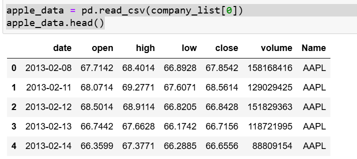
Following code reads the first CSV file from the company_list (which contains stock data for Apple) into a DataFrame called apple_data. The head() function then displays the first 5 rows of the dataset for a quick preview.
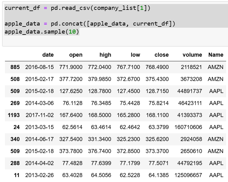
Following code reads another CSV file (the second in company_list) into a DataFrame called current_df. It then concatenates this new data with the existing apple_data DataFrame, effectively appending the data from both files. Finally, apple_data.sample(10) randomly displays 10 rows from the merged dataset for inspection
We use the following code to read stock data from multiple CSV files, iterating over a list of file paths, and concatenates them into a single DataFrame. It enables seamless merging of data for analysis across different companies.

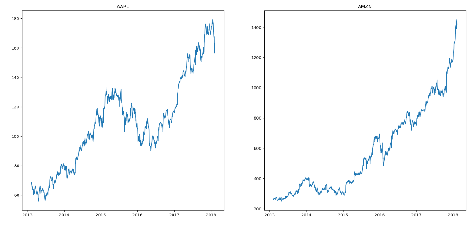
3. Visualizing Stock Closing Prices
We can visualize the closing prices for each company using Matplotlib:

4. Calculating and Plotting Moving Averages
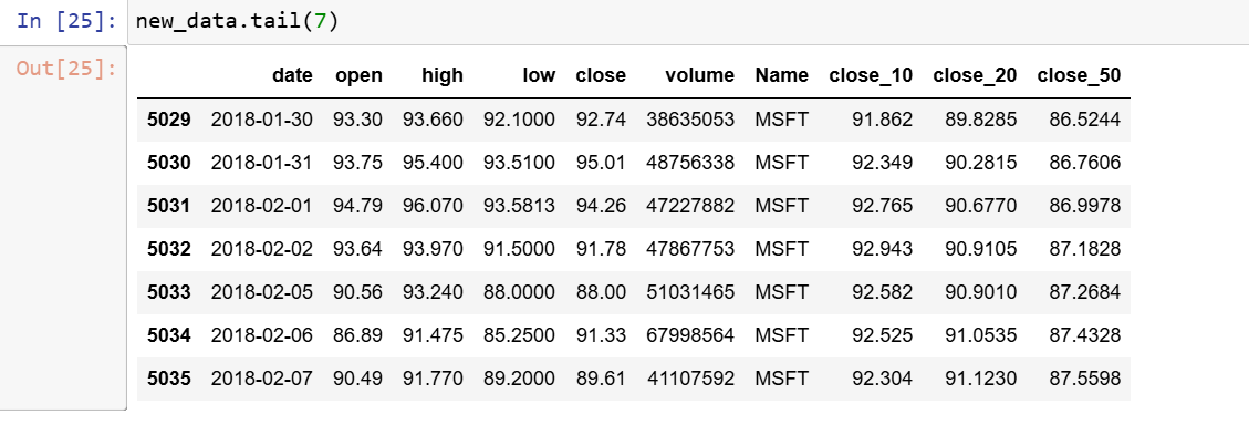
Moving averages help smooth out short-term fluctuations in stock prices and highlight longer-term trends. We calculate the 10, 20, and 50-day moving averages:


5. Daily Stock Price Returns
Next, we calculate daily stock price returns for Apple, which can give us insights into stock volatility. The plot shows how daily returns for Apple stocks change, providing a sense of the stock's performance and volatility


6. Correlation Analysis of Tech Stocks
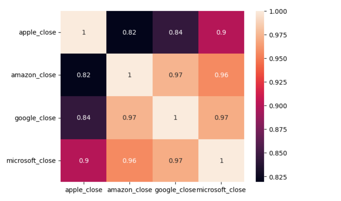
To understand if the closing prices of these companies move in tandem, we compute the correlation matrix and visualize it with Seaborn’s heatmap:

Conclusion
This analysis provides a comprehensive look at stock price trends, moving averages, and correlations for major tech companies. By leveraging Python libraries like Pandas, Seaborn, and Plotly, we gain valuable insights into stock performance and inter-company correlations.
Subscribe to my newsletter
Read articles from Sabin Gaire directly inside your inbox. Subscribe to the newsletter, and don't miss out.
Written by
