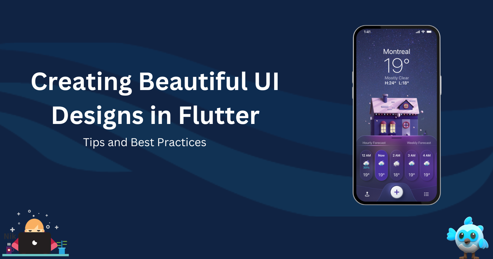
Creating Beautiful UI Designs in Flutter: Tips and Best Practices
 Ravi Patel
Flutter is widely known for its ability to create beautiful, responsive UIs across platforms, making it a favorite among developers and designers alike. The framework’s flexibility and rich widget library enable the creation of highly customized and elegant user interfaces. In this blog, we’ll explore some tips, tricks, and best practices for designing stunning UIs in Flutter while maintaining performance and responsiveness.
1. Start with a Consistent Design System
A well-defined design system is essential to ensure consistency throughout your app. This includes typography, color schemes, button styles, and spacing guidelines. Flutter’s ThemeData class allows you to define a global theme that can be reused across your app.
Set up a Theme
In your main.dart, you can define global themes like this:
ThemeData appTheme = ThemeData(
  primaryColor: Colors.blue,
  accentColor: Colors.orange,
  textTheme: TextTheme(
    headline1: TextStyle(fontSize: 32.0, fontWeight: FontWeight.bold),
    bodyText1: TextStyle(fontSize: 16.0),
  ),
  buttonTheme: ButtonThemeData(
    buttonColor: Colors.blue,
    shape: RoundedRectangleBorder(
      borderRadius: BorderRadius.circular(8.0),
    ),
  ),
);

void main() {
  runApp(MaterialApp(
    theme: appTheme,
    home: HomeScreen(),
  ));
}
This ensures that typography, colors, and button styles are consistent across all screens.
2. Use Material and Cupertino Widgets
Flutter offers both Material and Cupertino design widgets. While Material widgets follow Google’s Material Design principles, Cupertino widgets follow Apple’s iOS design guidelines. To maintain a native look and feel across platforms, use the appropriate widget for each platform.
Material Widgets: Use for Android-like designs.
Cupertino Widgets: Use for iOS-like designs.
Example of Platform-Specific Widgets:
Widget build(BuildContext context) {
  return Platform.isIOS
      ? CupertinoButton(
          child: Text('iOS Button'),
          onPressed: () {},
        )
      : ElevatedButton(
          child: Text('Android Button'),
          onPressed: () {},
        );
}
This approach makes your app look native on both iOS and Android while maintaining the same functionality.
3. Optimize for Different Screen Sizes
Designing for different screen sizes is crucial for mobile apps. Flutter provides several tools for building responsive UIs:
MediaQuery: Retrieve screen size and orientation details.
LayoutBuilder: Build widgets based on available space.
FittedBox: Scale and position widgets dynamically.
Using MediaQuery for Responsiveness:
@override
Widget build(BuildContext context) {
  var screenWidth = MediaQuery.of(context).size.width;
  var fontSize = screenWidth > 600 ? 24.0 : 16.0;

  return Text(
    'Responsive Text',
    style: TextStyle(fontSize: fontSize),
  );
}
This ensures that the font size adapts to different screen widths, improving readability on both small and large devices.
4. Implement Custom Animations
Animations play an important role in creating smooth, engaging user experiences. Flutter’s rich animation APIs allow you to create everything from simple transitions to complex, custom animations.
Implicit Animations: Widgets like
AnimatedContainerautomatically animate property changes.Explicit Animations: Use
AnimationControllerandTweenfor finer control.
Example of Implicit Animation:
class AnimatedBox extends StatefulWidget {
  @override
  _AnimatedBoxState createState() => _AnimatedBoxState();
}

class _AnimatedBoxState extends State<AnimatedBox> {
  bool isExpanded = false;

  @override
  Widget build(BuildContext context) {
    return GestureDetector(
      onTap: () {
        setState(() {
          isExpanded = !isExpanded;
        });
      },
      child: AnimatedContainer(
        width: isExpanded ? 200.0 : 100.0,
        height: isExpanded ? 200.0 : 100.0,
        color: isExpanded ? Colors.blue : Colors.red,
        duration: Duration(seconds: 1),
        child: Center(child: Text('Tap me')),
      ),
    );
  }
}
Using AnimatedContainer, you can create smooth transitions between different states with minimal effort.
5. Leverage CustomPainter for Unique UI Designs
Flutter’s CustomPainter allows you to create custom graphics and shapes that are not available in standard widgets. It’s ideal for drawing shapes, charts, or any unique design element.
Example of a Custom Shape:
class MyCustomPainter extends CustomPainter {
  @override
  void paint(Canvas canvas, Size size) {
    var paint = Paint()
      ..color = Colors.blue
      ..strokeWidth = 4.0;

    var path = Path();
    path.moveTo(0, 0);
    path.lineTo(size.width, size.height);
    path.lineTo(size.width, 0);
    path.close();

    canvas.drawPath(path, paint);
  }

  @override
  bool shouldRepaint(CustomPainter oldDelegate) {
    return false;
  }
}
CustomPaint(
  size: Size(200, 100),
  painter: MyCustomPainter(),
);
This example shows how you can use CustomPainter to draw unique shapes or graphics to make your UI stand out.
6. Use Shadows and Gradients for Depth
Adding depth to your UI elements can enhance the visual appeal. Flutter provides BoxShadow and gradient properties that can give buttons, cards, or containers a modern, 3D effect.
Example of Shadow and Gradient:
Container(
  decoration: BoxDecoration(
    boxShadow: [
      BoxShadow(
        color: Colors.grey.withOpacity(0.5),
        spreadRadius: 5,
        blurRadius: 7,
        offset: Offset(0, 3),
      ),
    ],
    gradient: LinearGradient(
      colors: [Colors.blue, Colors.purple],
      begin: Alignment.topLeft,
      end: Alignment.bottomRight,
    ),
  ),
  child: Padding(
    padding: EdgeInsets.all(16.0),
    child: Text('Stylized Container'),
  ),
);
This simple use of gradients and shadows can make UI elements more engaging and visually attractive.
7. Maintain Accessibility
Designing for accessibility ensures that your app is usable for all users, including those with disabilities. Flutter provides several tools and guidelines for improving accessibility:
Screen Readers: Widgets like
Semanticsprovide additional information for screen readers.Large Fonts: Make sure your app scales well with system-wide large text settings.
Contrast: Ensure that there is enough contrast between text and background for readability.
Example of Using Semantics:
Semantics(
  label: 'Clickable button',
  child: ElevatedButton(
    onPressed: () {},
    child: Text('Click Me'),
  ),
);
This helps screen readers understand the purpose of UI elements, improving accessibility.
8. Maintain Clean and Scalable Code
As your Flutter app grows, maintaining clean and scalable code is essential. Here are a few tips to ensure your app remains easy to maintain:
- Break Widgets into Small Components: Divide large widgets into smaller, reusable components.
class CustomButton extends StatelessWidget {
  final String label;
  final VoidCallback onPressed;

  CustomButton({required this.label, required this.onPressed});

  @override
  Widget build(BuildContext context) {
    return ElevatedButton(
      onPressed: onPressed,
      child: Text(label),
    );
  }
}
- Use State Management: Use tools like
Provider,Riverpod, orBlocto manage the state efficiently, especially in large apps.
Conclusion
Designing beautiful UIs in Flutter is both a creative and technical process. By using a consistent design system, leveraging platform-specific widgets, optimizing layouts for different screen sizes, and implementing animations and custom graphics, you can create a visually appealing and highly functional app. By following these best practices, you’ll ensure that your Flutter apps not only look great but also perform smoothly.
Start building your next Flutter UI with these tips in mind, and watch your designs come to life!
Happy designing!
Subscribe to my newsletter
Read articles from Ravi Patel directly inside your inbox. Subscribe to the newsletter, and don't miss out.
Written by

Ravi Patel
Ravi Patel
"📱 Passionate Flutter Developer with 6+ years of experience, dedicated to crafting exceptional mobile applications. 🚀 Adept at turning ideas into polished, user-friendly experiences using Flutter's magic. 🎨 Design enthusiast who believes in the power of aesthetics and functionality. 🛠️ Expertise in translating complex requirements into clean, efficient code. 🌟 Committed to staying updated with the latest trends and continuously pushing boundaries. Let's create something extraordinary together!"