Activity 20: Research BEM - Block, Element, Modifier - Architecture
 Danilo Buenafe Jr
What is BEM?
BEM (Block, Element, Modifier) is a popular CSS naming convention designed to make code more maintainable and reusable by organizing styles in a structured way.
BEM Structure:
1. Block:
A block is a standalone entity. It can be a header, a button, or any component that can exist independently.
Example:
<button class="button">Submit</button>
.button {
    background-color: #007BFF;
    color: white;
    padding: 10px 20px;
    border: none;
    cursor: pointer;
}
.button is the block in this example. It's a standalone button component.
2. Element:
An element is a part of a block that performs a specific function. It is tied to the block and cannot exist independently. It's denoted by a double underscore (__).
Example:
<button class="button">
    <span class="button__icon">🔍</span>
    Search
</button>
.button__icon {
    margin-right: 8px;
}
.button__icon is the element of the .button block. It’s a part of the button (an icon in this case) and depends on the button block to exist.
3. Modifier:
A modifier is a different version of a block or element, used for styling variations. It’s denoted by a double hyphen (--).
Example:
<button class="button button--primary">Submit</button>
<button class="button button--secondary">Cancel</button>
.button--primary {
    background-color: #007BFF;
}

.button--secondary {
    background-color: #6C757D;
}
.button--primaryis a modifier that changes the style of the.buttonblock to a primary button..button--secondaryis another modifier that changes the style to a secondary button.
Full Example:
<button class="button button--primary">
   <span class="button__icon">🔍</span>
   Search
</button>

<button class="button button--secondary">
   <span class="button__icon">❌</span>
   Cancel
</button>
.button {
   display: inline-flex;
   align-items: center;
   padding: 10px 20px;
   font-size: 16px;
   border: none;
   cursor: pointer;
}

.button__icon {
   margin-right: 8px;
}

.button--primary {
   background-color: #007BFF;
   color: white;
}

.button--secondary {
   background-color: #6C757D;
   color: white;
}
In this full example:
The
.buttonblock has different modifiers (--primaryand--secondary) for styling variations.The
.button__iconis an element inside the button block, representing an icon.
Advantages :
1. Modular and Reusable Code:
BEM breaks the UI into independent blocks, elements, and modifiers, making components modular. This allows you to reuse the same blocks across different parts of your project without code duplication.
For example, in the sample, the
.buttonclass is used with different modifiers (.button--primary,.button--secondary) to create consistent yet customizable buttons.
2. Avoid CSS Conflicts:
BEM’s structured naming convention reduces the chances of class name conflicts. The specificity provided by BEM ensures that styles are isolated, even in large projects with many developers.
In the sample, classes like
.header__logoand.header__navare specific to the.headerblock, so they won’t interfere with other sections of the site that might use similar names (like another.logoor.nav).
3. Clear and Descriptive Names:
BEM provides a clear, human-readable structure that makes it easy to understand which classes correspond to specific elements and their roles within the UI.
In the project, classes like
.nav__item,.content__title, and.footer__textare self-explanatory, so anyone reviewing the code can quickly understand what each class is for.
4. Scalability:
As projects grow, the BEM methodology helps maintain clarity. Adding new features or elements to the site can be done without causing styling conflicts or confusion, making it easier to scale large codebases.
In larger projects, you can introduce new blocks (e.g.,
.sidebar,.card) without interfering with the existing ones.
5. Consistency:
BEM ensures that you maintain a consistent structure throughout your CSS code, which is especially useful in team environments where multiple developers work on the same project.
In the sample project, every section follows the BEM convention, making the code consistent and predictable, reducing the learning curve for new developers.
6. Ease of Maintenance:
Due to the modularity and naming clarity, updating or maintaining the code becomes much simpler. You can easily modify or extend styles for a specific block or element without impacting unrelated parts of the project.
For example, if you want to add a new modifier like
.button--danger, you can do so without worrying about unintended style changes elsewhere in the project.
7. Encourages Best Practices:
BEM encourages good CSS practices, such as keeping selectors simple and avoiding deeply nested rules. This leads to faster rendering in browsers and less complex CSS.
The CSS in the sample project avoids unnecessary nesting, which keeps the code clean and easy to maintain.
Sample :
<!DOCTYPE html>
<html lang="en">
<head>
<meta charset="UTF-8">
<meta name="viewport" content="width=device-width, initial-scale=1.0">
<meta http-equiv="X-UA-Compatible" content="ie=edge">
<title>BEM Sample Project</title>
<link rel="stylesheet" href="css/styles.css">
</head>
<body>
<header class="header">
<div class="header__logo">
<h1>My Website</h1>
</div>
<nav class="header__nav">
<ul class="nav__list">
<li class="nav__item"><a href="#" class="nav__link">Home</a></li>
<li class="nav__item"><a href="#" class="nav__link">About</a></li>
<li class="nav__item"><a href="#" class="nav__link">Services</a></li>
<li class="nav__item"><a href="#" class="nav__link">Contact</a></li>
</ul>
</nav>
</header>
<main class="content">
<section class="content__section">
<h2 class="content__title">Welcome to BEM Sample Project</h2>
<p class="content__text">This is a simple project to demonstrate the use of BEM naming convention in HTML and CSS.</p>
<button class="button button--primary">Click Me</button>
<button class="button button--secondary">Cancel</button>
</section>
</main>
<footer class="footer">
<p class="footer__text">© 2024 My Website</p>
</footer>
</body>
</html>
/* General Styles */
body {
    font-family: Arial, sans-serif;
    margin: 0;
    padding: 0;
}

h1, h2 {
    margin: 0;
}

/* Header Block */
.header {
    background-color: #333;
    color: white;
    padding: 20px;
    text-align: center;
}

.header__nav {
    margin-top: 10px;
}

.nav__list {
    list-style: none;
    padding: 0;
    display: flex;
    justify-content: center;
}

.nav__item {
    margin: 0 15px;
}

.nav__link {
    color: white;
    text-decoration: none;
}

.nav__link:hover {
    text-decoration: underline;
}

/* Content Block */
.content {
    padding: 20px;
    text-align: center;
}

.content__title {
    font-size: 24px;
    margin-bottom: 10px;
}

.content__text {
    margin-bottom: 20px;
}

/* Button Block */
.button {
    padding: 10px 20px;
    border: none;
    cursor: pointer;
    font-size: 16px;
    margin: 5px;
}

.button--primary {
    background-color: #007BFF;
    color: white;
}

.button--secondary {
    background-color: #6C757D;
    color: white;
}

/* Footer Block */
.footer {
    background-color: #333;
    color: white;
    text-align: center;
    padding: 10px 0;
}

.footer__text {
    margin: 0;
}
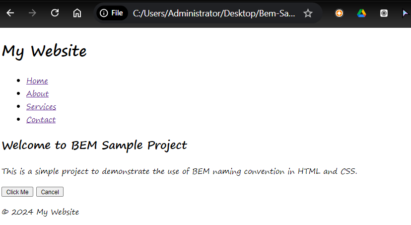
Output:

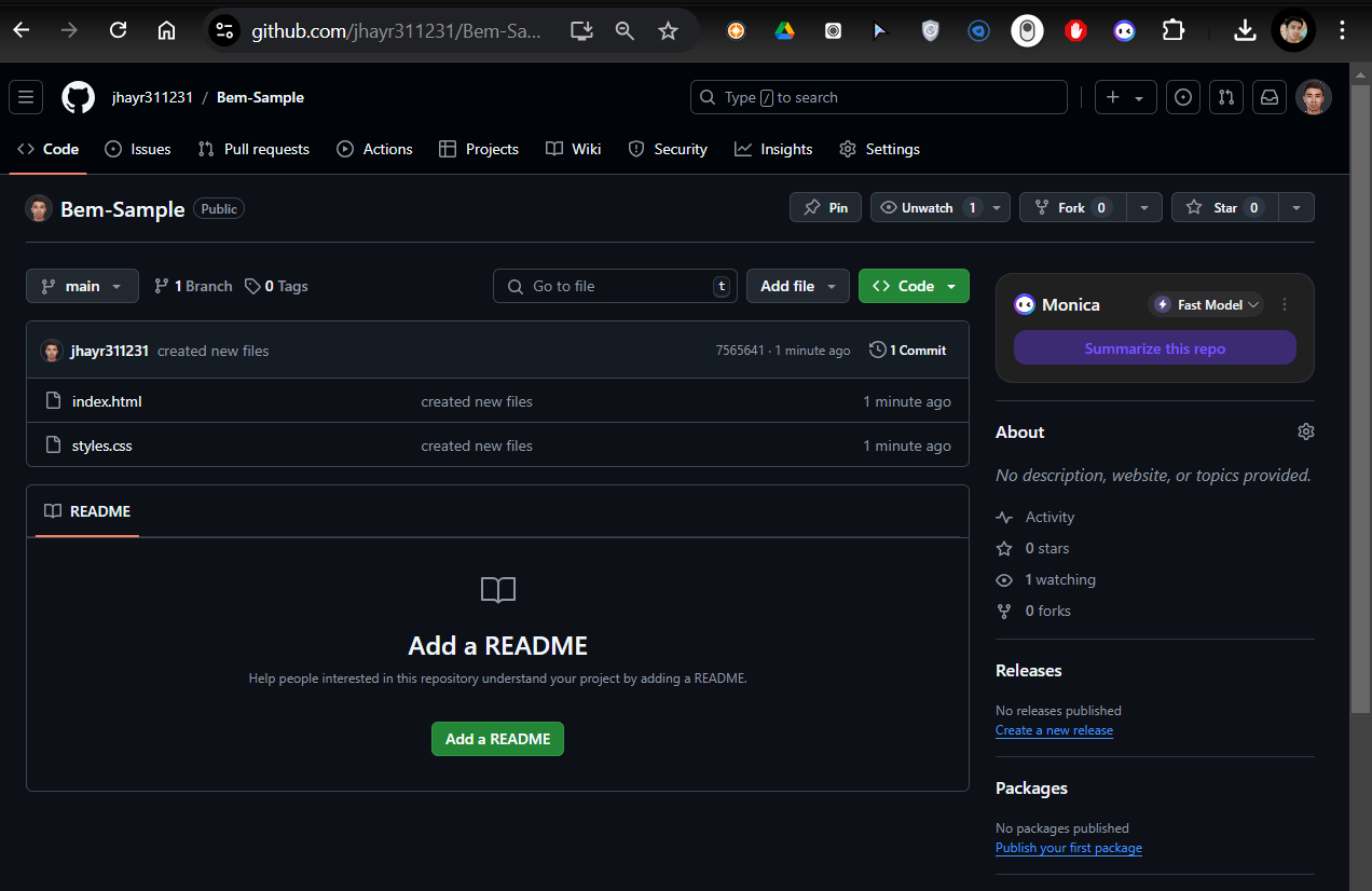
Repository:

Subscribe to my newsletter
Read articles from Danilo Buenafe Jr directly inside your inbox. Subscribe to the newsletter, and don't miss out.
Written by
