Activity 21: Research OOCSS - Object-Oriented CSS
 Danilo Buenafe Jr
OOCSS (Object-Oriented CSS) is a CSS methodology that aims to create more efficient, maintainable, and scalable CSS by applying object-oriented principles. It treats UI elements as reusable objects and emphasizes the separation of concerns in styling.
Core Principles:
Separation of Structure and Skin:
- This principle divides an element’s layout (structure) from its visual styling (skin). The structure includes things like padding, margins, and positioning, while the skin refers to colors, fonts, and other aesthetic properties.
Separation of Container and Content:
- Components should be flexible and not dependent on where they are placed within the layout. This ensures that the same object (UI component) can be reused in different contexts without breaking its design.
Advantages:
Encourages Reusable Code:
- OOCSS allows you to create modular components that can be reused across different parts of a project, reducing redundancy in your code.
Scalable:
- OOCSS makes it easier to manage larger projects because its modular approach ensures that adding new components doesn’t require rewriting or restructuring large portions of CSS.
Maintainable:
- Separating concerns between structure and skin, and between container and content, results in cleaner code that is easier to maintain and update over time.
Consistent Design:
- Reusing the same components ensures design consistency throughout the project, helping to avoid inconsistencies in appearance.
By focusing on modularity and reuse, OOCSS improves both the development workflow and the final user experience.
Example 1: A Button Component
In this example, we separate the structure (layout) from the skin (visual design) of a button to make it reusable and flexible.
<!DOCTYPE html>
<html lang="en">
<head>
    <meta charset="UTF-8">
    <meta name="viewport" content="width=device-width, initial-scale=1.0">
    <title>OOCSS Example: Button</title>
    <link rel="stylesheet" href="styles.css">
</head>
<body>
    <button class="btn btn-primary">Primary Button</button>
    <button class="btn btn-secondary">Secondary Button</button>
</body>
</html>
/* Structure (layout, spacing) */
.btn {
    padding: 10px 20px;
    border-radius: 5px;
    border: none;
    cursor: pointer;
    font-size: 16px;
}

/* Skin (visual design) */
.btn-primary {
    background-color: #007bff;
    color: white;
}

.btn-secondary {
    background-color: #6c757d;
    color: white;
}

/* Skin can change independently of structure */
.btn-primary:hover {
    background-color: #0056b3;
}

.btn-secondary:hover {
    background-color: #5a6268;
}
Explanation:
Separation of Structure and Skin:
The
.btnclass defines the structural properties like padding, border-radius, and font size.The
.btn-primaryand.btn-secondaryclasses apply the visual design (skin), such as background color and text color. These skins are independent of the button's layout.
Example 2: A Card Component
This example demonstrates a reusable card component with separated structure (layout) and skin (visual design).
<!DOCTYPE html>
<html lang="en">
<head>
    <meta charset="UTF-8">
    <meta name="viewport" content="width=device-width, initial-scale=1.0">
    <title>OOCSS Example: Card</title>
    <link rel="stylesheet" href="styles.css">
</head>
<body>
    <div class="card card-default">
        <div class="card-content">
            <h2 class="card-title">Card Title</h2>
            <p class="card-text">This is a reusable card component.</p>
        </div>
    </div>

    <div class="card card-info">
        <div class="card-content">
            <h2 class="card-title">Info Card</h2>
            <p class="card-text">This is an info card with a different visual style.</p>
        </div>
    </div>
</body>
</html>
/* Structure (layout, spacing) */
.card {
    width: 300px;
    padding: 20px;
    margin: 20px;
    border-radius: 8px;
    box-shadow: 0 2px 4px rgba(0, 0, 0, 0.1);
}

.card-content {
    text-align: center;
}

.card-title {
    font-size: 24px;
    margin-bottom: 10px;
}

.card-text {
    font-size: 16px;
}

/* Skin (visual design) */
.card-default {
    background-color: #f8f9fa;
    border: 1px solid #ddd;
}

.card-info {
    background-color: #17a2b8;
    border: 1px solid #138496;
    color: white;
}
Explanation:
Separation of Structure and Skin:
- The
.cardclass defines the layout (structure) of the card (width, padding, margin), while the.card-defaultand.card-infoclasses handle the visual design (background colors, borders, and text colors).
- The
Reusability:
- Both the
.card-defaultand.card-infoclasses reuse the same structure but apply different visual styles, making them flexible to use in different contexts.
- Both the
In these examples, OOCSS principles help create reusable components with a clear separation between their layout (structure) and visual design (skin). This makes it easier to maintain and scale the CSS while ensuring flexibility and consistency across the website.
My SAmple:
<!DOCTYPE html>
<html lang="en">
<head>
<meta charset="UTF-8">
<meta name="viewport" content="width=device-width, initial-scale=1.0">
<title>OOCSS Example: Reusable Components</title>
<link rel="stylesheet" href="styles.css">
</head>
<body>
<header>
<h1>My OOCSS Example Page</h1>
</header>
<main>
<section class="card-container">
<div class="card card-default">
<div class="card-content">
<h2 class="card-title">Card Title 1</h2>
<p class="card-text">This is a reusable card component.</p>
<button class="btn btn-primary">Read More</button>
</div>
</div>
<div class="card card-info">
<div class="card-content">
<h2 class="card-title">Card Title 2</h2>
<p class="card-text">This card has a different style.</p>
<button class="btn btn-secondary">Learn More</button>
</div>
</div>
<div class="card card-success">
<div class="card-content">
<h2 class="card-title">Card Title 3</h2>
<p class="card-text">Another reusable card component.</p>
<button class="btn btn-primary">Discover</button>
</div>
</div>
</section>
</main>
<footer>
<p>© 2024 My OOCSS Example</p>
</footer>
</body>
</html>
/* Global Styles */
body {
    font-family: Arial, sans-serif;
    margin: 0;
    padding: 0;
    background-color: #f4f4f4;
    color: #333;
}

header {
    background-color: #007bff;
    color: white;
    text-align: center;
    padding: 20px 0;
}

footer {
    text-align: center;
    padding: 10px 0;
    background-color: #333;
    color: white;
}

/* Card Structure */
.card-container {
    display: flex;
    justify-content: center;
    flex-wrap: wrap;
    padding: 20px;
}

.card {
    width: 300px;
    margin: 20px;
    border-radius: 8px;
    box-shadow: 0 2px 4px rgba(0, 0, 0, 0.1);
    overflow: hidden; /* Ensures that children do not overflow */
}

.card-content {
    padding: 20px;
    text-align: center;
}

.card-title {
    font-size: 24px;
    margin-bottom: 10px;
}

.card-text {
    font-size: 16px;
    margin-bottom: 20px;
}

/* Card Skin */
.card-default {
    background-color: #fff;
    border: 1px solid #ddd;
}

.card-info {
    background-color: #17a2b8;
    border: 1px solid #138496;
    color: white;
}

.card-success {
    background-color: #28a745;
    border: 1px solid #218838;
    color: white;
}

/* Button Structure */
.btn {
    padding: 10px 20px;
    border-radius: 5px;
    border: none;
    cursor: pointer;
    font-size: 16px;
}

/* Button Skin */
.btn-primary {
    background-color: #007bff;
    color: white;
}

.btn-secondary {
    background-color: #6c757d;
    color: white;
}

/* Button Hover Effects */
.btn-primary:hover {
    background-color: #0056b3;
}

.btn-secondary:hover {
    background-color: #5a6268;
}
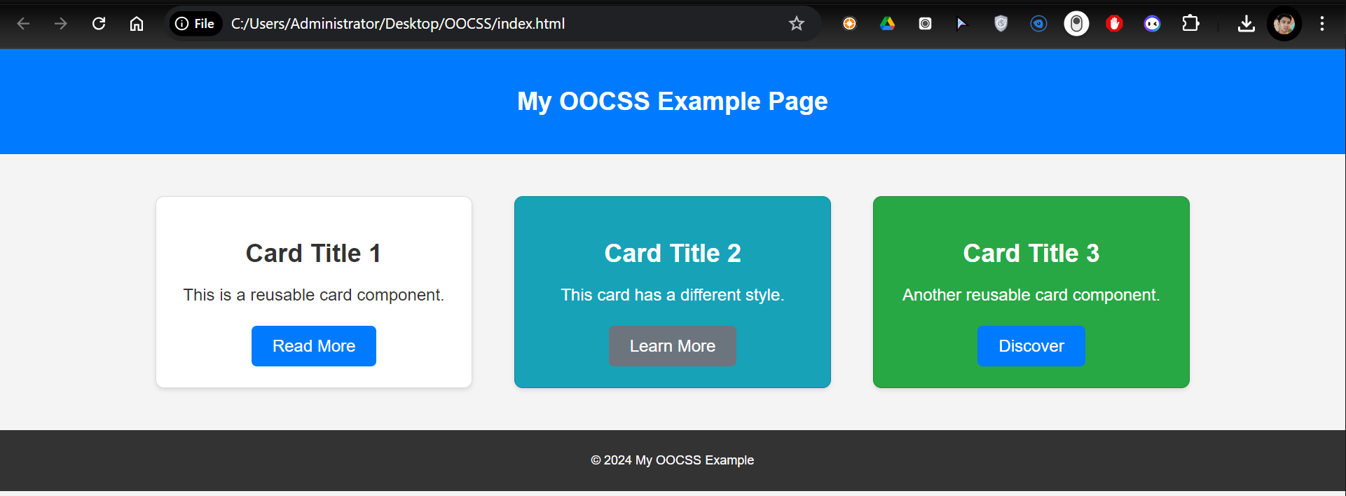
Output:

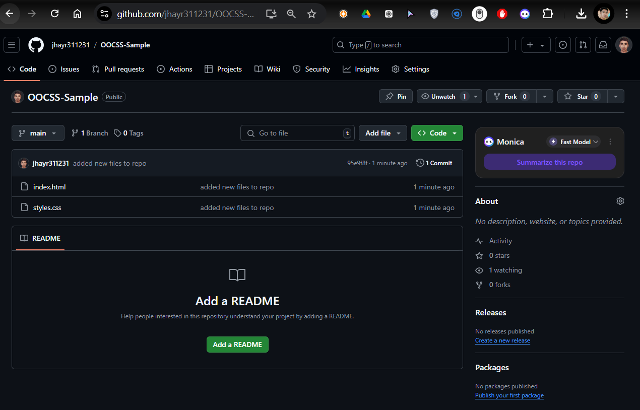
Repository:

##
Subscribe to my newsletter
Read articles from Danilo Buenafe Jr directly inside your inbox. Subscribe to the newsletter, and don't miss out.
Written by
