The Rise, Fall, and Rebirth of Visual Editing
 Steve Sewell
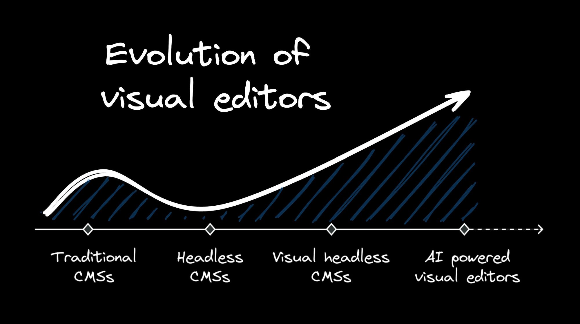
Visual editors have come full circle in the world of content management systems (CMSs). Once a staple feature, they disappeared for a while, and now they're back with a vengeance.
But why? Let's dive into the history, evolution, and future of visual editors in the world of web development.
The rise and fall of visual editing
Traditional CMSs like WordPress came with built-in visual editors. Initially basic, these editors evolved to allow for image insertion, text styling, and even interactive widgets.
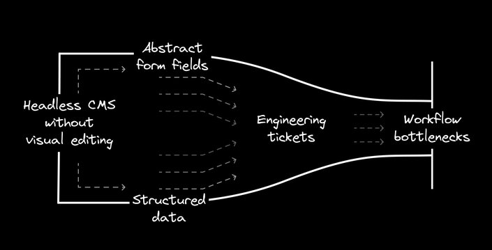
Then came the era of headless CMSs. These systems decoupled content from presentation, offering more flexibility in content delivery across platforms. However, this architectural shift came at a cost: visual editing disappeared.
Content creators were left with abstract form fields and structured data, unable to see how their content would look on the final page. This wasn't just inconvenient — it significantly impacted workflows and business operations.
Updating a homepage or launching a time-sensitive landing page often required developer involvement, leading to bottlenecks. Marketing teams, once in control of their content, became dependent on development resources for even minor changes.
The result? Slower campaigns, limited A/B testing, and reduced ability to respond quickly to market changes. Businesses found themselves less agile in their digital presence, despite the supposed flexibility of headless architecture.
This tension between technical benefits and practical content creation needs set the stage for the next evolution in content management systems — one that would aim to bring visual editing back into the headless world.
Recognizing the gap
This is where Builder came in. We saw a gap in the market — a need for visual editing in a headless world. But we didn't just want to recreate the old visual editors. We wanted something better, something that could truly bridge the gap between developers and content creators.
Our journey began with a real-world problem. While working at ShopStyle, a company doing headless commerce at a massive scale (half a billion in GMV in 2014), I felt the pain of headless architecture firsthand. We had a cutting-edge tech stack, but our marketing team was struggling. They couldn't make the changes they needed without going through development, which slowed down their ability to optimize and personalize content.
This experience led to a crucial insight: in e-commerce, and many other industries, marketing-driven changes often have a bigger impact on sales than technological improvements. We needed a way to give marketers the power to make changes quickly, without sacrificing the benefits of our headless architecture.
Our initial requirements for Builder were ambitious:
- It had to work with any tech stack, just like a headless CMS.
- It needed to use the exact components and design tokens that developers were using in their code.
- It had to be publishable over an API, without requiring code deployment.
- Most importantly, it needed to be as capable as coding, allowing for unlimited customization.
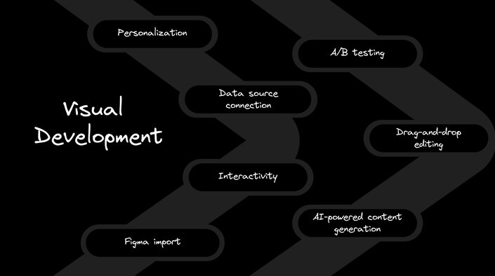
We wanted marketers to be able to drag and drop components, import designs from Figma, and even add interactivity — all without needing to understand the underlying code.
Looking beyond visual editing
As we developed Builder, our vision expanded. We didn't stop at just creating a visual editor — we set out to build a complete visual development environment.
We added AI capabilities and Large Language Models (LLMs) to help with content generation and optimization. We developed features for A/B testing and personalization, allowing marketers to create targeted content variations easily. These additions made Builder not just a tool for making changes, but a platform for experimentation and optimization.
One key part of our efforts was developing a way to visually edit code. This means that anything created in Builder can be as performant and consistent with your codebase as if a developer had hand-coded it. It also means that developers can export anything created in Builder as code, giving them the flexibility to work with the visual editor's output in whatever way best fits their workflow.
We focused on making Builder a true end-to-end solution. It's not just about making small text changes — it's about being able to create entire new pages, add new sections, run experiments, and connect to various data sources, all without needing to involve developers for every change.
This approach has allowed us to create a tool that's not just a compromise between developer needs and marketer needs, but a solution that empowers both. By building on a foundation of headless architecture, we've ensured that content created in Builder can be delivered anywhere, to any platform or device, while still providing the visual editing capabilities that marketing teams need.
The result? A platform that accelerates workflows and enables businesses to move at the speed of their ideas, truly bridging the gap between headless flexibility and visual editing power.
The visual editor landscape
Since Builder pioneered the headless visual editor, many other companies have jumped on the bandwagon. Contentful, ContentStack, Sanity, Storyblok, Prismic — they've all added some form of visual editing to their offerings.
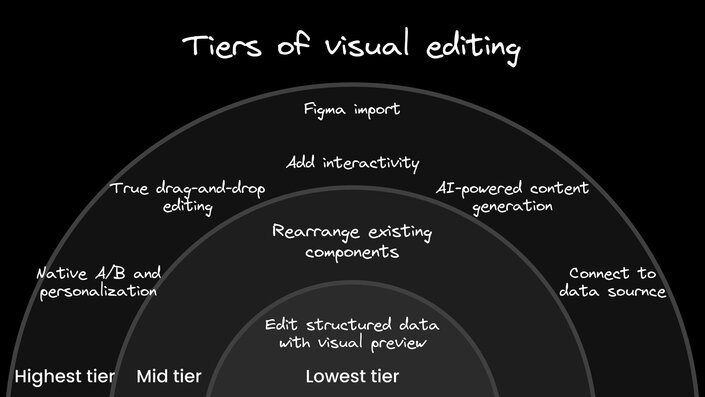
But here's the thing — not all visual editors are created equal. There are tiers of visual editing capabilities, and many solutions fall short of what we consider the gold standard.
At the lowest tier, you have systems that simply provide a button to edit structured data with a visual preview. These don't offer much flexibility or reduce engineering costs significantly.
The next tier up might allow for rearranging existing components, but they often don't support creating net new designs, A/B testing, or personalization without developer involvement.
Many of these solutions feel tacked on, like an afterthought rather than a core feature. They often lack the depth and flexibility of a purpose-built visual editor like Builder's.
Our visual editor isn't just a pretty interface slapped on top of a CMS. It's the foundation of our entire platform. This allows us to offer features that others can't, like:
- True drag-and-drop editing on a direct canvas
- AI-powered content generation and manipulation
- Seamless import from design tools like Figma
- The ability to add interactivity and connect to data sources
- Native A/B testing and personalization
These features might not be immediately obvious when you're just looking at screenshots. But they make a world of difference when you're actually using the tool to create and manage content at scale.
How this translates to business impact
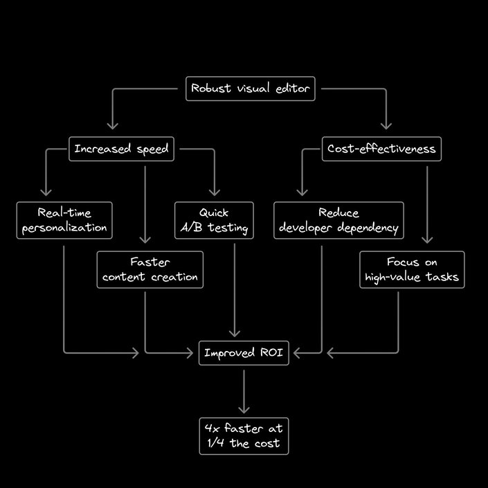
What makes a visual editor like Builder's so revolutionary for businesses? It all comes down to speed and cost-effectiveness.
In the world of e-commerce and digital marketing, the ability to move quickly can make or break a business. A robust visual editor allows marketing and content teams to move at the speed of their ideas, rather than being bottlenecked by development resources.
Imagine creating a new landing page for a flash sale, launching it, and running A/B tests — all without writing a single line of code. Or personalizing your homepage for different audience segments in real-time. These agile marketing tactics can significantly boost conversion rates and drive revenue.
But it's not just about speed. It's also about cost savings and resource allocation. By empowering marketing teams to make changes themselves, businesses can allocate their development resources to more complex, high-value tasks. This not only reduces costs, but also improves job satisfaction among developers, who can focus on building new features rather than making minor content updates.
Moreover, the ability to quickly test and iterate can lead to significant improvements in conversion rates and user engagement. This data-driven approach to content creation can substantially increase the ROI of your marketing efforts. We have customers who are moving four times faster at a quarter of the cost.
In essence, a robust visual editor doesn't just save time and money — it fundamentally changes how businesses approach their digital presence, allowing for a level of agility and experimentation that was previously impossible in a headless architecture.
The future is visual (and AI-powered)
So where do we go from here? At Builder, we're betting big on AI. We're working on features that will make content creation and optimization even more autonomous.
Imagine being able to have a conversation about your homepage in Slack, and then having an AI agent automatically implement those changes, run an A/B test, and report back on the results. Or picture a world where every piece of content you create is automatically optimized for different audience segments.
This is the future we're building towards — a world where content creation is not just visual, but intelligent and autonomous. A world where ideas can go from conception to live on your site with minimal human intervention.
The visual editor has come a long way from its humble beginnings. And at Builder, we're excited to be at the forefront of its evolution. We believe that visual is the only way forward for creating digital experiences. It's faster, more intuitive, and more accessible. And when combined with the power of AI, it has the potential to revolutionize how we create and optimize content on the web.
So the next time you're frustrated with your current CMS or struggling to get changes made to your site, remember — there's a better way. The future of content management is visual, and it's already here.
Subscribe to my newsletter
Read articles from Steve Sewell directly inside your inbox. Subscribe to the newsletter, and don't miss out.
Written by
