Activity 20: Research BEM - Block, Element, Modifier - Architecture | Aligan, Rhed N.
 Rhed Aligan
What is BEM?
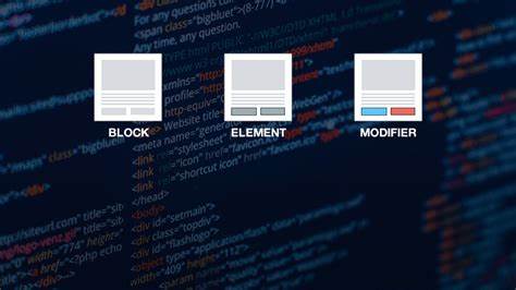
- BEM is a popular naming convention used in CSS to organize code in a modular and reusable way.
In addition, BEM is a methodology that helps you to create reusable components and code sharing in front‑end development.
It stands for:
Block: A standalone entity like a button or menu (.button).
Element: A part of the block that has a specific function (.button__icon).
Modifier: A variation of the block or element (.button--primary).
Advantages of BEM:
Improves code readability.
Encourages modularity, making it easy to manage large projects.
Helps avoid CSS conflicts.
Practice:
- Create an HTML structure using BEM naming conventions and write CSS to style it.
Document Your Work:
Write about your findings and examples on Hashnode.com or Medium.com.
include code snippets
include screenshot
oct 4
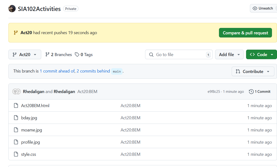
repo
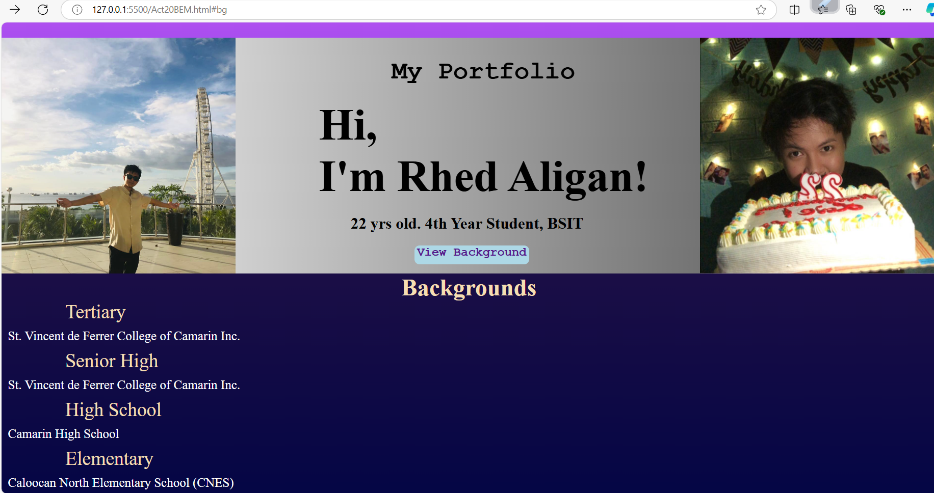
OUTPUT OF ACT 20

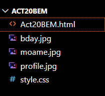
File I use

Act20BEM.html
  <!DOCTYPE html>
  <html lang="en">
  <head>
      <meta charset="UTF-8">
      <meta name="viewport" content="width=device-width, initial-scale=1.0">
      <link rel="stylesheet" href="style.css">
      <title>ACTIVITY 20: RESEARCH BEM</title>
  </head>
  <body>
   <div class="me">
      <img src="moame.jpg" class=" me__moa">
      <div class="me__welcome">
      <span class="me__portfolio">My Portfolio</span>
      <h1 class="me__h1">Hi, <br>I'm Rhed Aligan!</h1>
      <span class="me__span">22 yrs old. 4th Year Student, BSIT</span>

      <a href="#bg" class="me__btn">View Background</a>
  </div>
      <img src="bday.jpg" alt="BirthdayBoy" class="me__img">
   </div>
  <div class="sec">
   <section id="bg">
      <div class="bg_h1bg">
      <h1 class="bg__h1--primary">Backgrounds</h1></div>
      <div class="bg__educ">
          <span>Tertiary</span>
          <p class="bg__p">St. Vincent de Ferrer College of Camarin Inc.</p>
          <span>Senior High</span>
          <p class="bg__p">St. Vincent de Ferrer College of Camarin Inc.</p>
          <span>High School</span>
          <p class="bg__p">Camarin High School</p>
          <span>Elementary</span>
          <p class="bg__p">Caloocan North Elementary School (CNES)</p>
      </div>
  </div>
  </section>
  </body>
  </html>
In this code snippet shows different name convention to help our design more understandable, scable by the name, and organized. BEM helpful for the clarity of the code, and to avoidance of any specific issues in tags or in container, you can identify each with a relative name. With a different use of Block or classes called for container using elements within the blocks, and the modifier name convention to set the appearance of tags defined in the code above.
a style.css I use
html {
  scroll-behavior: smooth;
}
* {
  margin: 0;
  padding: 0;
  box-sizing: border-box;
}
body {
  background-image: linear-gradient(to bottom,  #bf56f0, #0a11e6);
  background-repeat: no-repeat;
  height: 100vh;
}
.me {
  margin-top: 100px;
  display: flex;
  flex-direction: row;
  height: 370px;
  justify-content: space-between;
  background-image: linear-gradient(to left, #444444, #FFFFFF );

}
.me__h1 {
  font-size: 70px;
  margin: 20px 0 0 50px;
  justify-content: center;
}
.me__portfolio {
  font-size: 40px;
  font-family:'Courier New', Courier, monospace;
  font-weight: bolder;
  display: flex;
  flex-direction: row;
  margin: 30px 0px 0px 50px;
  justify-content: center;

}
.me__welcome {
  display: flex;
  justify-content: flex-start;
  flex-direction: column;


}
.me__span {
  font-size: 25px;
  font-weight: 600;
  display: flex;
  flex-direction: column;
  margin: 20px 0 0 100px;

}
.me__img {
  display: flex;
  justify-content: flex-end;
  flex-direction: row;
}
.me__btn {
  border-radius: 8px;
  width: 180px;
  height: 30px;
  margin: 20px 0 0 200px;
  font-size: 19px;
  font-weight:bolder;
  background-color: lightblue;
  font-family:'Courier New', Courier, monospace;
  text-decoration: none;
  align-self: auto;
  text-align: center;
  cursor: pointer;

}

#bg {
  display: flex;
  flex-direction:column;
  justify-content:flex-start;
  background-color:rgba(0,0,0,0.7);
  height: 50vh;
}
.bg_h1bg {
  display: flex;
  flex-direction: column;
  font-size: 25px;
  text-align: center;
  color: wheat;
}
.bg__educ span {
  margin: 20px 0 0 100px;
  color: wheat;
  font-size: 30px;
  align-self: auto  ;
}
.bg__p {
  color: white  ;
  font-size: 20px;
  margin:10px 0 10px 10px;
}
I use html { scroll-behavior: smooth; } for the sake of smooth transition when the button with a value “View Background smoothly transition. In my case I use within the same page so the action only is to scroll where I put the section corresponding with this ID. In the output, I zoom out to capture whole design, But when I zoom in, the a tags with href as my button will use also for the sake that the BEM is very helpful.
REPO LINK (GitHub)
https://github.com/Rhedaligan8/SIA102Activities.git
https://github.com/Rhedaligan8/SIA102Activities.git
https://github.com/Rhedaligan8/SIA102Activities.git
I use a branch Name “Act20” to reposited my Activity 20 under SIA102Activities


Subscribe to my newsletter
Read articles from Rhed Aligan directly inside your inbox. Subscribe to the newsletter, and don't miss out.
Written by
Rhed Aligan
Rhed Aligan
I'm very enthusiast in things that gives me new material to learn.