20 Seaborn concepts with Before-and-After Examples
 Anix Lynch
Table of contents
- 1. Line Plot (seaborn.lineplot) 📉
- 2. Bar Plot (seaborn.barplot) 📊
- 3. Count Plot (seaborn.countplot) 📊
- 4. Histogram (seaborn.histplot) 📈
- 5. Box Plot (seaborn.boxplot) 📦
- 6. Violin Plot (seaborn.violinplot) 🎻
- 7. Scatter Plot (seaborn.scatterplot) 🔵
- 8. Pair Plot (seaborn.pairplot) 🔀
- 9. Heatmap (seaborn.heatmap) 🔥
- 10. Joint Plot (seaborn.jointplot) 🌐
- 11. Regression Plot (seaborn.regplot) 📈
- 12. KDE Plot (seaborn.kdeplot) 📊
- 13. Facet Grid (seaborn.FacetGrid) 📐
- 14. Swarm Plot (seaborn.swarmplot) 🐝
- 15. Point Plot (seaborn.pointplot) 📍
- 16. LM Plot (seaborn.lmplot) 🧮
- 17. Strip Plot (seaborn.stripplot) 🟡
- 18. PairGrid (seaborn.PairGrid) 🔗
- 19. Joint Grid (seaborn.JointGrid) ⚙️
- 20. Heatmap with Annotations (seaborn.heatmap) 🔢
1. Line Plot (seaborn.lineplot) 📉
Boilerplate Code:
import seaborn as sns
Use Case: Create a line plot to display trends over time or ordered data. 📉
Goal: Visualize continuous data over a range or time. 🎯
Sample Code:
# Example data
data = [1, 2, 3, 4, 5]
sns.lineplot(x=[1, 2, 3, 4, 5], y=[2, 4, 6, 8, 10])
Before Example: You have a sequence of data points but no clear trend visualization. 🤔
Data: x = [1, 2, 3, 4, 5], y = [2, 4, 6, 8, 10]
After Example: With lineplot, the trend of the data is clear! 📉
Output: A line plot connecting the points.
Challenge: 🌟 Try adding markers with markers=True to make each data point stand out.
2. Bar Plot (seaborn.barplot) 📊
Boilerplate Code:
import seaborn as sns
Use Case: Create a bar plot to compare categorical data. 📊
Goal: Compare means or other summary statistics across categories. 🎯
Sample Code:
# Example data
sns.barplot(x=['A', 'B', 'C'], y=[10, 20, 30])
Before Example: You have categories and values but no visual way to compare them. 🤔
Data: x = ['A', 'B', 'C'], y = [10, 20, 30]
After Example: With barplot, you can compare the values across categories! 📊
Output: A bar chart showing categorical comparisons.
Challenge: 🌟 Try adding error bars using the ci parameter to represent uncertainty.
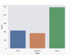
3. Count Plot (seaborn.countplot) 📊
Boilerplate Code:
import seaborn as sns
Use Case: Create a count plot to show the count of observations in each category. 📊
Goal: Visualize the frequency of each category. 🎯
Sample Code:
# Example data
sns.countplot(x=['cat', 'dog', 'dog', 'cat', 'bird'])
Before Example: You have categorical data but no way to visualize how often each category appears. 🤔
Data: ['cat', 'dog', 'dog', 'cat', 'bird']
After Example: With countplot, you see how frequently each category appears! 📊
Output: A bar plot showing the count of each category.
Challenge: 🌟 Try using hue to split the counts by an additional categorical variable.
4. Histogram (seaborn.histplot) 📈
Boilerplate Code:
import seaborn as sns
Use Case: Create a histogram to visualize the distribution of numerical data. 📈
Goal: Display the frequency of data points within bins. 🎯
Sample Code:
# Example data
sns.histplot(data=[1, 2, 2, 3, 3, 4, 5], bins=5)
Before Example: You have numerical data but no way to visualize its distribution. 🤔
Data: [1, 2, 2, 3, 3, 4, 5]
After Example: With histplot, the data distribution becomes clear! 📈
Output: A histogram showing data frequencies.
Challenge: 🌟 Try changing the number of bins to see how it affects the histogram.
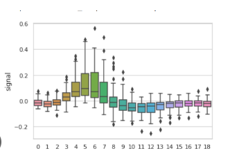
5. Box Plot (seaborn.boxplot) 📦
Boilerplate Code:
import seaborn as sns
Use Case: Create a box plot to show the distribution of data and detect outliers. 📦
Goal: Summarize the data distribution using quartiles and outliers. 🎯
Sample Code:
# Example data
sns.boxplot(data=[1, 2, 3, 4, 5, 6, 7, 8, 9])
Before Example: You have numerical data but no way to visualize its range, quartiles, and outliers. 🤔
Data: [1, 2, 3, 4, 5, 6, 7, 8, 9]
After Example: With boxplot, you can see the distribution and detect any outliers! 📦
Output: A box plot summarizing the data.
Challenge: 🌟 Try splitting the box plots by categories using x and y arguments.
6. Violin Plot (seaborn.violinplot) 🎻
Boilerplate Code:
import seaborn as sns
Use Case: Create a violin plot to show the distribution of data and its probability density. 🎻
Goal: Combine the benefits of box plots and density plots. 🎯
Sample Code:
# Example data
sns.violinplot(data=[1, 2, 3, 4, 5, 6, 7, 8, 9])
Before Example: You have numerical data but want a more detailed look at its distribution than just a box plot. 🤔
Data: [1, 2, 3, 4, 5, 6, 7, 8, 9]
After Example: With violinplot, you visualize both the distribution and probability density! 🎻
Output: A violin plot showing data density and distribution.
Challenge: 🌟 Try splitting violins by categories to compare distributions between groups.
7. Scatter Plot (seaborn.scatterplot) 🔵
Boilerplate Code:
import seaborn as sns
Use Case: Create a scatter plot to show the relationship between two numerical variables. 🔵
Goal: Visualize individual data points to detect patterns or correlations. 🎯
Sample Code:
# Example data
sns.scatterplot(x=[1, 2, 3, 4], y=[10, 11, 12, 13])
Before Example: You have two variables but no way to visualize their relationship. 🤔
Data: x = [1, 2, 3, 4], y = [10, 11, 12, 13]
After Example: With scatterplot, the relationship between the variables is visualized! 🔵
Output: A scatter plot showing individual data points.
Challenge: 🌟 Try adding a third dimension by mapping a categorical variable to hue.
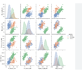
8. Pair Plot (seaborn.pairplot) 🔀
Boilerplate Code:
import seaborn as sns
Use Case: Create a pair plot to visualize relationships between multiple pairs of variables. 🔀
Goal: Show scatter plots for each pair of variables in a dataset. 🎯
Sample Code:
# Example data
sns.pairplot(sns.load_dataset("iris"))
Before Example: You have multiple variables but no way to visualize their relationships in one view. 🤔
Data: Iris dataset (sepal length, sepal width, petal length, petal width)
After Example: With pairplot, you can view scatter plots for each pair of variables! 🔀
Output: A grid of scatter plots for each pair of variables.
Challenge: 🌟 Try using hue to differentiate categories in the dataset.
9. Heatmap (seaborn.heatmap) 🔥
Boilerplate Code:
import seaborn as sns
Use Case: Create a heatmap to visualize data intensity in a matrix. 🔥
Goal: Represent numerical data as color-coded intensity. 🎯
Sample Code:
# Example data
import numpy as np
data = np.array([[1, 2], [3, 4]])
sns.heatmap(data)
Before Example: You have a matrix of numerical data but no clear way to visualize the intensity. 🤔
Data: [[1, 2], [3, 4]]
After Example: With heatmap, you visualize the data intensity using colors! 🔥
Output: A heatmap representing the matrix.
Challenge: 🌟 Try using annot=True to show the data values inside the heatmap cells.
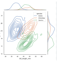
10. Joint Plot (seaborn.jointplot) 🌐
Boilerplate Code:
import seaborn as sns
Use Case: Create a joint plot to visualize both the distribution and relationship of two variables. 🌐
Goal: Combine scatter plots and distribution plots into one view. 🎯
Sample Code:
# Example data
sns.jointplot(x=[1, 2, 3], y=[4, 5, 6])
Before Example: You have two variables but no way to visualize both their relationship and distribution. 🤔
Data: x = [1, 2, 3], y = [4, 5, 6]
After Example: With jointplot, you can visualize both the scatter plot and histograms in one! 🌐
Output: A combined scatter and histogram plot.
Challenge: 🌟 Try using different kind options like reg for regression or hex for hexbin plots.
11. Regression Plot (seaborn.regplot) 📈
Boilerplate Code:
import seaborn as sns
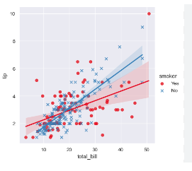
Use Case: Create a regression plot to display a linear regression line with data points. 📈
Goal: Visualize the relationship between two variables with a regression line. 🎯
Sample Code:
# Example data
sns.regplot(x=[1, 2, 3, 4], y=[5, 6, 7, 8])
Before Example: You have two variables but no way to represent their linear relationship. 🤔
Data: x = [1, 2, 3, 4], y = [5, 6, 7, 8]
After Example: With regplot, you visualize the relationship with a linear regression line! 📈
Output: A scatter plot with a regression line.
Challenge: 🌟 Try adding ci=None to remove the confidence interval or change the order for polynomial regression.
12. KDE Plot (seaborn.kdeplot) 📊
Boilerplate Code:
import seaborn as sns
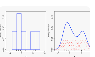
Use Case: Create a Kernel Density Estimate (KDE) plot to visualize the distribution of data. 📊
Goal: Show the probability density function of a variable. 🎯
Sample Code:
# Example data
sns.kdeplot(data=[1, 2, 2, 3, 4, 5])
Before Example: You have numerical data but no smooth representation of its distribution. 🤔
Data: [1, 2, 2, 3, 4, 5]
After Example: With kdeplot, you see a smooth curve representing the data's distribution! 📊
Output: A KDE plot showing the probability density.
Challenge: 🌟 Try combining kdeplot with histplot for a detailed view of the distribution.
13. Facet Grid (seaborn.FacetGrid) 📐
Boilerplate Code:
import seaborn as sns
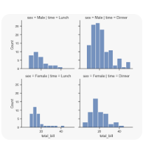
Use Case: Create a facet grid to plot multiple plots based on subsets of data. 📐
Goal: Display the relationship between variables across different subsets of data. 🎯
Sample Code:
# Load example data
df = sns.load_dataset("tips")

# Create FacetGrid
g = sns.FacetGrid(df, col="sex", row="time")
g.map(sns.scatterplot, "total_bill", "tip")
Before Example: You have data split by categories but no way to visualize each subset clearly. 🤔
Data: Tips dataset with sex and time categories.
After Example: With FacetGrid, you get multiple plots for each subset of the data! 📐
Output: A grid of scatter plots showing tips by total bill.
Challenge: 🌟 Try using hue to add another categorical dimension to the grid.
14. Swarm Plot (seaborn.swarmplot) 🐝
Boilerplate Code:
import seaborn as sns
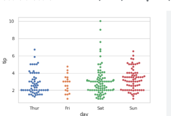
Use Case: Create a swarm plot to display categorical scatter plots with non-overlapping points. 🐝
Goal: Show the distribution of data points within categories without overlapping. 🎯
Sample Code:
# Example data
sns.swarmplot(x=["cat", "cat", "dog", "dog"], y=[2, 3, 4, 5])
Before Example: You have categorical data but no way to show individual data points clearly. 🤔
Data: Categories: ["cat", "dog"], Values: [2, 3, 4, 5]
After Example: With swarmplot, you display individual data points without overlap! 🐝
Output: A swarm plot showing the distribution of points.
Challenge: 🌟 Try using hue to color-code points based on an additional variable.
15. Point Plot (seaborn.pointplot) 📍
Boilerplate Code:
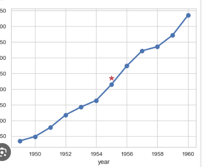
import seaborn as sns
Use Case: Create a point plot to visualize the relationship between categorical data and numerical data. 📍
Goal: Show mean values of categories with confidence intervals. 🎯
Sample Code:
# Example data
sns.pointplot(x=["A", "B", "C"], y=[4, 5, 6])
Before Example: You have categorical data but no way to visualize the mean values across categories. 🤔
Data: Categories: ["A", "B", "C"], Values: [4, 5, 6]
After Example: With pointplot, the mean values are visualized with error bars! 📍
Output: A point plot showing means with error bars.
Challenge: 🌟 Try adding hue to compare means across different categories.
16. LM Plot (seaborn.lmplot) 🧮
Boilerplate Code:
import seaborn as sns
Use Case: Create an lmplot to visualize linear relationships with multiple facets. 🧮
Goal: Combine regression lines and scatter plots with facet grids. 🎯
Sample Code:
# Load example data
df = sns.load_dataset("tips")

# Create lmplot
sns.lmplot(x="total_bill", y="tip", hue="sex", data=df)
Before Example: You want to visualize both scatter plots and linear regression with multiple subsets of data. 🤔
Data: Tips dataset with total bill and tip variables.
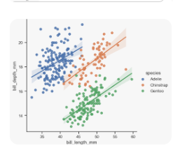
After Example: With lmplot, the linear regression lines and scatter plots are displayed! 🧮
Output: A scatter plot with regression lines based on gender.
Challenge: 🌟 Try using col to split the plot by time of day.
17. Strip Plot (seaborn.stripplot) 🟡
Boilerplate Code:
import seaborn as sns
Use Case: Create a strip plot to display individual data points with some jitter. 🟡
Goal: Show the distribution of data points along a categorical axis with slight jitter. 🎯
Sample Code:
# Example data
sns.stripplot(x=["cat", "dog", "dog", "cat"], y=[2, 3, 4, 5])
Before Example: You have categorical data and want to display individual points, but they overlap. 🤔
Data: Categories: ["cat", "dog"], Values: [2, 3, 4, 5]
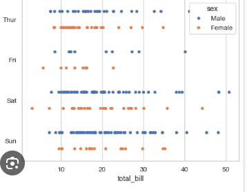
After Example: With stripplot, you can add jitter to make individual points clearer! 🟡
Output: A strip plot with jittered data points.
Challenge: 🌟 Try using hue to differentiate points based on another category.
18. PairGrid (seaborn.PairGrid) 🔗
Boilerplate Code:
import seaborn as sns
Use Case: Create a pair grid to visualize pairwise relationships between variables using different plots. 🔗
Goal: Combine multiple plot types (scatter, histograms, etc.) into a grid for deeper analysis. 🎯
Sample Code:
# Load example data
df = sns.load_dataset("iris")

# Create PairGrid
g = sns.PairGrid(df)
g.map_diag(sns.histplot)
g.map_offdiag(sns.scatterplot)
Before Example: You have multiple variables and want to use different plot types to explore their relationships. 🤔
Data: Iris dataset with multiple numerical variables.
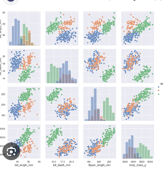
After Example: With PairGrid, you combine scatter plots, histograms, and more in one view! 🔗
Output: A grid of plots for each pair of variables.
Challenge: 🌟 Try mapping different plot types to diagonal and off-diagonal elements for a more detailed analysis.
19. Joint Grid (seaborn.JointGrid) ⚙️
Boilerplate Code:
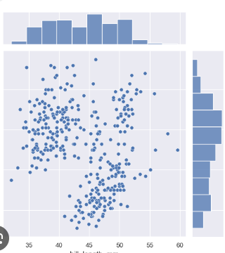
import seaborn as sns
Use Case: Create a joint grid to visualize the relationship between two variables using multiple plots. ⚙️
Goal: Create a custom plot that combines scatter plots, KDE, or histograms. 🎯
Sample Code:
# Example data
g = sns.JointGrid(x=[1, 2, 3], y=[4, 5, 6])
g.plot(sns

.scatterplot, sns.histplot)
Before Example: You want to customize the combination of scatter and distribution plots. 🤔
Data: x = [1, 2, 3], y = [4, 5, 6]
After Example: With JointGrid, you customize how different plots are displayed together! ⚙️
Output: A combined scatter plot and histogram.
Challenge: 🌟 Try using plot_kws to add custom styles to the plots.
20. Heatmap with Annotations (seaborn.heatmap) 🔢
Boilerplate Code:
import seaborn as sns
Use Case: Create a heatmap with annotations to visualize a matrix of numbers with text annotations. 🔢
Goal: Display numerical data as color-coded intensity and show the exact values. 🎯
Sample Code:
# Example data
import numpy as np
data = np.array([[1, 2], [3, 4]])
sns.heatmap(data, annot=True)
Before Example: You have a matrix of numbers but want both a color map and the exact values. 🤔
Data: [[1, 2], [3, 4]]
After Example: With heatmap and annotations, the data is color-coded and labeled! 🔢
Output: A heatmap showing data values with annotations.
Challenge: 🌟 Try changing the fmt argument to display different formats for annotations.
Seaborn documentation
Subscribe to my newsletter
Read articles from Anix Lynch directly inside your inbox. Subscribe to the newsletter, and don't miss out.
Written by
