Activity 22: Research SMACSS - Scalable and Modular Architecture for CSS | Aligan, Rhed N.
 Rhed Aligan
Instructions:
What is SMACSS?:
- SMACSS is a CSS architecture designed to help developers write scalable and modular CSS. It breaks down styles into manageable categories to make large projects easier to maintain.
Key Categories:
Base: Default styles for HTML elements.
Layout: Defines the major sections of a page.
Module: Reusable components like buttons or cards.
State: Styles for different states (e.g., is-active).
Theme: Styles for visual variations.
Advantages:
- Improves scalability and maintenance of large projects.
Practice:
- Build a simple webpage using SMACSS principles.
Document Your Work:
Include code examples and screenshots in your blog post on Hashnode.com or Medium.com.
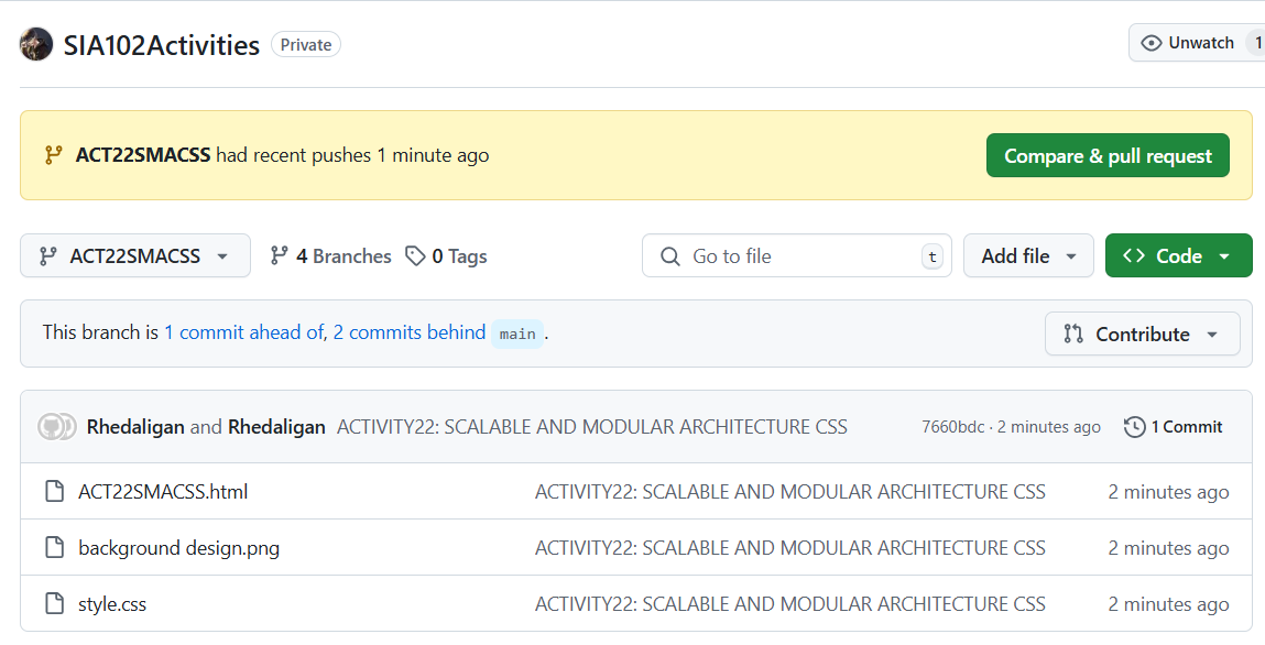
repo
oct 4
OUTPUT:
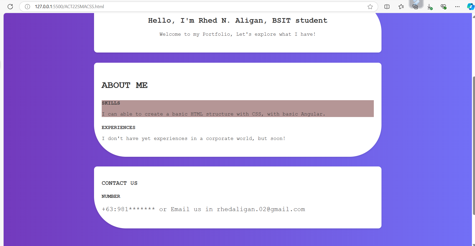
WITH HOVER (STATE)
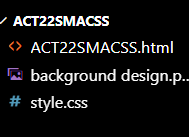
The file under my folder:
My html as named “ACT22SMACSS.html”
<!DOCTYPE html>
<html lang="en">
<head>
<meta charset="UTF-8">
<meta name="viewport" content="width=device-width, initial-scale=1.0">
<title>SMACSS Portfolio Page</title>
<link rel="stylesheet" href="style.css">
</head>
<body>
<header class="header__layout">
<h1>My Portfolio</h1>
<nav class="nav_layout">
<a href="#">Home</a>
<a href="#">About Me</a>
<a href="#">Contact</a>
</nav>
</header>
<main class="main__layout">
<section class="welcome__catalog">
<h2>Hello, I'm Rhed N. Aligan, BSIT student</h2>
<p>Welcome to my Portfolio, Let's explore what I have!</p>
</section>
<section class="proj__catalog">
<h3>ABOUT ME</h3>
<div class="project">
<h4>SKILLS</h4>
<p>I can able to create a basic HTML structure with CSS, with basic Angular.</p>
</div>
<div class="project">
<h4>EXPERIENCES</h4>
<p>I don't have yet experiences in a corporate world, but soon!</p>
</div>
</section>
<section class="proj__catalog3">
<h3>CONTACT US</h3>
<div class="project">
<h4>NUMBER</h4>
<p>+63:981******* or Email us in rhedaligan.02@gmail.com</p>
</div></section>
</main>
<footer class="myfooter">
<p>© 2024 My Portfolio</p>
</footer>
</body>
</html>
As you can see, I only use a various classes only with a principle of SMACSS, it looks more clarity and our codebase not been unstructured code or spaghetti code what they called.
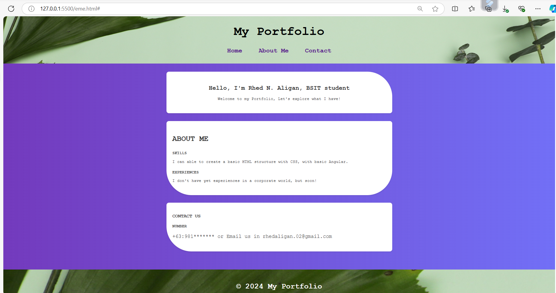
In the output, it shows with my BASE SET UP (The body), There’s a LAY OUT SET UP also that I use to create and design my header part. I use a 3 card as now MODULE SET UP including the 3 catalog or cards to display my information with a design custom border-radius. STATED SET UP such as hover to make interactive the elements. To help to understand this is my breakdown definition to make PRINCIPLE OF SMACSS more understandable. as a THEME SET UP, I use a :root that can be able to input or inject based on the color give example of that is
background-color: var(--secondary-color); with the set up in the: root with a pre-defined color, you can do this without inputting every color each element or components. The best practice to make OUR CODE REUSABLE especially in designing of webpage/front end. It depends on you, but in my case, I do not use the theme rules in the: root section because it’s my choice. Yes, my choice to be put linear gradient. you can put in the :root. But this time, my preference.
Structure: The HTML uses important tags like <header>, <main>, and <footer> to organize the content clearly. This helps anyone reading the code understand the layout easily. Additionally, this is like a standard base or necessarily requirement in a code or our html that must have.
Class Naming: The classes are named clearly, like header_layout for the header and proj__catalog for project sections. This name convention with applying SMACSS principle will makes it easier to know what each part of the page does, which is a key idea in SMACSS.
Sections: Each section has a specific purpose like "ABOUT ME" and "CONTACT US". This modular approach means you can easily add or change sections without affecting the whole page.
Navigation: The links in the navigation menu are set up correctly using <nav> and <a> tags. This improves usability, helping users find what they need quickly.
my style.css file
/* My Base Set up */
body {
    font-family:'Courier New', Courier, monospace;
    margin: 0;
    padding: 0;
    background: linear-gradient(to right, rgba(115, 58, 189, 2), rgba(34, 30, 241, 0.64));

    color: #333;
}
a {
    text-decoration: none;
    color: rgb(98, 8, 232,);
}

/* My Layout Set up  */
.header__layout {
    background-image: url("background\ design.png");
    background-size:cover;
    background-repeat: no-repeat;
    color: rgb(0, 3, 3);
    padding: 1.5em;
    text-align: center;
    font-family:'Courier New', Courier, monospace;
    font-size: 25px;

}
.nav_layout a {
    margin: 0 1em;
    color: rgb(98, 8, 232,);
    font-family: 'Courier New', Courier, monospace;
    font-weight: bold;
}
.main__layout {
    padding: 2em;
    max-width: 900px;
    margin: 0 auto;
}

/* Module I did */
.welcome__catalog {
    background-color: white;
    padding: 2em;
    margin-bottom: 2em;
    text-align: center;
    box-shadow: 0 2px 5px rgba(0, 0, 0, 0.1);
    border-radius: 10px 100px 10px 10px;
}

.proj__catalog {
    background-color: white;
    padding: 1.5em;
    border-radius: 10px 10px 100px 100px;
    box-shadow: 0 2px 5px rgba(0, 0, 0, 0.1);

}
.proj__catalog h3 {
    font-size: 30px;
}
.proj__catalog3 {
    background-color: white;
    padding: 1.5em;
    border-radius: 10px 10px 10px 100px;
    box-shadow: 0 2px 5px rgba(0, 0, 0, 0.1);
    margin-top: 30px;
}
.proj__catalog3 p {
    font-size: 20px;
}
.project {
    margin-bottom: 1.5em;
}
.project h4 {
    margin-bottom: 0.5em;
}

/* As an State */
.project:hover {
    background-color: #b59696;
}
.myfooter {
    background-image: url("background\ design.png");
    color: white;
    text-align: center;
    padding: 1em;
    margin-top: 2em;
    font-size: 20px;
}
.myfooter p {
    font-size: 30px;
    font-weight: bold;
}

/* Theme rules */
:root {
    --primary-color: #3498db;
    --secondary-color: #f1f1f1;
}
In this case, I use a different category including in the Principle of SMACSS or Scalable and Modular Architecture for CSS. This will help a lot for scalable webpage for upgraded over time or in a near future. It’s a good for me to learn this principle, This is my short understanding and explanation/description for every style so you can understand more fully especially for the public viewers.
Base Styles: The CSS sets basic styles for the whole page, like font and background color, in the body and a section. This keeps things consistent throughout your site.
Layout Styles: Classes like .header__layout and .main__layout control how the page is laid out. They define spacing, background images, and text alignment, which is important for a good design.
Module Styles: Each module, like .welcome__catalog and .proj__catalog, has its own styles. This keeps the styles organized and makes it easy to change one part without affecting others.
State Styles: The hover effect on .project changes its background color when the user moves the mouse over it. This is a nice touch to show interactivity, making the page feel more engaging.
In Conclusion, the SMACSS Principles help showcasing potential scalable architecture webpage over time. This will be a great methodology for creating and designing our front page easier and convenient with a clarify and readability codes.
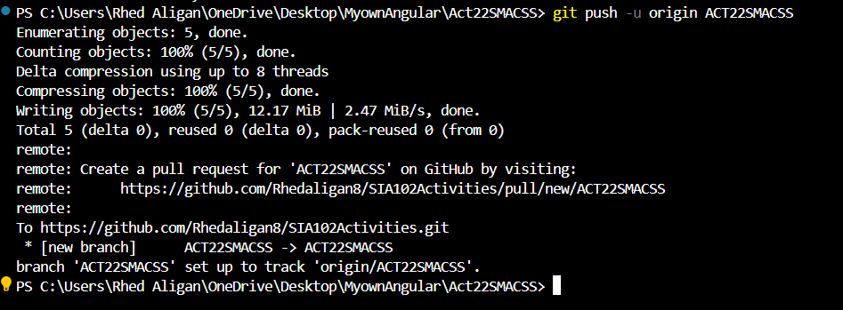
Repository Link (GitHub):
Branch name “ACT22SMACSS” under repository named “SIA102ACTIVITIES”
https://github.com/Rhedaligan8/SIA102Activities.git
https://github.com/Rhedaligan8/SIA102Activities.git
https://github.com/Rhedaligan8/SIA102Activities.git

Subscribe to my newsletter
Read articles from Rhed Aligan directly inside your inbox. Subscribe to the newsletter, and don't miss out.
Written by
Rhed Aligan
Rhed Aligan
I'm very enthusiast in things that gives me new material to learn.