Research SMACSS - Scalable and Modular Architecture for CSS
 Walter Mark B. Inductivo Jr.
SMACSS (Scalable and Modular Architecture for CSS) is a methodology for organizing CSS to enhance scalability and maintainability, especially in large projects. It categorizes styles into distinct sections, making it easier for developers to manage and modify styles over time.
SMACSS (pronounced “smacks”) is more style guide than rigid framework. There is no library within here for you to download or install. There is no git repository for you to clone. SMACSS is a way to examine your design process and as a way to fit those rigid frameworks into a flexible thought process. It is an attempt to document a consistent approach to site development when using CSS. And really, who isn’t building a site with CSS these days?
Key Categories:
Base: Default styles for HTML elements.
Layout: Defines the major sections of a page.
Module: Reusable components like buttons or cards.
State: Styles for different states (e.g., is-active).
Theme: Styles for visual variations.
Advantages of SMACSS
Scalability: Facilitates the growth of styles in large projects without becoming unwieldy.
Maintainability: Makes it easier to locate and update styles due to a clear organizational structure.
Reusability: Encourages the creation of modular components, reducing duplication of code.
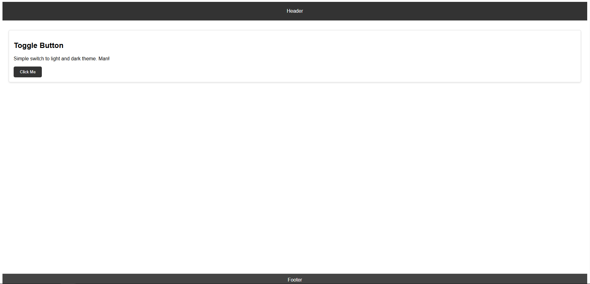
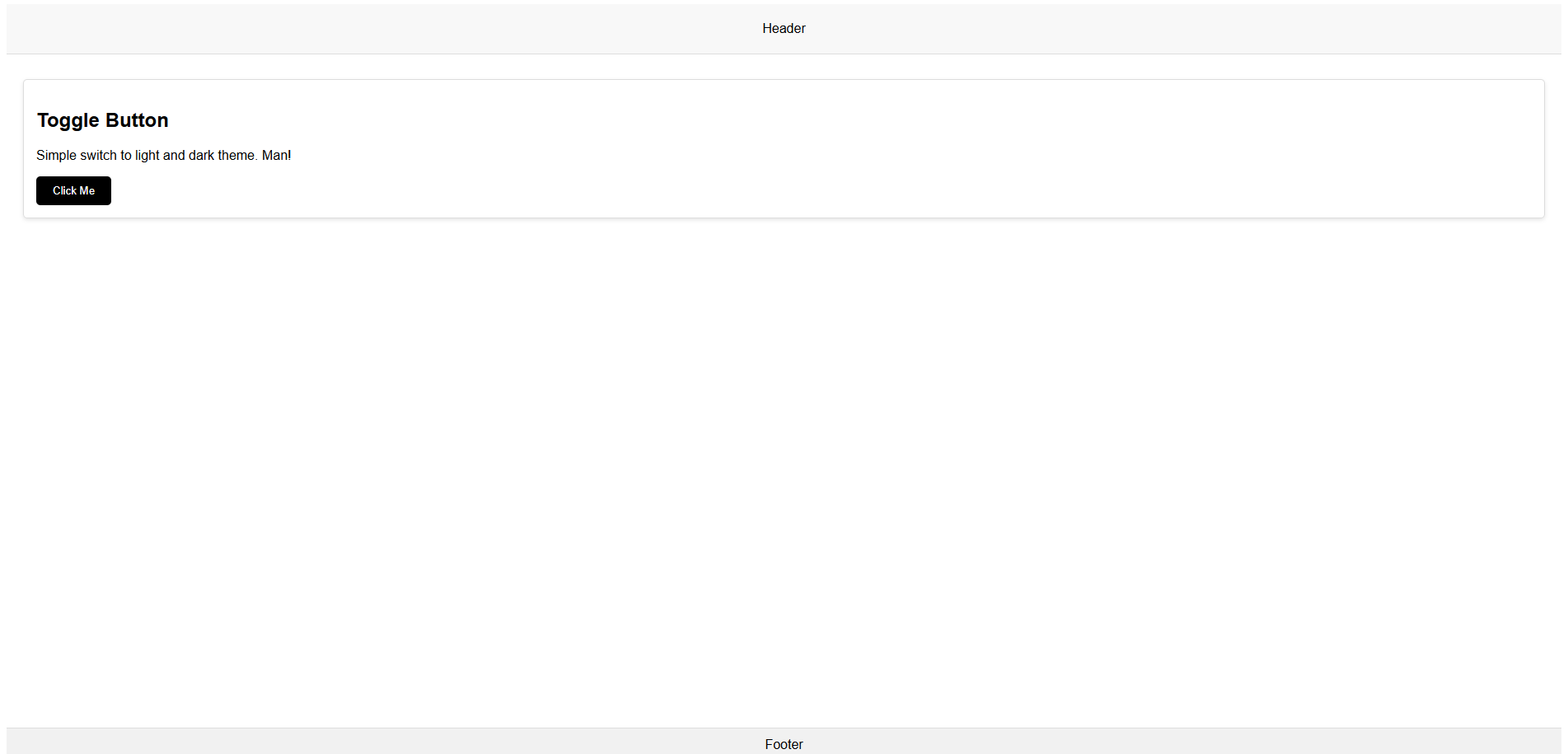
This is the activity I created to apply SMACSS. Please check the code and output to visualize the concept of SMACSS.
HTML, CSS and OUTPUT
HTML:
<!DOCTYPE html>
<html lang="en">
<head>
  <meta charset="UTF-8">
  <meta name="viewport" content="width=device-width, initial-scale=1.0">
  <link rel="stylesheet" href="/assets/style.css">
  <title>Simple SMACSS Webpage</title>
</head>
<body>
  <header class="header">Header</header>

  <main class="main">
    <section class="module card">
      <h2>Toggle Button</h2>
      <p>Simple switch to light and dark theme. Man!</p>
      <button class="button" id="toggle-button">Click Me</button>
    </section>
  </main>

  <footer class="footer">Footer</footer>

  <script src="/assets/main.js"></script>
</body>
</html>
CSS:
/* Base */
html {
    font-size: 16px;
    margin: 0;
    padding: 0;
    box-sizing: border-box;
}

body {
    font-family: Arial, sans-serif;
    display: flex;
    flex-direction: column;
    height: 100vh;
}

/* Layout */
.header {
    height: 60px;
    background-color: #f8f8f8;
    text-align: center;
    line-height: 60px;
    border-bottom: 1px solid #ddd;
}

.footer {
    height: 40px;
    background-color: #f1f1f1;
    text-align: center;
    line-height: 40px;
    border-top: 1px solid #ddd;
}

.main {
    padding: 20px;
    height: 100vh;
}

/* Module */
.card {
    border: 1px solid #ddd;
    border-radius: 5px;
    padding: 15px;
    margin: 10px 0;
    box-shadow: 0 2px 5px rgba(0, 0, 0, 0.1);
}

/* State */
.button {
    padding: 10px 20px;
    background-color: #000000;
    color: white;
    border: none;
    border-radius: 5px;
    cursor: pointer;
    transition: background-color 0.3s ease;
}

.button:hover {
    background-color: #181818;
}

.button.is-active {
    background-color: #333;
}

/* Theme */
.theme-dark .header {
    background-color: #333;
    color: white;
}

.theme-dark .footer {
    background-color: #444;
    color: white;
}
OUTPUT:


Github Link:
https://github.com/Walterific/Scalable-and-Modular-Architecture-for-CSS.git
References:
What is MSACSS?
https://smacss.com/
Subscribe to my newsletter
Read articles from Walter Mark B. Inductivo Jr. directly inside your inbox. Subscribe to the newsletter, and don't miss out.
Written by

Walter Mark B. Inductivo Jr.
Walter Mark B. Inductivo Jr.
Watch Me Whip 👊, Watch Me Nae-Nae 🖐️