The 60-30-10 Rule in UI Design
 Kavindu Chathuranga Dasanayaka
When it comes to UI/UX design, color plays a vital role in creating visually appealing and functional interfaces. One of the most effective techniques designers use to ensure color balance is the 60-30-10 Rule. This simple rule helps organize color schemes, ensuring that the design looks harmonious and professional. In this blog, we'll explore what the 60-30-10 Rule is, how it works, and how you can apply it to your UI designs.
What is the 60-30-10 Rule?
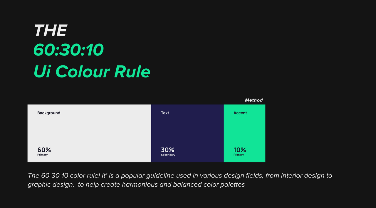
The 60-30-10 Rule is a color theory concept widely used in interior design, fashion, and UI/UX design. It breaks down the color palette into three sections:
60% of the dominant color
30% of the secondary color
10% of the accent color
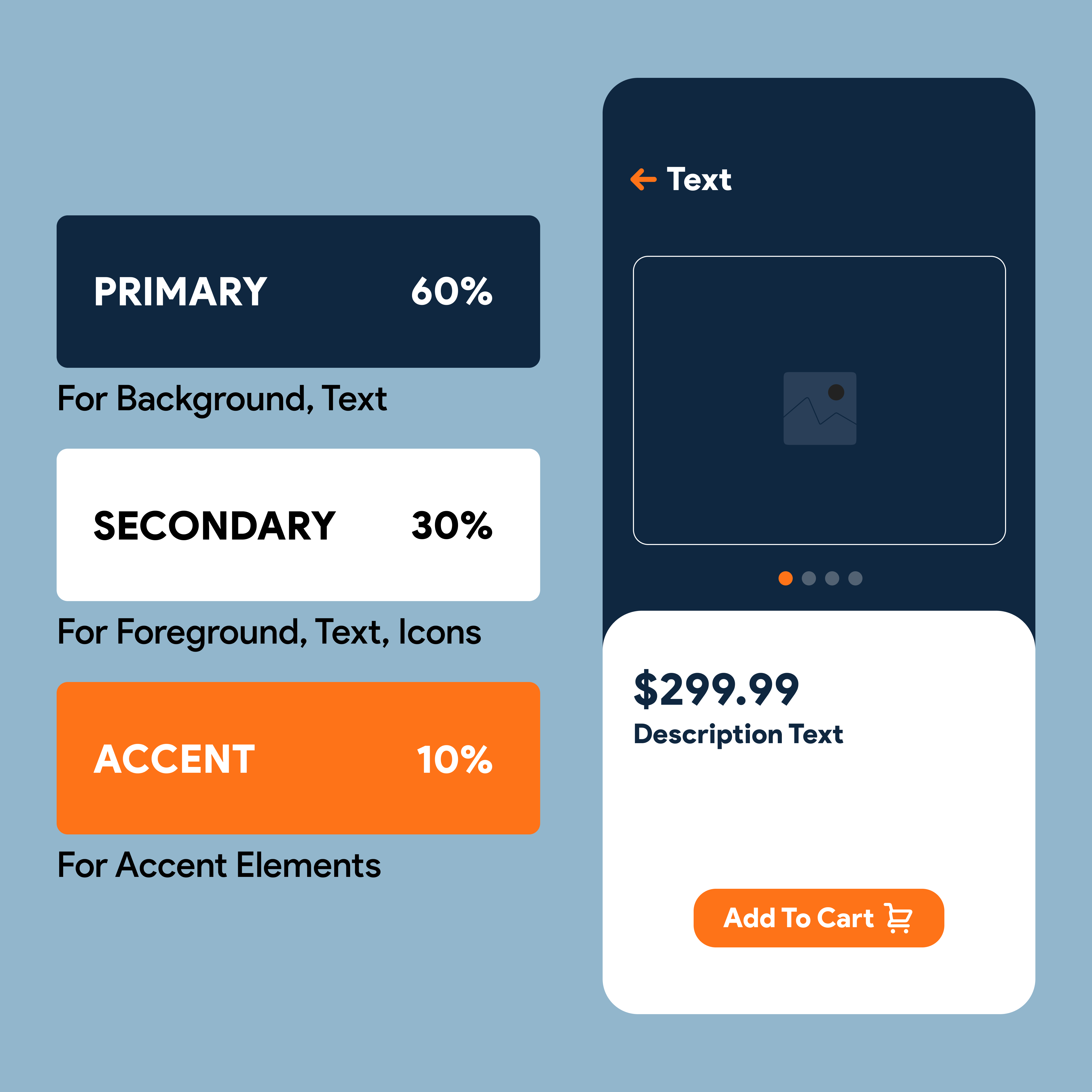
The idea is that the dominant color creates the overall theme, the secondary color adds contrast, and the accent color introduces vibrancy or emphasis. This distribution ensures balance and harmony, making designs more visually pleasing and less overwhelming.

Breaking It Down:
60% – The Dominant Color
This color should cover the majority of your UI. It sets the overall tone for your design. In UI design, the dominant color is often used for the background or large sections such as headers or containers. It should be a neutral or subtle color that provides a stable base for the rest of your palette
30% – The Secondary Color
The secondary color adds variety and contrast to your design. This color is typically used in UI elements like sidebars, navigation menus, or areas that need differentiation from the background. The secondary color should complement the dominant color without overwhelming it.
10% – The Accent Color
This is where you add a pop of vibrancy! The accent color is used sparingly but strategically to draw attention to important elements, such as buttons, icons, or call-to-action (CTA) areas. Since it’s only 10% of the palette, make sure it stands out while still aligning with the dominant and secondary colors.

How to Apply the 60-30-10 Rule to UI Design
Applying the 60-30-10 Rule in UI design is simple but highly effective. Here’s how you can put it into practice:
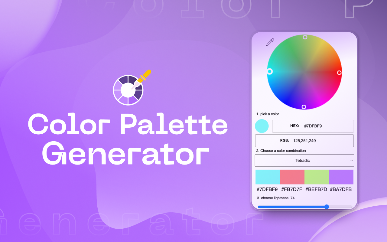
Choose Your Colors Wisely: Start by picking your dominant, secondary, and accent colors. Tools like Coolors and Colordesigner can help generate a palette that fits the rule.
Apply 60% Dominant Color: Use the dominant color for most of your background elements. This could be the page background, large containers, or primary sections in your layout. Make sure the dominant color is easy on the eyes since it will take up the most space.
Add 30% Secondary Color: Implement the secondary color on elements like navigation bars, side panels, or content sections. This color should provide contrast to the dominant color without creating a jarring visual experience.
Finish with 10% Accent Color: Finally, use the accent color sparingly but strategically. It’s ideal for drawing attention to interactive elements like buttons, links, and notifications. The accent color can be bold or bright to stand out against the rest of your design.
Tips for Using the 60-30-10 Rule
Keep It Simple: Stick to three main colors to avoid clutter and confusion in your UI. Overcomplicating your palette can lead to an unbalanced design.
Use Neutrals for Balance: Often, the dominant color can be a neutral tone (white, gray, or beige) to allow the secondary and accent colors to shine without overwhelming the design.
Experiment with Shades: You don’t have to stick to pure colors. Experiment with different shades or tints of the dominant and secondary colors to add depth and variety to your UI.
Test on Multiple Devices: Colors can appear differently across screens, so ensure your palette looks good on mobile, tablet, and desktop versions of your UI.
Useful Tools for Applying the 60-30-10 Rule

Creating the perfect color palette for your design can be daunting, but there are plenty of tools available to make the process easier. Here are some top tools for generating color palettes:
Coolors: A user-friendly tool that helps you generate harmonious color schemes. It also allows you to explore trending palettes and fine-tune your colors.
Colordesigner.io: A robust color palette generator that lets you experiment with various color combinations using the 60-30-10 rule.
Adobe Color Wheel: Adobe’s classic tool for creating color schemes, especially useful for professionals who want precision and versatility.
Paletton: Similar to Adobe Color, Paletton allows for more custom color combinations without being limited to only five tones.
Designspiration: This is a great tool for inspiration. You can pick up to five colors and search for design images that match your selected palette.
Kuler: A widely used tool that generates palettes based on color theory principles. It’s great for ensuring your palette adheres to professional standards.
Conclusion
The 60-30-10 Rule is a tried-and-tested method to create balanced, harmonious, and visually pleasing UI designs. By following this simple formula and using the right tools, you can ensure that your designs not only look great but are also functional and intuitive. Whether you're building a website, mobile app, or software interface, remember that the right balance of color can make all the difference!
Happy designing ! 🎨✨
Subscribe to my newsletter
Read articles from Kavindu Chathuranga Dasanayaka directly inside your inbox. Subscribe to the newsletter, and don't miss out.
Written by

Kavindu Chathuranga Dasanayaka
Kavindu Chathuranga Dasanayaka
Passionate full-stack developer and UI/UX enthusiast, shaping intuitive digital experiences with innovative solutions