Practical amount of HTML,CSS to remember
 rohit mantha
As a beginner in web development, HTML and CSS are the building blocks you need to understand. However, spending too much time memorizing every tag and property can be inefficient. Instead of trying to remember everything, it’s better to focus on a few key concepts that will help you build functional and responsive web apps.
In this guide, I’ll share three important principles that can simplify your approach to HTML and CSS. You can always look up additional details when needed, so don’t stress about memorizing everything!
1) Understanding <div> vs <span>
These two tags are fundamental in structuring your page:
<div>(block-level): Adivtakes up the entire width of its container, no matter the content size. Eachdivcreates a new block on a new line,each element takes up the entire horizontal space without regard to the size of the content inside the tag.<span>(inline-level): Aspanonly takes up as much space as the content inside it and does not break the flow of the text.
Tip: Most of the time, you will work with div to structure your layout, so don’t worry about memorizing every tag. Use div wherever you need a new block.
2) Flexbox: The Key to Layouts
What if we want to have elements on the same line?
If you want elements to be aligned in a row or have better control over their positioning, Flexbox is the tool to use.
Step 1: Basic Flexbox Setup
Create a div container and place your elements inside it as children. Then, apply the following CSS to the container as display: flex
Step 2: Understanding justify-content
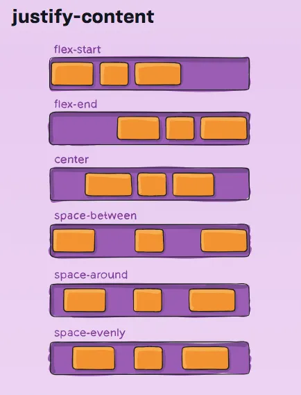
The justify-content property controls how items are aligned along the horizontal axis (left to right) within the flex container.
Here are the most common values you’ll use:
flex-start: Align items to the start (left) of the container.center: Center items horizontally.flex-end: Align items to the end (right).space-between: Place space between items.space-around: Add space around each item.
Tip: Focus on understanding justify-content properly, as almost all designs can be accomplished with it.

3) Flexbox Hierarchy: Building Responsive Layouts
From my experience, achieving responsiveness without understanding CSS design principles can be challenging. To make responsive design easier, I recommend following a consistent approach using Flexbox, which ensures that elements align correctly across different screen sizes.
1. Use div with Flex for Horizontal Alignment
For most layouts, you can use a div with display: flex to arrange elements horizontally. Whether it’s centering a single element or aligning multiple elements, Flexbox simplifies the process.
Simple Alignment: If you're centering a single element, create a parent
divwithdisplay: flexand usejustify-content: centerto center it horizontally.Multiple Divs: If you have multiple
divs and need a specific layout that isn’t covered by predefined Flexbox properties, create multiple flex containers as children of the parent. This gives you flexibility in customizing the layout.
2. Example: Responsive Navigation Bar
Let’s take a practical example: a navigation bar where a logo needs to appear on the left, and buttons (e.g., Support, Contact, Signup) should appear on the right with space between them.
Step-by-Step Implementation:
Create a parent
divwithdisplay: flexto hold the layout.Inside the parent, create two child
divs: one for the logo and one for the buttons.Use
justify-content: space-betweenin the parent container to place the logo on the left and the buttons on the right with space between them.To align the buttons correctly, apply Flexbox to the buttons container and use
justify-content: space-aroundorspace-evenlyas needed.
By following these steps, you can create responsive, well-aligned layouts without overwhelming yourself by memorizing too many tags or properties.
These are just the basic principles to practically remember some key things of HTML and CSS that I use almost majority of the time. As you dive deeper into web development, you’ll often encounter new tags, properties, or design challenges. Don’t worry! You don’t need to memorize everything. 🧠
One of the most important skills as an engineer is knowing how to Google efficiently. Whenever you get stuck or need to learn something new, search for it! 🔍📚 That’s the beauty of being a developer.
Happy coding! 💻
Subscribe to my newsletter
Read articles from rohit mantha directly inside your inbox. Subscribe to the newsletter, and don't miss out.
Written by
