Linear and Lateral Thinking: A Designer’s Guide to Problem-Solving
 peterbstyle - Blog
As a designer, problem-solving is at the core of what we do, whether it’s figuring out how to arrange elements in a layout, selecting the right color scheme, or ensuring that user flows are intuitive. Two approaches that play a huge role in how we take on challenges effectively are linear thinking and lateral thinking.
In this post, we will dive deeper into the meanings and differences of each type and how you can use them for effective problem-solving in any Design field or life in general, so make sure to read to the end!
Edward de Bono first coined the terms Linear Thinking (or Vertical Thinking) and Lateral Thinking (or Horizontal Thinking) in his 1967 work, The Use of Lateral Thinking, where he explored different approaches to creative problem-solving. As well as the Six Thinking hats for creative exploring, and developing of the ideas from Linear and Lateral Thinking.
Be sure to check out his creative solutions for all “creatives” HERE.
Lateral Thinking: Embracing Creative Exploration
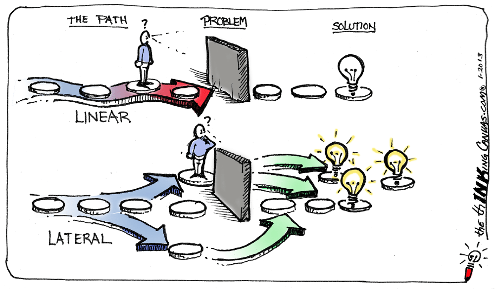
An approach to the exploration of new ideas, that prioritizes unconventional and imaginative methods of inquiry and problem-solving.
Example
A designer brainstorming marketing ideas for a product might abandon traditional methods of research and imagine the product being advertised in an unexpected setting, like a game or virtual reality, to spark creativity and find innovative solutions.Linear Reasoning: Following a Structured Path
A structured thought process that follows a sequential, logical progression, where each step builds on the previous one.
Example
When coding a website, a developer starts by creating a basic HTML structure, then moves to ‘styling’ with CSS, and finally adds interactive functionality with JavaScript programming language, following a logical step-by-step progression to achieve the final result.
(where is this image from?)
Don’t get them confused!
While lateral thinking and linear reasoning are valuable problem-solving approaches, they serve very different purposes. Lateral thinking encourages creativity and unconventional solutions by exploring ideas from multiple angles, breaking away from traditional methods. On the other hand, linear reasoning focuses on logical, step-by-step progression, ideal for tasks that require precision and order.
Practice Scenario: Combining Linear and Lateral Thinking in the Design Process
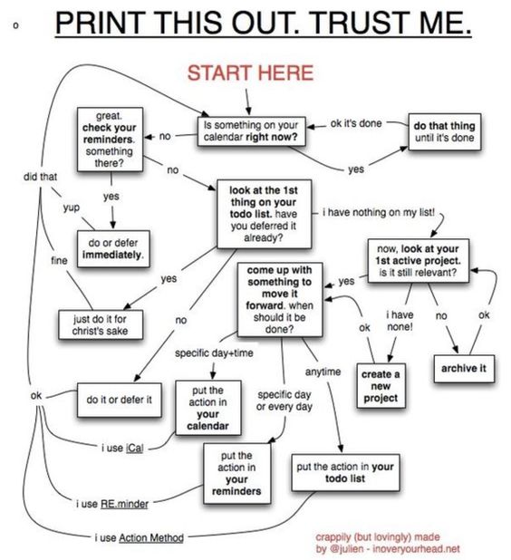
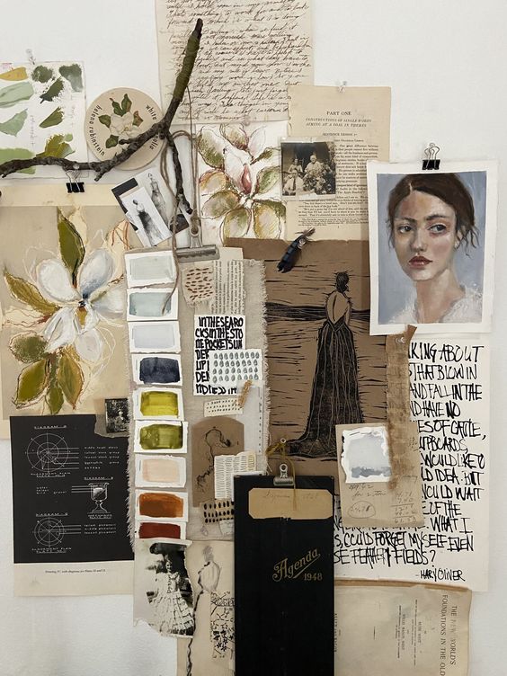
Integrating linear and lateral thinking can greatly enhance your creative process, especially when developing visual projects like posters. Begin with familiar brainstorming techniques, such as writing and listing, then transition into visual exploration through mood boards and sketches.
Example of writing and listing for linear thinking:

(where is this image from?)
Example of mood boarding (no not sand boarding!) and sketching for lateral thinking:

(where is this image from?)
Scenario: Designing a Poster for a Community Art Festival
Brief:
Create a poster for an upcoming community art festival that celebrates local artists and encourages public participation. The design should be vibrant and engaging, appealing to families, art enthusiasts, and casual visitors. The poster must include essential details like the festival dates, location, and a call to action for submissions from local artists.
Step 1: Initial Word Association Lists
Start by breaking the brief into the main themes and listing everything that comes to mind. This process encourages lateral thinking, allowing you to explore various angles related to the festival.
Community
Togetherness → gathering, unity, collaboration.
Local → neighborhood, culture, familiar faces, family.
Participation → volunteers, submissions, engagement.
Art
Creativity → paintbrushes, colors, textures.
Expression → emotions, diverse styles, feelings.
Activities → workshops, exhibitions, performances.
Festival
Celebration → music, food, decorations.
Atmosphere → lively, cheerful, inclusive, inviting.
Information → dates, location, schedule.
Next, expand on each word with more associations to stimulate creative ideas.
Gathering → unity → shared experiences → stories
Creativity → colors → vibrant imagery → visual noise
Celebration → food → local flavors → cultural richness
Step 2: Deepening Associations
Take your associations and explore them in greater detail. To identify connections that can inform your design.
Gathering → Could evoke images of diverse groups coming together, possibly reflected in visual motifs (symbols, props with similar themes) or patterns.
Vibrant imagery → Suggests a bold color palette and dynamic compositions that reflect the festival's energy.
Local flavors → Using elements from local culture or history to create a sense of place in time (appreciation of history and culture).
Step 3: Visualize Concepts with Moodboards
Before diving into the design, create mood boards that represent your ideas. This method helps you solidify your concepts and explore the festival's aesthetic.
Moodboard 1: Colorful and Playful
Colors: Bright primary colors, playful pastels, and bold accents.
Textures: Hand-drawn illustrations, playful patterns, and splashes of paint.
Images: Examples of community art, joyful gatherings, and engaging activities.
Moodboard 2: Artistic and Whimsical
Colors: Rich tones, earthy shades, and soft neutrals.
Textures: Layered paper, brush strokes, and mixed media.
Images: Artistic expressions from local artists, snippets of previous festivals (NB!), and whimsical fonts.
Step 4: Sketching and Combining Ideas
With your mood boards as inspiration, start sketching various poster layouts. Use lateral thinking to experiment with combining different elements, such as typography, imagery, and colors.
Consider integrating:
Artistic illustrations of local landmarks or iconic symbols.
Dynamic typography that reflects the festival's lively spirit—play around with different styles and orientations.
Interactive elements, like QR codes for festival information or artist submissions, are creatively incorporated into the design.
Step 5: Refinement Through Linear Thinking
Once you have a range of sketches, apply linear thinking to refine your concepts. Evaluate how each element in your design contributes to the overall message and user experience:
Hierarchy: Ensure that information (dates, location, call to action) stands out clearly and is relevant to the surrounding elements (bread —> butter —> butter knife —> plate —> napkin —> table).
Balance: Review the visual balance between text and imagery, ensuring neither overwhelms the other(eg. YES! —> this is why we say YES).
Legibility: Confirm that the font choices are readable from a distance, especially for poster design. (NB! Posters are meant to be legible 10m away, especially signage and outdoor advertising!)
By combining lateral exploration (with diverse sketches and out-of-the-box ideas) and linear (thinking) refinement (with a clear hierarchy and balance), you'll create a poster that effectively promotes the community art festival and resonates with a broad audience.
Conclusion
Thank you for taking the time to explore the concepts of linear and lateral thinking in design. By integrating these approaches, you will enhance your creative process and produce more impactful solutions. Whether you're brainstorming, sketching, or refining your ideas, embracing both methods will allow you to unlock new possibilities in your work.
Happy being creative!
Subscribe to my newsletter
Read articles from peterbstyle - Blog directly inside your inbox. Subscribe to the newsletter, and don't miss out.
Written by
