26 Type of Seaborn Plots With Samples
 Anix Lynch
Table of contents
- 1. Relationship Plots (Visualize relationships between variables)
- 2. Distribution Plots (Understand how data is distributed)
- 3. Categorical Data Plots (Compare categories)
- 4. Heatmaps and Cluster Maps (Visualize matrices and clustering)
- 5. Grids and Pair Plots (Subplots and multiple plots)
- Best to Use When:
- 1. Relationship Plots
- 2. Distribution Plots
- 3. Categorical Data Plots
- Summary:
- 4. Heatmaps and Cluster Maps
- 5. Grids and Pair Plots
1. Relationship Plots (Visualize relationships between variables)
relplot: High-level function to draw scatter or line plots.scatterplot: Plot individual data points with optional grouping.lineplot: Show trends by connecting data points with a line.lmplot: Plot data with linear regression fit.regplot: Plot data with optional linear regression model.residplot: Show residuals from linear regression.
2. Distribution Plots (Understand how data is distributed)
displot: High-level function for histograms or kernel density estimates.histplot: Plot the frequency of data in bins.kdeplot: Show the probability density function.ecdfplot: Empirical cumulative distribution function plot.rugplot: Add small vertical ticks on the plot to show distribution.distplot(deprecated): Used to combine histograms and kde plots.
3. Categorical Data Plots (Compare categories)
catplot: High-level function for categorical plots.stripplot: Plot individual points for each category.swarmplot: Spread points out within categories to avoid overlap.boxplot: Show the distribution of data based on quartiles.violinplot: Combine boxplot and kde to show data distribution.boxenplot: Extended box plot for larger datasets.pointplot: Plot point estimates with confidence intervals.barplot: Show means or other aggregates for each category.countplot: Count the occurrences of each category.
4. Heatmaps and Cluster Maps (Visualize matrices and clustering)
heatmap: Display matrix data with color mapping.clustermap: Perform hierarchical clustering and plot the data matrix.
5. Grids and Pair Plots (Subplots and multiple plots)
FacetGrid: Build a grid of subplots to show data relationships across subsets.pairplot: Plot pairwise relationships in a dataset.PairGrid: Fine-tuned pairwise plot creation.jointplot: Combine scatterplot and marginal plots.JointGrid: Fine-tuned creation of joint plots.
Best to Use When:
Relationship plots: When exploring correlations (when you have only 2 variables) or trends.
Distribution plots: To understand data distribution.
Categorical plots: To compare data across different categories.
Heatmaps/Cluster maps: For visualizing matrices, correlations(when you have more than 2 variables) , or clustering (grouping or clustering similar variables).
Grid/Pair plots: To visualize multiple relationships or distributions at once.
1. Relationship Plots
(Visualize relationships between variables)
relplotData: Monthly sales and marketing budget.
Use: Compare sales trends based on budget.
Example:
sns.relplot(x="month", y="sales", hue="budget", data=sales_data, kind="line")
scatterplotData: Weight and height of athletes.
Use: Visualize correlation between weight and height.
Example:
sns.scatterplot(x="height", y="weight", data=athletes_data)
lineplotData: Daily temperature over a year.
Use: Show temperature trends.
Example:
sns.lineplot(x="day", y="temperature", data=weather_data)
lmplot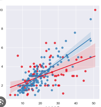
Data: Salary vs. years of experience.
Use: Show linear relationship between salary and experience.
Yes, thislmplotshows two linear regression lines, likely representing two different groups of employees (blue and red) based on some categorical variable, like gender, department, or job level.Here's how to interpret the lmplot:
Dots (Scatter Points):
Each dot represents an individual employee.
The x-axis shows the years of experience.
The y-axis shows the salary (in thousands, most likely).
Regression Lines:
The blue line and the red line are the regression lines for the two groups.
These lines show the overall trend or relationship between years of experience and salary for each group:
Upward slope: Both lines are going upwards, meaning that as employees gain more experience, their salary tends to increase.
Blue vs. Red Line: The blue group has a steeper slope, suggesting a stronger relationship between experience and salary for this group compared to the red group.
Confidence Intervals:
The shaded areas around each line represent the confidence intervals (likely 95% confidence). This shows the uncertainty or variability in the salary predictions:
Narrower intervals (less shaded area) indicate more confidence in the prediction.
Wider intervals (more shaded area) indicate greater uncertainty in the salary prediction.
The blue group's model is likely more accurate or reliable because the shade area is narrower.
Comparison:
The blue group seems to experience a higher salary growth per year of experience than the red group, as indicated by the steeper slope of the blue line.
The red group has a shallower line, suggesting a weaker relationship between experience and salary.
Conclusion:
Both groups show a positive correlation between experience and salary.
The blue group shows a steeper salary increase with experience compared to the red group.
There's more variability in the red group, indicated by the wider confidence interval.
The blue group's model is likely more accurate or reliable because the shade area is narrower.
Example:
sns.lmplot(x="experience", y="salary", data=employee_data)
regplot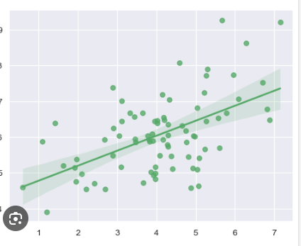
Data: Advertising spend vs. revenue.
Use: Add regression line to show impact of advertising on revenue. same as lmplot on how to interpret but it is just for one group. Relationship between 2 variables, where
lmplot= relationship between 2 variables with an option to compare across multiple groups.Example:
sns.regplot(x="ad_spend", y="revenue", data=business_data)
residplot
Data: Predictions vs. residuals in a sales model.
Use: Visualize residuals to check for model accuracy.
How to read?
Flat and scattered = Good model fit.
Curve or pattern = Try a more complex model (e.g., add polynomial terms, interaction terms).
Clusters or separate groups = There might be a categorical variable or need for separate models.
Fanning out or funneling in = Possible heteroscedasticity; consider transforming your variables or using a model that accounts for this.
Example:
sns.residplot(x="predictions", y="residuals", data=model_data)
2. Distribution Plots
(Understand how data is distributed)
displot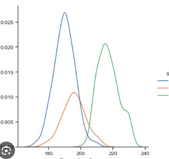
Data: Height of people in a survey.
Use: Show height distribution.
Basketball players (likely the taller group) will have a peak in the higher range (e.g., 190-220 cm).Football players will be more spread out, with a moderate peak.
Tennis players might have a lower peak around the shorter heights (e.g., 160-185 cm).
Example:
  import seaborn as sns
  import matplotlib.pyplot as plt

  # Sample data: heights of people in three groups (e.g., sports)
  data = {
      'height': [175, 180, 165, 178, 182, 190, 210, 220, 185, 188, 195, 198, 205, 172, 160, 178, 182, 185, 192, 195, 199],
      'group': ['Basketball', 'Basketball', 'Basketball', 'Basketball', 'Basketball',
                'Basketball', 'Basketball', 'Basketball', 'Football', 'Football',
                'Football', 'Football', 'Football', 'Football', 'Football', 'Tennis',
                'Tennis', 'Tennis', 'Tennis', 'Tennis', 'Tennis']
  }

  # Plot a displot with kde
  sns.displot(data=data, x="height", hue="group", kind="kde")

  plt.title("Height Distribution of Athletes by Sport")
  plt.xlabel("Height (cm)")
  plt.ylabel("Density")
  plt.show()
histplotData: Test scores of students.
Use: Show frequency of scores in bins.
Example:
sns.histplot(student_scores, bins=20)
kdeplotData: House prices in a city.
Use: Smooth out distribution of house prices.
Example:
sns.kdeplot(data=house_prices, x="price")
1. Using Exact Values (Histogram):
Focus: You want to know the precise count of houses in each price range.
Typical Questions:
"How many houses are priced between $150,000 and $200,000?"
"What is the most common price range?"
"How many houses are listed at exactly $250,000?"
Example:
pythonCopy codesns.histplot(data=house_prices, x="price", bins=20)Answer:
"There are 50 houses priced between $150,000 and $200,000."
"The most common price range is $175,000 to $200,000, with exactly 20 houses listed in that range."
"There are 3 houses listed exactly at $250,000."
Use Case: Exact values are ideal for answering questions when you need a specific count of houses in various price ranges or at specific price points.
2. Using Smoothed Distribution (KDE Plot):
Focus: You want to understand the overall shape or trend of house prices, without focusing on the precise counts.
Typical Questions:
"What is the general price range where most houses are concentrated?"
"Does the price distribution look like it’s skewed (e.g., more houses on the lower/higher end)?"
"Where do house prices tend to cluster, and how spread out are they?"
Example:
pythonCopy codesns.kdeplot(data=house_prices, x="price")Answer:
"Most house prices are concentrated between $150,000 and $200,000."
"The price distribution is right-skewed, meaning there are more houses priced on the lower end, with fewer high-priced houses."
"House prices tend to cluster around $175,000, and the spread is moderate, with prices ranging from $100,000 to $250,000."
Use Case: KDE is ideal when you want a big-picture view of the distribution and trends, focusing on general patterns rather than exact counts.
ecdfplot(Empirical Cumulative Distribution Function)
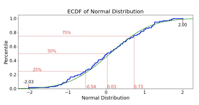
Data: Time spent on different tasks.
Use: Show the proportion of tasks completed within a certain time
Example:
sns.ecdfplot(data=task_times, x="time_spent")
Got it! Let's simplify by thinking about something more relatable than tasks—let’s use homework completion as an example.
You’re tracking how long it takes for students to finish their homework. Each student takes a different amount of time, and you want to see how quickly different students finish.
What the ECDF Plot Does:
X-axis: Shows the time (in minutes) each student took to finish their homework.
Y-axis: Shows the percentage of students who finished their homework by a certain time.
Example:
If the x-value is 30 minutes and the y-value is 0.5 (50%), it means that 50% of the students finished their homework in 30 minutes or less.
If the x-value is 60 minutes and the y-value is 0.9 (90%), it means that 90% of the students finished in 60 minutes or less.
Easy Breakdown:
At 30 minutes (x = 30): Half of the students are done.
At 60 minutes (x = 60): Almost all students (90%) are done.
Questions the ECDF Helps Answer:
"How many students finished within 20 minutes?"
→ Look at x = 20 and find the y-value (percentage)."How long does it take for 75% of students to finish?"
→ Look at y = 0.75 (75%) and find the x-value (time).
rugplot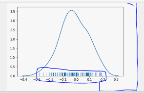
Data: Sales amounts.
Use: Add tick marks for each sale to show data points along the axis.
Example:
sns.rugplot(data=sales_data, x="amount")
distplot(deprecated)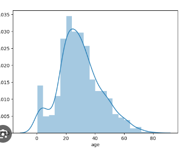
Data: Product prices in a store.
Use: Plot combined histogram and kde of prices.
Example:
sns.distplot(store_data["prices"])
3. Categorical Data Plots
(Compare categories)
catplot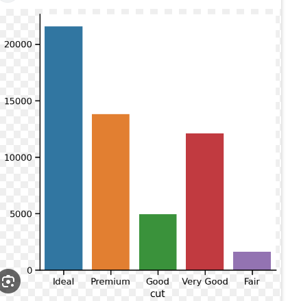
Data: Average salary by job position.
Use: Compare salary distributions across different jobs.
Example:
sns.catplot(x="position", y="salary", data=employee_data, kind="bar")
stripplot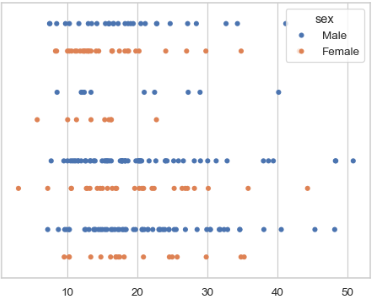
Data: Sales for different regions.blue dots representing Males and orange dots representing Females.
Which group has higher sales amounts: Look at the spread and concentration of dots. If the blue dots (males) extend further to the right, it suggests that males are making larger sales.
Which group has more small sales: If orange dots (females) are clustered more around the lower sales amounts, it shows females tend to make smaller sales.
Use: Show individual data points across regions.
Example:
sns.stripplot(x="region", y="sales", data=sales_data)
swarmplot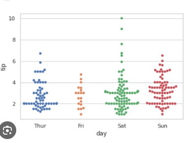
What the Plot Shows:
X-Axis: The days of the week (Thursday, Friday, Saturday, and Sunday).
Y-Axis: The tips received (likely in dollars).
Dots: Each dot represents an individual tip given by a customer on that day.
Key Points to Notice:
No Overlapping Points:
Unlike a stripplot where points might stack on top of each other, swarmplot spreads the dots horizontally to avoid overlap.
This gives a clearer picture of how many tips fall in the same range, especially when there are a lot of tips at similar amounts.
Distribution by Day:
Each day shows a different spread of tips.
For example, Saturday seems to have a wider range of tips (from $2 up to $10), indicating that the tips are more variable that day.
Thursday and Friday have more clustered tips, mainly between $2 and $4, with fewer higher tips.
Comparison Across Days:
You can easily compare which day has higher tips on average. For example, Saturday seems to have more high-value tips compared to other days, especially since there are multiple dots higher up on the y-axis.
Sunday also shows some higher tips (around $6), while Friday has more concentrated smaller tips.
Outliers:
- Saturday has a clear outlier with a tip above $8, which stands out compared to the rest of the days.
How to Interpret This:
Thursday and Friday have more consistent tips that are concentrated around the lower amounts (mostly between $2 and $4).
Saturday has a wider distribution, with tips ranging from $2 to $10, indicating a broader range of generosity.
Sunday has some higher tips around $5 or $6 but is still somewhat clustered like Friday.
Example:
  import seaborn as sns
  import matplotlib.pyplot as plt

  # Sample data: tips given by customers on different days
  tips_data = sns.load_dataset("tips")  # Built-in dataset from seaborn

  # Plot the swarmplot to show the distribution of tips across different days
  sns.swarmplot(x="day", y="tip", data=tips_data)

  # Title and labels for better understanding
  plt.title("Distribution of Tips Across Different Days")
  plt.xlabel("Day of the Week")
  plt.ylabel("Tip Amount (in dollars)")

  plt.show()
boxplotData: Monthly expenses.
Use: Show distribution and outliers for expenses.
Example:
sns.boxplot(x="month", y="expense", data=expense_data)
violinplot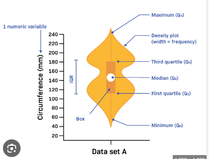
Data: Titanic Dataset.
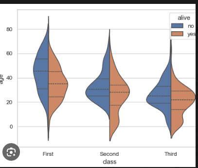
Detailed Explanation of Titanic Violin Plot:
1. Median (Q2):
The white dot in the center of each violin represents the median age of passengers within each class.
Median is the middle value, meaning 50% of the passengers are younger and 50% are older than this age.
For example, in First Class, the median age of passengers might be around 40 years, while in Third Class, the median age could be lower, around 20-25 years.
2. Quartiles (Q1, Q3):
The thick black bar within the violin represents the interquartile range (IQR), which spans from the first quartile (Q1, 25%) to the third quartile (Q3, 75%).
This shows the range of ages where the middle 50% of passengers fall.
For instance, in Second Class, you might see that 50% of the passengers are aged between 20 and 50.
3. Minimum and Maximum:
The ends of the violin represent the minimum (Q0, 0%) and maximum (Q4, 100%) ages for each group.
For example, the youngest passengers (minimum) in Third Class might be infants, while the oldest passengers (maximum) in First Class could be in their 70s or 80s.
4. Density Plot (Width of the Violin):
The width of the violin at any point shows the density of data points (ages in this case). A wider section means more passengers are in that age range.
For example, in First Class, you might see that the violin is wider around the ages of 40 to 50, meaning many passengers in First Class were in this age group.
In contrast, in Third Class, the violin might be wider around the 20 to 30 age range, showing many younger passengers.
5. Comparing Survival Status (Alive vs. Not Alive):
The violin plot is split to compare two groups:
Left side: Passengers who did not survive (blue).
Right side: Passengers who survived (orange).
In First Class, you might notice that more survivors are clustered around the 40-50 age range, whereas the non-survivors are spread across a wider age range.
In Third Class, there might be a greater proportion of non-survivors (blue) who are younger, and the survivors (orange) are fewer in this age range.
6. Outliers:
Outliers are shown as small individual points outside the main body of the violin. These points represent passengers who fall outside the normal age range for their class.
For example, you might see a very old passenger (around 80) in First Class as an outlier, or a young child as an outlier in Third Class.
Example Code:
  import seaborn as sns
  import matplotlib.pyplot as plt

  # Sample data: Sales distribution by product and demand level
  # Here, we're using the built-in 'tips' dataset to simulate a sales scenario.
  # In practice, replace 'tips' with your actual sales_data.
  sales_data = sns.load_dataset("titanic")

  # Plot violinplot with sales (age in this case) split by 'alive' status (e.g., high vs. low demand)
  sns.violinplot(x="class", y="age", hue="alive", data=sales_data, split=True)

  # Title and labels
  plt.title("Sales Distribution by Product and Demand Level")
  plt.xlabel("Product Type (class)")
  plt.ylabel("Sales (age)")

  plt.show()
boxenplot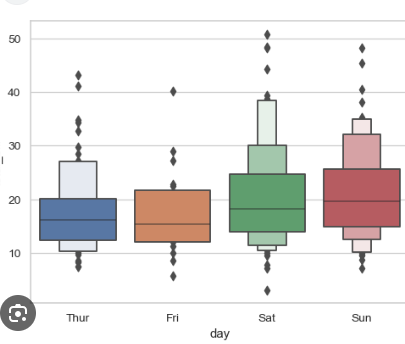
Data: Tips per day
Thursday:
Navy blue and light blue boxes show that tips are spread in the upper percentiles, with greater variation in higher tips.
Outliers exist, but the overall range is moderate, with most tips between $10 and $30.
Friday:
Only an orange box shows, meaning tips are clustered within a narrower range (less variability).
Data points above and below the orange box are outside this range:
Above the box: The top 25% of the data points (75th to 100th percentile).
Below the box: The bottom 25% of the data points (0th to 25th percentile).
Why No Light Orange Box?
- The light orange box would represent the next layer of data (like the 75th to 90th percentile), but there isn't enough variability or spread in the Friday data to generate this additional box.
Tips are mostly consistent between $10 and $25, with fewer extreme values or outliers.
Saturday:
Multiple light green layers indicate that tips are widely spread across high values.
The core box (dark green or dark red) still represents the IQR (25th to 75th percentile).
The light green/red boxes extend beyond the IQR:
Next layer: Covers 75th to 87.5th percentile of the data (upper middle).
Another layer: Covers 87.5th to 93.75th percentile (upper-upper middle).
Top layer: Represents the very top percentiles of the data (e.g., 93.75th to 100th percentile).
There is significant variation in tips, with amounts reaching up to $50. Higher tips are more frequent.
More outliers and larger spread compared to other days.
Sunday:
Multiple light red layers show tips are highly variable, similar to Saturday.
A broad range of tips, with many values in the upper percentiles. Some tips reach $50, and there are many outliers.
Example:
  import seaborn as sns
  import matplotlib.pyplot as plt

  # Load the sample 'tips' dataset from seaborn
  tips_data = sns.load_dataset("tips")

  # Create the boxenplot showing the distribution of total bill by day
  sns.boxenplot(x="day", y="total_bill", data=tips_data)

  # Add title and labels for clarity
  plt.title("Distribution of Total Bill by Day")
  plt.xlabel("Day of the Week")
  plt.ylabel("Total Bill (in dollars)")

  # Show the plot
  plt.show()
pointplot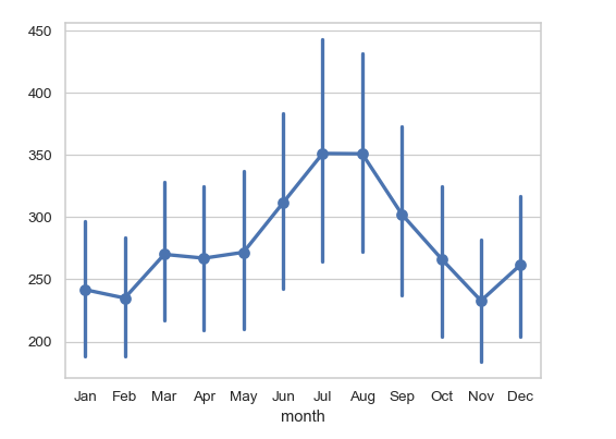
January:
Point: The dot for January represents the average number of passengers for January across all years in the dataset.
The dot is around 250 passengers, meaning that, on average, there were about 250 passengers flying in January across all the years in the dataset.
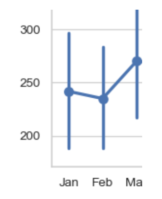
Error Bar: The vertical line extending from the dot is the error bar, which shows the variation in the average number of passengers across different years.
The bottom of the error bar for January is close to 200 passengers, while the top is closer to 300 passengers. This means that in some years, the average number of passengers in January was closer to 200, and in other years, it was closer to 300.
The error bar reflects how much the average could vary from year to year, not the exact number of passengers.
February:
Point: The dot for February represents the average number of passengers for February across all years in the dataset.
- The dot is slightly lower than January’s dot, around 230 passengers on average.
Error Bar: The error bar for February is shorter than January's, indicating less variation in the average number of passengers across different years.
The error bar ranges roughly from 220 to 250 passengers, meaning that in most years, the average number of passengers in February was between 220 and 250.
The shorter error bar suggests that the average number of passengers in February was more consistent from year to year compared to January.
Summary:
January: The average number of passengers is around 250, with more variation (error bar ranging from 200 to 300).
February: The average number of passengers is around 230, with less variation (error bar ranging from 220 to 250).
This revised explanation accurately reflects the role of the error bars in showing the variation in average values across years, rather than indicating the exact number of passengers.
Example:
  import seaborn as sns
  import matplotlib.pyplot as plt

  # Load the 'flights' dataset from seaborn
  flights_data = sns.load_dataset("flights")

  # Pivot the data to get it in a wide format (years as rows, months as columns)
  flights_wide = flights_data.pivot(index="year", columns="month", values="passengers")

  # Create a point plot using the wide-format data
  sns.pointplot(data=flights_wide)

  # Add labels and title
  plt.title("Monthly Number of Passengers (Averaged Across Years)")
  plt.xlabel("Month")
  plt.ylabel("Number of Passengers")

  # Show the plot
  plt.show()
barplotData: Average income by education level.
Use: Compare income means for each education level.
Example:
sns.barplot(x="education", y="income", data=income_data)
countplotData: Count of people in different age groups.
Use: Count occurrences of each category.
Example:
sns.countplot(x="age_group", data=people_data)
4. Heatmaps and Cluster Maps
(Visualize matrices and clustering)
heatmapData: Correlation matrix of financial indicators.
Use: Visualize correlations between financial metrics.
Example:
sns.heatmap(corr_matrix, annot=True)
clustermap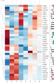
Data: Customer purchase patterns.
Use: Perform hierarchical clustering to group similar customers.
Example:
sns.clustermap(purchase_data)
5. Grids and Pair Plots
(Subplots and multiple plots)
FacetGrid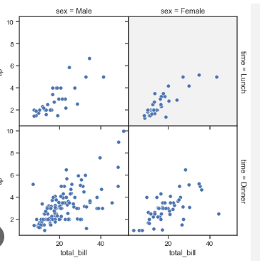
Data: Sales by region and product category.
Use: Create subplots for each region.
Example:
  g = sns.FacetGrid(sales_data, col="region", row="category")
  g.map(sns.scatterplot, "day", "sales")
pairplot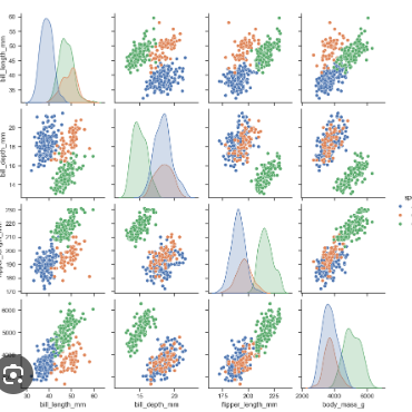
Data: Features of cars (price, engine size, horsepower).
Use: Show relationships between all features.
Example:
sns.pairplot(car_data)
PairGrid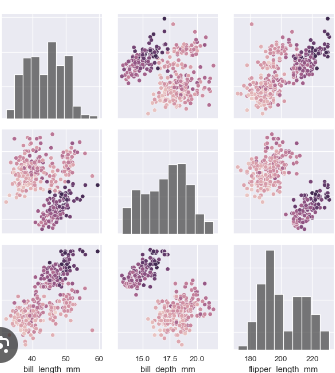
Data: Different student scores (math, reading, writing).
Use: Fine-tune pairwise plots between all scores.
Example:
  g = sns.PairGrid(student_data)
  g.map_diag(sns.histplot)
  g.map_offdiag(sns.scatterplot)
jointplot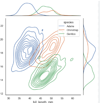
Data: Hours of study vs. exam score.
Use: Combine scatterplot and distribution.
Example:
sns.jointplot(x="study_hours", y="exam_score", data=student_data)
JointGrid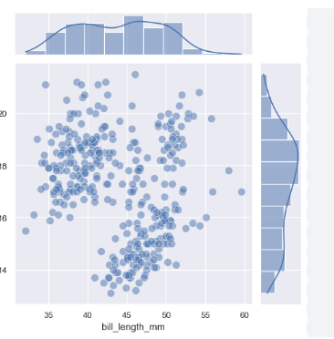
Data: Weight vs. height.
Use: Fine-tune joint plots with additional control.
Example:
  g = sns.JointGrid(data=people_data, x="height", y="weight")
  g.plot(sns.scatterplot, sns.histplot)
Subscribe to my newsletter
Read articles from Anix Lynch directly inside your inbox. Subscribe to the newsletter, and don't miss out.
Written by
