Visualizing and Managing Dataset Relationships in Microsoft Fabric : Unlocking Insights Across Semantic Models
 Nalaka Wanniarachchi
Table of contents
- Why This Matters
- Step 1: Setting Up the Environment
- Step 2: Fetching and Listing Datasets in the Workspace
- Step 3: Visualizing Relationships for Each Dataset
- Step 4: Iterating Through All Datasets
- Step 5: Converting and Storing Visualizations
- Step 6: Splitting Large URLs into Chunks
- Step 7: Storing Data in a Delta Table
- Step 8: Create a PowerBI Report having all the relationships
- Summary:
- Conclusion

Original idea by Prathy Kamasani: Kudos to her! For a detailed step-by-step demo, visit her YouTube video.
In data-driven organizations, understanding how datasets relate to one another is crucial for efficient data management, accurate reporting, and insightful analysis. Microsoft Fabric, a comprehensive data platform, allows you to build, manage, and explore relationships within semantic models in a given workspace. In this post, we explore how Python can be used in Microsoft Fabric to visualize and manage these relationships, helping you unlock valuable insights across your datasets.
By visualizing dataset relationships, you gain a clearer picture of how your data sources interact, empowering you to maintain data consistency, detect potential conflicts, and optimize your data processing pipelines. This guide walks through a Python notebook that retrieves, visualizes, and stores relationships from semantic models within a workspace, making it easier to manage the complexity of interconnected datasets.
Why This Matters
In Microsoft Fabric, semantic models often serve as the backbone for many analytics and reporting tools. As datasets become more interconnected, understanding how they relate is critical for:
Data Governance: Tracking dependencies helps prevent errors caused by breaking relationships.
Data Consistency: Maintaining visibility over relationships ensures data integrity across multiple datasets.
Impact Analysis: Visualizing relationships lets you predict how changes to one dataset may affect others.
This process allows us to list and visualize all relationships across semantic models in a particular workspace, making it a powerful tool for data engineers, analysts, and business intelligence professionals.
Step 1: Setting Up the Environment
The first step involves importing the necessary libraries. These include sempy, which is used to interact with Microsoft Fabric, and popular Python libraries for data manipulation (pandas), visualization (graphviz), and plotting (matplotlib).
import sempy.fabric as fabric
from sempy.relationships import plot_relationship_metadata
from sempy.relationships import find_relationships
from sempy.fabric import list_relationship_violations
from sempy.dependencies import plot_dependency_metadata

import pandas as pd
import graphviz
import base64
import matplotlib.pyplot as plt
Step 2: Fetching and Listing Datasets in the Workspace
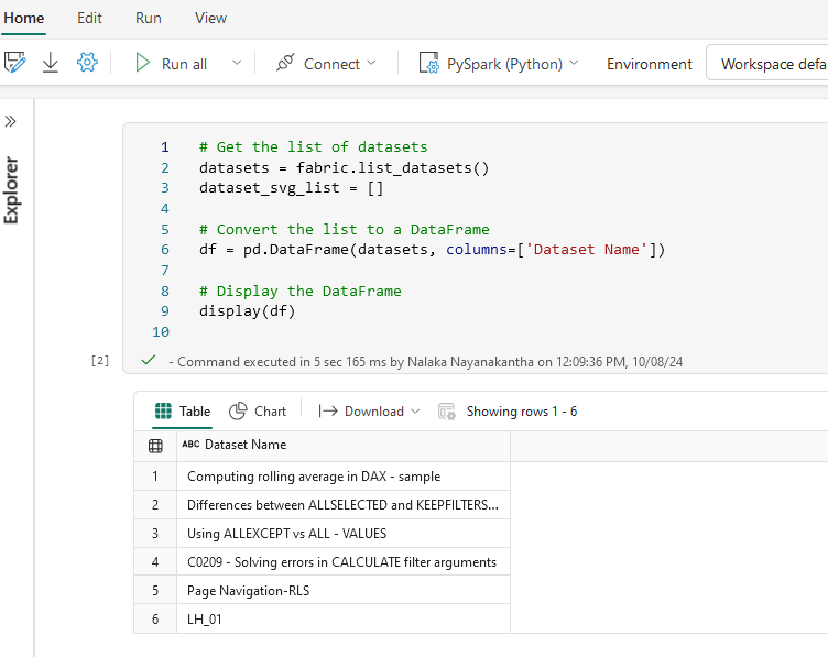
We start by fetching the list of datasets in the specified workspace. This helps us identify which datasets are included in the semantic model and ready for relationship mapping.
datasets = fabric.list_datasets()
dataset_svg_list = []

df = pd.DataFrame(datasets, columns=['Dataset Name'])
display(df)
This gives a quick snapshot of all available datasets within your relevant Microsoft Fabric workspace as below.

Step 3: Visualizing Relationships for Each Dataset
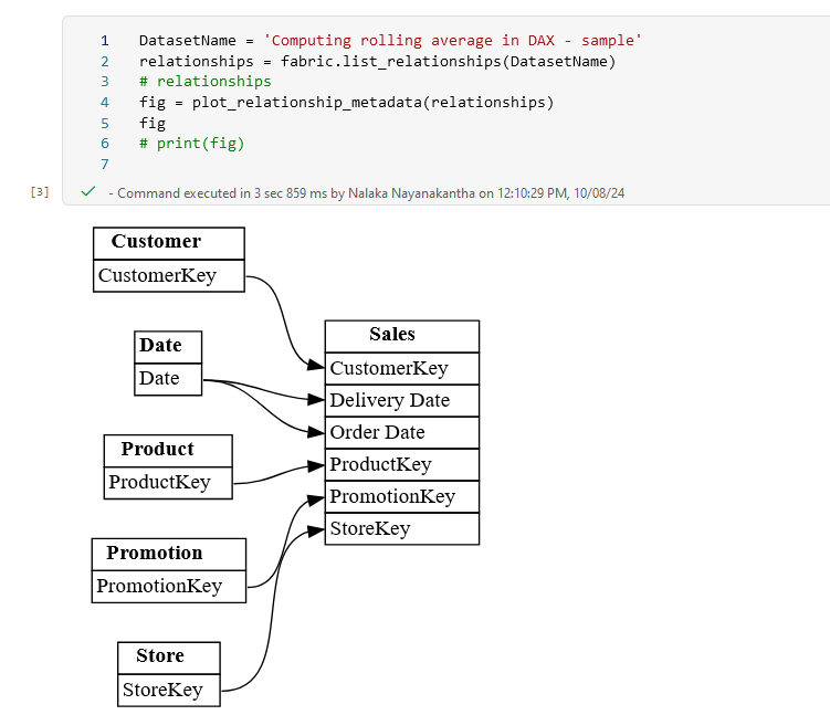
Once we have our dataset list, we can dive deeper and visualize the relationships within each one. For this example, we pick a specific dataset and generate a graphical representation of its relationships using plot_relationship_metadata.
DatasetName = 'Computing rolling average in DAX - sample'
relationships = fabric.list_relationships(DatasetName)
fig = plot_relationship_metadata(relationships)
fig
This visualization helps you understand how the dataset in question interacts with others, offering insights into dependencies, hierarchies, and relationships that may be critical for analysis and reporting.

Step 4: Iterating Through All Datasets
Now we extend the process to all datasets in the workspace. We loop through each dataset, retrieve its relationships, and store the results as SVGs (Scalable Vector Graphics). SVGs are ideal for web-based visualizations, making them a great choice for embedding in dashboards or documentation.
for dataset_name in df['Dataset Name']:
    relationships = fabric.list_relationships(dataset_name)
    if not relationships.empty:
        fig = plot_relationship_metadata(relationships)

    svg_text = fig.pipe(format='svg').decode('utf-8')
    start_index = svg_text.find('<svg')
    end_index = svg_text.find('</svg>') + len('</svg>')
    svg_content = svg_text[start_index:end_index]

    dataset_svg_list.append((dataset_name, svg_content))
Step 5: Converting and Storing Visualizations
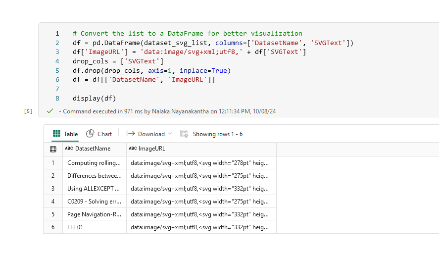
To make these relationship graphs easily accessible, we convert them into URLs. Each dataset's relationship graph is stored as a base64-encoded URL, which can be directly embedded in reports or dashboards.
df = pd.DataFrame(dataset_svg_list, columns=['DatasetName', 'SVGText'])
df['ImageURL'] = 'data:image/svg+xml;utf8,' + df['SVGText']
drop_cols = ['SVGText']
df.drop(drop_cols, axis=1, inplace=True)
df = df[['DatasetName', 'ImageURL']]

display(df)

Step 6: Splitting Large URLs into Chunks
Some URLs can get quite long, so we split them into smaller chunks for easier handling. (But for my use case Image URLs were not very long.so you can skip step 6)
max_length = df['ImageURL'].str.len().max()
chunk_size = 30000 /*Change accordingly */
num_columns = round((max_length / chunk_size) + 1)

for i in range(num_columns):
    col_name = f'ImageURL{i+1}'
    start, stop = i * chunk_size, (i+1) * chunk_size
    df[col_name] = df['ImageURL'].str.slice(start, stop)
Step 7: Storing Data in a Delta Table
To ensure that this data is easily accessible in the future, we save the relationships as a Delta table in Microsoft Fabric. Delta tables are perfect for large datasets, offering support for schema evolution and efficient querying.
spark_df = spark.createDataFrame(df)
spark_df.write.format("delta").option("mergeSchema", "true").mode("overwrite").saveAsTable("Dataset_list_relationships_svg")

(Above displays the created table (Dataset_list_relationships_svg) in the LH)
Step 8: Create a PowerBI Report having all the relationships

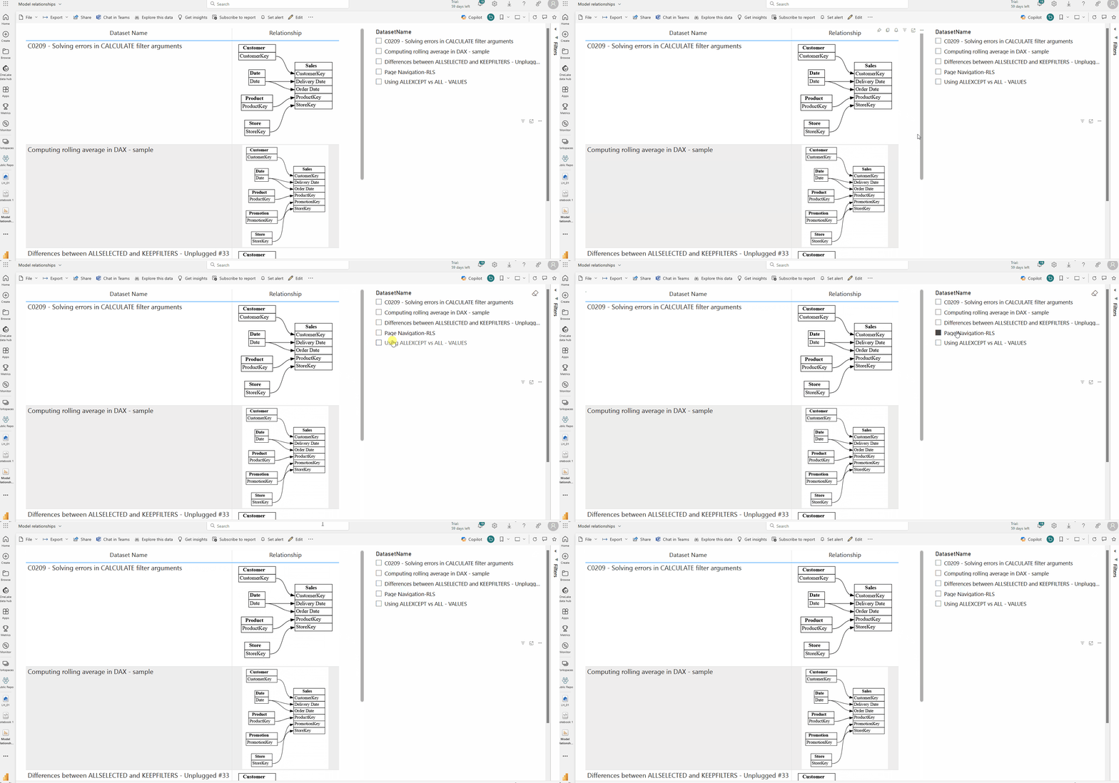
Finally, you can create a report in the powerbi service using the finally created table in step 7 . I have used the simple table visual and a slicer for this.
This enables you to revisit the stored relationships whenever needed, ensuring scalability and performance across large datasets.

Summary:
Importing Libraries: Sets up libraries for data manipulation and visualization.
Dataset Listing: Retrieves and lists datasets from a semantic fabric.
Relationship Plotting: Visualizes relationships in datasets and stores them as SVGs.
Data Handling: Converts relationships to DataFrames and splits large image URLs.
Storage: Saves the processed data in a Delta table for further analysis.
Conclusion
In this blog post, we explored how to list and visualize relationships in semantic models within a Microsoft Fabric workspace. By leveraging Python’s powerful data manipulation and visualization libraries, we can create clear, scalable insights into how datasets interact. This approach is essential for ensuring data consistency, managing dependencies, and performing impact analysis in complex data ecosystems.
Visualizing relationships is more than just a technical exercise; it’s a way to enhance your understanding of the entire data infrastructure, enabling smarter decision-making and more efficient data management. Microsoft Fabric’s seamless integration with Python and Delta tables ensures that this process can be scaled as your organization grows.
Keep experimenting with different datasets and relationships, and continue to unlock the hidden connections within your data!
This blog post provides a practical framework for data professionals to navigate the complexities of semantic models using Microsoft Fabric. By listing and visualizing relationships in your workspace, you ensure better control and deeper insights into your data infrastructure.
Subscribe to my newsletter
Read articles from Nalaka Wanniarachchi directly inside your inbox. Subscribe to the newsletter, and don't miss out.
Written by

Nalaka Wanniarachchi
Nalaka Wanniarachchi
Nalaka Wanniarachchi is an accomplished data analytics and data engineering professional with over 20 years of working experience. As a CIMA(ACMA/CGMA) UK qualified ex-banker with strong analytical skills, he transitioned into building robust data solutions. Nalaka specializes in Microsoft Fabric and Power BI, delivering advanced analytics and engineering solutions. He holds a Microsoft certification as a Fabric Analytic Engineer and Power BI Professional, combining technical expertise with a deep understanding of financial and business analytics.