Learn CSS Flexbox: A Simple Guide for Beginners to Design Layouts
 Eleftheria Batsou
Introduction
If you've ever struggled with aligning elements or creating responsive designs, Flexbox is here to simplify your life. Introduced to make the layout of web pages easier to manage, Flexbox streamlines what used to be complex CSS layout tasks into manageable, logical steps.
Basic Concepts
Flex Containers and Items: At the heart of Flexbox is the distinction between containers and items.
.container {
    display: flex;
}
This simple declaration transforms .container into a flex container. Everything inside .container becomes a flex item, subject to Flexbox rules.
Key Flex Container Properties
Flex Direction: Flexbox can arrange items in different directions.
.container {
    display: flex;
    flex-direction: row; /* default, but can be column, row-reverse, or column-reverse */
}
Justify Content: This property controls alignment along the main axis.
.container {
    justify-content: center; /* or flex-start, flex-end, space-around, space-between */
}
Align Items: For alignment perpendicular to the main axis.
.container {
    align-items: center; /* or flex-start, flex-end, stretch (default), baseline */
}
Flex Wrap: To manage overflow.
.container {
    flex-wrap: wrap; /* or nowrap */
}
Basic Flex Item Properties
Flex Grow and Shrink: These properties govern how items share space.
.item {
    flex-grow: 1; /* items can grow to fill available space */
    flex-shrink: 1; /* items can shrink if necessary */
}
Flex Basis: Sets the initial main size.
.item {
    flex-basis: 100px; /* initial main size of the item */
}
Practical Examples
Simple Navigation Bar
Here's a practical example of how Flexbox can simplify layout:
<nav class="navbar">
    <a href="#">Home</a>
    <a href="#">About</a>
    <a href="#">Contact</a>
</nav>
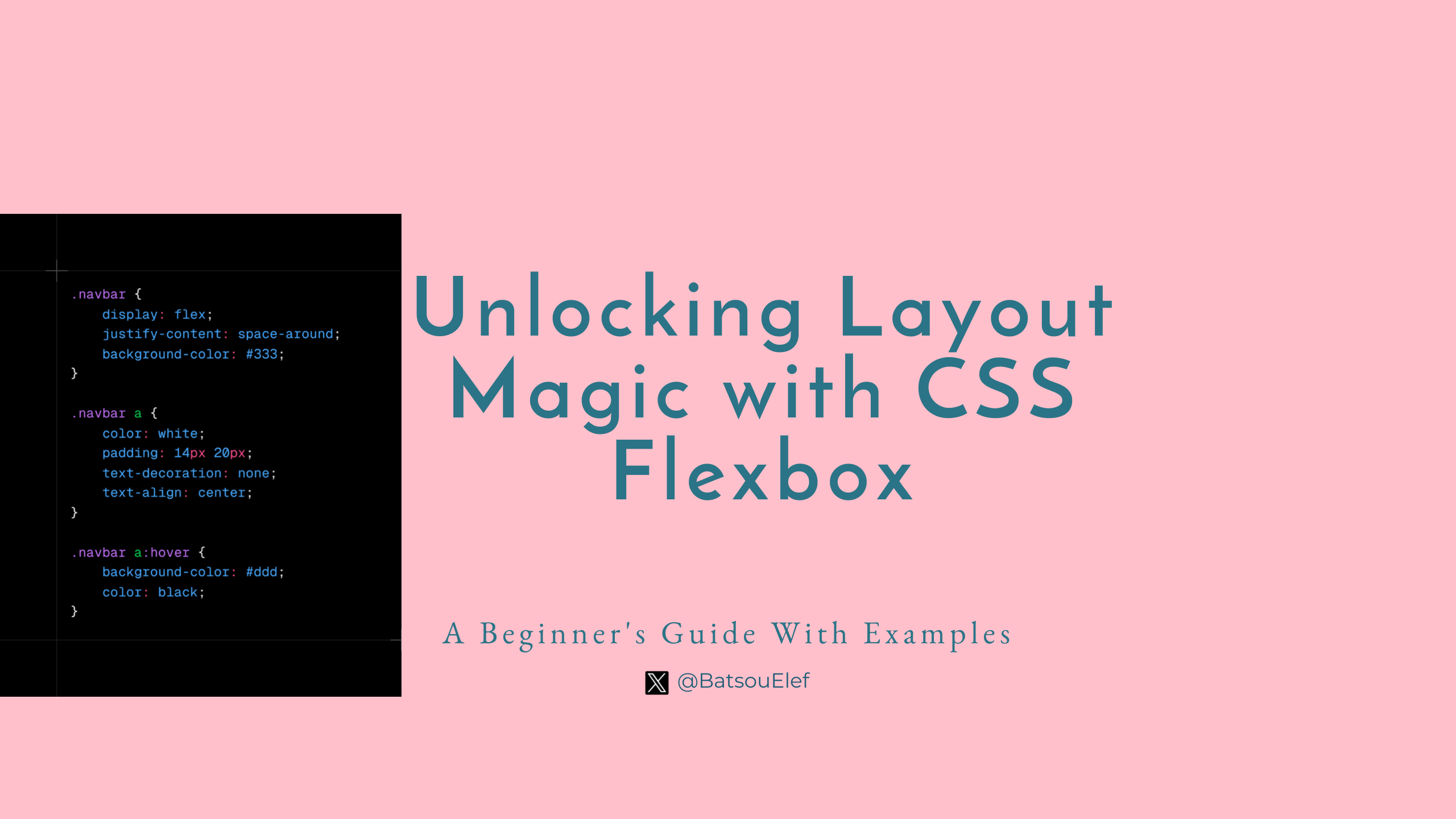
.navbar {
    display: flex;
    justify-content: space-around;
    background-color: #333;
}

.navbar a {
    color: white;
    padding: 14px 20px;
    text-decoration: none;
    text-align: center;
}

.navbar a:hover {
    background-color: #ddd;
    color: black;
}
This creates a centered navigation bar where links are evenly spaced.
Card Layout
Flexbox excels at creating responsive card layouts:
<div class="card-container">
    <div class="card">Card 1</div>
    <div class="card">Card 2</div>
    <div class="card">Card 3</div>
</div>
.card-container {
    display: flex;
    flex-wrap: wrap;
    justify-content: space-around;
}

.card {
    flex: 0 0 calc(33.333% - 10px); /* each card takes 1/3 of the width minus some margin */
    margin: 5px;
    border: 1px solid #ccc;
    padding: 10px;
    box-sizing: border-box;
}
Best Practices
Semantic HTML: Use appropriate HTML tags for structure.
Avoid Overuse: Use Flexbox where it's necessary; simpler layouts might not need it.
Order Property: Use order for rearranging items without altering HTML.
When To Use It
Responsive Navigation: flex-basis and flex-grow can create mobile-first navigation that expands on larger screens.
Equal Height Columns: align-items: stretch naturally aligns columns of different content heights.
Troubleshooting Tips
Flex Items Not Displaying: Ensure
display:flex;is applied to the parent.Items Not Aligning as Expected: Check if
flex-basisorflex-growmight be overriding alignment properties.
Conclusion
Flexbox simplifies layout, making responsive design intuitive. By understanding these basic concepts, you're well on your way to mastering layout in web development. Practice with your own projects, or try online sandboxes to further explore Flexbox's capabilities.
What's Next?
In this article, we've covered the basics of Flexbox, giving you a solid foundation to start experimenting with layouts. But there's more to explore! In our next article, we'll dive deeper into:
Advanced Flexbox Techniques: Learn about
flex-flow,align-content, and more nuanced uses offlex,align-self.Flexbox with Other Layout Techniques: How Flexbox plays nicely with CSS Grid for even more complex layouts.
Real-World Applications: Practical examples in navigation, forms, and responsive images.
Troubleshooting and Optimization: Tips on debugging common Flexbox issues and optimizing performance.
Stay tuned for our deep dive into Flexbox, where we'll take your layout skills to the next level!
👋 Hello, I'm Eleftheria, Community Manager, developer, public speaker, and content creator.
🥰 If you liked this article, consider sharing it.
Subscribe to my newsletter
Read articles from Eleftheria Batsou directly inside your inbox. Subscribe to the newsletter, and don't miss out.
Written by

Eleftheria Batsou
Eleftheria Batsou
Hi there 🙆♀️, I'm Eleftheria, Community Manager with a coding background and a passion for UX. Do you have any questions? Don't hesitate to contact me. I can talk about front-end development, design, job hunting/freelancing/internships.