Mastering CSS Media Queries: A Guide for Beginners and Intermediates
 Fred Douglas
In the world of web development, responsive design is essential. Users today access websites from a variety of devices, each with different screen sizes and resolutions. CSS media queries enable developers to create fluid and adaptive layouts that look great on any screen. This article will walk you through the essentials of CSS media queries, helping you build responsive websites with ease.

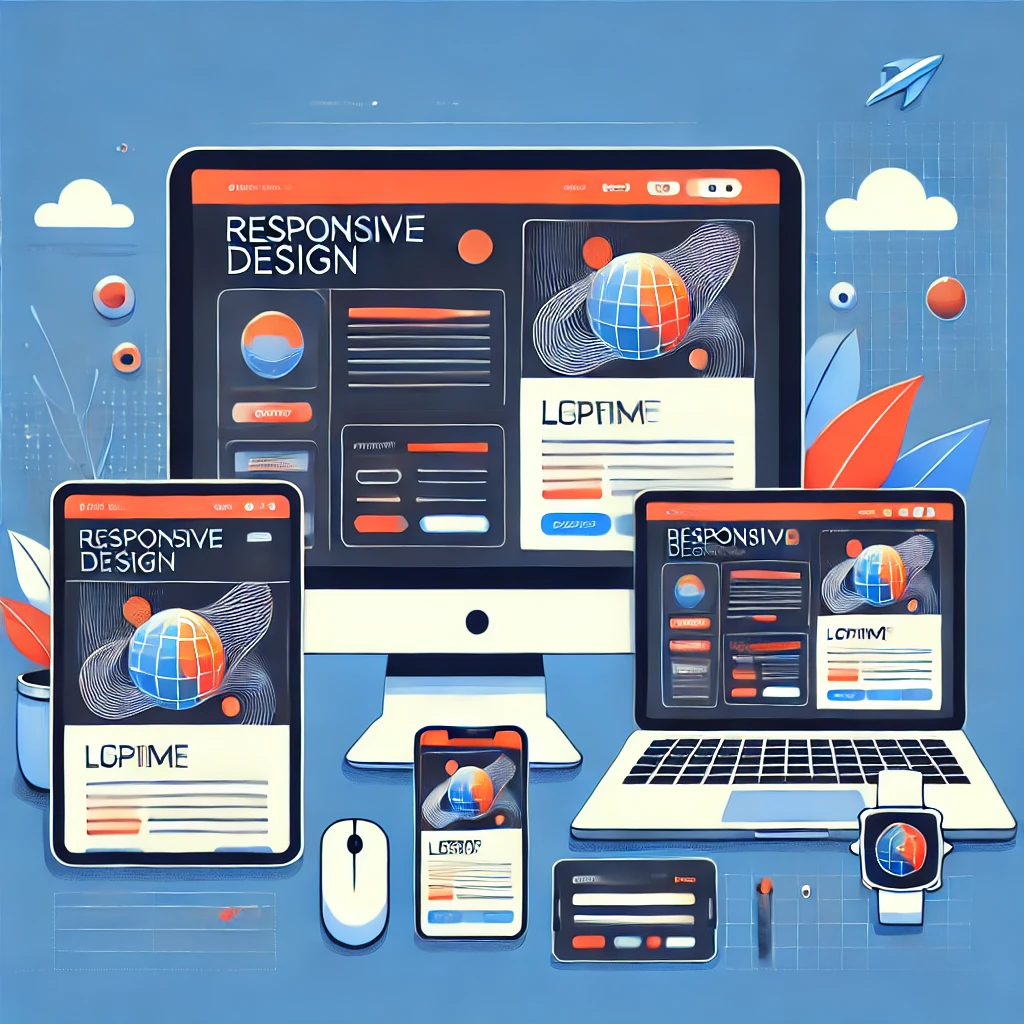
Image: An illustration of various devices displaying the same website layout.
1. Introduction
What are CSS Media Queries?
CSS media queries are rules that allow you to apply specific styles to different devices based on their characteristics, such as screen width, height, and resolution. They enable developers to create designs that respond to the user's environment, ensuring a seamless experience across devices.
The Importance of Responsive Design
Responsive design is crucial for enhancing user experience. With a responsive website, content adjusts according to the screen size, making it easier for users to read and interact with your site. This adaptability not only improves usability but also boosts SEO rankings.
Benefits of Using Media Queries
Enhanced User Experience: Content is easily readable and navigable.
Greater Accessibility: Ensures your site is functional on all devices.
Improved SEO: Google favors responsive designs in search results.
2. Basic Syntax and Usage
Understanding the @media Rule
The @media rule is the cornerstone of media queries. It allows you to specify styles that apply only under certain conditions. Here's the basic syntax:
@media media-type and (condition) {
  /* CSS rules here */
}
Example:
@media screen and (max-width: 600px) {
  body {
    background-color: lightblue;
  }
}
Common Media Features
Width and Height: Use
min-width,max-width,min-height, andmax-heightto target specific viewport dimensions.Orientation: Detect whether the device is in portrait or landscape mode.
Resolution: Adjust styles based on the screen’s resolution.
3. Creating Responsive Layouts
Fluid Layouts
Using percentages instead of fixed units allows your layout to adjust according to the screen size. For example:
.container {
  width: 80%; /* Adjusts to 80% of the viewport */
  margin: 0 auto; /* Centers the container */
}
Flexible Images and Videos
Ensure images and videos scale appropriately by using the following CSS:
img {
  max-width: 100%;
  height: auto; /* Maintains aspect ratio */
}
Media-Specific Styles
Apply different styles for various devices to enhance user experience:
@media screen and (max-width: 600px) {
  h1 {
    font-size: 24px;
  }
}

@media screen and (min-width: 601px) {
  h1 {
    font-size: 36px;
  }
}
4. Advanced Media Query Techniques
Using Multiple Media Features
Combine multiple conditions to create more specific styles:
@media screen and (min-width: 600px) and (orientation: portrait) {
  /* Styles for portrait screens with width over 600px */
}
Creating Complex Media Query Expressions
Utilize and, or, and not operators for complex queries:
@media screen and (min-width: 600px) and (max-width: 900px) {
  /* Styles for screens between 600px and 900px */
}
Responsive Design Patterns
Mobile-First: Design for mobile devices first, then adapt for larger screens.
Desktop-First: Begin with desktop layouts, then adjust down for smaller devices.

Image: A flowchart illustrating mobile-first vs. desktop-first design approaches.
5. Best Practices for Media Queries
Prioritizing Mobile-First Design
Start with a mobile-first approach to ensure a solid foundation. This way, you cater to the largest user base effectively.
Using Media Query Breakpoints Effectively
Set breakpoints where the layout naturally breaks. This ensures a smooth transition between layouts rather than relying solely on common device widths.
Testing Across Different Devices and Browsers
Testing is vital to ensure that your media queries work as expected. Use tools like Chrome DevTools or responsive design checkers to preview how your site looks on different devices.
6. Common Use Cases
Responsive Websites
Media queries are essential for building responsive websites. For instance, you can change font sizes, images, and layout structures based on the viewport.
Email Design
Use media queries in HTML emails to ensure your content looks great on mobile devices.
<style>
  @media only screen and (max-width: 600px) {
    .content {
      padding: 20px;
    }
  }
</style>
Print Media
Adjust styles for print using media queries. For example, you can hide unnecessary elements when a user prints a page:
@media print {
  .no-print {
    display: none;
  }
}
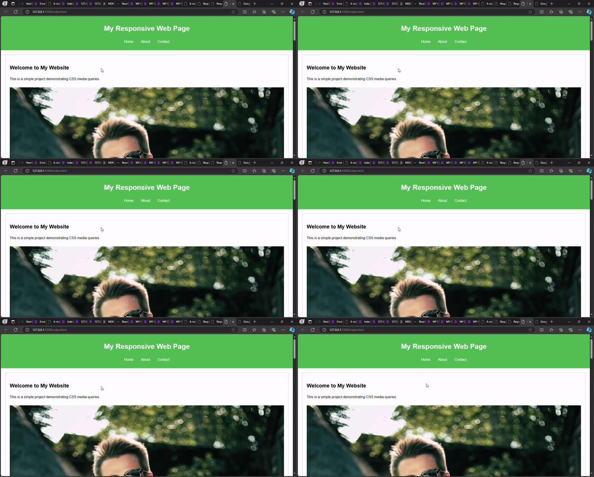
A simple website design using the CSS media query

7. Conclusion
Recap of Key Points
Media queries are vital for responsive design.
Start with a mobile-first approach to build adaptable layouts.
Use breakpoints based on content for smoother transitions.
Encouragement for Further Exploration
As you continue to explore CSS media queries, experiment with different techniques and layouts. The more you practice, the more adept you’ll become at creating responsive designs.
Additional Resources
Subscribe to my newsletter
Read articles from Fred Douglas directly inside your inbox. Subscribe to the newsletter, and don't miss out.
Written by

Fred Douglas
Fred Douglas
I'm a front-end web developer who thrives on building user-centric experiences. I bring websites and web applications to life with clean, interactive code and a focus on usability. My technical writing skills ensure clear and concise documentation, empowering users to get the most out of any digital product.