CSS Units
 Abdullah Salaudeen
Measurement is crucial to everything we do in life. We measure time, our height, and even our work performance. The concept of measurement is no different on a basic web page. Just as we measure time in hours, web pages are measured in CSS units.
CSS Units are the fundamental building blocks for any website, enabling us to create responsive web pages. They allow us to measure the size of fonts, the length of margins, or the width of boxes.
However, not all CSS units of measurement are equal. Some, like Rem and Em, measure in relation to a preset font size, while others, like viewports, use screen size proportions.
This example-rich guide explores the basics of CSS units, including those introduced in March 2022.
Broad Categorizations of CSS Units
Absolute Units
Font-Relative Units
Viewport-Relative Units
Percentages
Absolute Unit Lengths
These unit lengths are standalone units that do not change. They don’t determine their sizes based on any other element on the webpage. Rather, they maintain the same size on any screen size or webpage.
They include
Centimetres (
cm)Millimetres (
mm)Quarter millimetres (
Q)Inches (
in)Picas (
pc)Points (
pt)Pixels (
px)
Pixels are the most commonly used unit lengths in absolute styling. Since it’s the go-to unit for learning CSS, you’ve probably encountered it before as a beginner.
While Pixels are widely used, the need to create web pages that constantly adjust to different screen sizes means they are not the best fit for responsive designs. You’d have to alter pixel values when creating pages for various screen sizes.
Besides, all other absolute units are more widely used for physical print styling, rather than the screen. Hence, centimetres and inches are more commonly used to measure a book’s thickness or a poster’s length.
Here is the proportion of each absolute values.
| Unit | Name | Equivalent |
cm | centimetres | 1cm 37.8px = 25.2/64in |
mm | millimetres | 1mm 1/10th of 1cm |
Q | quarter millimetres | 1Q 1/40th 1cm |
in | Inches | 1in 2.54cm = 96px |
pc | Picas | 1pc 1/6th of 1in |
pt | Points | 1pt 1/72nd of 1in |
px | Pixels | 1px 1/96th of 1in |
In the code below, the px units are defined for #paragraph_one, #paragraph_two and #paragraph_three.
Here are the results, which remained unchanged regardless of the screen size.
Font-Relative Unit Lengths
Unlike absolute unit lengths, relative measurement standards are determined by a parent element within the web page. These elements aren’t standalone. Rather, they take their size from a pre-defined parent.
In this case, a font-relative unit assumes its font size in proportion to the font size defined by its parent element. They include
Em
Rem
Em
Em are relative units that determine their sizes based on the font size defined by their parent elements. Consider a case where we have a paragraph <p> within a <div> . If the <div> font size is set at 18px, then a margin of 1em set for the paragraph means the margin will be 18px. But if the <p> font size is set at 0.5em, it would be 9px. That is (0.5*18px). The element sets its default value (1em) based on the parent element.
In the example above, the parent element .post sets its font size at 16px. Hence, all its succeeding child elements will set their default value of 1em at 16px.
Hence, the padding-left of .main_post is 16px. that is (1*16px= 16px).
Besides, the .post div font size is 40px. That is (2.5em*16= 40px)
Since their parent div is set at 2.5em, #paragraph-one and #paragraph-two naturally takes sized at 40px. See the results here.
The main advantage of Em is its easy scalability. If you want to change font sizes for a responsive webpage, you don’t have to change every px element defined on the page. Rather, you can always change the font size of the global parent and every other text will adjust to the parent.
However, em is only relative to its direct nearest parent. Hence, a <p> nested in several <div> elements might get confusing because it only relates to its direct parent, who also might have another parent.
Take the case of #paragraph-three that is nested in two <div> ; the .main_post and its direct parent <div>. Since it is relative to its nearest parent, the font size is calculated as (2.5em*2.5em*16px), making 100px. In a situation where you are working on several nested elements, using em could cause major issues.
Rem
Rem, which stands for ‘root em’ is another relative measurement unit in CSS. Unlike Em which relates directly to its preceding parent, REM refers directly to the font size of the root element or the root parent container where a px value is defined. It works similarly to Em units, albeit easier to use even if you have several nested containers. Let’s analyse a similar to the one used above. But this time, the values are changed to rem units.
Here, #paragraph_three, relates directly to its root element (.main_post), even though it is nested in another <div> container. This is because rem relates directly to the root, not the immediate preceding parent. Hence, it still maintains a size of 40px (2.5em*16px). Here is its result shown below.
Use Cases or Rem and Em
rem and em units offer several flexibility options tailored to building a responsive website. Here are some advanced use cases of Em and Rem
Use
emfor compound scaling effects. As explained earlier,emworks relatively to its direct parent element. Look at the following example%[https://codepen.io/Abdullah-SEO/pen/jOgmLMy]
Use
remfor simplicity in responsiveness. You can easily define the media screen, margin, padding, and line height for several screen sizes without the webpage becoming too complex.Use
remfor global values and em for more specific values that are tailored to a single parent-child relationship.Document Scalability: With
remunits, it becomes easier to scale documents by defining the width, margin and padding in tune with the root font size.
Viewports Relative Units
A viewport is the user’s visible area of a computer device screen on a webpage. Thus, its units are scales of measurement that are relative to the screen sizes of the container. When the container’s dimensions aren’t defined, the default viewport is the height and width of a device’s screen or webpage.
Device screen sizes and their measurements can range from
Desktops and Laptops: Ranges from 1024x768 to 1920x1080 pixels.
Tablets: Its viewports range from 768x1024 to 1280x800 pixels.
Mobile Phones: Viewports usually range from 360x640 to 414x896 pixels.
Viewports unit of measurement have 6 popular categories
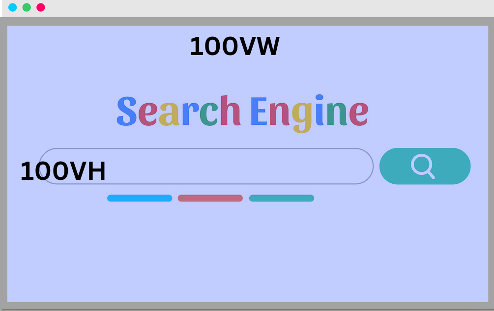
vh: This stands for viewport height. Hence, 1vh equals 1% of the viewport height, while, 100vh means 100% of the viewport height. At default, a viewport height is the total height of your available screen space.vw: This also stands for the viewport’s width. Hence, 1vw equals 1% of the viewport width, while, 70vh means 70% of the viewport width. Viewport height’s default is the total width of your screen spacevmin(viewport minimum): Know as the viewport minimum, it adopts the lowest value between thevwandvh.vmax(viewport maximum): Also called the viewport maximum, it takes the highest value between thevwandvh.vb(viewport block): Represents the percentage of the block or the vertical axis of the viewportvi(viewport inline): Represents the percentage of the inline or the horizontal axis of the viewport.
Viewport Height and Viewport Width
If a viewport is 1200px wide and 500px high. A box nested within with dimensions of 20vw as width, 15vh as height and 3vw as font size, will have dimensions of 120px, 75px and 36px respectively.
(20vw/100)*1200px = 120px.
(15vw/100)*500px = 75px.
(3vw/100)*1200px = 36px.
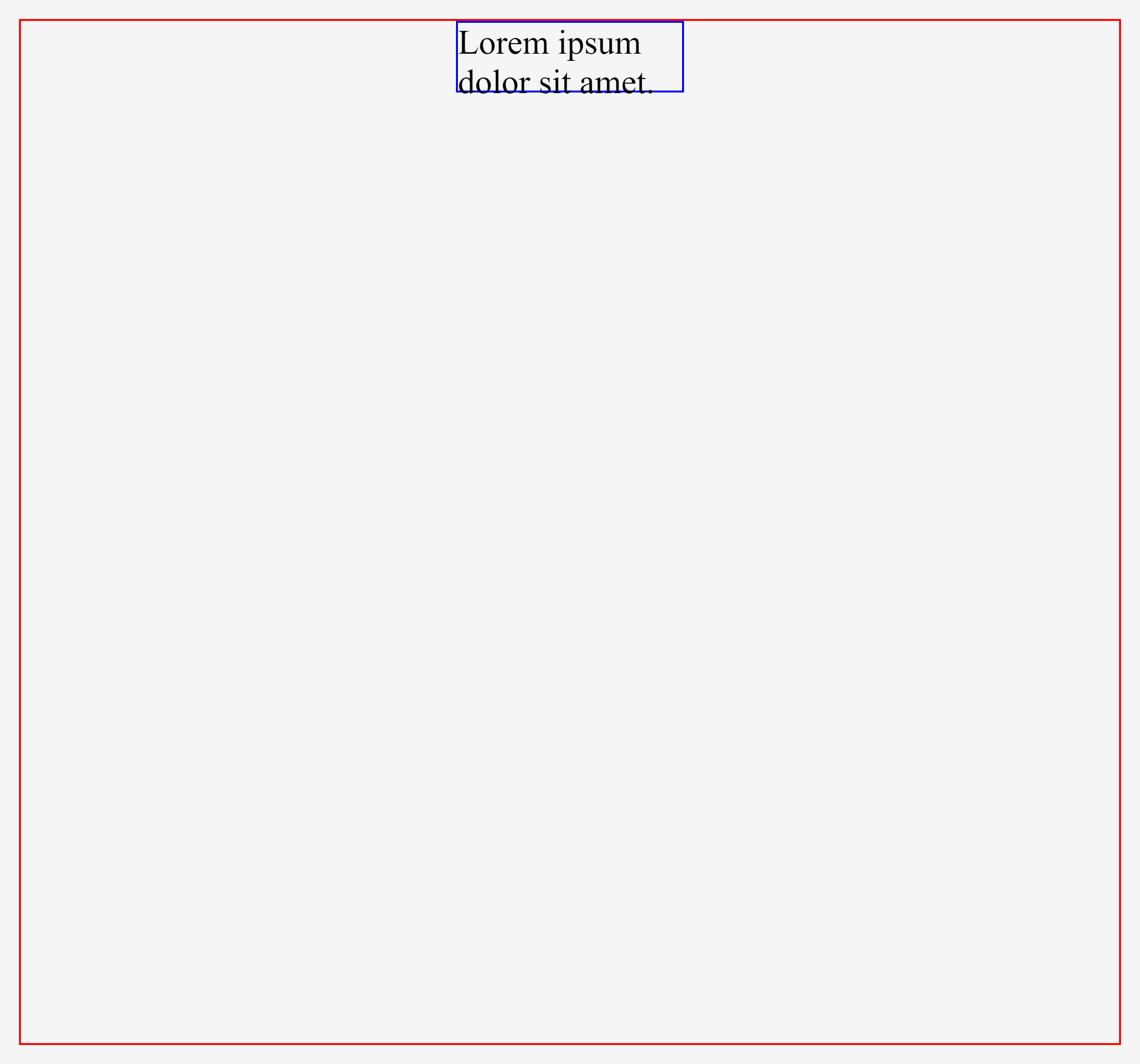
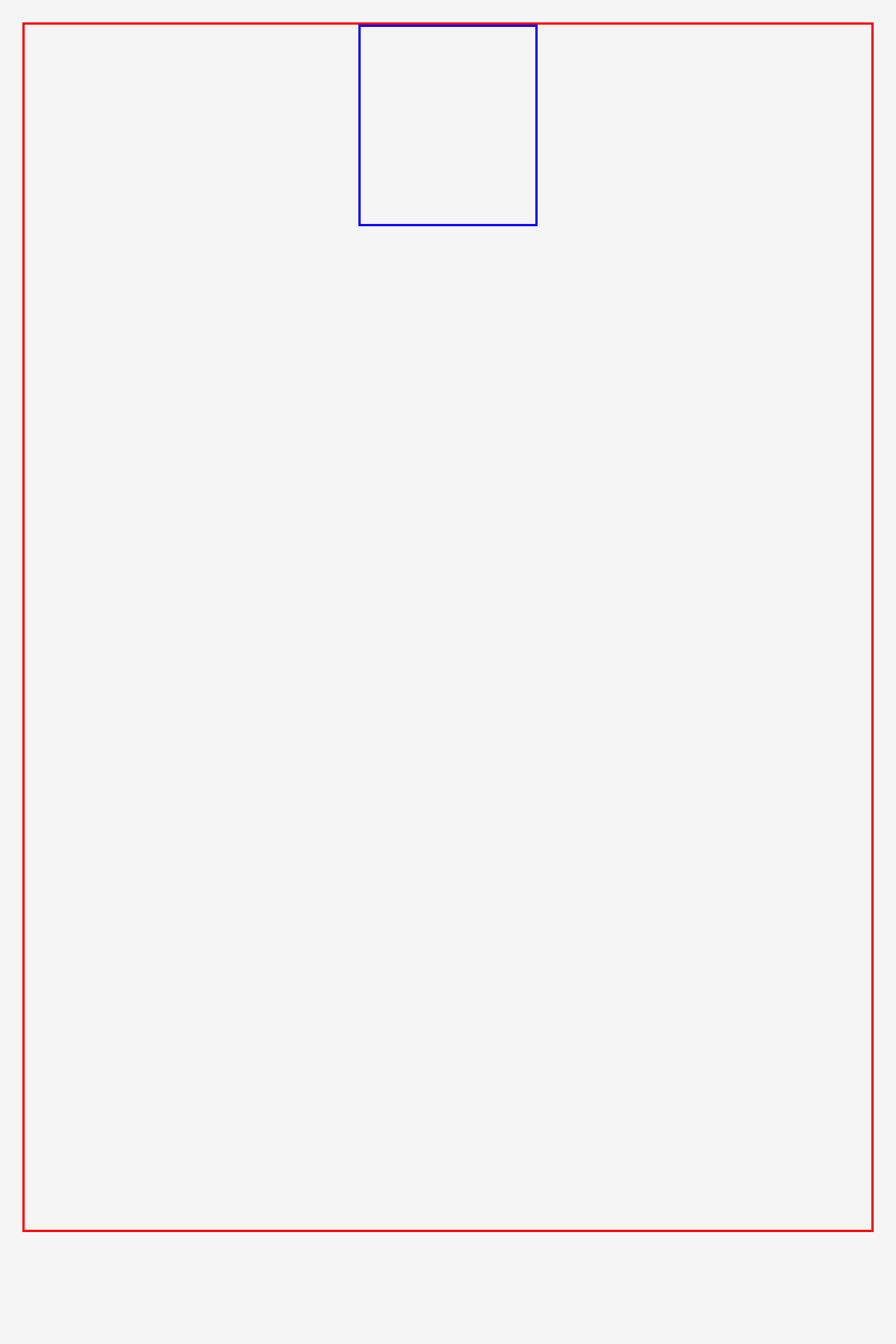
But if you resize the browser to a width of 800px and height of 1200px. Then, 20vw will be 160px wide, while 15vh will be 180px high.
Viewport Minimum and Viewport Maximum
Here is a short explainer video on vmin and vmax.
Viewport Inline and Viewport Block
vi and vb facilitate seamless switches between landscape and portrait on mobile devices. When a horizontal writing mode on a webpage is changed to vertical, the roles of each block direction get reversed. This means the top and bottom roles go to the left and right.
This change normally disorganizes the overall layout, where the text in a default horizontal mode bleeds out when changed to vertical, or text in a preset vertical mode becomes too tiny when changed to horizontal.
Hence, vi and vb allow the elements on a screen to change as the screen orientation changes. In horizontal mode, the wider the screen, the wider the text block. While in vertical modes, the higher the screen, the higher the text block.
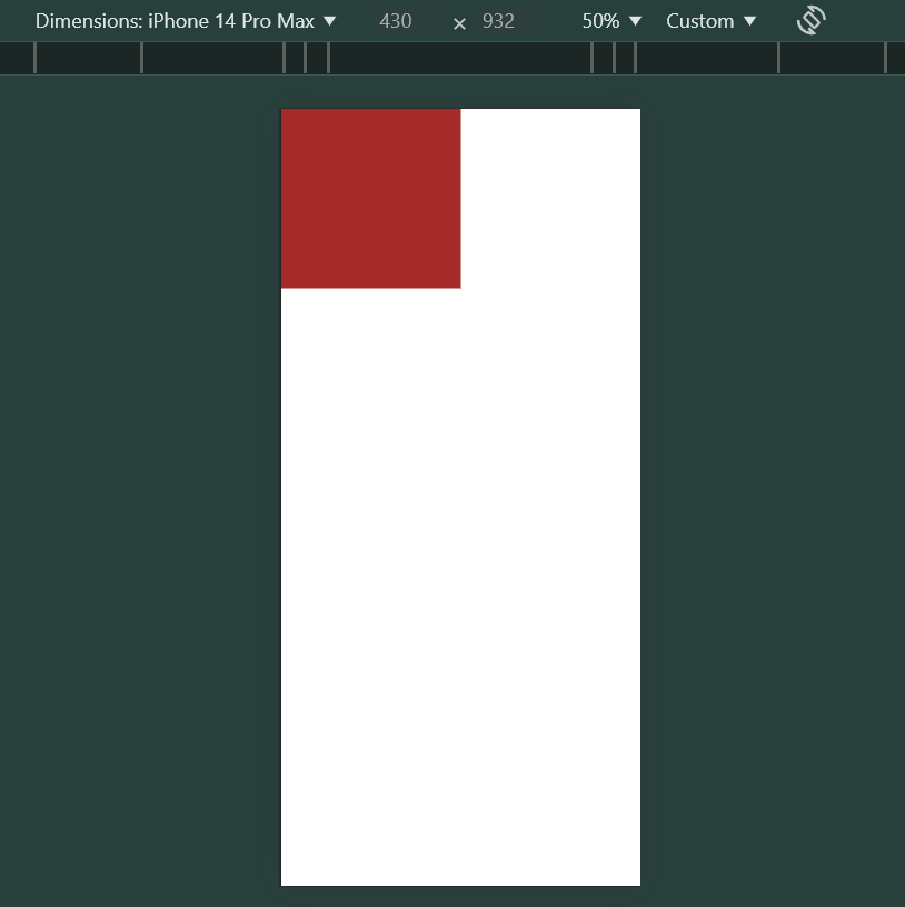
Example of Viewport Inline (vi)
<body>
    <div class="horizontal-box"></div>
</body>

<style>
    .horizontal-box {
    width: 50vi;
    height: 50vi;
    background-color: brown;
}
</style>
<!-- 50vi equals to 50vw -->
Vi Portrait Mode
Vi Landscape Mode

The box above with a square size of 50vi ( 50% of the screen's width) maintains the width dimensions regardless of the height variations in horizontal or vertical modes.
Example of Viewport Block (vb)
<body>
    <div class="vertical-box"></div>
</body>

<style>
    .vertical-box {
    width: 50vb;
    height: 50vb;
    background-color: aquamarine;
}
</style>
<!-- 50vb equals to 50vh -->
vb Portrait Mode

vb Landscape Mode
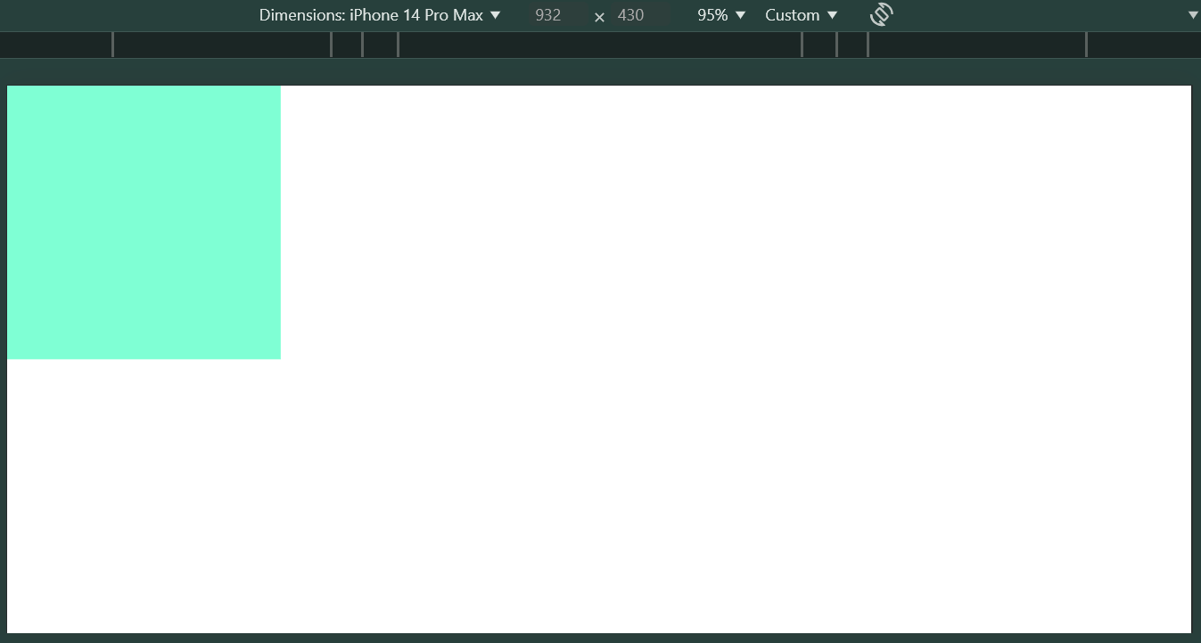
The box above also with a square size of 50vb ( 50% of the screen's height) maintains the height dimensions regardless of the height variations in horizontal or vertical modes.
Issues with Viewports on Mobile Layouts
It is worth knowing that VH and VW may not behave well on mobile devices because they don’t consider dynamic toolbars. Have you ever scrolled on a web page on a mobile phone?
You may notice that the URL bar at the bottom disappears when you scroll down a webpage and reappears when scrolling up, thus overlaying parts of the viewport. It’s not always URL bars, sometimes, it could be the address bar, tab bar or any other user interface.
Here is an example
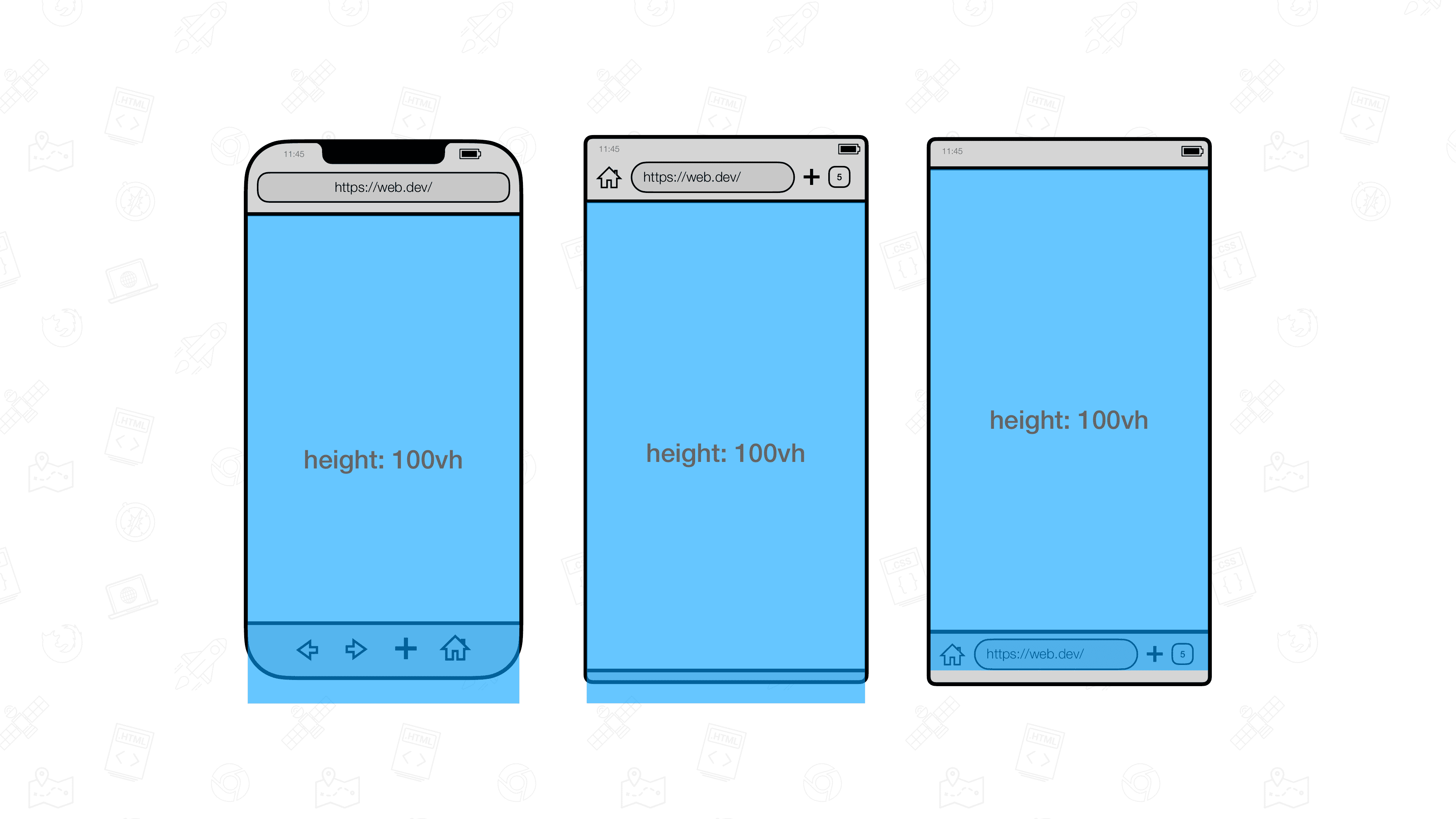
Source: web.dev
Hence, in March 2022, new viewport units were introduced to fix the problem. They included the small, large and dynamic viewport modifiers.
Small Viewport (svh) Large Viewport (lvh) and Dynamic Viewport (dvh) Prefixes
s: The Small viewport represents the viewport size when an overlay element is visible. It assumes that a URL bar or address bar is showing, thus, adjusting its viewport to prevent overlay.
l: The Large viewport represents the viewport size when no overlay elements like the URL bar are visible. It assumes that a URL bar or address bar is hidden, thus, adjusting its viewport to the fit whole webpage.d: The Dynamic viewport changes its current size depending on whether the overlay element is visible or not. It automatically adjusts to whether the URL bar is visible or not.
Since s, d and l are just prefix modifiers, you can combine them to the 6 traditional viewport units to get 24 different viewport units. for instance
vh: svh, lvh, dvh
vw: svw, lvw, dvw
vmin: svmin, lvmin, dvmin
vmax: svmax, lvmax. dvmax
vi: svi, lvi, dvi
vb: svb, lvb, dvb.
The video below explains the intricacies of these values
It is worth knowing that dvh, svh, and lvh are still the most widely used modifiers because URL bars mostly affect the top and bottom of the page and rarely on the left or right. Here is another short explainer on when to use vh, svh and dvh
Percentages
Percentages had never been absolute. They are another relative CSS unit of measurement that measures it relative to its parent container. Hence, when the parent element dimension changes, the child element adjusts its size relative to it.
Percentages can be used for width, height, padding and margin. However, they are less ideal for defining font sizes. It also supports responsive layouts that change based on different screen sizes and page orientations.
Here is an example
Conclusion
This article explained the dynamics of CSS units. Each unit has its use cases. While px is perfect as an absolute unit and defining global dimensions, em and rem are perfect for defining font sizes. But I bet you should be careful when using em
Meanwhile, viewports and percentages are also good for defining containers. When you master viewport modifiers expertly, you should not have any problems with defining mobile layout.
All in all, I hope you enjoyed the article. Don’t forget to comment, like and shre the article. Looking forward to what you have to say!
Subscribe to my newsletter
Read articles from Abdullah Salaudeen directly inside your inbox. Subscribe to the newsletter, and don't miss out.
Written by
