NextJS Theme Mode Toggle
 Ulaş Özdemir
In every project, I have a hard time deciding where to place the theme toggle and how to design it. It may seem simple, and many might not think much of it, but I know there are others out there who share my obsession. So, I'm determined to resolve this once and for all.
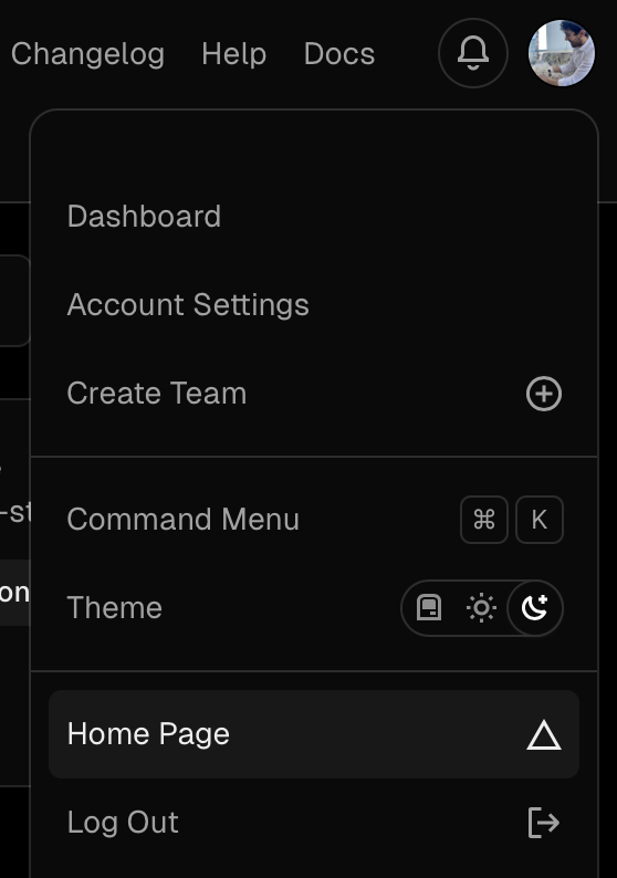
Like all of you I also browse the web a lot and seeing all kinds of designs and I think I’ve seen every kind of implementation of this. However I’ve decided the best way of implementing this is using radio inputs and for the design aspect I like the way vercel handles it.

It looks quite good right?
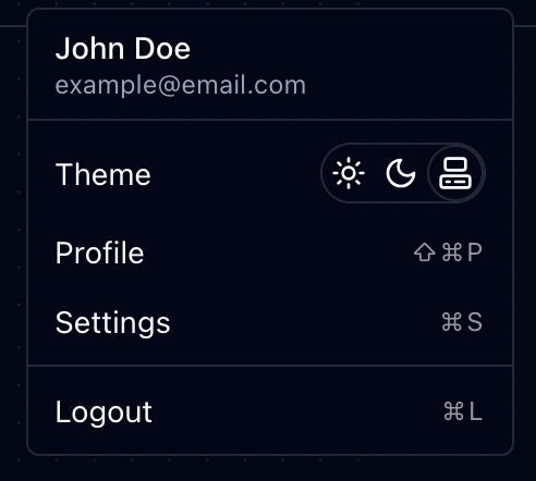
Let’s check how does my implementation looks like.

Well… I guess that could be better, because the border of the icon and the border of the surrounding div don’t align. Still, it’s good enough, and I’ll leave it to you to fix it. 🤓
I think the packages I use is quite clear in the gist but if you are confused check the following links:
https://tailwindcss.com/docs/guides/nextjs
https://github.com/pacocoursey/next-themes
https://lucide.dev
If you are using shadcn this would be enough:
Subscribe to my newsletter
Read articles from Ulaş Özdemir directly inside your inbox. Subscribe to the newsletter, and don't miss out.
Written by

Ulaş Özdemir
Ulaş Özdemir
I am passionate about advancing towards a post-scarcity economy and deeply respect organizations that prioritize unity, diversity, and meritocracy.