From Scratch to Skilled: My UI/UX Design Journey Through IIT Roorkee’s Teachnook Course
 Ashvini Bhure
Introduction: Starting from Scratch
In the beginning, I had minimal exposure to UI/UX design and wasn’t particularly aware of its impact on digital products. Coming from an engineering background, my focus was largely on technical subjects, but coding didn’t appeal to me as much. I was more inclined toward my creative side and found myself constantly looking for ways to express it. That’s when I realized that I didn’t have to separate creativity from tech — I could blend both by working on the design aspect of websites and apps.
For those unfamiliar, UI (User Interface) design focuses on the look and layout of a product—how it’s presented and how users interact with it visually, while UX (User Experience) design centers on how users feel when interacting with that product, ensuring it's intuitive, enjoyable, and seamless.
My motivation to pursue UI/UX stemmed from my interest in aesthetics and user-centric design. I enjoyed experimenting with how websites look and feel, combining creativity with my basic coding skills to build user-friendly and visually appealing interfaces. It was this fusion of creativity and technology that led me to explore UI/UX as a career path.However, enrolling in the UI/UX course offered by Teachnook in collaboration with IIT Roorkee marked a turning point.
Foundations of UI/UX Design
UI/UX design forms the backbone of how users interact with digital products. At its core, it’s about creating intuitive, efficient, and enjoyable experiences. The foundations lie in understanding the user through research and empathy, defining clear goals, brainstorming creative solutions, prototyping those ideas, and testing them rigorously. Good design finds the sweet spot between aesthetics and functionality, ensuring accessibility and seamless interactions. It's the perfect fusion of art and science, shaping how users feel and engage with every digital touchpoint.
The 5 Stages of UI/UX Design
The UI/UX design process kicks off with five dynamic stages: Empathize, Define, Ideate, Prototype, and Test. These phases aren't just steps, they're a creative journey, guiding designers from grasping user needs to polishing a product with real-world feedback. For me, each stage sparked new ideas and challenges, turning what started as a beginner's curiosity into a deeper passion for creative problem-solving and design. It was a wild ride from zero to knowing how to build intuitive, user-friendly experiences!
1. Empathize: Understanding User Needs
The journey begins by understanding the users—what they need, their pain points, and how your product can improve their experience. This stage is all about stepping into the user’s shoes and building empathy. During my course, we were introduced to Miro and FigJam as essential tools for brainstorming and mapping out the early stages of the design process. These tools became the foundation for capturing user insights and mapping out the user journey.
My Experience: Personalizing Skincare Solutions
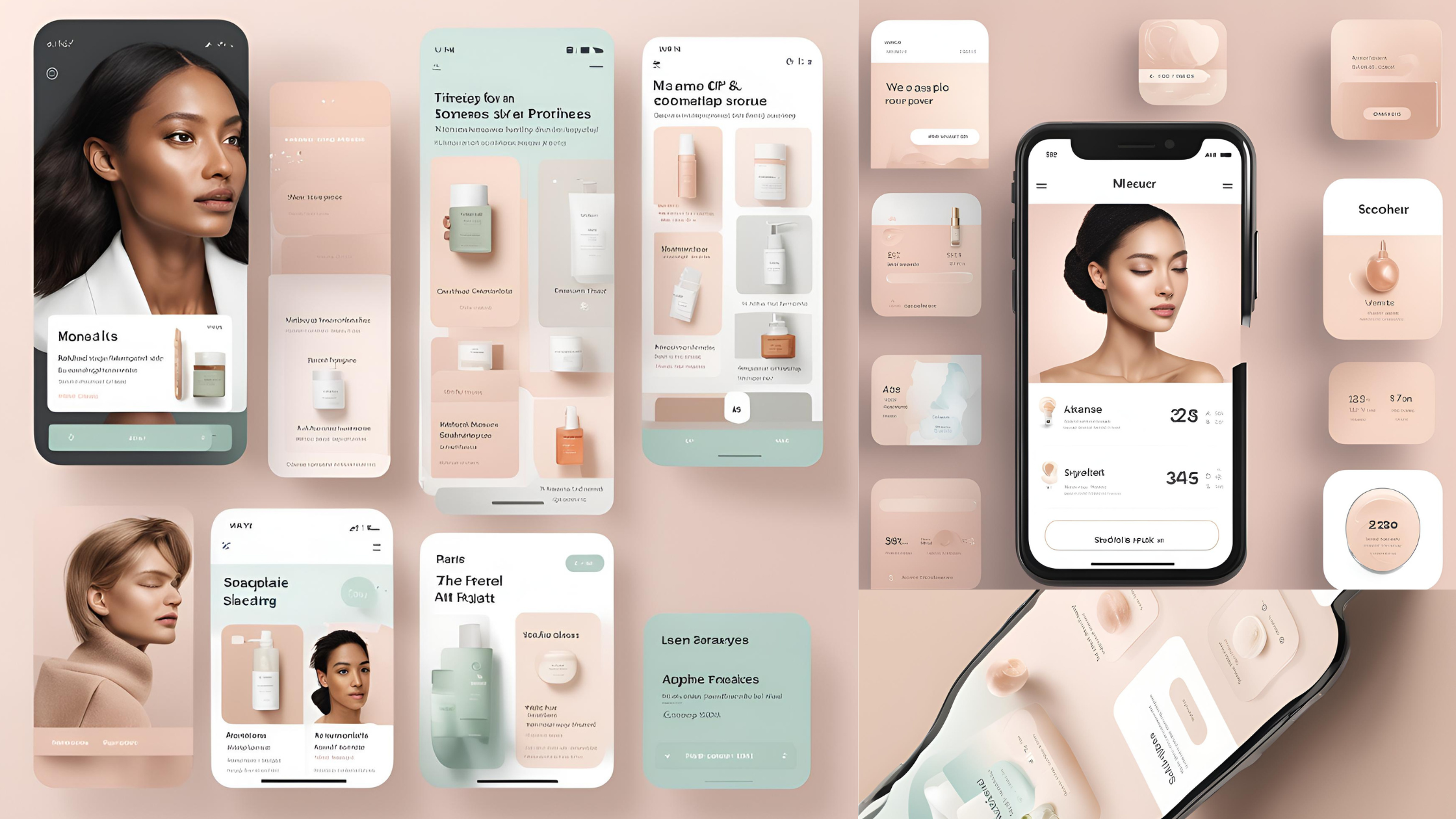
For my minor project, I chose to work on a personalized skincare app, and the first task was to create a survey using Google Forms. The form included questions around skin types, daily routines, and challenges people face with skincare products. This survey allowed me to gather real user data, which informed every subsequent design decision. It was fascinating to see how diverse user needs could be and how crucial it was to align my app to address those needs.
"User feedback is like a roadmap—it's not always the straight path you imagined, but it always leads you to the right destination." — Ashvini Bhure
2. Define: Narrowing Down the Problem
Once you understand user needs, it’s time to define the problem. This stage focuses on turning raw insights into a clear problem statement that will guide your design. Based on the feedback from the Google Forms survey, I defined the core issue: users often struggle with selecting the right skincare products tailored to their specific skin conditions. This definition served as the foundation for the rest of my design process.
My Experience: Defining the Skincare Problem
During this stage, I mapped out the common preferences and pain points users expressed in their responses. Some users wanted products for sensitive skin, while others sought eco-friendly options. This step helped me focus on what my app should achieve—providing personalized recommendations while making the interface easy to navigate.
"Design is not just about solving problems, it's about defining them so well that the solutions become obvious."
3. Ideate: Creative Problem-Solving
With a clearly defined problem in mind, the next step is to brainstorm creative solutions. The ideation stage is where you think outside the box and generate as many ideas as possible. This was one of the most enjoyable stages for me, as it allowed me to be creative and explore multiple design approaches.
My Experience: Ideating Solutions for Skincare
Using Miro for ideation, I started mapping out potential features for my app. Should it include a skin analysis tool? Could it recommend products based on daily weather conditions? At this stage, I wasn’t limited by feasibility; the goal was to think big and come up with innovative solutions. Eventually, I narrowed it down to a simple and user-friendly product recommendation tool, which would guide users based on their preferences and needs.
"Creativity doesn't always come from a blank page; sometimes it comes from seeing a problem in a completely different light."
4. Prototype: Bringing Ideas to Life
The prototyping stage is where your ideas begin to take shape. Using tools like Figma, Sketch, and Adobe XD, you create wireframes and early prototypes to visualize the structure and functionality of your design. It’s a vital step to test the initial concept before diving into the final design.
My Experience: Prototyping the Skincare App
I started with low-fidelity wireframes, using Figma to outline the basic layout of the app. The main goal was to test how users would navigate through the app, and whether they could easily find what they needed. Prototyping helped me identify areas where users might face challenges and gave me the chance to address them early on. This iterative approach allowed me to refine the app's flow and make it more intuitive.
"A prototype isn't perfect, but it's where ideas meet reality—and that's where the magic happens."
5. Test: User Feedback and Refinement
The final stage of the UI/UX process is testing. This is where you put your prototypes in front of real users and gather feedback on their experiences. Testing is essential because it reveals issues you may not have anticipated, and it helps ensure your final product truly meets user needs.
My Experience: Testing and Iterating
Once I had my basic prototype, I conducted usability tests with a small group of users. Their feedback was invaluable—some found certain buttons confusing, while others suggested new features like daily skincare tips. Based on their input, I refined the design, making adjustments to the user interface to improve the overall experience. The testing phase taught me the importance of iterating and constantly improving, even after the initial design is complete.
"Design without testing is like building a house without doors—you might think it's complete, but the user can't get in." — Ashvini Bhure
By following these five stages, I was able to take my project from a simple idea to a fully functioning prototype. Each step in the process was a learning opportunity, teaching me that UI/UX design is not just about making things look good—it’s about understanding users, solving their problems, and continuously refining the experience.
Tools of the Trade.
Figma: A collaborative design tool perfect for creating wireframes, prototypes, and UI mockups. Figma allows real-time collaboration, making it easier to share designs with team members or gather feedback quickly. Its intuitive interface and versatility make it a go-to for UI/UX designers.
Miro: A digital whiteboard tool that helps in brainstorming, ideation, and planning. Miro was crucial during the ideation stage, allowing me to visually map out user flows, ideas, and solutions, fostering creativity and collaboration.
Adobe XD: Another powerful tool for designing and prototyping user interfaces. It offers smooth workflows for creating interactive prototypes, wireframes, and screen layouts, helping to visualize the user experience early on.
UXPressia Integration: UXPressia is a powerful tool designed specifically for creating user journey maps, personas, and impact maps. It helps UX designers and product teams visualize the entire user experience across various stages and touchpoints.
"I used UXPressia to map out a detailed customer journey for the skincare app, focusing on Aisha's experience as she navigated through the app. This tool allowed me to identify key touchpoints, user goals, and pain points, enabling me to iterate on design solutions that addressed user concerns, such as information overload and the effectiveness of personalized skincare routines. Learn more about UXPressia here."
Below is a customer journey map I designed using UXPressia for a skincare app, showcasing how users interact with the app at various stages. Click [here] to view the full map."
Key Takeaways from My Journey
User-Centered Design Matters: It’s crucial to always keep the user in mind throughout every stage. Good design isn’t just about making things look nice, but about solving problems and enhancing the user experience.
Tools Make a Difference: Learning tools like Figma and Miro early on allowed me to prototype quickly and efficiently. Their collaborative features made real-world design work more seamless, especially in team environments.
Continuous Learning: Even after the course, I kept learning on the job. My experiences taught me how to adapt my designs based on user feedback and client requirements, something that you can only fully appreciate in real-world applications.
Looking Ahead: The Next Steps in My UI/UX Journey.
This journey from a beginner to a more advanced UI/UX designer has been filled with learning and growth. The combination of the structured learning process provided by IIT Roorkee and Teachnook with the practical application of the design stages has helped me build a strong foundation in user-centered design. As I continue to develop my skills, I am excited about the endless possibilities UI/UX design offers in crafting digital experiences that truly connect with users.
Looking ahead, I’m excited to continue honing my skills and applying what I’ve learned to real-world projects. This course has sparked a passion for creating intuitive and impactful digital experiences, and I’m eager to explore more advanced concepts in UI/UX design. My future aspirations include working on diverse projects that challenge me creatively, collaborating with like-minded designers, and potentially contributing to innovations that make technology more accessible and user-friendly for everyone.
This experience has undoubtedly set the foundation for a rewarding career in design, and I look forward to exploring the endless opportunities in this ever-evolving field.
Subscribe to my newsletter
Read articles from Ashvini Bhure directly inside your inbox. Subscribe to the newsletter, and don't miss out.
Written by