Design Systems Explained
 Luke Stahl
If you've ever found yourself copying and pasting UI code from one project to another, or struggling to maintain consistency across a large application, you're not alone. These are common pain points in software development, and they're exactly what design systems aim to solve.
In this article, we'll break down what design systems are and how they work. We'll cover the core components, walk through the process of building one, and look at some tools that can help. Whether you're just curious about design systems or thinking of implementing one, this should give you a solid overview of what's involved.
What is a design system?
A design system is more than just a style guide or a component library. It's a comprehensive set of standards, documentation, and reusable components that help teams build more consistent and efficient user interfaces.
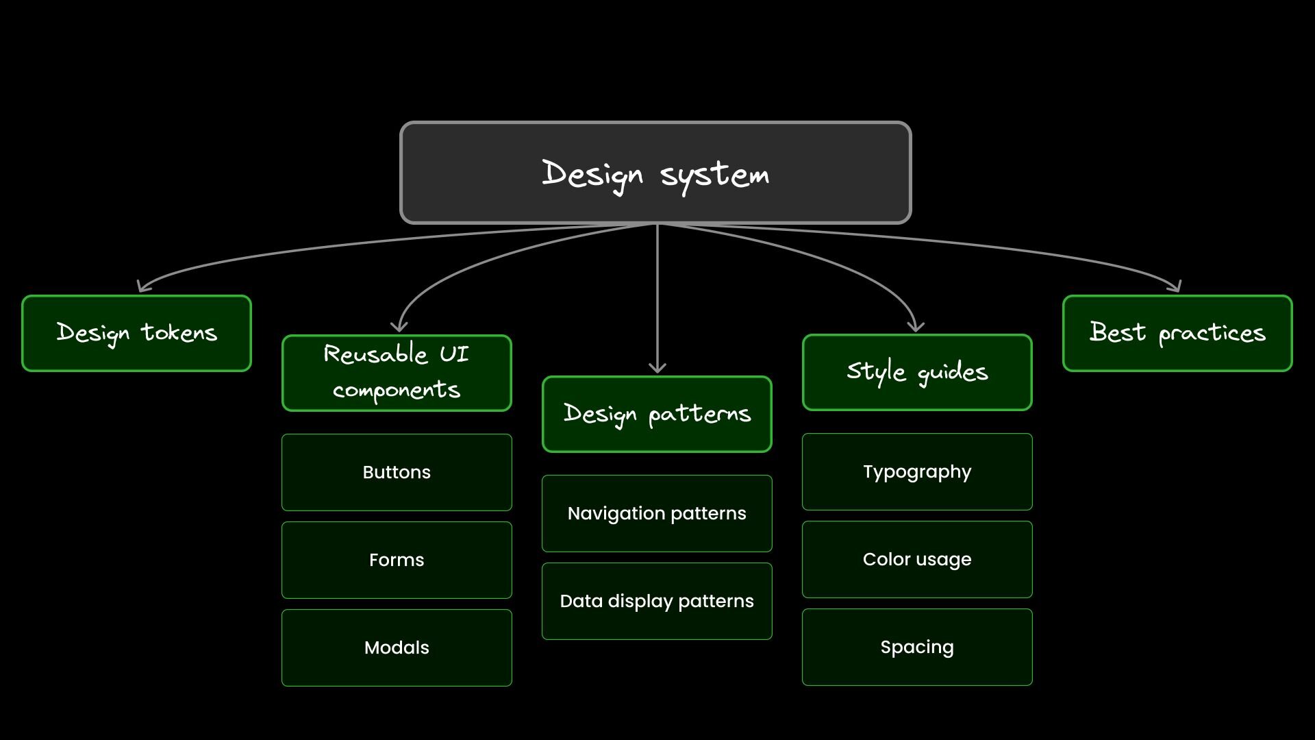
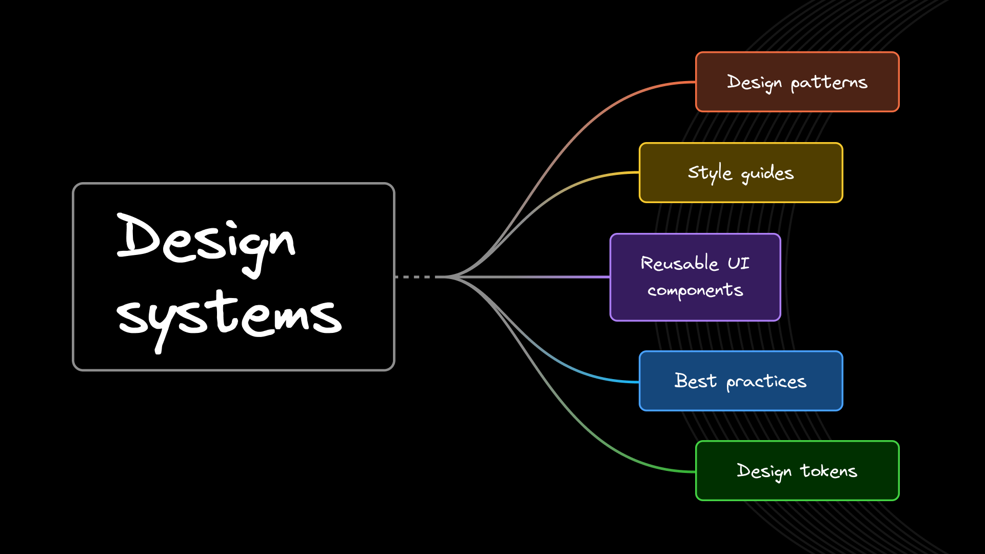
Here's what you'll typically find in a design system:
- Reusable UI components: Think buttons, forms, modals, and other common UI elements.
- Design patterns: Standardized solutions for common UX problems.
- Style guides: Documentation on typography, color usage, spacing, and other visual elements.
- Best practices: Guidelines on how to use components and apply design principles.
- Design tokens: Variables for storing visual design attributes.
A design system serves as a single source of truth for your application's UI. It bridges the gap between design and development, ensuring everyone's on the same page.
Why do developers care about design systems?
You might be wondering why you should invest time in a design system. Here are some concrete benefits:
- Consistency: No more subtle differences between components across your app. A design system ensures that a button looks and behaves the same way everywhere it's used.
- Efficiency: Instead of coding the same components from scratch for each project, you can reuse pre-built, tested components. This can significantly speed up development time.
- Better teamwork: Design systems provide a shared language between designers and developers. This reduces miscommunication and speeds up the handoff process.
- Scalability: A design system helps maintain consistency and manageability as your application grows. It's much easier to update a single component in your design system than to find and update it across a large codebase.
- Quality control: Components in a design system are typically well-tested and refined. This leads to fewer bugs and a more polished final product.
- Accessibility: By baking accessibility standards into your design system, you ensure that all parts of your application meet these standards by default.
- Brand cohesion: A design system helps maintain a consistent brand identity across all parts of your application or even across multiple applications.
The building blocks of a design system
Let's review the core components of a design system:
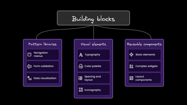
Pattern Libraries
Pattern libraries are collections of reusable solutions to common design problems. They're not just about visual design; they also encompass interaction patterns and UX best practices.
For example, a pattern library might include:
- A standard way to structure navigation menus
- Best practices for form validation and error handling
- Conventions for data visualization
These patterns help create a consistent user experience across your application. They're handy for complex interactions in multiple places in your app.
Visual Elements
Visual elements form the foundation of your design system's aesthetics. They include:
- Typography: This goes beyond just choosing fonts. It includes guidelines on font sizes, line heights, and typographic scale.
- Color palette: This isn't just a list of colors, but rules about how and when to use each color. It might include primary and secondary colors and rules for text colors, background colors, and accent colors.
- Spacing and layout: Consistent spacing is crucial for a polished UI. Many design systems use a standardized spacing scale.
- Iconography: Guidelines for icon style, size, and usage.
These elements work together to create a cohesive visual language for your application. Google's Material Design is a comprehensive example of how these elements can be defined and documented.
Reusable Components
At the heart of any design system are reusable components. These are the LEGO blocks of your UI:
- Basic elements (buttons, inputs)
- Complex widgets (date pickers, modals)
- Layout components (grids, cards)
Good reusable components are:
- Modular: They work independently.
- Customizable: They adapt to different contexts.
- Well-documented: They come with clear usage guidelines.
Why they matter:
- Consistency: Everyone uses the same building blocks.
- Efficiency: No reinventing the wheel for common UI elements.
- Easier maintenance: Update once; changes apply everywhere.
When building components, consider all states (hover, disabled, etc.) and make them responsive. Here's a simple example of a reusable button in React:
const Button = ({ onClick, disabled, children, variant = 'primary' }) => (
  <button
    className={`button button--${variant}`}
    onClick={onClick}
    disabled={disabled}
  >
    {children}
  </button>
);
Remember, a good component library evolves with your team's needs. Regular reviews and updates keep your components relevant and valuable.
Building your own design system
Creating a design system is a significant undertaking but pays dividends in the long run. Here's a more detailed look at the process:
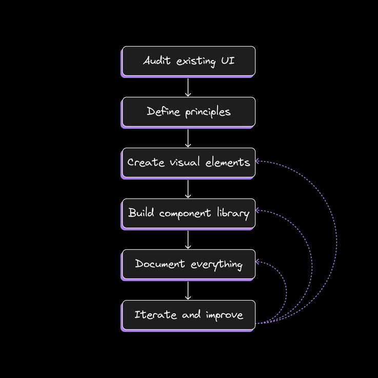
- Audit what you've got: Start by analyzing your existing UI. Look for patterns and inconsistencies. This will help you identify what components you need and where you can standardize.
- Define your principles: What core values should guide your design decisions? These might include things like clarity, efficiency, or accessibility.
- Create visual elements: Develop your color palette, typography, spacing scale, and other foundational elements. These will inform the design of your components.
- Build your component library: Start with the most commonly used components. For each component, consider different states (hover, active, disabled) and variations (size, color).
- Document everything: Clear, comprehensive documentation is crucial. Include usage guidelines, code examples, and explanations of when to use each component.
- Iterate: A design system is never truly finished. Gather feedback from your team and users, and continuously refine and expand your system.
Remember, you don't have to build everything at once. Start with the most critical elements and expand over time.
Accessibility matters
Accessibility shouldn't be an afterthought. By incorporating accessibility into your design system, you ensure that all parts of your application are usable by as many people as possible.
Your design system should:
- Include specific accessibility guidelines for each component
- Ensure color contrast ratios meet WCAG standards
- Provide keyboard navigation support
- Include guidelines for writing accessible content
Making your application accessible isn't just about compliance—it's about creating a better user experience for everyone.
Teamwork makes the dream work
A design system is a collaborative effort that bridges the gap between design and development. To be successful, it should:
- Serve as a shared language understood by all team members
- Facilitate collaboration between designers, developers, and other stakeholders
- Be open to contributions and feedback from the entire team
Consider meeting regularly to discuss the design system, gather feedback, and plan updates. This helps ensure the system remains relevant and useful to all team members.
Gaining adoption of your design system
Implementing a design system is a significant undertaking. Here's a more detailed approach:
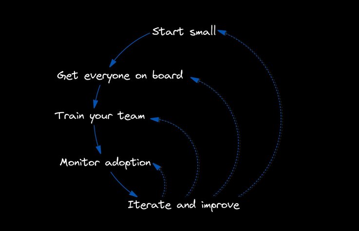
- Start small: Begin with a few key components and expand gradually. This allows you to refine your process and demonstrate value quickly.
- Get everyone on board: Ensure all stakeholders understand the value of the design system. This can include presentations, workshops, or one-on-one discussions.
- Train your team: Provide resources and support to help everyone use the system effectively. This might include documentation, tutorials, and hands-on training sessions.
- Monitor adoption: Track how the design system is used and address any challenges. Tools like analytics and code linting can help with this.
- Iterate and improve: Continuously gather feedback and refine the system. Be prepared to make changes based on real-world usage and evolving needs.
Implementation is an ongoing process. Be prepared to adapt and evolve your approach over time.
Builder and design systems
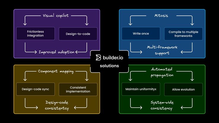
Design systems promise consistency and efficiency, but implementing them effectively can be challenging. Builder addresses common pain points with innovative solutions:
- Adoption: Builder's Visual Editor makes integration frictionless by bridging the gap between design and development.
- Multi-Framework Support: Mitosis, an open-source tool, allows for the writing of components once and compiling them into multiple frameworks.
- Design-to-code Sync: Features like component mapping and automated code generation help maintain consistency between designs and implementation.
- Consistency Maintenance: Automated propagation of design system changes across codebases helps maintain uniformity while allowing for evolution.
By tackling these challenges, Builder.io's platform streamlines the entire process from design to production, making design systems more accessible and effective for teams of all sizes.
Tools to get the most out of your design system
There are many tools available to help create and manage design systems:
- Figma for collaborative design: Allows designers and developers to work together in real-time.
- Storybook for building component libraries: Provides a sandbox to develop and test UI components in isolation.
- Zeroheight for documentation: Helps create comprehensive, easy-to-navigate documentation for your design system.
These tools can streamline the process of creating, implementing, and maintaining your design system. Choose tools that integrate well with your existing workflow and tech stack.
Keeping it fresh
A design system is never truly "finished." To keep it relevant and effective:
- Regularly review and update components: As your application evolves, so should your design system.
- Solicit feedback from users and team members: They use the system daily and can provide valuable insights.
- Keep up with design trends and technological changes: While you shouldn't chase every trend, maintaining a modern and relevant system is important.
- Document changes and communicate updates to the team: Make sure everyone knows about new features or changes to existing components.
By treating your design system as a living document, you ensure it continues to meet the changing needs of your organization and users.
Wrapping up
A design system is a powerful tool for creating consistent, efficient, and scalable user interfaces. While it requires an initial investment of time and resources, the long-term benefits of improved consistency, efficiency, and collaboration make it worthwhile for any organization serious about digital experiences.
Remember, a successful design system evolves with your organization, continually adapting to meet new challenges and opportunities in the digital landscape. By embracing the concept of a design system, you're not just improving your current products — you're setting the stage for more efficient and effective development in the future.
Subscribe to my newsletter
Read articles from Luke Stahl directly inside your inbox. Subscribe to the newsletter, and don't miss out.
Written by

Luke Stahl
Luke Stahl
Marketer and frontend developer with a master's in Communications: New Media and Marketing. Following my master’s degree, I obtained a Full Stack Web Development certificate from Northwestern University. Marketing is my jam, videography and UX design are other interests I enjoy exploring.
