Boxplots : All in One
 Victor Nduti
Univariate, Bivariate and Multivariate analysis
The Power of Exploratory Data Analysis (EDA) for Machine Learning Success
Machine learning thrives on data. But not just any data – high-quality, well-understood data is the fuel that drives successful models. This is where Exploratory Data Analysis (EDA) comes in. It's the crucial first step in any machine learning project, acting as a bridge between raw data and building a powerful model.
Why EDA Is Essential in Machine Learning:
Identifying Relationships:
EDA allows for the identification of relationships between variables, which is crucial for feature selection and engineering.
By understanding relationships such as correlations, feature interactions, and dependencies, we can enhance both model performance and interpretability, helping us select the most predictive features.
Detecting Outliers and Missing Values:
EDA helps in identifying outliers and missing values, which can distort models and lead to biased predictions.
Addressing these issues early on ensures cleaner and more reliable data for model training.
Guiding Data Preparation:
Insights gained from EDA guide data cleaning, transformation, and feature engineering steps.
This preparation ensures that the data fed into machine learning models is of high quality.
Boxplots: A Powerful Tool in the EDA Toolbox
Boxplots, also known as box-and-whisker plots, are powerful tools for visualizing the distribution of data and identifying outliers.
They are particularly useful for understanding the spread and central tendency of data in a compact, visual format.
Why Use Boxplots?
Summarizing Data Distribution:
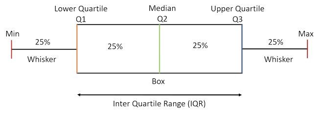
Boxplots provide a visual summary of the minimum, first quartile (Q1), median, third quartile (Q3), and maximum values of a dataset.
They offer a clear view of the central tendency, spread, and skewness of the data.
Identifying Outliers:
Boxplots highlight outliers, which are data points that fall outside the whiskers of the plot (typically 1.5 times the interquartile range from Q1 and Q3).
Detecting outliers is crucial as they can distort model training and predictions.
Comparing Distributions:
They also allow for comparison across different categories or variables, helping us understand differences in distributions.
This comparison is vital for interpreting relationships in the data and identifying significant trends.
Understanding Boxplot Elements
How do I interpret a boxplot?

Definition of Terms
Median (Q2): The middle value of the dataset, dividing it into two equal halves. If the dataset has an odd number of observations, the median is the middle number. If the dataset has an even number of observations, it is the average of the two middle numbers.
Lower Quartile (Q1): The median of the lower half of the dataset, excluding the overall median if the number of observations is odd. It represents the 25th percentile, meaning 25% of the data points are below this value.
Upper Quartile (Q3): The median of the upper half of the dataset, excluding the overall median if the number of observations is odd. It represents the 75th percentile, meaning 75% of the data points are below this value.
Interquartile Range (IQR): The range between the first quartile (Q1) and the third quartile (Q3), calculated as IQR = Q3 - Q1. It measures the spread of the middle 50% of the data.
Whiskers: Lines extending from the quartiles to the minimum and maximum values within 1.5 times the IQR from the lower and upper quartiles. They represent the range of the data, excluding outliers.
Outliers: Data points that fall outside 1.5 times the IQR from the quartiles. They are typically represented as individual points beyond the whiskers.
Minimum: The smallest data point within 1.5 times the IQR from Q1. It marks the lower end of the whisker.
Maximum: The largest data point within 1.5 times the IQR from Q3. It marks the upper end of the whisker.
Box: The central rectangle spanning from Q1 to Q3. It represents the interquartile range, which contains the middle 50% of the data.
Univariate Analysis with Boxplots
Single Variable Boxplots
1.Visualizing distribution / Skew
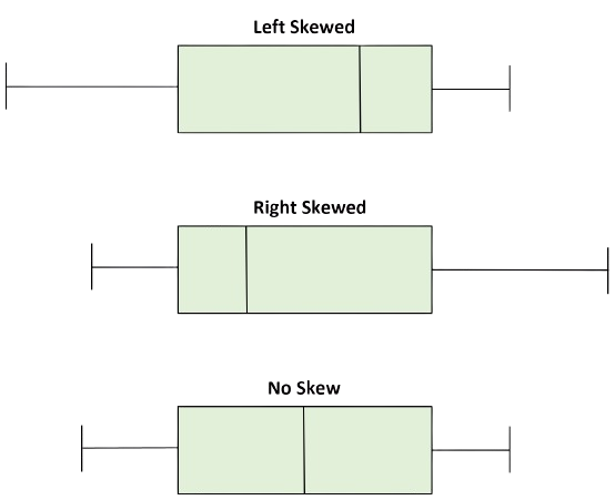
Skewness is a measure of the asymmetry of the probability distribution of a real-valued random variable about its mean. It describes the direction and degree of skew (or departure from symmetry) in the data distribution.
Skew would appear as shown below, with the specific type of skew being highlighted.

Implications of Skewness for Machine Learning
Linear Models: Assumes normality in the residuals. Skewed data can violate this assumption, leading to biased or inaccurate models.
Distance-Based Models: Skewness can affect distance calculations, leading to biased results.
Tree-Based Models: Generally robust to skewness but can be impacted by extreme outliers.
2. Identifying Outliers
As defined earlier, outliers, which are data points that fall outside 1.5 times the IQR from the quartiles, would appear as the individual dots outside the whiskers.

Implications of Outliers for Machine Learning
Linear Models (e.g., Linear Regression): Outliers can disproportionately influence the model parameters, leading to poor fit.
Distance-Based Models (e.g., K-Nearest Neighbors): Outliers can distort distance calculations, leading to incorrect classifications.
Tree-Based Models (e.g., Decision Trees, Random Forests): Generally robust to outliers, but extreme outliers might still impact model performance.
3.Spread/Dispersion
The IQR gives insight into the spread or dispersion of the data. A large spread could indicate high variability, while a tight box with small whiskers suggests consistency in the data.
This is important in machine learning because high variability may necessitate feature scaling or transformation before modeling.
Case Study: Employee Tenure and Satisfaction Levels
Insight from Boxplot Analysis

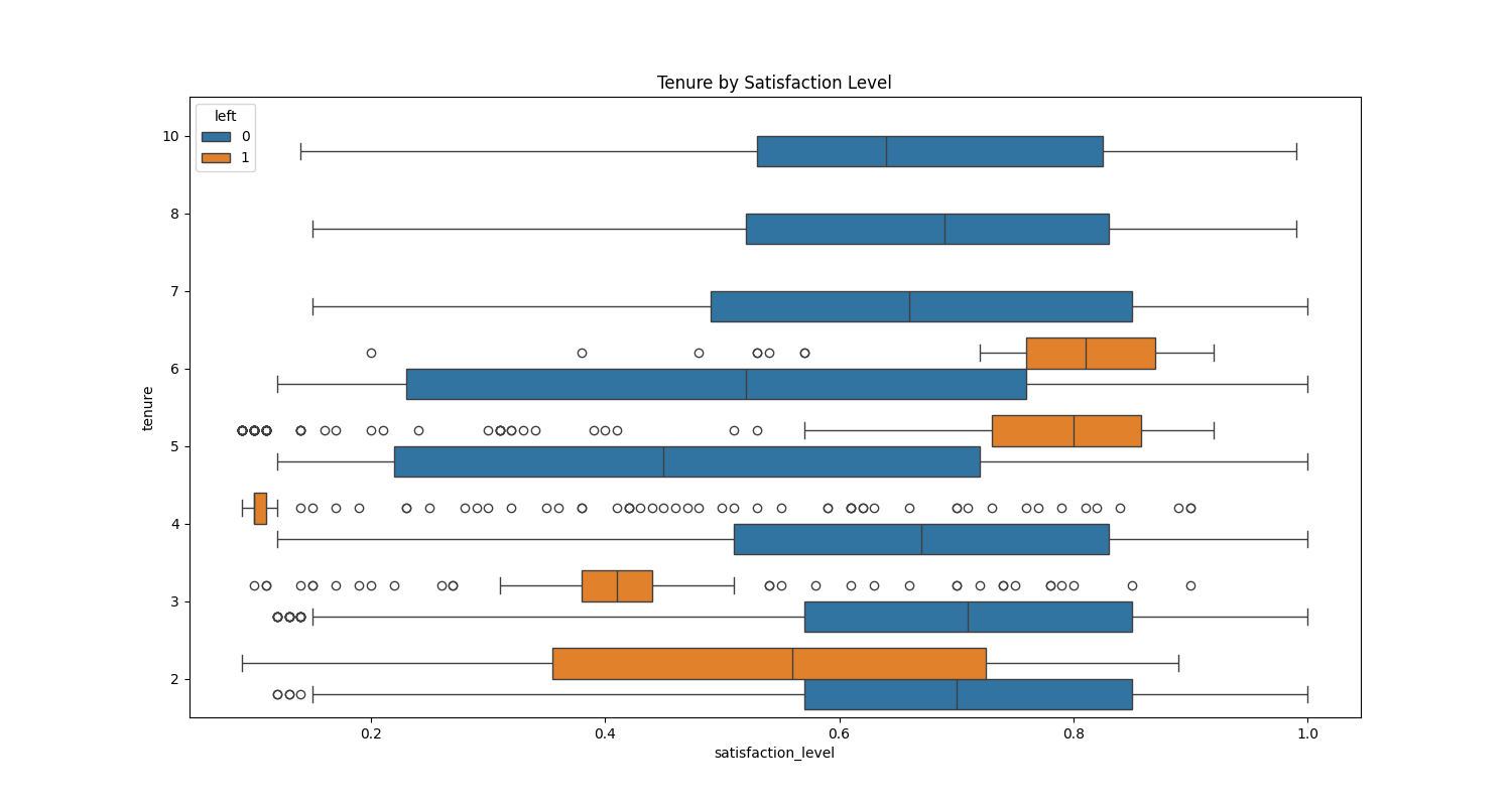
In this example, we analyze employee satisfaction levels over different tenure periods, using a boxplot to explore differences between employees who left the company and those who stayed.
Narrow Spread for Employees Who Left:
At tenure 3 and tenure 4 (years employees have stayed in the company), the boxplot for those who left shows a narrow interquartile range (IQR). This indicates low variability in satisfaction levels—suggesting most employees who left had similar satisfaction experiences. The presence of outliers also indicates that a few had either significantly higher or lower satisfaction than the majority.
Wider Spread for Employees Who Stayed:
In contrast, the boxplot for employees who stayed shows a wider IQR, indicating more variability in satisfaction levels. This suggests a range of experiences, with some employees being highly satisfied and others less so. The absence of extreme outliers further supports the idea that the majority had moderate satisfaction levels.
Narrow Spread for Employees Who Left:
For both tenure 3 and tenure 4, the boxplot for employees who left the company shows a narrow interquartile range (IQR), indicating low variability in satisfaction levels among this group. This suggests that most employees who left during these periods had relatively similar satisfaction levels. Additionally, the presence of outliers shows that a few individuals had either very high or very low satisfaction levels compared to the majority.
Implications of the Spread:
The low spread among those who left suggests that dissatisfaction may be a more uniform factor leading to attrition, particularly within the tenure ranges of 3 to 4 years.
The greater variability in satisfaction among employees who stayed highlights that, even if some individuals were less satisfied, they chose to stay, which could suggest factors other than satisfaction (such as job security, compensation, or loyalty) playing a role in retention.
These insights into the spread help in understanding employee behavior and can inform targeted retention strategies.
For instance, interventions to improve satisfaction may need to focus specifically on employees in their 3rd or 4th year to prevent attrition.
Conclusion: Boxplots as a Key to Data Mastery
Boxplots offer a simple yet powerful way to gain insights into your data’s distribution, spread, and potential outliers. Incorporating them into your EDA process ensures that you have a deep understanding of your data before feeding it into machine learning models. By recognizing and addressing issues like skewness and outliers early, you set a solid foundation for building reliable, high-performance models.
Subscribe to my newsletter
Read articles from Victor Nduti directly inside your inbox. Subscribe to the newsletter, and don't miss out.
Written by

Victor Nduti
Victor Nduti
Data enthusiast. Curious about all things data.